Hello guys, it looks like we have a new update from the creators of the game after a while hehe. It also appears that we have a new Holomon to play around with. Do check him out from the latest pinned posts in the Holozing community. I don't wanna ruin the surprise here haha. Alright Alright, I know some of us are lazy so I'm just gonna share it here.
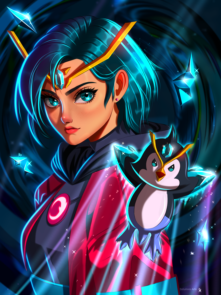
Anyway, I have anew fanart to share with you guys today. I decided to paint Zingu in attack mode this time. It's time to get serious now according to our water healer so I painted her in a serious expression as well. I painted Zingu in way that it looks like he is flying so make him look more dynamic this time. It was time to do something different so I did this instead of drawing him and healer cute all the time. I hope you guys like my painting :)
Zingu, ATTACK!
The Process
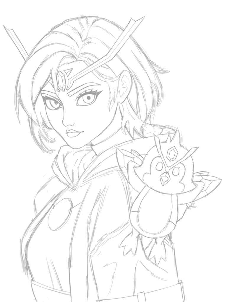
- Made a rough sketch using this reference from Pinterest
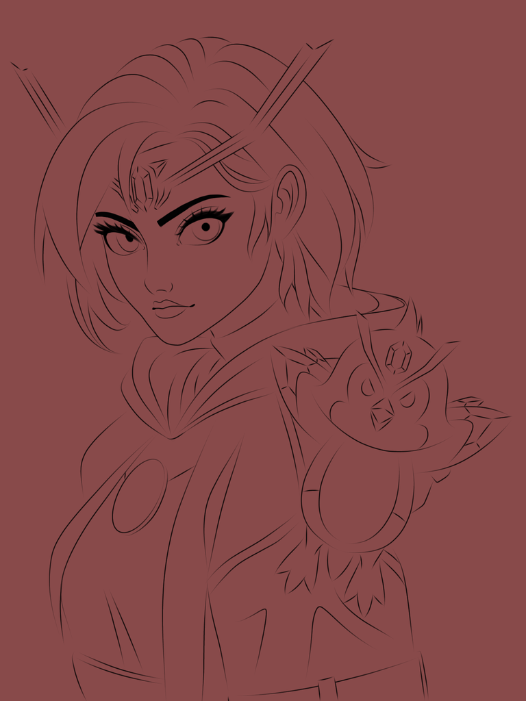
- Made a clean lineart form the rough sketch.
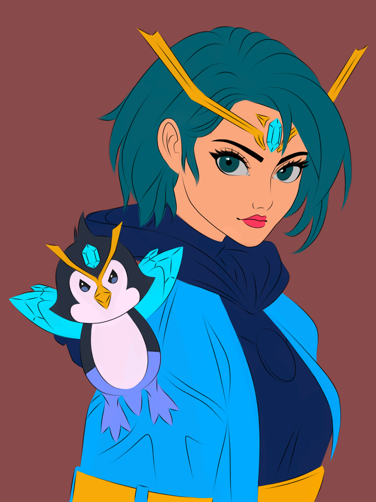
- Painted the base colours of the characters.
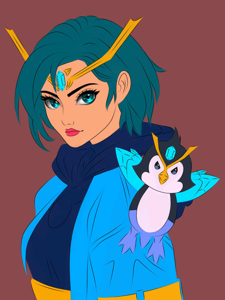
- Painted her eyes by adding highlights and shadows using penfade brush.
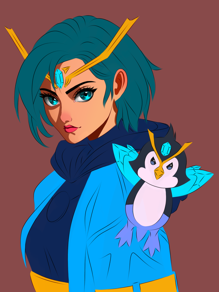
- Added shades on her skin according to the source of light.
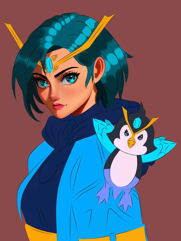
Added highlights and rendered the skin. After that I started working on the hair.
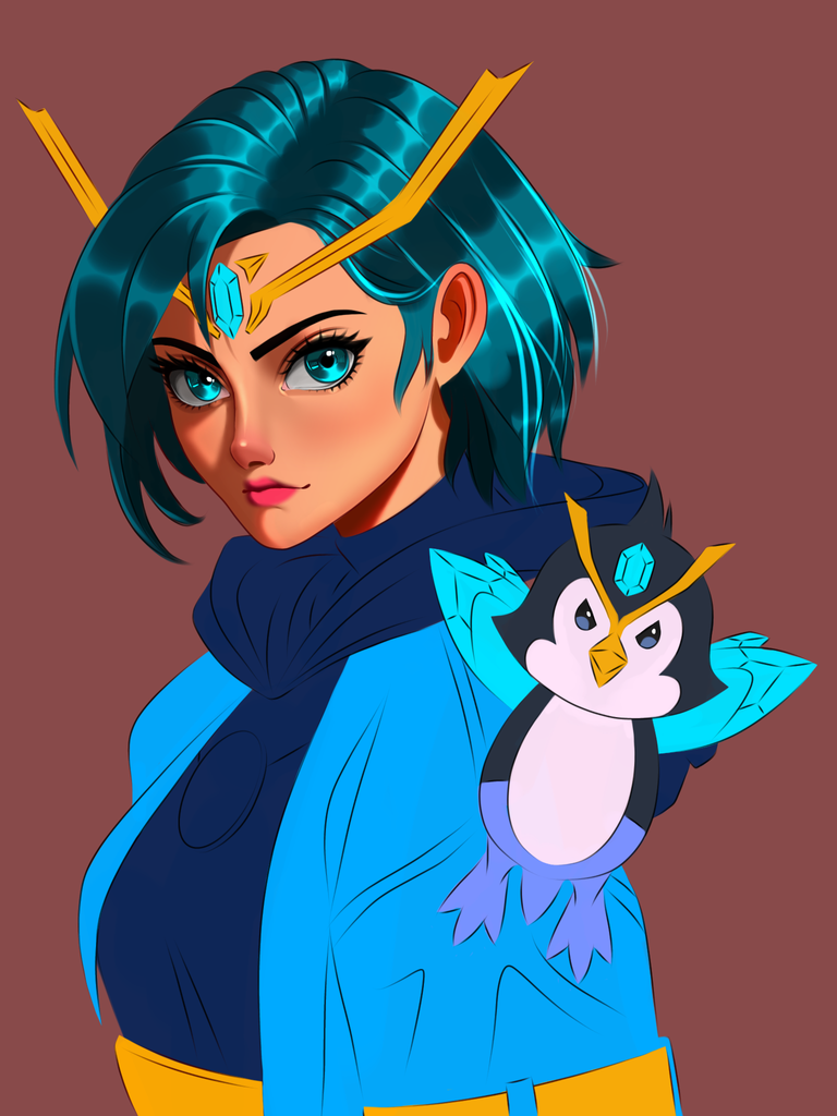
- I kept refining the hair and added more strands on her hair for depth and 3d effect.
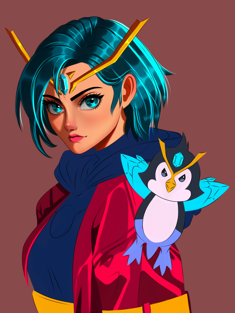
- Decided to change her coat colour to red instead of blue to spice things up a bit. Also red and blue are complementary so it will look good together hehe. I started adding shades on her coat after changing the colour.
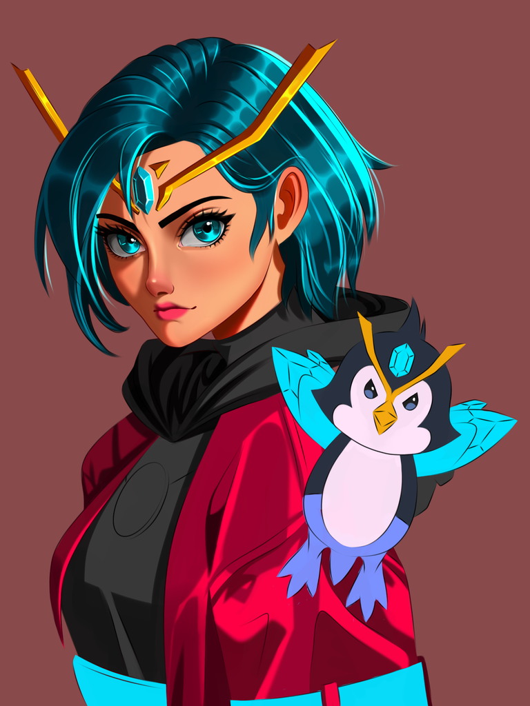
- I decided to change the colour of her top from blue to black at this point and added shadows on it in respect to the source of light.
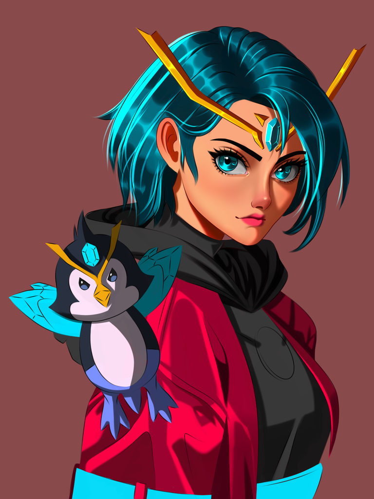
- Started working on Zingu at this point. shaded him according to the source of light.
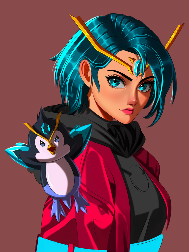
- After adding the shades I tweaked the shade colours a bit and added blue in the shade edges for a 3d effect.
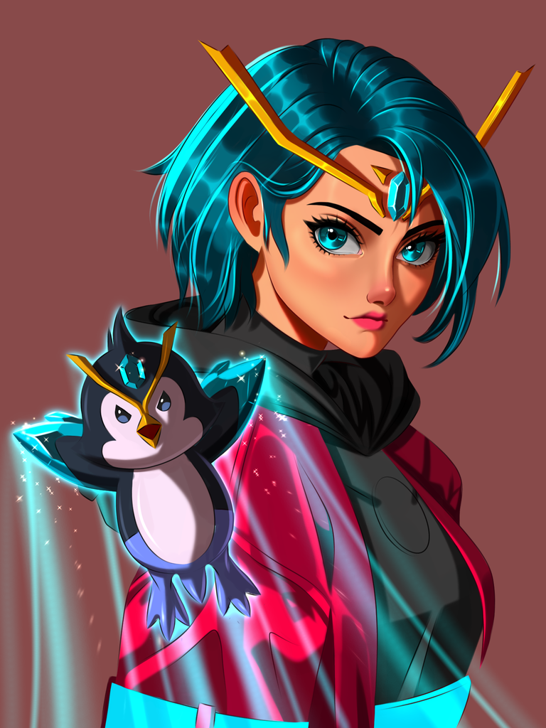
- Painted a trail of light and stars under him to make him look more dynamic. This part was fun to do plus it does make him look more cool haha.
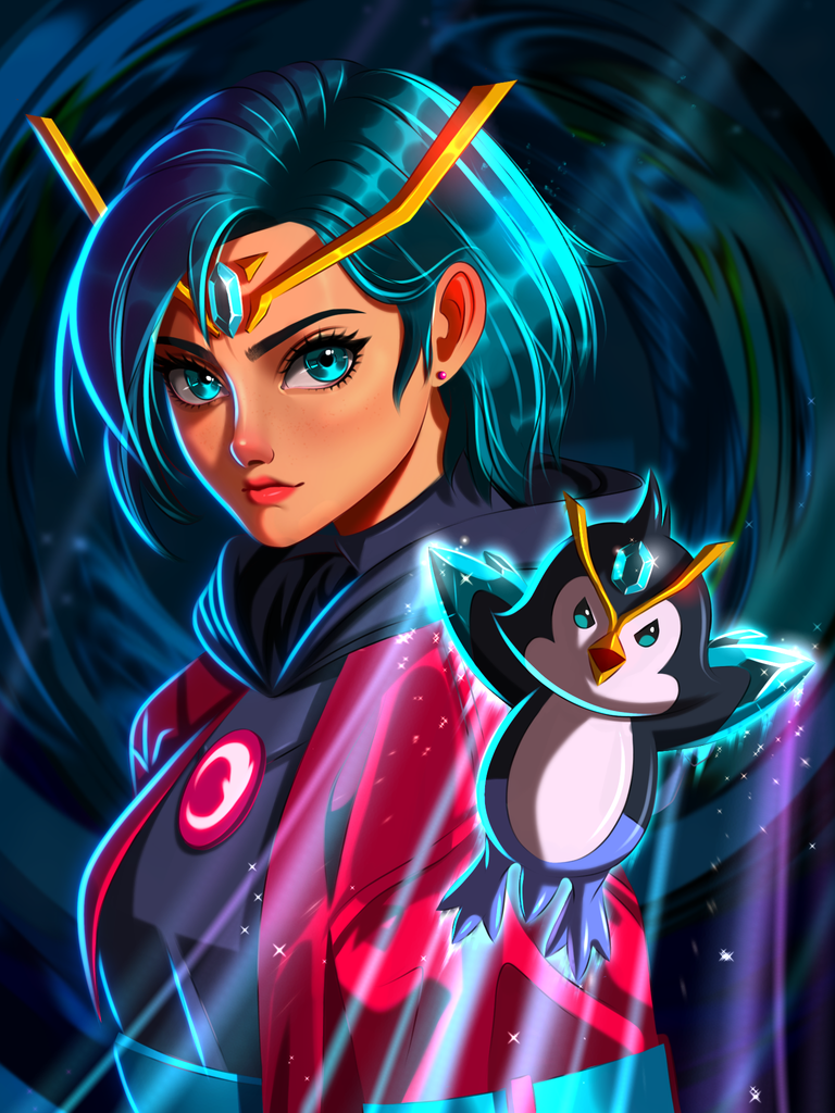
- Painted a simple dakr background because the rim lights on the dark side of the characters will be more visible in such a dark background.
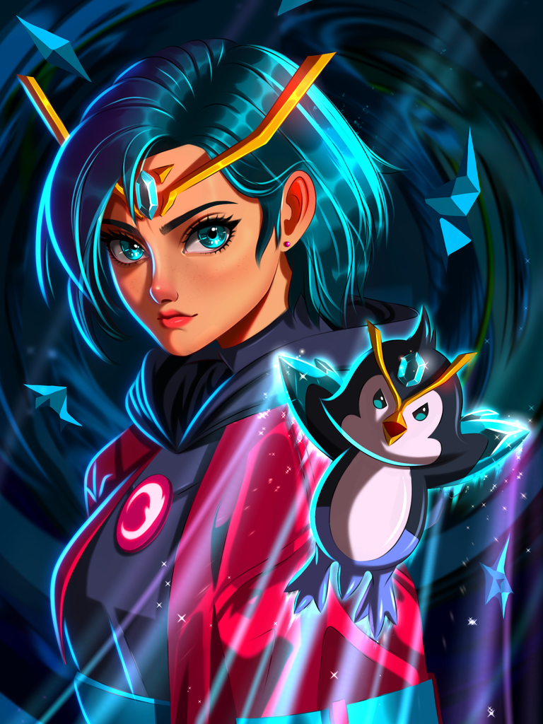
- Felt like the background was empty so I painted some crystal shards in there.
The Result

- Finished the painting by working a bit more on the shards and refined the painting as a whole before posting it.
App used: Ibis paint x
Duration: 8 hrs
Device: Oppo pad air tab
Follow holozing offical twitter handle for updates
Thank you so much for your time ☺️
I think a tiara or headdress would have been a better option than to embed the jewel on her forehead?
Ah I was just imitating Zingu's design on her xd.
Zingu is ready to fight! 😈
!PIZZA
Yes he is 😈😈😈
$PIZZA slices delivered:
julsdraws tipped solumviz
@eustace-kidd(2/5) tipped @solumviz
jijisaurart tipped solumviz
Amazing as always bro
!PIZZA
I love This Guy, your arts are very catchy 💓
Keep up the good work sir..
!PIZZA
The final result is amazing my friend!
I really liked the colours
Thanks bro