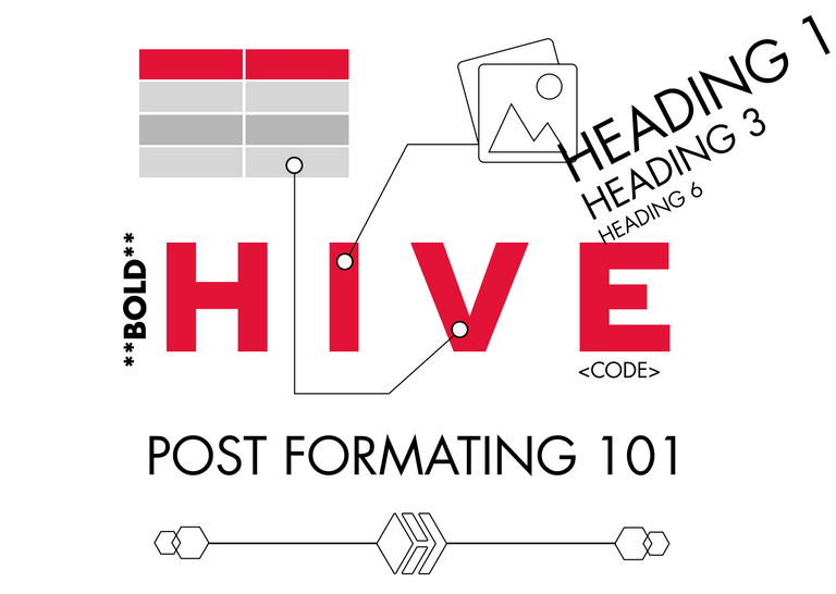
Part 2 with even more formatting and HTML
Formatting your post for dummies!
Today I spent some time commenting on newbies posts. I did that to help @aliento in giving them feedback. As a former graduate from his Newbies Initiative I am really happy to give back some of the help, that I received.
So I decided to write this post for all the newbies and give them some advice on creating more aesthetic, appealing and easy to read posts.
Why would you need that?
Aesthetics and the Aesthetic-Usability Effect is a principle in UX design that states that Users or in our case Readers tend to understand better, more beautifully created applications or in our case - posts.
Reading a beautiful post can make readers feel less fatigued, make them think more clearly, be more creative in their responses, be more patient in reading long post and even be more generous in upvoting.
More about this effect in the UX experience you can read here, but let’s continue with the practical advice.
Use nice images.

You can use your own, but If you don't find them appealing you can always find some free to use.
Optimal is to use an image for every section of your text. But it is still great if you can provide 3 images for 350 word post.
Some of best sites to use for commercial free images are:
- https://unsplash.com/
- https://www.pexels.com/
- https://www.canva.com/photos/free/
- https://stocksnap.io/
- https://pixabay.com/
Use headings and separators
Using #, ##, ###, ####, ##### - at the start of a line of text, let you make a H1, H2, H3 and so on.
According to @projectmamabg, it is good to have just one H1 - heading, probably at the top of your post, which can just rephrase the title or tell more about it.
If you don't know what H1, H2, H3 ... means these are the different sizes of Headings.
This is H1 Heading
This is H2 Heading
This is H3 Heading
This is H4 Heading
This is H5 Heading
This is H6 Heading
In My post I am using H2 Heading to separate the different sections/blocks of text.
⠀

You can use image separators, to make the task of separating the blocks of text even more aesthetic.
You will make them easier to read - so better User Experience or maybe Reader Experience and better aesthetics - So even better usability.
You can use different separators, that people share for free or you can make you own in minutes using a lightweight software like Figma or Canva.
You can even make your own beautiful Headings in the form of Images.
Format your Text
Don't just write a long blanket of words. When you are done writing, read you text, find a way to stress out the important words or sentences. If you just scroll up and scan this article without even reading a word, you have some idea what it is about. This is what you wanna do with formatting.
You can use the markup show below to stress out a word or a few words:
Bold - To make a word bold, surround it with double asterisks ** word** , please not I am leaving a black space before the word, so you can see the asterisks, if you remove the space the word will become bold
Italic - To make a word italic, use single asterisk to surround it: * word*
Code This is my favorite. Surrounding a word with code tags, make it have a background. You should write these: < code> word < /code> , again to make it work, remove the black spaces from my example.
citation - Using a single < symbol at the beginning of your post, makes you text look like this. You can use it in multiple cases.
You can also use lists. They can be:
- Ordered
- Unordered
You can make this effect using a digit and a dot just like that 1. for ordered list or just a asterisk and space at the start of a line to make unordered list like that *⠀
You can also use tables. It looks a little complex at the start, but actually it is pretty simple.
⠀| Column 1 | Column 2 | Column 3 |
⠀| ------------ | ------------ | ------------ |
⠀|⠀⠀Text⠀⠀|⠀⠀Text⠀⠀|⠀⠀Text ⠀⠀|
As you see above, It is done by drawing a table using | and -
If you copy-paste the code above and** remove the blank space** at the start of each line, you will see it working and start tinkering it till you understand how it works.
It should look like this:
| Column 1 | Column 2 | Column 3 |
|---|---|---|
| ⠀⠀Text⠀⠀ | ⠀⠀Text⠀⠀ | ⠀⠀Text ⠀⠀ |
✔️Another way to make you text more 😄 fun and 😎 fancy is by using 😉 smiles. You can use them to make
⚫ lists
🎯 attract attention
🙏 say Namaste to @iliyan90
👉 point the person, you blame for being on hive, @manoldonchev
🖖 Live long and prosper!
You can also use them to make
🔹🔹🔹🔹🔹🔹 SEPARATORS 🔹🔹🔹🔹🔹🔹🔹
Thank you for your time and I hope this helps!
Let me tag the new-bies, that could find this useful:
@projectmamabg, @jay-one, @maryjacy, @maykk, @mrenglish, @merit.ahama, @esther-emmanuel
Part 2 with even more formatting and HTML
Good luck!


Join our young UX / UI Design community

All images, text and illustrations in this post are original content.

Oh my gosh! This article is going to be of great influence for me and other newbie here
I must tell you that I learned a lot on how to make an eye-catching post.....hehehehe
Though I use to make use of the * to make some part of my post to be bold, today I learned something different especially the way of creating a column in a post.
I cannot but appreciate you for this 🤩🤩
Happy to help 😊
Super helpful!!! Thank you. @l0tti3 this is a good one to save and use the coding to add pizazz to blogs!!!
Yes this is super helpful, thank you and thank you @zo3d
Thank you too :) Stay tuned for part 2 with more advanced tags and html.
Wow 😃 I love this post, this is the most helpful post I have come across since I joined Hive and I am going to make use of it very well.
Please how can I save a post so I could go back to it for reference purpose?
I know about the bold and italics on my posts but never tried the code and line dividers, I will surely give it a trial.
Thanks @brutalisti for this great help to newbies, I hope my fellows see this and bring more beautiful posts to Hive.
Let me try to make a post and add these features, am so excited already 😁
That is nice! I am so glad that you find it useful :)
Good post. Upvoted and tipped up because of helpfulness and positive energy.
Ps: there are some additional options like advanced table and block alignments but the traverse away from markdown into manual html teritory.
@tipu curate
Upvoted 👌 (Mana: 0/22) Liquid rewards.
Thank you! Next I am gonna dig into HTML formatting. Btw can you help me with this. Is it me or I can't find a way to format in a pure HTML in the Peakd and ecency front ends. Is there a front end where I can inspect and edit the post's html structure?
how to align text to center
< center> text
When you remove the blank space you will get
Been looking for this actually. Thank you so much
Glad I helped!
A helpful post for newbies. Upvoted!
Thank you!
I like how you can use a ton of html tags, makes it easier to write nice looking articles.
Yea, still I am yet to learn about all the html tags, that can be included. I am also wondering can we have a style property in a div tag.
Awesome man. I see you spreading the positive energy of helping newbies. This post contains most of the things I tell people I onboard. Your post construction also matters in getting upvotes. Great article. Curated!!!
Yea, It should be like this. If you are given help, you should keep giving too.
@brutalisti Wow! This is great. I just bookmarked it now. You explain everything well and it makes so easy.
I am glad and thankful that you took the time to make this post for us. Thank you so much Drfor your efforts. It won't go in vain.
So let's start practicing heheh😀😀🏃♀️🏃♀️
Happy to help. I am gonna make more of this kind of posts. You can join the UX / UI design community, it will give good knowledge useful for anybody.
Thanks for the post. Always really usefull for newcomers like me. One thing I never seem to get right is if I want to center a text/image. Maybe you can help a stranger 😀
If I write < center > "Text to be centered" < /center >...I get all kinds of results. Sometimes it will be centered. Sometimes also the stuff, after die closing tag will still be centered and so on...
Or are those "problems" only in the preview and not in the real posting...just realizing that I never have tried that .
Nice post. I've learned these things back in 2018 when I started out in Steemit, and there is one thing that you have not included here that would make the most difference in your post, and make it look better. It is text justification, and if don't know what it means, just take a look at how the text of this comment is uniformly aligned on the left and right side. To create this effect the code is,
<div class=text-justify>placed at the top of the paragraph, and closed with a</div>at the end. I usually put it after the period.Thank you for your input. I have missed this intentionally for two reasons.
For now, justifications has its place in books and newspapers and in text paragraphs made with complex algorithms for justification like in InDesign. I am even thinking to write a longer text about text justification, till then you can have a look here
Nicely edited post is a much easier and enjoyable read. Thanks for all the tips and suggestions on how to edit HIVE posts, @brutalisti.
Thank you! I am working on next part for power users :)
Aaah these are all wonderful tips, thank you so much; especially since I'm not quite as familiar with Markdown formatting. Will have to give my posts a better polish so that they're easier on the eyes. :D
Thank you! I am working on a new post with the advanced markup and html possibilities
Formatting with markdown editing and using simple language should be the key to make the post understandable and attractive to the readers.
You are pretty right! Still you should know you users. If we are posting in a scientific community, we should be able to make a post close to Academic English, use minimal styling and still have good typography hierarchy. If we post in Art society, great artistic separators and more free styling would be great. If we target larger multipurpose community or write for newbies, as you say simple language will attract most users.
So cool!
Thank you!
Thank you so much, this is really helpful for the newbies like me ❤️
Happy it helps! Stay tuned for next part with advanced and html tags :)
Sure thing!🙂
One thing that sucks about the header tags is you can't center it! :(
You can use the html header tags. H1, H2, H3 ...
Just put the line below, between center tags and it works.
<h1> Headline with h1 </h1>Working H1 centered
So nice, thanks
Thanks for this! I really didn't know how to use tables. I have to try it in a post.
Thank, you. There is one more way to use them with html table tag
When i try to bring people to hive this is one of the obstacles i find, is just no so easy like the traditional social media, they doesn't even offer the option to format like this.
But for each i attract to hive i spend 1-3 hours teaching the basics 😂
@sketch17 voteandshare
Very exemplified post you have here. I have read this over and again. It is totally useful to be able to get your post in the eyes of other users.
Well done @brutalisti for this detailed work. I will always keep this in mind while creating a beautiful post.
Thanks! You probably got an notification, cause I edited the post to insert the link to part 2
This is so helpful I’m definitely using it for my introductory post Thanks🙏🏾
How does one post html banners into a post on the ecency app? Is there a menu option I'm missing?