Finally, I would like to show the autumn berry trees and shrubs in a graphically beautiful way. Only two fruit trees will be present here: the hawthorn and the apple tree.
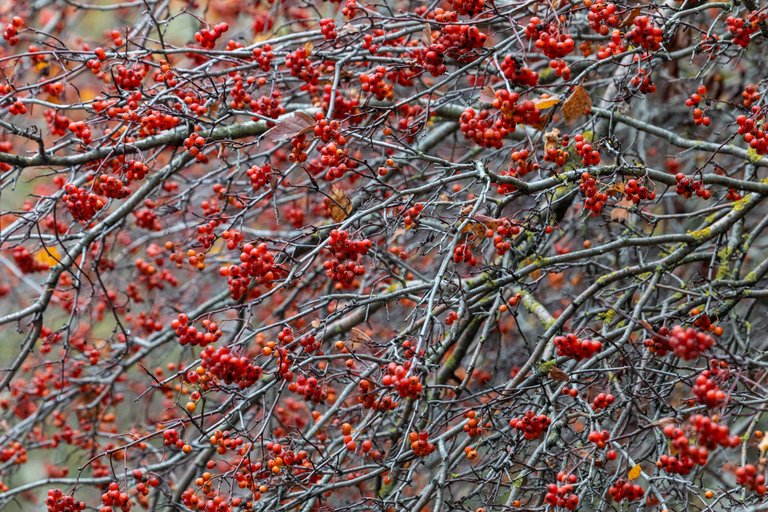
For the first time in my life, I ever photographed hawthorn in any form, although I ate the berries several times.
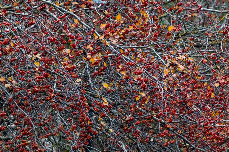
The berries are as graphic as possible and just look beautiful on bare branches.
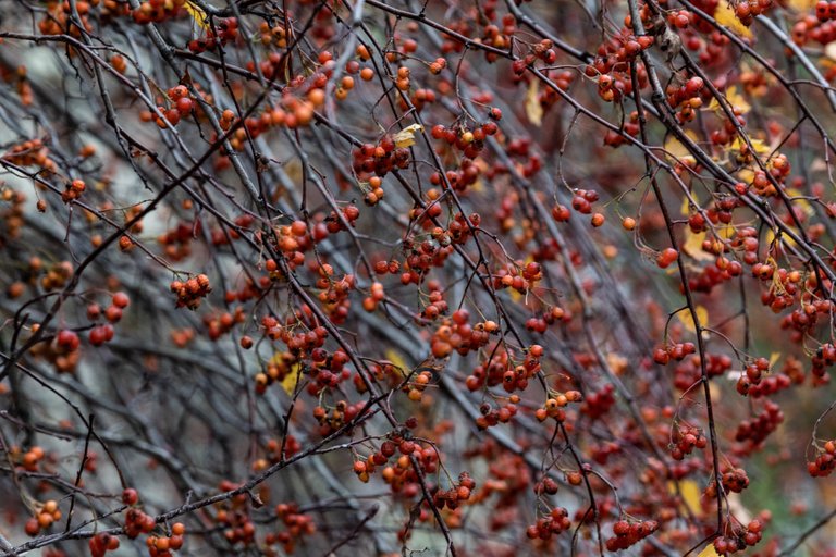
And red always attracts attention without exception.
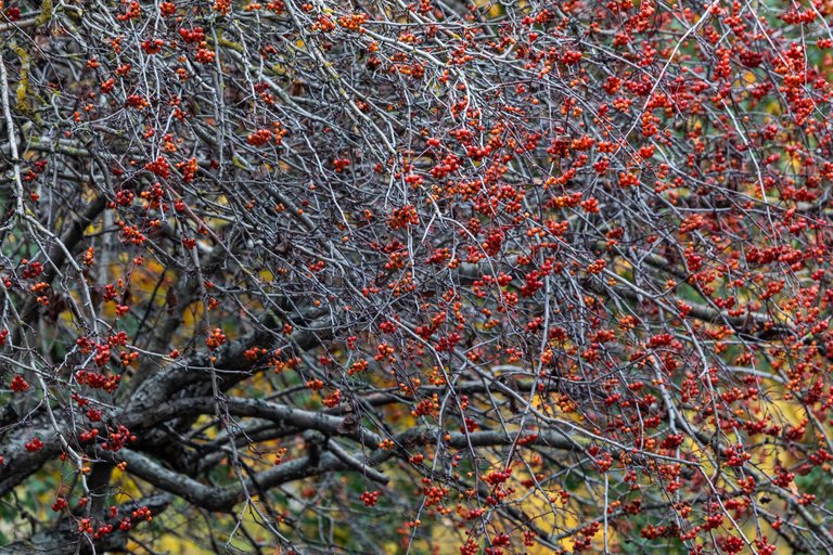
But if you add some more color to the background, then the picture becomes livelier and all graphics disappear at once.
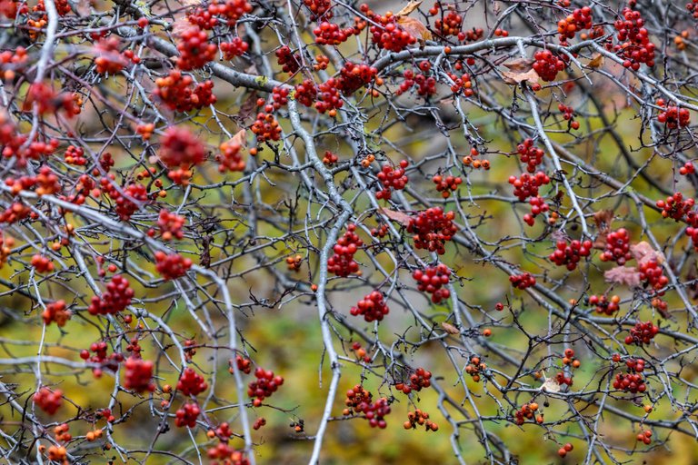
The picture becomes closer to the postcard.
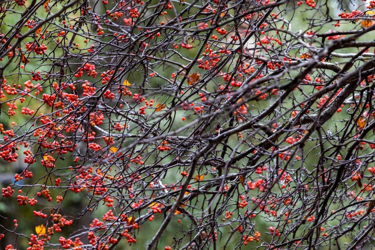
Apples, mainly small in size, have a cool shade in red.
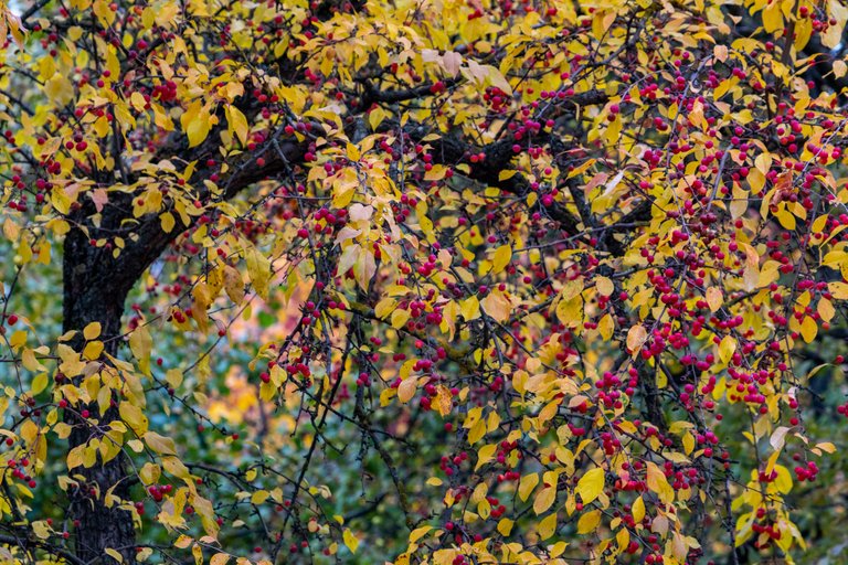
Cool red is less preferred in photographic art than warmer scarlet or even brick orange.
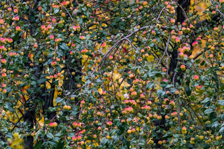
Lemon yellow, by the way, is also rarely found in the pictures of world photographers.
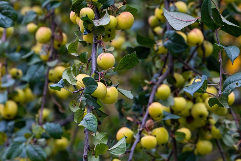
Warm yellow, however, is quite common.
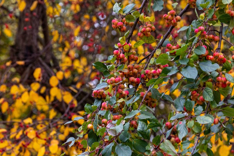
In general, there is a saying among lovers of fashionable dress: learn to combine colors from nature!
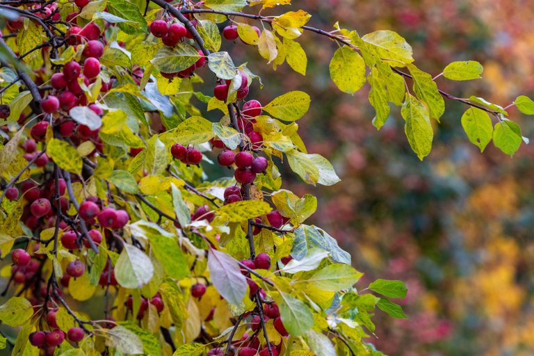
And now I accept all colors from nature, even if it is the hated lemon or cold red.
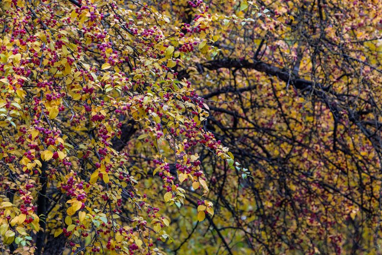
After all, if nature came up with this and, in addition, the light fell so that some unusual or undesirable shades were obtained, then it means that it was intended by nature (the system). In this case, the word "undesirable" in relation to the color should disappear forever. If you don’t want to take it, don’t take it off! But then it turns out that you are squeezed within the framework and think rather narrowly...