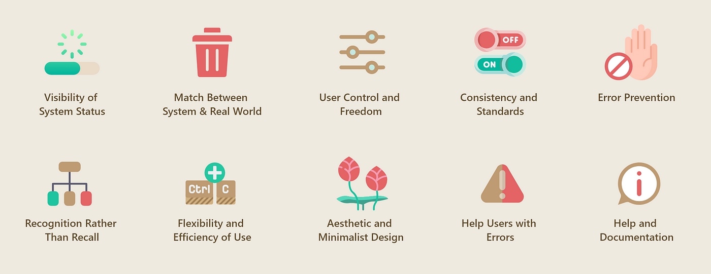
Nielsen's Heuristics is fundamental when learning the best way to design UI. These ten principles serve as helpful guidelines for what is essential when designing digital platforms. But I looked up when Jakob Nielsen established this, and surely enough, I found out that it's been three decades since the establishment of these ten principles. As I read through the principles, I see they are still relevant today, but I would like to evaluate these heuristics further and see their impact on current user interfaces, as a lot has changed over the last 30 years. I will be limited in covering only the first five principles in this article.
First is the visibility of system status. This principle says that users must know what is happening in the system. For example, a loading screen should show the percentage of it loading by a number, a moving loading graphic, or both. I think this one is a timeless principle. It is still relevant now and in the foreseeable future.
Next is the match between the system and the real world. This principle says that we should design our interactions to mirror reality. An example would be using "Trash" or "Recycle Bin" to delete files on a computer. When applying this principle, even the most novice in technology would know what moving an item to the trash icon would do. I would say developers practice this principle highly even today. A relatively recent and popular feature that uses this principle is "Stories," whether Instagram or Snapchat stories; they mirror the real-world concept of sharing short moments in a person's day. These posts are temporary and will disappear after a certain period. I am confident people will continuously use this principle in UI design indefinitely.
Another principle is user control and freedom. In Instagram DMs, users can edit messages shortly after sending them, allowing for quick correction of any mistakes. Users are likely to do actions when they know they can undo said actions. I can testify to this. After Messenger's edit feature, I became more confident in sending messages quickly because I knew I could make a quick edit in case of a mistake. In perpetuity, developers will most certainly implement this principle in UI design.
The fourth one is consistency and standards. This principle says the design should have uniformity in colors, fonts, labels, buttons, and other elements throughout the interface. Font sizes and icons are scaled for optimum readability. Menus and system features are consistently organized and placed in ways that make sense in their appropriate category, if there are any. Imagine a scenario where you lent your phone to your sibling, and they messed up with the positions of your apps on the home screen. It would annoy you because you are not used to this new layout. Now, imagine if that were to happen to an app or website you often use, and there is nothing you can do to undo that change. It might just push you over the edge.
It is important to consider consistency and standards when designing UI. I remember when there was a UI change with GCash, and many people, including me, were ranting about how inefficient the change was. At the end of the day, as someone who designs UI, you cannot please everyone. You will receive criticism after changing a feature or design users have been familiar with. Still, if you stand by the changes you created because you think they are for the best user experience, you must deal with complaints. Many people are uncomfortable with change, but eventually, they will learn to love it if it is for the better. Given this, if you see something that isn't broken, do not fix it. Just try to be consistent and uphold good standards.
The last principle I will cover in this article, but only the fifth of ten heuristic principles, is error prevention. This principle states that system designs should have automatic error detection and also preemptively prevent errors from happening. In Google Docs, as a user types, the cloud-based software automatically underlines misspelled words and suggests corrections. This feature helps users catch and correct errors as they type, preventing mistakes from being part of the final document. I have seen the improvements in error prevention features throughout the last decade. It is the foundation of a good UI design, and I am confident we will see more and better use of this principle in the coming days.
Unfortunately, I cannot cover all ten of Nielsen's Heuristics in one go, but upon writing this article, I can say they have stood the test of time. They have guided designers and developers in creating intuitive and user-friendly interfaces for different generations of users. The whole of these principles is greater than the sum of its parts. When designing a UI, try to uphold all ten principles, and you will be off to a good start.
Posted using Honouree