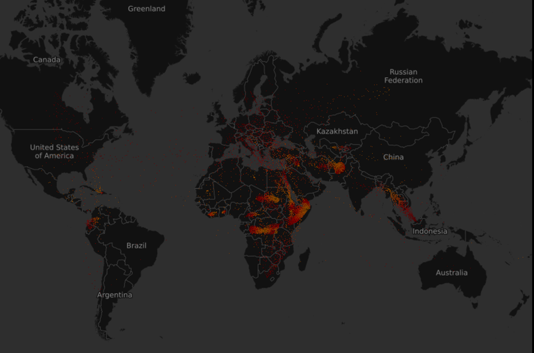
We read a lot about the numbers of refugees, but it is hard to grasp it without a nice visualization. On just that, Explorables did a very nice job.
Just wanted to share this cool visualization made from data of all refugees of the past 15 years. It is stunning to see how streams skyrocketed in the last 10 years. Especially the last few years were very big in numbers...
https://explorables.cmucreatelab.org/explorables/annual-refugees/examples/webgl-timemachine/
Screenshot:

Welcome to Steemit!
We have all been waiting for you, we are glad you could make it.
I have given you a upvote to help you out!
Hope you love Steemit as much as we do.
Give these a read:
Chat with us:
If this post was helpful, please leave an upvote. It helps me to keep helping new users.
I'm sunnybooster, a booster for accounts not posts. Send me 0.5 STEEM or SBD to get a week of upvotes! If you don't yet know what this is its fine.
I am a bot and this was automated. I exist to help out new members and attempt to get them hooked
Congratulations @sopver! You have completed some achievement on Steemit and have been rewarded with new badge(s) :
Click on any badge to view your own Board of Honor on SteemitBoard.
For more information about SteemitBoard, click here
If you no longer want to receive notifications, reply to this comment with the word
STOPCongratulations @sopver! You have received a personal award!
Click on the badge to view your Board of Honor.
Do not miss the last post from @steemitboard:
Congratulations @sopver! You received a personal award!
You can view your badges on your Steem Board and compare to others on the Steem Ranking
Vote for @Steemitboard as a witness to get one more award and increased upvotes!