If, like me, you are new to Steemit, and do most of your posts on your phone or tablet, you might find some of this helpful.
Background
As per the first few blogs I've posted, over a year ago I had a sudden inspiration to start writing a book. Which I shamelessly direct you to here, even if you don't read or vote for them.
My In Progress Book Posts
Empty Vodka Bottles And Burnt Cabbage
Shooting Stars And Empty Trashcans
As most of my writing and communication is done on my phone - yes, even the book - I am always looking for and finding new apps which make things easier and better.
Motivation
After a week of posting, I find myself in need of a markdown editor, so I too can make my posts interesting and eye catching, with the aim of getting more followers and making more money. Just kidding, not that it wouldn't be nice to make some money!
My original purpose for joining Steemit was to pave the way, be a guinea pig, test the waters, however you'd like to describe it, for a few of my friends (which includes my husband) who currently have no income and due to various circumstances won't be able to generate an income easily in the foreseeable future.
So I started gathering some basic information about Steemit, to make their start on Steemit as easy as possible, because I'm a good wife and friend 😃 As you can see, I have discovered how to use emojis 😉 which you can also use in comments, although if placed in your post, actually don't require markdown.
MarkdownX
Within seconds, I downloaded and installed an app from the App store, and I was ready for blast off!
When opening the app you'll see the following screen (as you can see I only did this screenshot after I had already started this post, I was that keen and excited!)
Screen 1
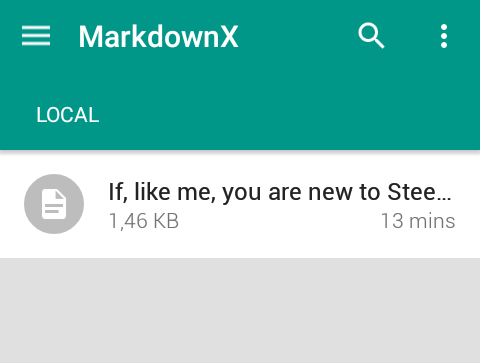
Before I started the post, I first looked for the help menu. Oops, there isn't one. But some of the icons looked familiar and self explanatory, so I thought I'd just wing it.
So I clicked on the pen icon in the bottom right corner. The following screen popped up, this was going to be interesting, a completely icon driven menu.
Screen 2
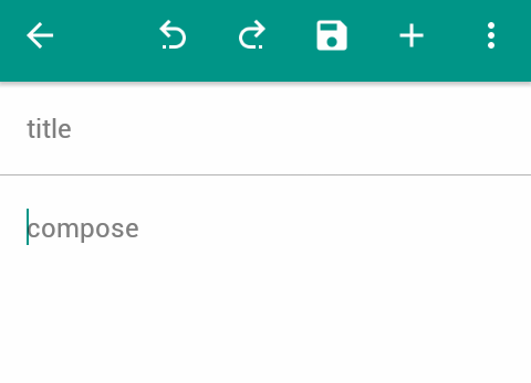
I didn't bother with a title, this being the first creation, I just clicked where the word 'compose' is and started typing. MarkdownX uses the first few words of the text as an auto title anyway.
Screen 3
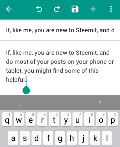
The icon funtions from left to right are
- The back button, once takes you back to Screen 1, twice exits the app.
- The undo/redo options, no explanation required as this works the same as an Office program.
- **The save button ** ,everyone's best friend! Interestingly there is an autosave that runs every minute or so, very impressive. If you've changed anything after an autosave, an alert appears to show unsaved editing, you can then click on the button to save manually.
Screen 4

Then I noticed the + icon at the top of the screen. This opened up a submenu of additional options.
Screen 5

You can scroll to the right on these icons for more options
Screen 6

Most of them are easy to figure out, although not all of them were necessary for me in this context.
The basics of what I used in terms of text style is as follows:
- Numbered list. Whilst you can just type in the numbering manually, this button keeps track of which number is next in the list.
- Bold text
- Heading 1, although once I saw that this was just a matter of one hash = biggest and six hashes = smallest, I didn't use the button anymore, just typed in the #'s followed by a space.
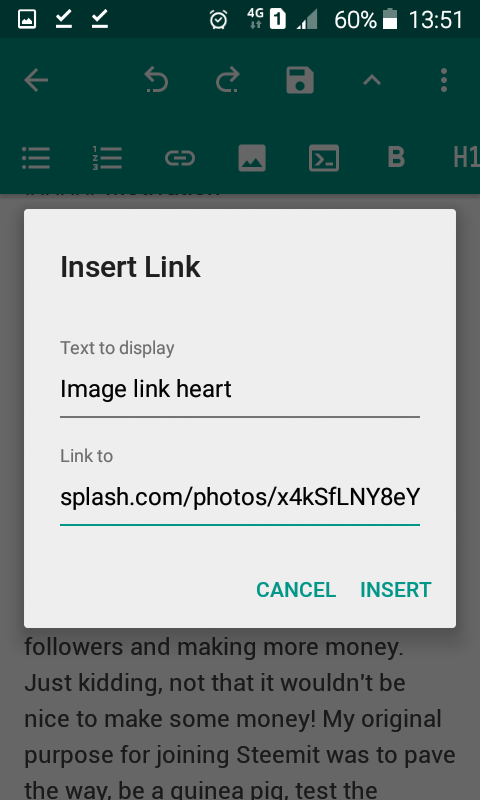
The link button

brings up the following screen where you can name your link and paste the url for photo crediting or webpage link, very handy indeed:
Screen 7
To review what your post will look like, and to check for pesky spelling mistakes not detected by, or even created by the android predictive text, simply swipe the editor from right to left (Screen 8), and left to right to go back to the editor (Screen 9).
Screen 8
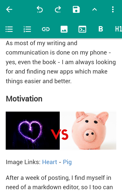
By the way, that's a piggy bank on the right, for saving all your Steemit dollars!
Screen 9
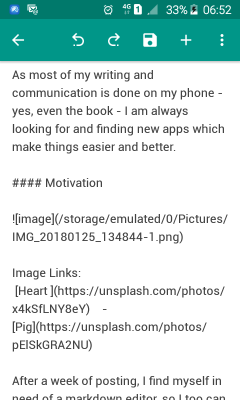
To insert an image, simply click the image icon

and you'll go straight to your Android gallery where you can select an image from your phone or Onedrive.
At this point I must confess that whilst I initially tested that the markdown editor was displaying correctly in Steemit, I didn't verify anything more beyond the first heading. So if you look carefully at Screen 9, in particular the link for the embedded image, you'll probably realise, or not like me, that there is a fundamental issue with images. The image link won't work when copying and pasting into Steemit! I, of course only realised this when I previewed my post in the Steemit preview pane! The picture is replaced with the word 'image'
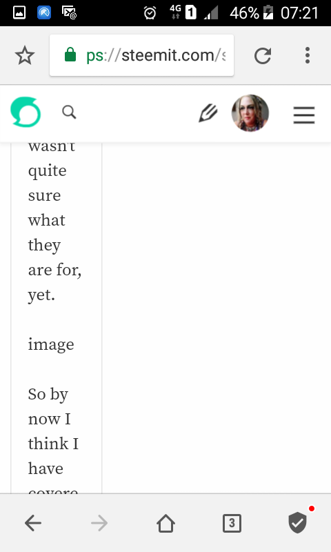
You're welcome! 😜
I think one way of getting around this is to use the same method as uploading your profile photo, using Postimage.
Be sure to copy the Markdown link!
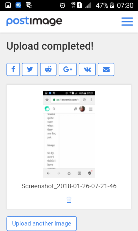
Or simply leaving out the images but having them in a separate folder, in order, ready to upload on the live post.
The 3 dots lead to another menu with Settings, where autosave is enabled, amongst other things. There is also a preview option if swiping makes you dizzy, as well as a couple of other selections, none of which I used...because I wasn't quite sure what they are for, yet.
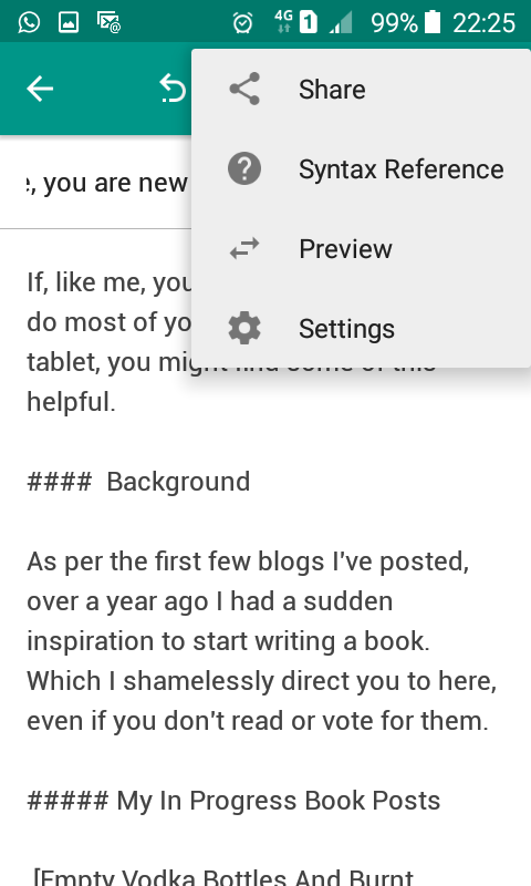
There is also a Syntax Reference for when you feel adventurous enough to type markdown code.
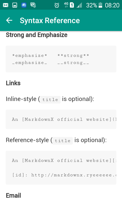
So by now I think I have covered the basics for beginners, all that remains is to select all, copy, and paste everything into my Steemit blog window, phew!
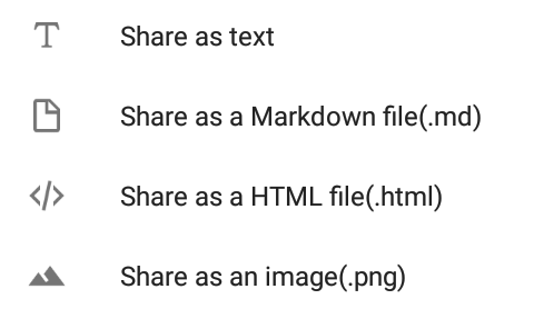
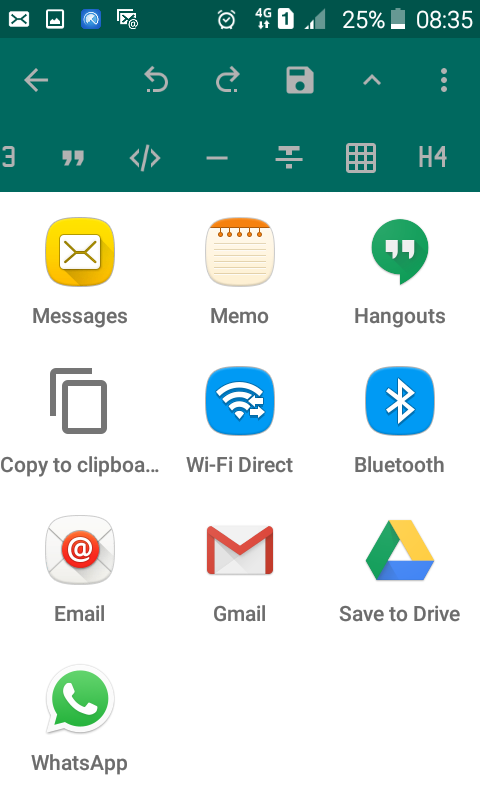
Alternatively you can use the Share button under the 3 dots, Share as Text and select Copy to clipboard, ready to paste into the Steemit post!
I hope this helps some of the newcomers to jazz up their blogs! Good luck!
Finally, as apps go, I was suitably impressed with MarkdownX, (and Steemit by the way), easy interface and smooth running, quite a few helpful features. I didn't figure out how to centre text, there was no italics button and of course the little issue of the images - no fault of the app though. Overall a big thumbs up! 👍

Congratulations! This post has been upvoted from the communal account, @minnowsupport, by emaraldearth from the Minnow Support Project. It's a witness project run by aggroed, ausbitbank, teamsteem, theprophet0, someguy123, neoxian, followbtcnews, and netuoso. The goal is to help Steemit grow by supporting Minnows. Please find us at the Peace, Abundance, and Liberty Network (PALnet) Discord Channel. It's a completely public and open space to all members of the Steemit community who voluntarily choose to be there.
If you would like to delegate to the Minnow Support Project you can do so by clicking on the following links: 50SP, 100SP, 250SP, 500SP, 1000SP, 5000SP.
Be sure to leave at least 50SP undelegated on your account.
Wow, what a thorough review and tutorial. My thumbs, I confess are too large, and I am far too fast (over 85 wpm) on a standard keyboard, to use this method much, but, I'll resteem it for those that might!
Thank you, much appreciated! I guess it's a rule of thumb guide then 😉