
Important update
Check the progress here
The colour or background colour of the proposed logo are flexible by design, to account for the many potential uses of the Gridcoin logo. If one colour comes out on top after further discussion, then this will be voted on and selected as the primary colour for the logo.
There's been a lot of exciting development across the Gridcoin community lately, so I thought it was high time for me to drop by and officially give you an update on branding efforts! I'm actually new to Steemit too, so since this doubles up as my first post - let's get introductions out of the way first...
Hey - great to meet you!
I'm Josh - a Designer & Marketing Manager based in the UK. I've been involved with BOINC since I was a kid and started using Gridcoin to support my BOINC efforts just over 18 months ago. I've always wanted to personally contribute to the Gridcoin project, so the establishment of the branding team on Slack has provided the perfect channel for me to get involved and volunteer my skills.
So what's new with branding?

Well, this is new for starters - and you're the first to see it!
We've been working tirelessly refining concepts to bring the Gridcoin logo up to date, whilst still maintaining the links to scientific research that you'd expect from a cryptocurrency that supports humanitarian research projects. Whilst the current 'artwork' logo (below) has some really fantastic detail when viewed at high resolution, it also has a number of problems as a general use logo - let's take a look at the logo and then discuss those:
Existing Gridcoin Logo
Logo Issues
- Complexity - the existing logo tries to convey too many concepts at once - this is a big no-no in logo design and is the primary issue when this logo is used out in the wild
- Detail is rapidly lost - at smaller sizes this logo is no longer visually distinct or identifiable. This destroys branding efforts, as the logo becomes lost amongst better designed currencies.
- Tired design conventions - dated design techniques used in this design do not effectively communicate a modern image
- Ineffective font choice - the chosen, main font adds little to the design and does not maintain legibility well due to some unusual letter shapes
Logo Legibility
To demonstrate the issues with legibility, here's a little graphic showing the existing logo as it scales down from 200px to 16px:
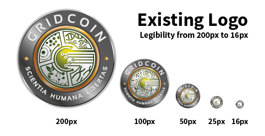
Existing logo, scaled from 200px to 16px
Now let's compare this to the proposed logo - shown here in a rather fetching purple (thanks for the suggestion @me-shell!):
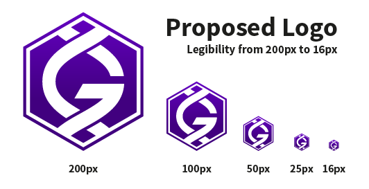
Proposed logo, scaled from 200px to 16px
Thanks to the simple form of the proposed logo, legibility is maintained across all sizes - this makes it invaluable for use as an icon, meaning it will be unique and identifiable even when minimised to 16px in a user's system tray. By making use of a simplified design, we're able to tick off two of the major issues with the existing logo - "Complexity" and "Legibility."
Further to this, the proposed logo's unique shape, colour and design allow it to stand out from the crowd and be easily recognised when viewed alongside other altcoin logos - neat!

Spot the Gridcoin - Old logo vs Proposed logo alongside altcoins
Development, Symbolism & Styling
One of the major concerns when we began looking at branding was whether or not a link to scientific research and concepts could still be conveyed by a simplified logo - after all, Gridcoin is intrinsically linked to BOINC and the research projects BOINC supports.
This was where the Slack branding channel came into its own - allowing for fast collaboration and discussion of mock-ups. Here's a small idea of how the concept has progressed from my initial designs to the current iteration (shown in green here):

Design progression from initial concept to current
The key aspects of the current, proposed design are:
- Double-helix symbolism - neatly tying Gridcoin to the scientific projects it supports in a way that is easily recognisable
- Hexagonal framing - hexagons are frequently seen in both nature and science, providing another subtle link between Gridcoin and science (it's also a fun shape for designing with..!)
- Modern, clean font choice - selecting a modern, clean sans-serif font does wonders for updating Gridcoin's image and improves legibility of text across a range of sizes
- Versatile design - a design that remains clear and legible no matter its use or colour - it is just as recognisable in black and white, inverted or in full colour
A Word on Colour

So, what about colour? We've tested a few options - including the white, green, and purple variants shown in this article - but the issue of colour is still up for debate.
Do you have any ideas? Feel free to share them below or in the branding channel on Slack - all will be considered, tested and new variants will be on display in the next Branding Update.
Thanks for Reading!
I'll be providing branding updates frequently over the coming weeks, especially as we ramp up to celebrate Gridcoin's Millionth Block. All community feedback is carefully considered, so get involved in the comments and keep an eye out for post #2 in a week's time!
A huge thanks to @dutch, @vortac, @me-shell, @jringo @slapbox and the rest of the Slack Branding team for your ongoing support, comments and collaborative efforts - be sure to check out their respective Steemit pages for more info' and updates.

Send GRC to this address and support my caffeine addiction :)
S4mJngSgfTyGEUsmTaFGNmr6GFJGCRLXvH
Well without any of my usual criticism, the new logo looks amazing.
Gridcoin was one of the worst when it came to logos. Dated, lo-def and ugly. This is an important change for the project.
Thank you, @kyle.anderson - glad you like the direction it's heading! It's my hope that a shift to a more modern image will help attract folks to the project, as well as allowing us to create adverts that are compelling and recognisable. More on that next week :)
Well best of luck to the project. I'm still just folding at home. I don't really think PoW can be abstracted in a Gridcoin way but at least it is "good" hashpower XD
Fantastic work @joshoeah. Not only have you done an exceptional job with the logo work, but you have done a great job communicating with everyone involved as well. If I did not know any better, I would think you were a professional designer hired by the Foundation!
Like @vortac mentioned, my contribution to your work was absolutely minimal. The current logo cannot compete with art like this, and I love seeing all the new stuff you come up with every day. The fact that you mock up every suggestion, no matter how odd, to prove what does or does not work was also great to see.
Keep it up, and looking forward to having a definitive decision made.
Thanks @dutch! Hope to keep surprising you all with new ideas as we go forward, you know I'm always up for trying out a concept and seeing where it goes!
It's been great working with the community - quickly pushing basic concepts and doodles to a developed mockup, allowing the community to offer an opinion, then tweaking as necessary. Can't wait to see where we go from here - particularly excited to see the final coin design!
Great design and amazing post! If every new Steemian had a first post like this, STEEM would be worth $100 billion already :)
Thanks for acknowledging me, but my contribution was minimal - other people mentioned deserve far more credit and the least I can do is to upvote and resteem their posts. @joshoeah, Gridcoin community is very fortunate to have a talented designer like you on board - if you could post a GRC address for donations, I am sure many of us would be glad to support your amazing work with more than just praise.
Thank you @vortac! Really appreciate your support - especially you convincing me to sign up here and post my progress. As far as donations go, I've edited a GRC address onto the bottom of the post in case anyone feels like donating GRC to fund my coffee habit :) - thank you for the suggestion!
Seconded, don't be shy, where's the address?
Haha alright, alright - I've edited an address on there for folks that feel that way inclined :) thanks for the suggestion!
Absolutely fantastic work!!! And such a beautiful post I read it twice. The purple looks great! So pleased with what you have come up with and had I not known better, I would of thought it was meant to be this from the beginning. The animation is also so perfect for a loading symbol or on a website. So much kudos to you. Keep up the good work! (Also no need to thank me I didn't do anything haha)
Thank you! The purple really does look great - nice job suggesting it, it wasn't something I'd considered until you brought it up!
Ahh you beat me to it with the loading symbol suggestion :). I'm hoping to tweak the first draft animation over the next week for use as a simple loading icon - I'll show off the various options in my second post next week!
Also - very much a need to thank you, your work on that 3D model is fantastic and I can't wait to see how the final coin comes out :). The first print that @dutch did looks great already!
I like the purple or the blue, blue is a nice calming colour but purple stands out more. I like the new design.
@andrewgenaille - thanks for the feedback! I like the purple too, it really stands out - glad to hear you like the new design too.
I love this design it sticks out, looks more modern and also factors in what gridcoin is all about which is researching (and yes we even research DNA)
Thanks for the feedback @bitcoinflood! Really glad you think the design sticks out whilst still tying in with what Gridcoin is all about. Your feedback on colour has been taken on board as well - green was my first choice too, but it is a little over-used. @me-shell suggested purple as an alternative and I think it really stands out!
P.S as per the color I would say green or purple
Green being - People often associate it with nature, health, good luck
Purple being - Stimulate feelings of spirituality, mystery, royalty
Green to me would be the clear winner here as it relates more to what gridcoin is all about, producing a better tomorrow.
@bitcoinflood I would agree with you, however it seems like many other coins use green, that Purple stands out so much from the rest of the brands. I feel green from that perspective would get lost.
Agreed, purple stands out far better and is underused. The spiritual relation could be linked with solving real problems humanity is facing rather than arbitrary complex problems like some coins :)
@j00lz - very true! Gridcoin does turn the 'waste of power' criticism of crypto on its head, so linking in a colour with strong spiritual and humanitarian links is a good shout :)
@joshoeah you seem quite into Gridcoin, I need to learn up more.
@mattbadura I remember joining SETI with my little Win98 machine back in 1999- that would've been the first time I heard about donating your computer power to distributed computing! It's always been a very appealing idea, so BOINC and then Gridcoin were a natural progression of that over the years :)
Well said @mattbadura - green does get lost amidst the sea of altcoin logos with it being quite an over-used colour. Purple, however, really seems to stand out - I think we're on to a winner :)
I absolutely have to say that you have given me a LOT to think about with some personal branding, I must pick your brain later!!
The comparisons, the size differences, the "Where's Waldo" logo search, just really bloody great presentation! Thank you!
Oh, and another thing, as someone that sculpts in wax, then makes silicone molds from those models, I have to say that THIS logo, is a HELL of a lot easier to even consider managing!
this is a great presentation on branding; standing out; not being afraid to grow or evolve the brand; to better represent it; i'm glad to be holding; makes me consider picking up more of these coins today
@topnetworkeral - glad to hear that! It's a great coin with lots of exciting development work ongoing at the moment, even outside of its branding. Look forward to keeping you up to date with the branding efforts in the coming weeks!
Thanks @erelas! Please, pick away - you know I'm always open for discussing ideas and concepts :). Glad you liked the presentation too - this being my first post, I wasn't sure how well it'd come across!
I didn't know you sculpted in wax - any examples of your work? Give me a shout if you'd like any files to build up moulds - would love to see what you come up with!
Branding Update #2
Vote on the logo proposal
by Wednesday, August 9th!
Great design! Much better than the last one. It gives it a more modern and futuristic feel, especially with the purple color and hexagon. I see big things coming with Gridcoin!
Thanks for the feedback @cryptodata! Glad the modern, futuristic symbolism comes across well, keep an eye out for more branding and advertising development work over the coming weeks - I see big things coming too!
I keep hearing about gridcoin and how great it is but the logo and visual aspect has in all honesty made me feel like the marketing wasnt great .... excited to hear about the rebranding! Will look to get into gridcoin soon! Love the new logo! Will also join the slack!
@ladram - glad to hear the rebranding is making you reconsider, Gridcoin is definitely worth looking into (I would say that!) Be sure to drop into Slack and say hey - look forward to hearing any feedback you have to offer.
The more I look at it the more I love it. It really stands out among the rest. The purple is a unique color and the logo itself will be instantly recognizable. You know it's a coin that starts with G, and it's way more visible than the others. Great work!
Cheers @step1 - really appreciate it :) I look forward to it hopefully passing the vote and going into general use! I'll be putting some more stuff out shortly, work is piling up at the day job at the moment :)
Top notch breakdown. Can't wait for next week!
Thanks @jringo! Glad to hear I may have converted you to the double-helix design as well ;)
welcome to steemit and thanks for sharing this update too! Love the new logo! I'm a proud holder of #gridcoin now and look forward to all you're doing as a community; That's an exciting project; I'm considering becoming one of several 'in the network' ..... one step at a time ::: again thanks for this awesome update!
@topnetworkeral - Drop by Slack if you get a chance, there's always plenty of discussions going on across the various channels and I'm sure your input would be welcomed! Very glad to hear you love the new logo and thanks for the welcome too :)
For me, green or purple really does it. Love the new proposed logo.
@riskdebonair - Those are my two top choices as well. I have to say, purple has leapt into first place after seeing it in practical use and judging by the response here. Glad to hear you like the new proposed logo too!
I like the old logo, but it is right that the proposed has better visibility in small sizes.
Purple is ok. I would prefer green, but that has it's own problems, mostly more widely usage and not least for color deficiency people. Blue/purple is always visible.
@lennstar - I also like the old logo as a piece of artwork - it has some lovely detail in it and, as you can see from the Commemorative Coin proofs, it works nicely as a large physical coin design. I initially tried most everything I could to simplify or strip down the original, but this ultimately proved unfeasible.
Do you have a preference on colour outside of the ones shown? I'm more than happy to mock up extra variants - it's a ten second job :). Purple really does stand out, as does blue - green ties in nicely with the general Gridcoin image but, you're right, it's widely used and not great for individuals with colour deficiency.
joshoeah, tanks for the brilliant work you've done in the Slack #branding channel!!
It's become obvious to me, during the collaborative sessions we've had in the Slack #branding channel, that you are a great designer and a great asset to the Gridcoin Community.
Thanks for your work on the logo and the 1 Millionth Block Commemorative coin.
I personally think that the purple example stands out from the crowd when it is seen among the other examples of alt coin logos.
I do like the idea that it has a spiritual hue and aura as our ethos is benefiting humankind while reducing the wasteful nature of coin creation.
I look forward to our continued collaboration in the Slack #branding channel.
Also welcome to Steemit.
Thanks @m3rcos1ty! Your support is greatly appreciated and I also look forward to our continued collaboration. It seems like purple is the clear winner at the moment - a great choice from @me-shell!
Hi! I'm new in this community and i want to show you my appreciation to your efforts as a community. The new logo simply ROCKS!!! Nice design and marketing consideration :)
Thank you @doctormenny! Really appreciate your support - look forward to working with the community in the future to continue development :)
Amazing design ! The old one did not met the design requirements. It's understandable - scientists are not artist :) the gridcoin.us website itself should have a revamp to at least web2 standarts
Thank you very much! With the project expanding in general I thought now would be a good time to take a fresh look at the design.
We have our millionth block coming up soon, as well as the team requirement for BOINC potentially being removed. Both of these things could mean more eyes on Gridcoin, so a modern, refreshed image will go a long way when new folks look into the project :)
Thanks for the support!
Good job on the new logo, I voted to approve. I like the old one, but for reasons already stated, time for a new one. Also, Gridcoin needs a slogan to pair with the new logo.
This post received a 1.7% upvote from @randowhale thanks to @joshoeah! For more information, click here!
Awesome work, @joshoeah! I can't wait for this to go through and start spreading.
Thanks @ravonn! Me too - look forward to working with you for the UI / icons in the coming weeks :)
Excellent post, Up-voted, followed, resteemed, shared and sent some GRC for your caffeine addiction :-)
Loving the animated logo and I like the purple because it makes it stand out.
Thank you @bullshark - coffee keeps me productive ;)
Glad you like the animated logo too - should have some more refinements and variants to show off next week!
No problem. Keep up the great work you are doing. Looking forward to next weeks update :-)
Very nice and very necessary logo update. I wonder how long it'll take Coinomi to update...
Thank you @deedlefake! I imagine we'll see the new logo propogate naturally if it's accepted by the community, though I'll be making efforts to speed that along wherever possible.
The new logo looks fantastic. And the scaling really is important, especially when presented with so many different crypto currencies (such as on Eobot). Differentiation is going to play an increasingly important role in growth of all cryptocurrencies, so this is a positive step to take. Thank you for your efforts on all of our behalf!
Thank you for the kind words @virtualgrant - scaling really is important, especially when the logo is used across such a wide range of applications. I hope to show off the practical application of the logo in the coming weeks with a few UI mockups, so keep an eye out for those!
I love the hexagon and I love the purple. It really stands out form other coins in all regards. I think this design is perfect, and the presentation perfect as well.
I planned to draft something like this up, but you have far exceeded anything I could have put together. Thanks for all your hard work.
@slapbox! Hey! I didn't realise you were on here too - the creation of the #branding channel was thanks to your efforts, so thank you! I'll be sure to edit up above to tag you too.
Glad you like how the logo is looking and the presentation of the post - if there's anything you'd like included for the next post do let me know!
The gif is fantastic! I didn't think I would like the purple but it's growing on me rapidly. Seeing all of the other logos together I can see how the green would blend in quickly. Purple definitely seems like the way to go.
Glad you like the gif! It's been fun polishing off my After Effects skills - hopefully there'll be more like that in future updates! Purple is also looking like the way to go here, for sure.
I like the green, but I also understand that some people in the other thread said it blends in too much when placed next to other logos. If that's a deal breaker, the purple really sticks out (fourth choice), but my second choice would be an aqua blue and my third choice would be a red (although that might cause some angry emotions, haha).
Great job!!!
Haha yeah, I think red might cause some angry emotions for sure :) it can work for some companies, but I'm not sure it's a great fit for Gridcoin. I'll work up some options for the next post and see what people think! I do also like the aqua blue - fortunately, the versatility of the logo and the decentralised nature of the community mean that if an individual user prefers one colour to another they could easily change it for their personal preference :)
Thanks for the feedback!
I am liking the new streamlined design, i am partial to purple or green color. Great work josh.
Thanks @combatwombat - very much appreciated!
Looks fantastic. Great work. :)
Thanks @grae! Check back next week for another update :)
@joshoeah, this comment is a little late in the game, but I was wondering if you had tried a version of this new logo with the same shape, but the bottom half of the DNA strand is microcircuits, blending upwards into the current "analog" DNA strand. I know you're going for simplicity here, so my suggestion might be too "busy" for a good logo. anyway, love the new one, really slick. and I vote purple, because it really jumps out to the eye in a sea of gold/silver/green coins.
Congratulations! This post has been upvoted from the communal account, @minnowsupport, by Shoe from the Minnow Support Project. It's a witness project run by aggroed, ausbitbank, teamsteem, theprophet0, and someguy123. The goal is to help Steemit grow by supporting Minnows and creating a social network. Please find us in the Peace, Abundance, and Liberty Network (PALnet) Discord Channel. It's a completely public and open space to all members of the Steemit community who voluntarily choose to be there.
If you like what we're doing please upvote this comment so we can continue to build the community account that's supporting all members.
Thats a nice logo maybe not purple tho
is it possible to get a full resolution version of the .gif?
i'm using the current one for our google plus, and it leaves a little to be desired.
@hermanhanafiah, if you wish to learn more about Gridcoin with a search you'll find many posts on the subject on Steemit.
However, by clicking on the banner below you will be brought to the main Gridcoin web site which will give you all the information you require on Gridcoin and show you how to participate.
You beat me to it @m3rcos1ty :) thank you!