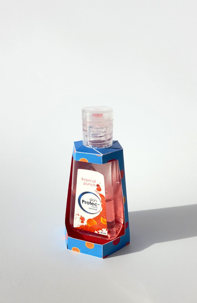
I did the graphic design on the outer packaging (wich was also made and designed by myself).
It should attract teenager, therefor I choose a simple design with strong colors and abstracted little fruits.
Since on the graphic design of the original product is already kinda playful, I reduced on the outer packaging.
I tinkered everything together (it wasn't easy) and took a picture of it wich u can see here.
(Just to clear it up. I wasn't hired for this. I just did it for fun. The company doesn't even know that i exist. xD)
I am not a pro in this, I just thought it would be nice to try it out but I think it doesn't look bad ;)
I'd like to know what you think about it :D

Congratulations @tamishumay! You have completed some achievement on Steemit and have been rewarded with new badge(s) :
Click on any badge to view your own Board of Honor on SteemitBoard.
For more information about SteemitBoard, click here
If you no longer want to receive notifications, reply to this comment with the word
STOP