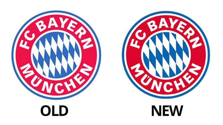
Bayern Munich has new logo

New and darker blue; new and warmer red (easy)
Vertex on ‘M’ is shorter and converges to a point
Angle on Bavarian lozenges changes from -30 degrees to -35 degrees in rotation.
Lozenges (or rhombuses, as we all know them) were scaled up to fix uneven crop. Seven blue instead of eight blue lozenges across.
The terminals of the ‘C’ were lengthened.
It was hard isn't it ?
Pretty minimal changes, really.
Yea they are
I got 3..
Nice
WOW !! I only see the change in colors and the rhombus hahaha. difficult