It was really quiet day I've been working on eSync as well as fixing some bugs and implementing new features for @eSteemapp.
We've been chatting in Telegram together with our illustrator and UI designer @dunsky where I've showed him few tweaks I've just made into current eSteem UI.

I am not sure guys, if it will be boring to read our chat here seeing how we were looking for some user interface solutions or not. If you really read the my posts, please let me know... :)
@good-karma: Working on the header avatar finding the way for filters to sit next to avatar or below. Some fiddling...
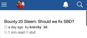
@dunsky: Cool! I think filters should go under the header. Like the mobile version of Steemit does.
@good-karma: Some tweaks...
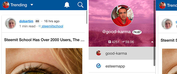
@dunsky: Looks really good! :) Have you tried making the bell and search icons smaller like the size of the pen icon there? God, this pink background overlay makes me crazy by the way!
@good-karma: Will fix that now too. There are lots of people complaining about that to me.
@dunsky: What if we will try
box-shadow':'inset 0 0 0 2000px rgba(33,34,35,0.7)? How do you think can we remove that avatar shadow in the post previews also?
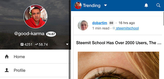
@dunsky: This one is better. I've seen it on desktop and those seemed too small looking but on mobile it's looking exact as it should be (at least for me).
@dunsky: Tested some headers, found that glow is not going to work. It gives me that feeling of old interfaces. I've also tried to tweak that brand blue color. If you like maybe we could test this?
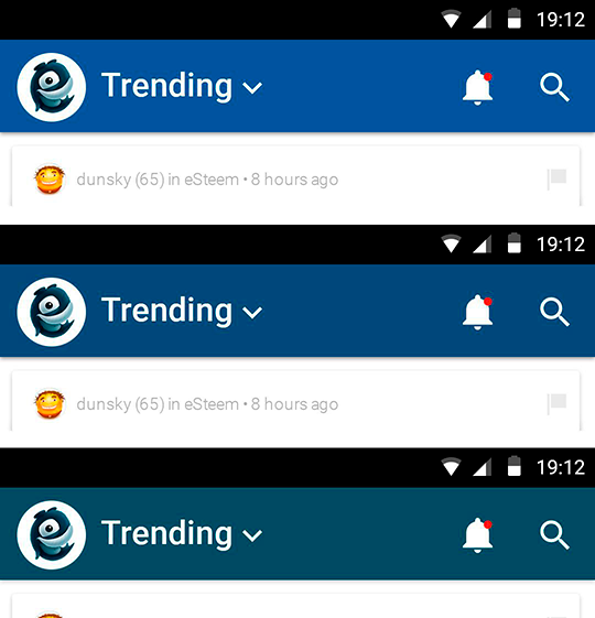
good-karma: It will require splash screen color change though. Do you think post title is well positioned by the way? Changes are: author, avatar, linked username and tags.
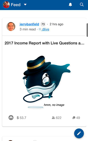
@dunsky: Splash screen updated and submitted to github. Please check some post view tweaks also:
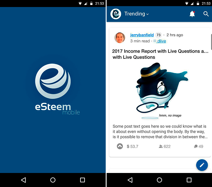
@dunsky: Whenever the title is too long see if we can have two lines of the post title? And may we add 2-3 lines of the post body text? If we will remove the dividing line in between post header with avatar, username, tag etc and in between the post preview maybe it would lighten the overall look.
For the top header I would suggest to made it slightly thickier (just a little bit) so we can have littble bit more room and our design elements would breath easily there.
@good-karma: About the text preview, don't you think it would overcrowd the design? I don't know, we could try... two line of title was also one of the things I've tried to avoid to make UI look less overcrowded. About line I agree, removing should lighten up. Title and preview is bit tricky to cover all edge cases... Something to think about bit more. But yeah, let's simplify then :)
@dunsky: 👍
What do you say, guys? Shall we continue such a story posts about eSteem development from time to time?
Steem on!
- Email:
info@esteem.ws - Home: https://esteem.ws
- Github: https://github.com/esteemapp
- Steem.chat: https://steemit.chat/channel/esteem
- Facebook: https://fb.com/esteemapp
- Telegram: https://t.me/esteemapp
- Discord: https://discord.gg/WywwJEu
Yes @good-karma, you must definitely keep posting about the esteem development progress and keep us updated about the upcoming development...esteem app Rocks!
yes ,, I can not get into #esteem.
is there a problem with @esteem?
Thanks @good-karma
no esteem works fine
I like to see some of the post text in the feed so I get a bit more idea if what is about. It looks like there's some spare screen space for that.
This is a very good point.
It could say that "no esteem, no steemit", because esteem is the best and convenience app forever.
It's flexible and it help me easily using.
And I ever want to say that your face expression is perfect matching with your name >> @good-karma .
I like that name and that expression too as it alive. 👍👍
In burmese, you are really "Yadanar" , means "Treasure".
Hi dear
Thanks.
I am very thankful of your upvoting my posts.
I am from iran. I will be glad if I could do anything to improve the steem platform.
I am layman, less able to interpret and retrieve the essence of the above conversation.
But in general I conclude that the above chats are discussions for improving the quality of eSteem services in the future.
And this is news I always look forward to, because anyone would want to enjoy improving the quality in any form, especially about the size of the Application Files that are very influential on the speed of connection and interaction.
But BTW eSteem applications that have been there now is good enough, but anyone would want the best.
Thanks a lot @good-karma
eSteem is the Best Choice
I am very supportive and happy when the future looks better esteemapp.
because I am a loyal user esteemapp
Very useful to enjoy. You exert a tremendous ability to esteem. We are very satisfied @good-karma. Thank you for notifying us. Successful endless greeting for you.
These contributions are the ones that are really needed in steemit, publications that
provide something good .... You have my congratulations, keep it up.
I recently download esteem app, that app is very usefull.
@good-karma i have problem with @esteemapps for my android mobile, beside there isfor android V5 and to long acces open with my mobile phone android.
Futhermore, i hope the developer can fix it.
anyway for UI, i like.
Cheers
@taufiksagoe
very good @good-karma good luck always
God Jobbbb
good-karma
Very good effort Mr. @good-karma and @dunsky, the pink of wallpaper is rather bad view and blurring the original color of Pict. I am very happy to know that this application will be completed bell as aware when new personal feed come in. I very appreciate you effort even though will not be tackled in short time. What have been doing by you is care to users. Weldone to esteemapp team. Thanks
Sincere: @rikaz87.
thanks.
Good post @good-karma
hopefully you succeed, I really like the system that you apply. my young life can be as great as you someday. my greetings to you @good karma
It's a good improvement but im looking forward to install esteem on my computer. it's easier for me to work on steemit by computer than phone.
I am proud of you, because you are so great in the world of steemit, from the pictures you post, very good, in explaining the picture is also very organized, I am happy if you take the time to go to account @zayanfaruk, what else if you want to give me upvote , hopefully you become a successful person for all ages, go ahead never give up, ok. thanks.
Good post.GOOD KARMA
Luar biasa, aplikasi esteem sangat bermanfaat dalam membuat postingan ke steemit, khususnya seperti saya, yang membuat postingan lewat handphone (HP).
Thanks U @good-karma karena telah menciptakan aplikasi dan memudahkan dalam membuat postingan steemit lewat HP.
BEST REGRAD FROM : @aminnullah
Thanks sharing..
Postingan ini sudah saya resteem
I have installed
Thanks for your share :)
this is very remarkable and interesting hopefully fore the application of esteem growing and progressing.
I am very confident with this..
Thanks you very much to my senior @good-karma
Great job, nice to see you guys working day in day out to improve @esteemapp.
informasi bagus untuk posting ini,,
Dapat jadi pelajaran buat saya
Terimakasih
I have been using esteem for most of my post. I love the “schedule” feature. I thought it was brilliant. And i am just as excited to see these new “tweaks”.
And yeah, story posts about the development would be great. Feels like eavesdropping but really isn’t. LoL!
Great work. The bell and the search icons are big for sure,can you make them small. Can you also put options to change the font size too and what about the themes and stuff. Anyways I appreciate your efforts to make esteem better.
good apps i like it easy to use thank you for sharing
App is running like a charm! It is The only way I access steemit now....
very good writing, keep working and motivating each other.
@good-karma
semoga bisa lebih bermanfaat .
SALAM KOMUNITAS STEEMIT
Keren
Hopefully this project can be successful friends and can be used perfectly oleg other steemian friends. because usually more steemians are using esteem. thanks friends for his work that is beneficial to all of us.
esteem is amazing, thanks @good-karma already present esteem
so good
Can enyone tell me how I can install esteem app?????
Thanks sharing:)
Please vote my blog.
Hello @good-karma!
I can only speak for myself but I'm happy to see a post like this because this means you guys are working on resolving these issues.
I've been planning to make a post about the issues I'm having on eSteem but I'm pretty new here and didn't want to seem ungrateful or you to think I'm making negative publicly.
I love eSteem and happy to know you are working on it. Keep up the good work and let me know if you need any feedback!
Any feedback is always appreciated, Erikah!
Actually I wrote in my latest article about why one should try and would love eSteem app, and some ideas on how to improve it. The article was submitted to participate in the ongoing contest.
This is what I have in mind:
And I love the idea of post's text preview (in home / trending section), maybe in 5 or 7 lines.
thanks
excellent service always pay attention to appreciate the user esteem. thank you @good-karma
what is good-karma say i agree all hopefully go well i like what good-karma say.
This is interesting. I cant wait to c what d new tweak and update within the esteem app would n. Thanks @good-karma for constantly thinking about the well beign of steemians and the improvement of steemit at large. Thanks once more @good-karma
I feel a pleasure using eSteem, this makes it easier for me to activate my post. whatever the development of this application of course I also support it for the better. thank you @good-karma
yes ,, I can not get into #esteem.
is there a problem with @esteem?
Thank you @good-karma
eSteem works fine.
Do not be discouraged my brother, your hard work is incredible, all your thoughts and efforts are very useful for all people on earth, keep on working and be the best, we really support you
Please improve speed and stability, i think esteem Will be better..thanks @good-karma
It's nice to read. It's nice that eSteem's graphic work is still being taken.
up vote :)
Keep on esteem on.