This is how it looks today.
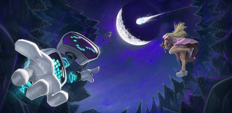
I am really happy with the result of this one, even tho' I think i will modify few things in the following days when my eyes stop getting used to what I've done already.
And actually this is a great advice you should take because you may think that what you see it's beautiful and amazing but it could be that your eye just got used to it and maybe some things are failing, and you can't spot these.
Which I am sure that are happening in this artwork atm.
I can't tell much about this since the project is still in development. But I can tell you that is going great and as I shared before with you,
it is going to change cryptos for ever!.
But let's stick for now with this artwork.
I won't describe either the meaning of all this and I also took some symbols and elements that could spoil the whole thing, so you, me fellows, will get surprised when it all comes to reality ;).
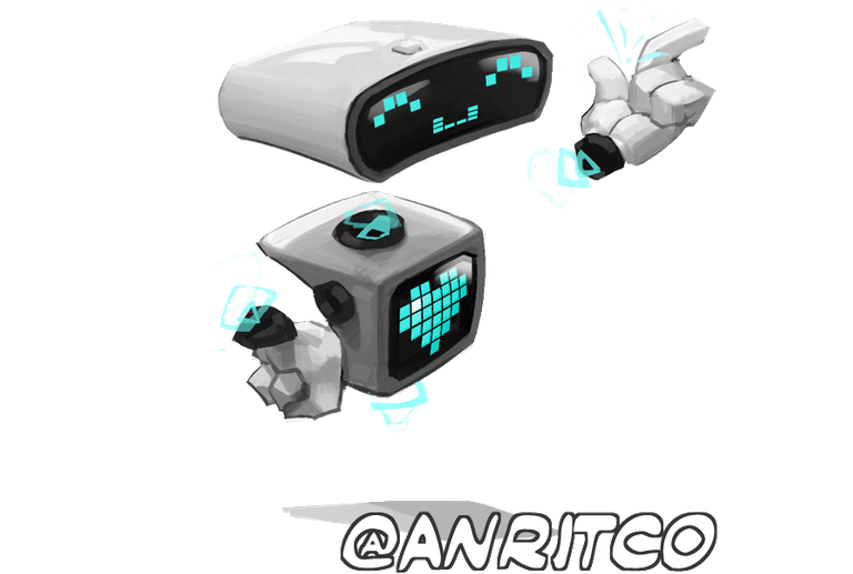
But as you could see on a previous post, I've been developing the design for this character of ours. Which in my personal opinion (and from many others) it fulfills my client and friend's request: To be cute and at the same time cool AF.
I must admit that it wasn't that hard to design it. I just adapted his idea to this and the output came out super nice and sharp!
Something I was saving for this artwork was a style I wanted to apply since some far time ago. I don't know if you are familiarized with Leyendecker, but he is one of my heroes. He is far gone already, but he was absolutely amazing in his technique and field.
He was known because of his amazing use of strokes for every artwork of his. I'm not gonna show you any right here, but you can google it!
ANYWAY...!

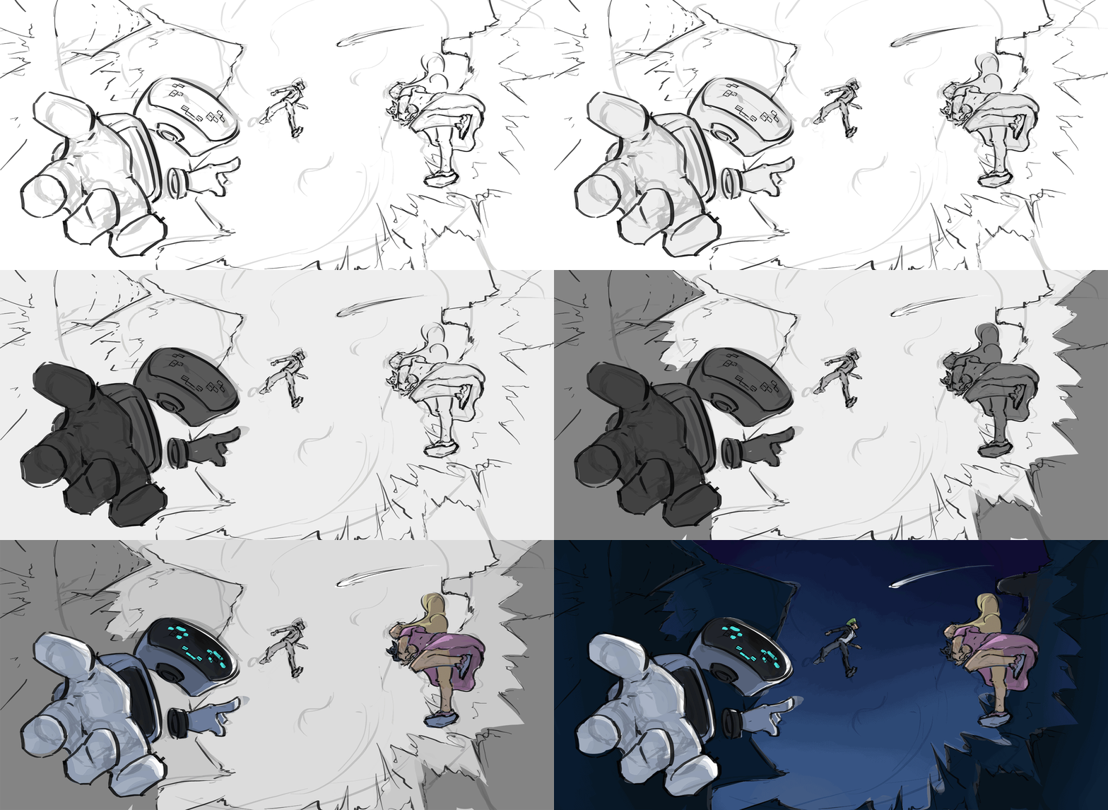
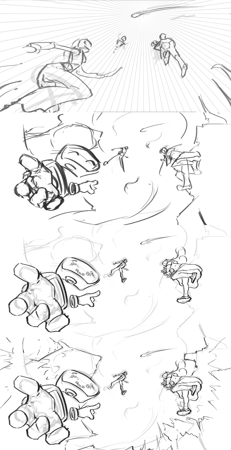
(First approach sketch)
...this artwork started pretty much like few lines on a canvas to analyze the composition and the original idea was a tiny bit different from the result: I planning to put the robot in the position of the girl and a girl on the position of the robot. And all of them watching to the moon to establish an interesting composition orientated to the natural-cheesy-satellite of ours.
But honestly, it was missing something, and that something was to make the viewer feeling involved in the whole event inside the canvas. Thing I solved by exchanging the position of these two main focus characters.
And it came out really well and pretty readable! Mostly because of the while and high-value materiality of the robot, which creates a lot more of contrast against the dark background than the girl would create if she was at the foreground in such way.
I am trying to always keep the focal point working since the beginning, in this case I made two of them, the robot and the moon/comet.
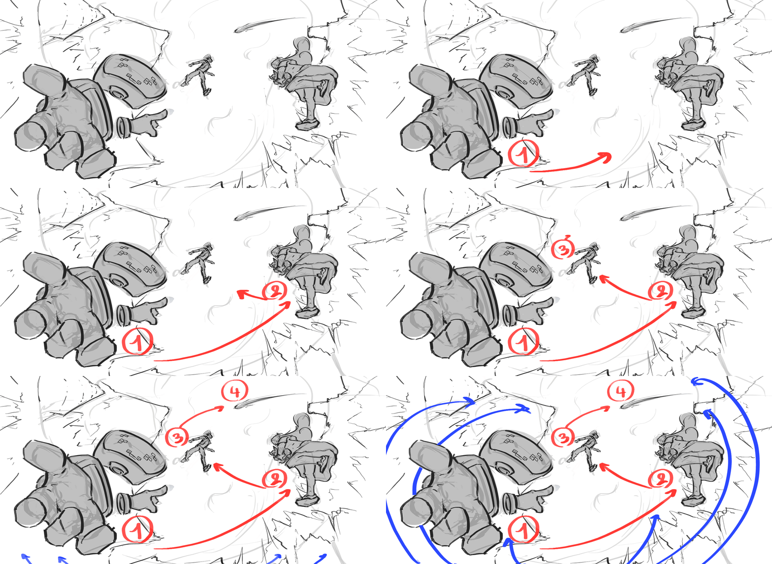
The whole point with this composition was to make different checkpoints all through the background. Drawing an imaginary path that the eye will follow until the main focal point in the sky.
Spot the numbers and how they read all through the canvas. These are the checkpoints we mentioned before and that is how they guide the eye until the main focal point (red lines).
Also observe how the rest of the background pushes this idea even further by pointing the same spot in the sky all together (blue lines).
Everything on this canvas works for and thanks to the main focal point (I know, you are tired of me saying focal point this focal point that. But it is a MUST to understand how important it is for your artworks to learn how to communicate your idea).
As you can see, we came up with a very solid base for working on. Which we will work in the same way than we always do.
 If you feel familiarized with the final result of this picture already, that's because I've uploaded it before to introduce you to this particular piece.
I've been working on this the whole day yesterday and the final result was pretty cool. One of the main challenges I had with this one (and the upcoming ones) was that everything had to be made in a very clean way since our plan is to animate this like these yummy League of Legends login screens.
Oh man, this will be an amazing portfolio set of artworks !
Let's jump to the rest of the process until I got to the final result.
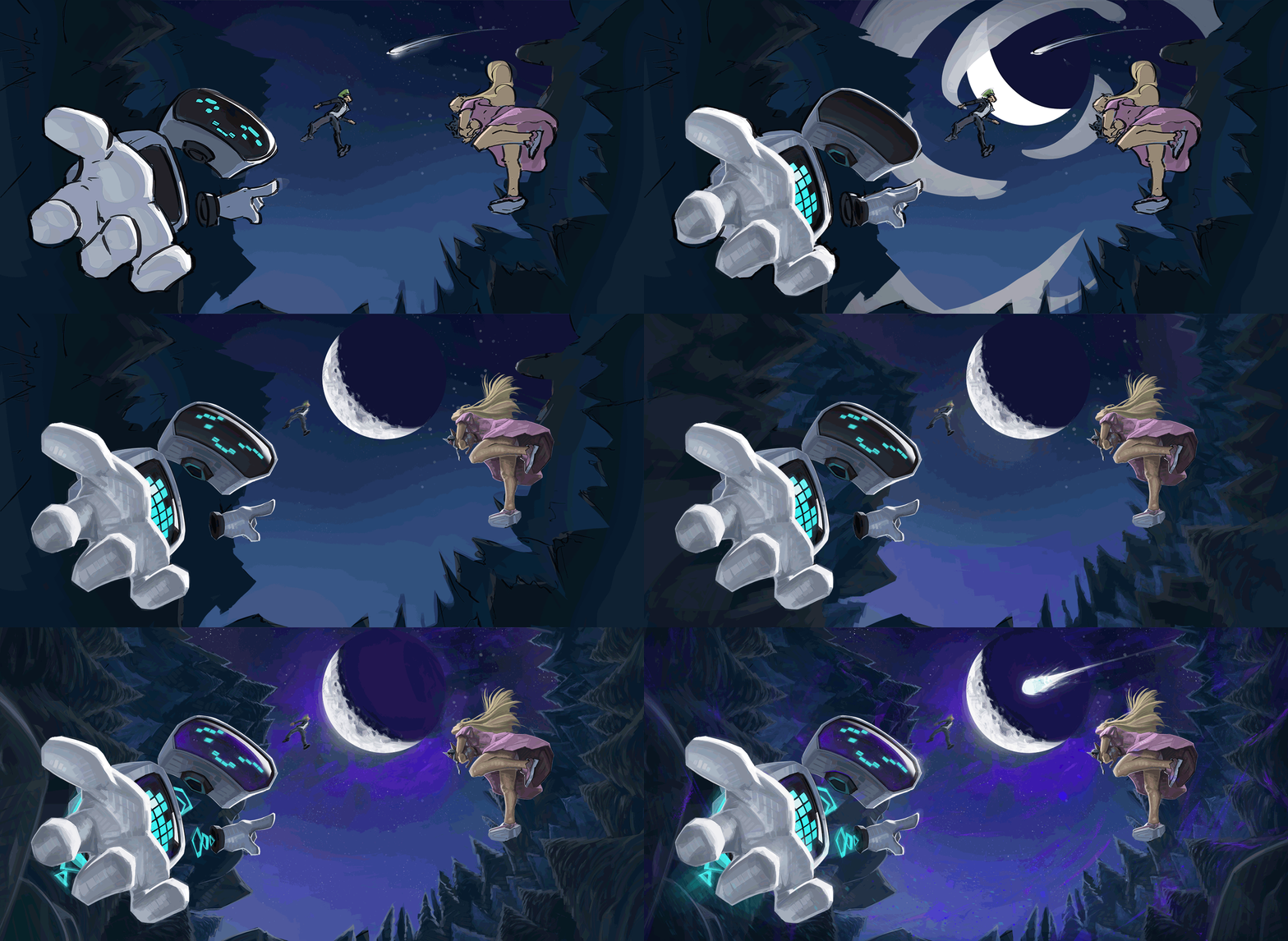 Oh, really enjoyable to see I must say.
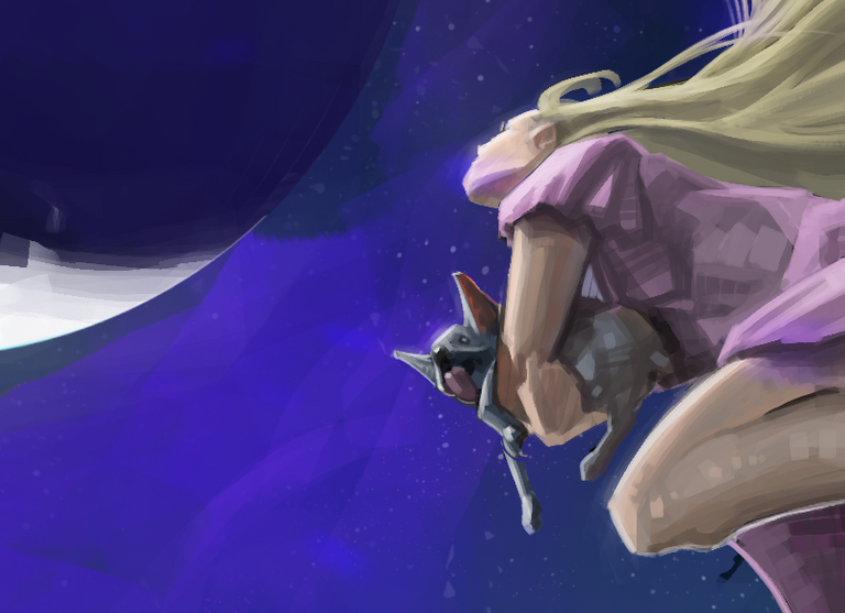
One of the main issues I had while painting was about the atmosphere given while rendering. Let me show you what I mean...
 Sometimes an atmosphere is not only given by some atmospheric degradation or one or another element.
Sometimes the atmosphere can be given by saturation and one or another palette working all together. Mostly on fantastic/magical atmospheres. The more magical or fantastic, the more colorful. The more serious, more desaturated colors.
I asked to many friends of mine which version they liked at most and I had an absolute 50-50 choice for them.
Half of them liked one and half of them the another.
An interesting fact about this, is that those who chose the desaturated one (more gray, serious and sad) were more likely going through an stressful situation while I asked them or were sad or angry for different reasons. While the other half were more likely in a positive mood or even happy. Interesting, huh?
I think few things are still failing in this artwork. Tiny things, such as the mist or atmospheric degradation because of depth. This is why I don't call this piece finished, but I will in the following days when I won't see it for a while and my eye will be able again to see what fails from here.
A little last detail I want to share with you, is about an element that my lady asked me to put while I was doing the lineart and base (that you could spot already if you payed attention enough). Honestly I love that little feature.
It is a little pug that the lady from the artwork is holding on hands of course! And so, the little fellow is also looking to the camera with the tongue out.
Oh little fellows, I love animals so much!
I must say that I am really happy with the technique that I am developing. I also feel it super suits me and my style/philosophy. Because it keeps the artwork clean and it creates some nice texture through brush strokes
And that's all! Thanks a lot for your support and I see you in the next one!
(All the images are my own creation and therefore I own their rights)
I always try to listen to the ideas of my fellow followers to improve my posts and to give something back to the community... therefor: What would you like the next posts to be about? What should I talk about? What kind of painting? Would you like some tutorials about arts, about cooking? Maybe some fresh gaming broadcast? I would love to know!
Bye!




Wow I love your art!
O wow, I really liked your art.
I loved the way you have shown human race and future concept too.
I am curious what wonders you can do with your art?
I think that the possibilities are endless =)
Yeah, that's perfectly true.
No one can imagine that and fix it in a math equation.
very nice post @anritco
I always do when I want to understand my creation is finished or not. I go to bed or do something else for a while, and then return to my work.
I really like the attention to detail in the picture! So keep)
Absolutely, sometimes we just need to keep the distance for a while and come back later on to the artwork in order to find out what was going on or failing =)
Thank you @naditinkoff!
Fascinating your way of illustrating, the concept of representative of the work is wonderful, the mixture between the natural elements taken to a futuristic plane is great, congratulations for applying the elements of design, and the balance the use of the tonalities very consistent with the Thematic of the work, both works have a very good finish in my opinion I lean more for the magical atmosphere, thank you for sharing your work, greetings and success.
Oh thank you so much for your words! I appreciate your point of view and encourages me to be more decided about the version I chose, thanks!
Wow, I love your art work.... you've got talent, greetings from venezuela
Saludos hermano! Y muchas gracias =)
Beautiful work, specially the ilumination :) I liked that you showed all the process of your work. I didn't know a Joseph Leyendecker but i googled it and i really loved his ilustrations.
Muchisimas gracias! Les mando un saludo muy grande desde Polonia (aunque soy Argentino =) )
Me alegro mucho de que te haya gustado Leyendecker, el tipo fue un genio y super marginado por ser homosexual en tiempos aun mas machistas que los que vivimos hoy dia. Un grande!
Thanks a lot for sharing this awesome concept
It s my pleasure buddy!
It's amazing to see how these drawings evolved, glad you added those gifs :)
Thanks a lot @daan! I m super glad you like it =)
Nice art! A meteor will hit the moon! Could it be steem?
Dude this made it soooo much better, really, don't know why, but just that tiny switcharoo made the artwork really standout.
Also, just my personal opinion, don't chose the desatured version, the other one is much better in my opinion of course, maybe try to do a vote with your followers so that they can vote which one they like more.
That s actually a pretty cool idea buddy! I think I will keep the saturated one tho' ;)
Just here to provide good ideas ma friend! :) i will keep coming back and commenting on your posts :D
hmmm yes dear
Wow! Your post leaves me with my mouth open. The normal experience with descriptions of optical art (by the way, it´s not that much different with sonic arts) is: either the art is poor and needs a description to be at least a bit more interesting, or there is a great piece of art getting totally destroyed by rational explanations/descriptions. But your post is phantastic! It´s phantastic in that the piece of art you present is fascinating and your text to it is a pleasurable - and informative and motivating - read as well! Thank you for that! Rolf
Thanks neighbor! I really appreciate it ! I just try to keep my posts interesting and valuable for artists that are learning or finding their way through their skills =)
This is a fantastic post! I love the angle you created its a really nice composition. Im following you already and im pretty new here, but if you get a chance come check out my stuff if you haven't already! =D I should be finishing this one up tonight and posting it.
You have really amazing skills for rendering and color... I think that if you would go back to fundamentals, you could get far as fuck. Few things are failing in this one, but indeed it looks really good, congratulations =)
If you are interested in getting better and study with other professional artists, let me know and we will connect.
thanks man! =D Yea we could totally connect. I just started my 3rd year of self study and I continually practice all my fundamentals. From muscle structure to bone to light and color and perspective... so much more to learn! So little time.
This is awesome bro. Your work is super inspiring!
Thanks buddy!
amazing art work i really appreciate your talent.
Really amazing ...... Nice wokr
This post gives new knowledge to me and everyone
the post is very interesting and fantastic
great work!
Only if i could do a fifth of what you could, i'd be be happy lol. Btw what software do you use for your art or is it just your magical hands
amazing art work i really appreciate your talent
wou ... this is very amazed, very good, i like the anemasinya very life
Nice and amazing post
Damn!!! This is crazy. So much talent. Kudos. This is ART!
looks good, i enjoy it
wow
good
Looks pretty good :)
Beautiful
Amazing
This post has received gratitude of 5.08 % from @appreciator thanks to: @anritco.
I think this is a great work of drawing because in the picture there is more explanation of intelligence. There is a very clear message even in special lines. So this is a picture that is talking about something important. You are like a singer with two kinds of sounds at once, I am studying these images, and want to make personal opinions on each of the parts. Good job.
Good post, i like it
I wish you success
@anritco
Me gustaría que en alguna de tus próximas publicaciones hablaras sobre los eclipses y reflejaras en tu dibujo un eclipse expectácular. ¿puedes?
Voy a tratar de encontrar un tiempito para hacerlo ;)
I read your post its impressive really and your art is awesome I must say keep it going. Title for your next post "A person deeply thing about its life what there future will take them "
This is an awesome work! I really liked your art @anritco
wow that´s some real artwork just fantastic keep up the good work
great post
This is amazing ,I love your art.am an artist too ,a painter to be precise
This is great. I love seeing how art is created.
Quedo muy bueno :o
Congratulations @anritco, this post is the most rewarded post (based on pending payouts) in the last 12 hours written by a Hero account holder (accounts that hold between 10 and 100 Mega Vests). The total number of posts by Hero account holders during this period was 436 and the total pending payments to posts in this category was $16034.87. To see the full list of highest paid posts across all accounts categories, click here.
If you do not wish to receive these messages in future, please reply stop to this comment.
Nice!
Another absolutely incredible post.Thank you so much for sharing!
That's some seriously amazing talent. Good luck with your upcoming work.
Awesome artwork!
Wouw I really like you're art, very beautiful!
Is great to see how you have progressed on your drawing. They are amazing. Love them. Followed.
I am new to Steemit. I am a architectural student and graphic design. I do design on world famous landscape and buildings.
If you have any free time, please do visit my post too.
https://steemit.com/introduceyourself/@ronluilh/hi-steemit-my-name-is-ron-and-i-am-a-architecture-student-graphic-designer
Beatiful pictures, nice...
Please cheack out my drawings
Amazing Work! Keep it up! i like your way of illustration! i´ll follow you