.
What you promised is debt.
.
As I mentioned in the first part of this publication, the design was created more than 6 months ago and it tries to create a new product by merging two articles already existing in the current market.
https://steemit.com/art/@javichi/university-project-d0273d1277c53
This was the final result of several days working on the same project
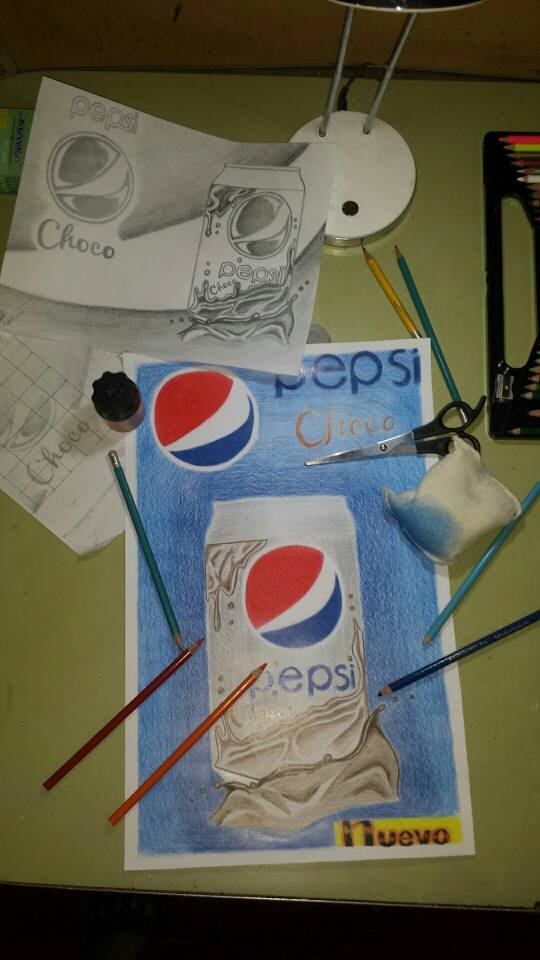.jpeg)
On the day of the pencil sketch correction, the teacher told me that she would make the poster vertically and not horizontally because it would look organized and more aesthetic, advice that I took immediately.
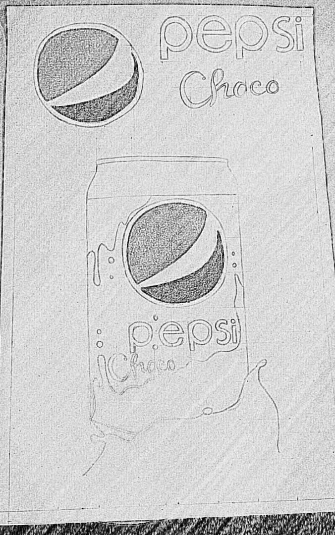 )
) That's how the Pepsi-Choco poster began. Plasmated on a tabloid-sized school cardboard with margins of 1 cm.
To be able to accurately and magnified the image I had in the sketch I had to resort to a technique I learned as a child in my father's work that was based on making a series of organized squaring and the sketch that I already had and then do the same in the tabloid size cardboard but doubling the size of each picture to enlarge the image without having to resort to an application made in a center of
.jpeg)
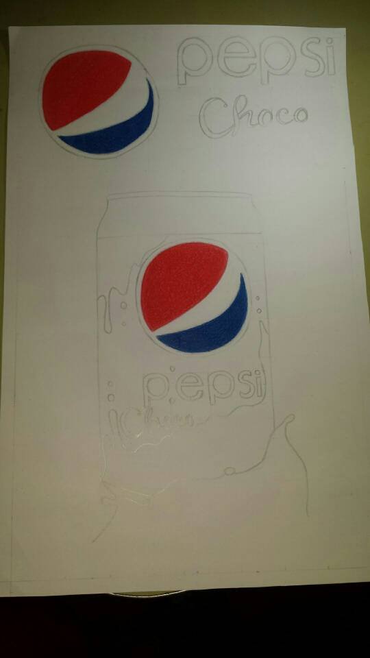
As you can see in the image I started to add color and started with the graphic identity of Pepsi which I tried to do as in a tutorial I saw that same day in Inter but I felt that I had been doing that technique for a long time to get to the desired color which was like that, just coloring that took more than an hour of work. Very good the technique but too slow the process to reach the desired result.
 )
)NOTA
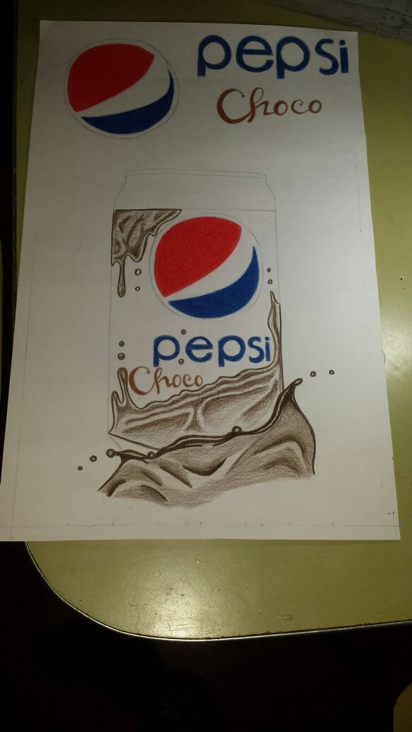
As you can see in this part I started to paint the chocolate part trying to make shadows with colors, something I didn't know how to do and I didn't know how to apply it to this poster.
But in a post I made of a gay short film I could add shadows and without seeing tutorials, it turns out that every time you practice drawing your agility to do so it develops on its own, but of course it is never too much to polish your knowledge in a professional way.
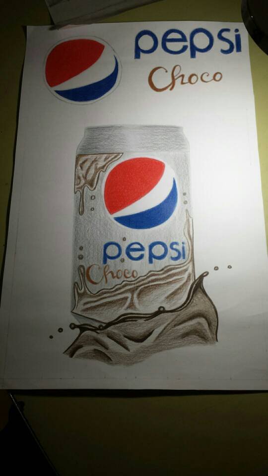.jpeg)
In this part I dedicated myself to the can which didn't give me much work but if I lack more darkness in the sides to be able to give depth to the can or to give it the cylindrical coma that it has.
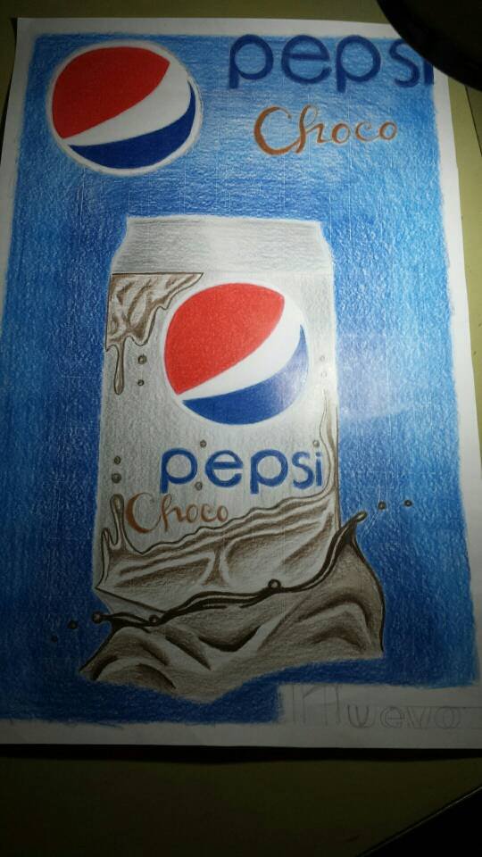.jpeg)
When the can was finished, I went to the back. Which for me was tedious to do because I wanted to apply the same technique I implemented on the Pepsi graphic identity that was layer by layer until I got the desired result, but as you can see it's too much space I had to fill in.
I chose to apply the one from the school trip that is painting my way. Which was fatal jajajajajajajaj I didn't like the result but I couldn't do anything anymore and the time was coming to deliver the project.
I have no choice but to move on to the next step.
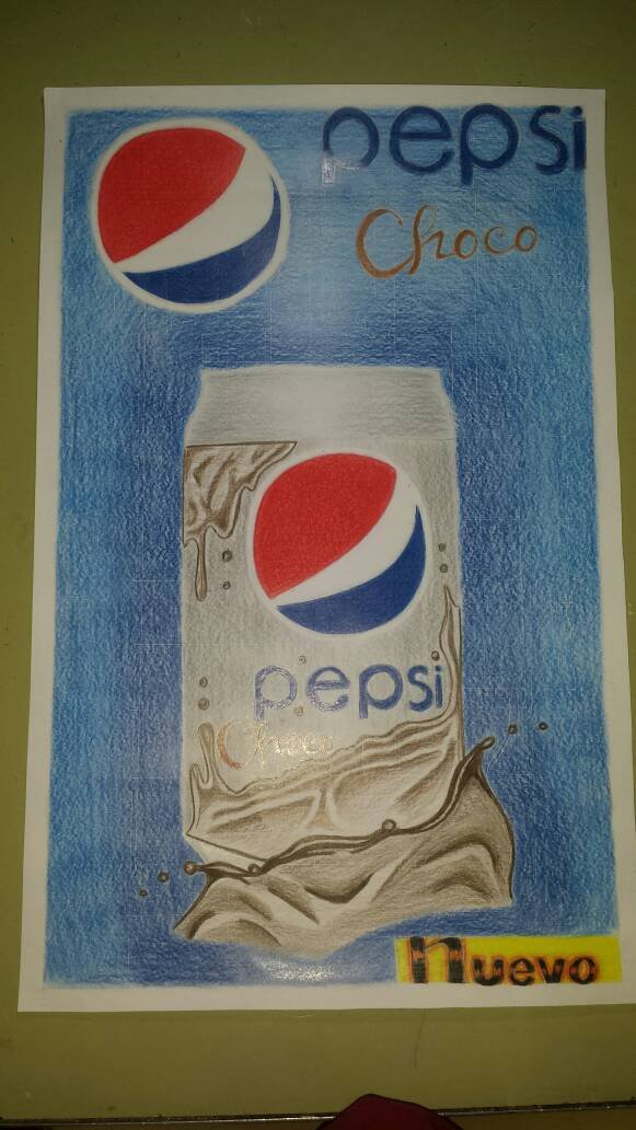.jpeg)
So I got to this point where I just need to paint the bottom right corner to give a little life to the word NEW.
And that's how this Pepsi-Choco poster came out, I hope you like this post and let me know your comments about it.
Thank you for your attention.
They're loved a lot.
Congratulations @javichi! You have completed some achievement on Steemit and have been rewarded with new badge(s) :
Click on any badge to view your own Board of Honor on SteemitBoard.
To support your work, I also upvoted your post!
For more information about SteemitBoard, click here
If you no longer want to receive notifications, reply to this comment with the word
STOPDo not miss the last announcement from @steemitboard!