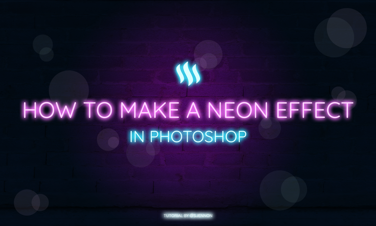
What's up, guys and welcome to my first ever design tutorial - whaat?!
As some of you might know, I am a volunteer at PANN. In a post I did awhile back, I explained briefly what PANN is and what my role is there.
Recently, we had to make online marketing for our upcoming NEON party. This means that neon also has to come back in posts - only thing, I didn't really do this before. So what did I do? I looked at other neon-y stuff, downloaded some free files for research on how other people did it and looked up some tutorials.
A bit confused about PANN? Let give you a short summary
PANN is a non-profit organisation in Utrecht, The Netherlands which mainly organises monthly parties in Utrecht and throughout The Netherlands for the young LGBTQ community.
For PANN, I am part of the designer team (woo, what a surprise!). Every party we team up in teams of two to create some dashing on- and offline marketing for the upcoming party - posters, flyers, headers, posts, you name it! The fun part is that every party is themed and can come up with some cool, new things every time. This also means that sometimes, I have to play around with something for a bit or self-educate myself.
So let's get to the actual tutorial
Since I am the queen of lazy, I do not like too complicated things to create things - all I need is for it to look fancy without too much effort.
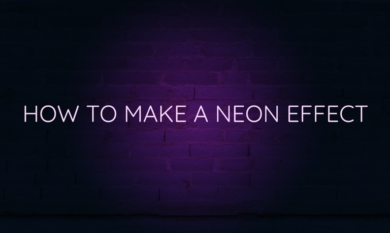
Let's start with the background
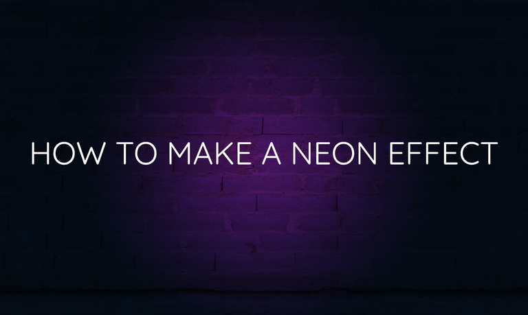
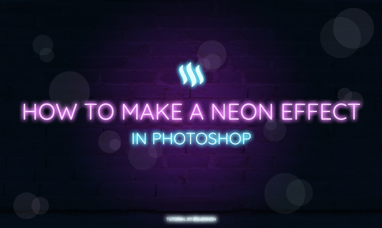
To make it obvious it's a neon sign, we need a background that goes nicely with it. Since it's light, it's pretty neat to have a radius gradient in the middle, which in addition, also creates a focus point. I want some flashy pink neon letters in the end, so I chose for a deep purple background for a nice match.

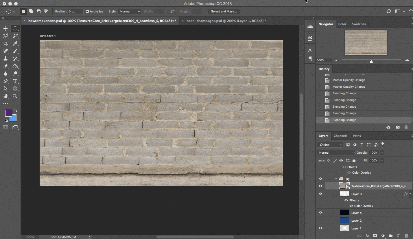
Since neon signs are usually used outdoors, I chose a brick background. Place this image above your gradient and start playing with the styles. I chose overlay since it nicely burns the pink in the bricks, but still keeps a nice texture. Depending on your image and how strong you want it to be visible, you can play with the styles, opacity and fill.
Now look at that neat background!
Let's put some text on here!
Neon signs are generally made out of one string of light - or however you want to call it. This means, that a nicely, rounded font will do well.
I am using Google's Quicksand. For now, we can use any font color we want - this will be overridden by the Blending Options soon anyway.
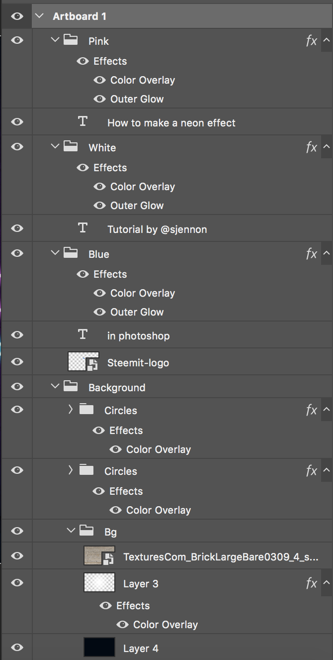
To make things easy, I just created a group called Pink, so I can drag other elements in there later to get the effect easily.
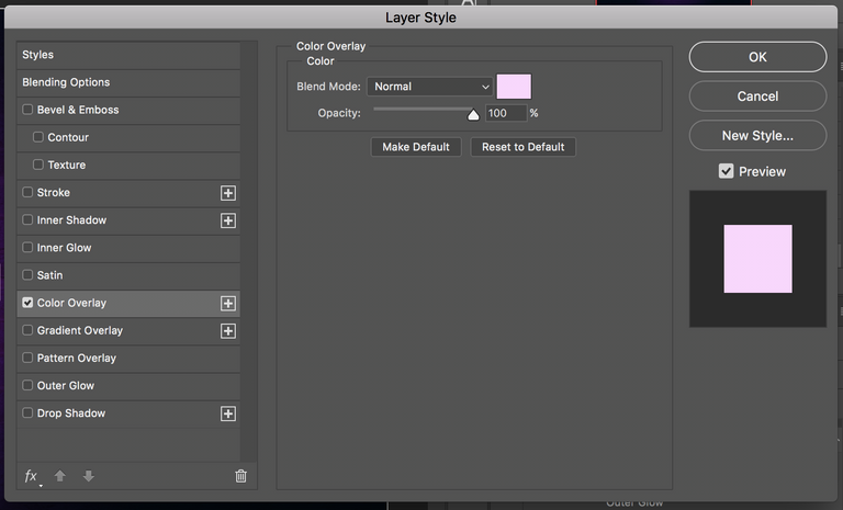
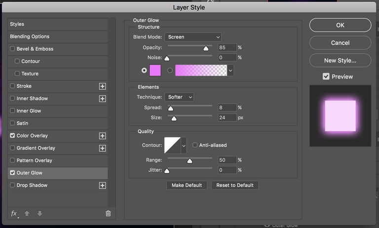
Right click on your group and select Blending Options and click on Color Overlay. Since we're aiming for pink, we are using a nice, light pink here. Don't worry, we will get to the bright part in a second.
For the ones exactly copying this tutorial, the color I used is #ffd5ff.
Okay! It's time to play with the actual light. Stay in the Blending options and navigate to Outer Glow. I played with these things for awhile before I figured out some settings which made me happy. To keep things easy, stick to these settings and your glow should be fine! Ofcourse, this depends also on your canvas size and how giant your glow needs to appear. In that case, try playing with the Spread and Size.
For the glow, we really want it to be bright and obvious - so we are going to the top right corner of your desired color to get this. I ended up with a #f86cff pink.
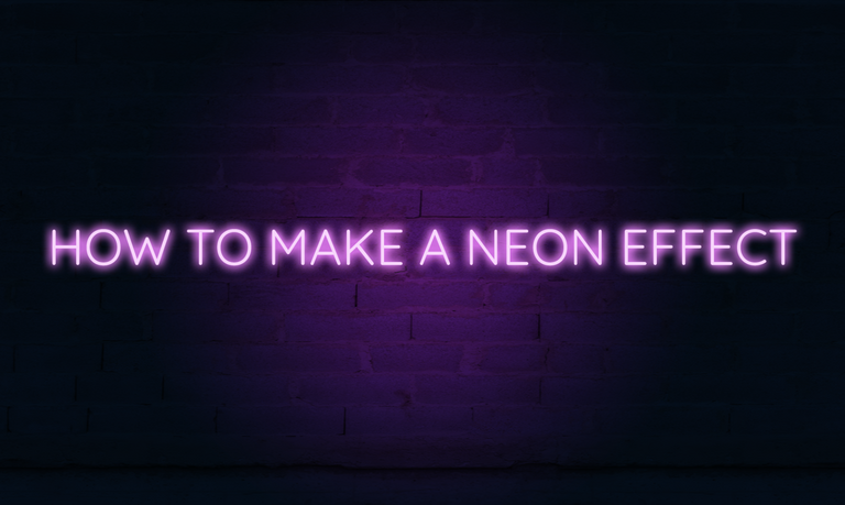
And voíla! Here we go. Fancy, easy neon letters!
Since I used the Blending Options on a group and not on a single layer, it's super easy to apply this effect on other elements too. Simply drag that layer inside this group and there we go.
You can also do this with other colors - not only pink, obviously. For all the colors, I used the same settings except for the color codes.
Blue:
Color Overlay: #dbffff
Outer Glow: #00e7ff
White:
Color Overlay: #ffffff
Outer Glow: #d4fbff
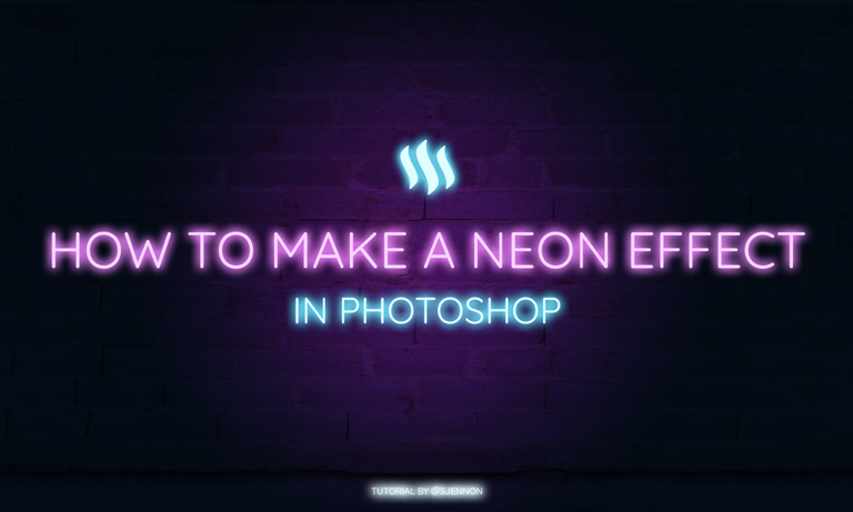
Additional effects
For some additional effect, I added simple circles to imply more light and brightness. I used for every single circle an opacity of 50%. To stick to the color theme, I used the colors I also used in the Color Overlay.
To make things easy, this is now what my layers look like:
That's it!
So yes, basically, that was it. Not too hard, I hope! If you have any tips or other solutions, feel free to let me know! I would love to improve on my tutorial writing :)


Track your followers with SPECTACLES

To much for me but interesting post , thanks
nice first ever design tutorial. it easy to understand. you do a greet job on this blog. keep posting okay
Thank you for the kind words! I am happy you found it easy to understand - that was my goal after all!
Cheers to you @gdieraigo
I want more of this. I just started using Photoshop again when i started with Steem. I noticed that this new UI is so different then the one I used to be a couple of years ago and I forgot about many of the concepts.
great work and hard work you my dear friend... very nice keep in touch freind
Thank you!
welcome my friend..nice post your