We are thrilled to announce our latest web update on the Build-it frontend! To boost-strap excellent user experience, we've added a Black and White theme display brightness.
To reach a great audience, we believe this tool will assist users in familiarizing and interacting perfectly with the network. This feature is free for all, in the future we might add other fancy theme displays under a premium package.
Without further ado, here's the technical documentation:

The document will consist of the following:
- Introduction
- Features
- How it Works
- Experience so Far
- Release
- Summary
Introduction
The Build-it project is a react-application page targeted toward making the user experience fun and more engaging. The new function that was added to the page enables users to choose between their preferred viewing mode.
Here is a breakdown of the process
Features
● Light and Dark mode.
We added a Light and Dark mode to the react application called Build-it. This was done with users' preferences in mind- they get to switch between both modes whenever they like! The Light and Dark mode is certain to make the website more lively and aesthetically pleasing.
Overall, the modes will help make the user experience fun, and engaging, and make users want to come back for more!
● Links
We also included a few links to the navigation bar. These links will serve as a Landing page and CTA will direct users to specific pages on the website. Again, the aim of the links is to make navigation easier for users, as well as to improve the website's overall performance.
How it Works
To activate the Light and Dark modes, we added a click button. This click button will make it easier for users to switch between both modes at will.
Experience so Far
To activate the new Light and Dark mode feature, we drafted out a mechanism that enables users to switch easily between both modes. The draft enabled us to code both features on the website with ease.
Release
The added features will be released on the 21st of April, 2022. To keep our users safe and ensure smooth browsing, we will test the features on our demo net to ensure it is clear of bugs. After the test has been successful, we will proceed to launch it on our official net.
Summary
User experience and satisfaction are some of our primary objectives.
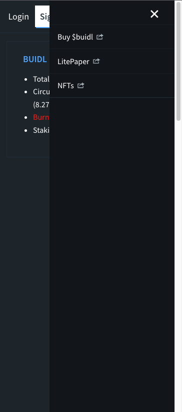
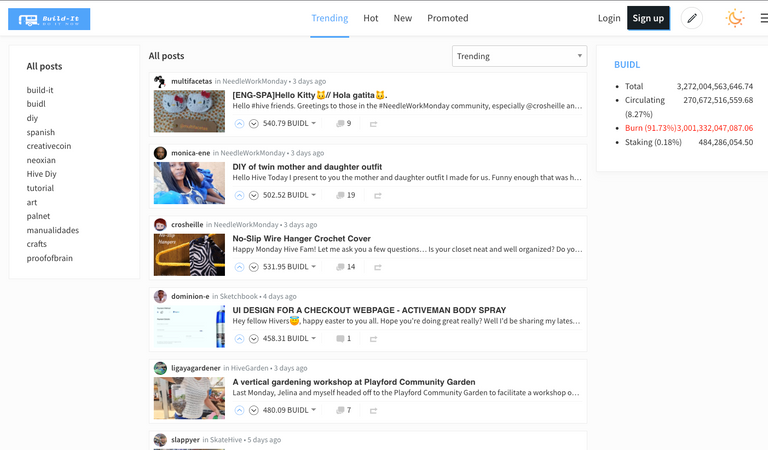
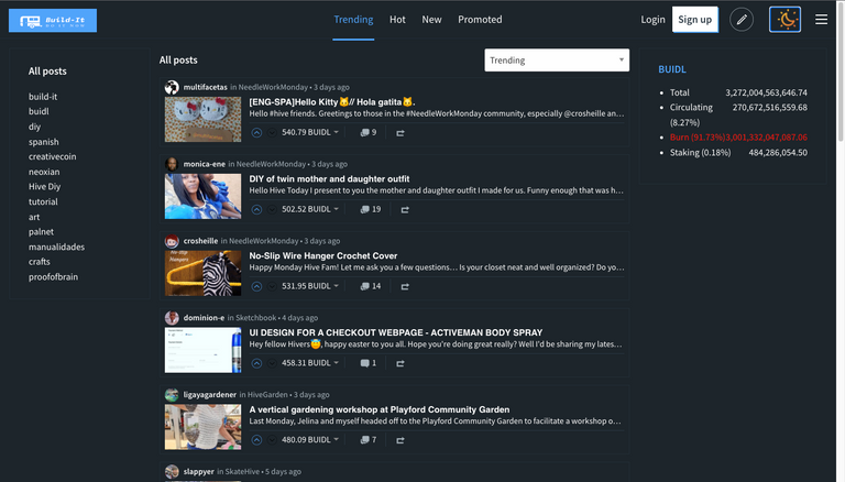
To ensure that users understand these new features, below are some snapshots of the added links, as well as how to switch to the Light or Dark mode.
- Navigation toolbar

- Light mode

- Dark mode

Congratulations @build-it! You have completed the following achievement on the Hive blockchain and have been rewarded with new badge(s):
Your next target is to reach 33000 upvotes.
You can view your badges on your board and compare yourself to others in the Ranking
If you no longer want to receive notifications, reply to this comment with the word
STOPTo support your work, I also upvoted your post!
Support the HiveBuzz project. Vote for our proposal!