A logo to represent Agoras
After a bunch of weeks(?), I finally put some time and effort into creating the Agoras logo for the contest by @kevinwong. I had already made the Tauchain logo, but still missed out on the one for Agoras.
Agoras will be an integral platform built over the Tau network and will serve as the primary economy that'll take full advantage of Tau's revolutionary features.
Agoras itself is comprised of 3 distinct parts: 1) Automated Knowledge Economy 2) Computational Resource Market and 3) Advanced Currency with Derivatives Features.
Through the power of Tau, we envision the possibility of fully autonomous businesses operating over the Agoras virtual economy.
By keeping the above in mind as well as the logo I already cooked up for Tauchain, I came up with the following design:
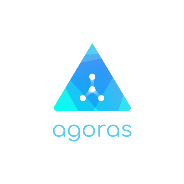
The shape
Similar to the Tauchain logo, this is also a triangle. In Tauchain the shape represented the T abstractly. Luckily, when you flip it upside down, it is an A!
Also with this one, there are two ends rounded and one sharp. Since I wanted to recreate the idea of an upwards arrow, the sharp point is pointing upwards.
The colors
Similar to Tauchain, I also added a gradient in Agoras for consistency. Along with that, I chose the following colors:
Green
Represents growth, harmony, stability, endurance and fertility. This is basically the marketplace and it needs to be accessible and flexible.
Blue
Represents balance, energy, wisdom and refreshing.


Track your followers with SPECTACLES


Like the dynamism of the points and the gradient used, as if it is moving.
I guess you could make some cool animations with this actually :D
If only I have some animation skills :P haha.. as for now, I imagine :)
I basically have a question :D.
Is it a good idea to put in too much gradient into logos? Won't it distract the eye, or even irritate it? Or even over-complicate things and make our brain think?
Maybe reducing the different colors towards the end so they don't overlap with the inside of the logo (The dots)?
Just my feedback :) (Not a Logo Designer :) )
It depends what kind of gradient you use and where. The issue with logos is that it's also a lot fo times just taste and you just need to nail the likes of the client.
I didn't want to make the gradient too soft, and I need the logo to pop out a bit. I think Agoras needs to make a statement, and so does it's logo. So maybe in this case, we do want the brain to think.
Thanks for stopping by :D
I will also do this, but I am losing my motivation for seeing the design that you produce so perfectly and it is very simple.
Don't lose motivation! I am sure you can make something neat!
What do you think about this?
Oh I love it! Very sleek and clean. Well done!
Looks like you are a professional graphic designer, maybe I will get inpiration from you.
@sjennon Nice logo, clear persentation.
Thank you!
Good creation.
Nice one sj nennon! :P