Learn how to design awesome cover art and designs in this easy to follow and hands-on series. In the first part we learned to find the right picture or photo. Read all about it here: Design Basics #01 - How to select a picture
This time we are all about color. :)
photo source: Unsplash
Before we get started, i want to thank @tinypaleokitchen, @bex-dk, @curie, @thewritersblock and all the others who helped me, supported me and inspired me to write this series. Thank you! Much Love!
Cooking with colors
Ok, let's get started. Design is like cooking. Three simple rules:
- The better the ingredients, the better the outcome.
- A simple dish is often more satisfying than a complicated and overloaded dish.
- All good cooks steal and call it inspiration. And we are going to do the same thing.
There is a lot that can be said about colors. Theories, systems, models, how they mix and combine, their harmonies and lots more. I don't want to overload you with all that stuff. After all, this is a basic lesson on design. So instead, we are going to take a shortcut. We are going to measure the colors of the images we want to use. That way, we leave the color choices to a professional photographer or illustrator and end up with a harmonic result.
There are several options to choose from on the internet, to do that job. Some of my favorites are:
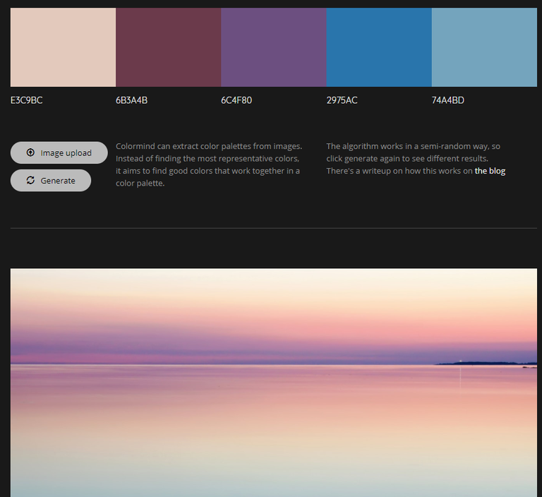
In my opinion Adobe Color is the most professional, but you need an Adobe account to use it's full potential. We will stick to colormind.io in this tutorial. When we upload an image to this page, it will analyze it and give us 5 colors with 5 hex codes. Hex codes mean that you can also use them online in your html and css.
Example 01
Example 02
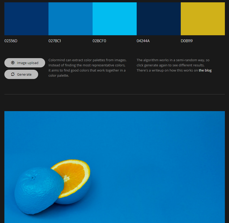
Example 03
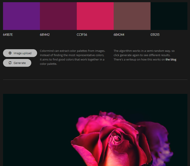
As you can see, we get some beautiful colors to work with, and we can be sure that they harmonize with the picture, because they are taken from the pictures.
Hint: With very colorful pictures it is also a good alternative to work with black or white for the fonts and design elements, to set a contrast to the picture. You see an example of this in the head picture of this lesson.
Playing around
Design is a game. Easy to use, hard to master. The best designers take years to learn it. Since we don't have that much time, I encourage you to just try out and see what sticks. Let's create some examples. Since we are not concerned with Fonts in this lesson, I will use the same, simple font in all examples.
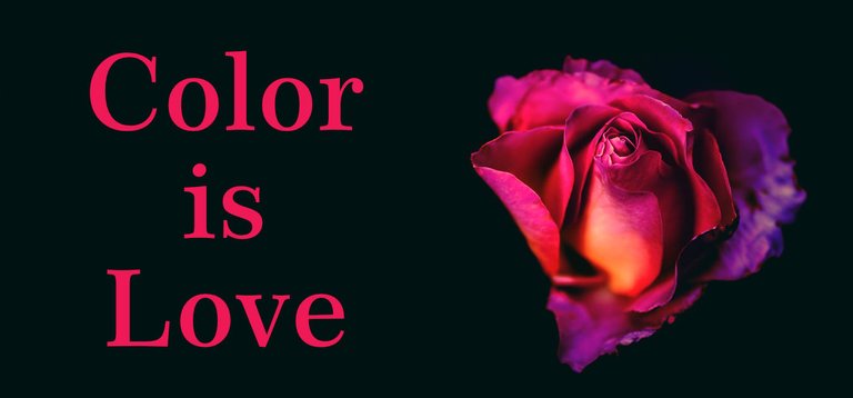
Color 1
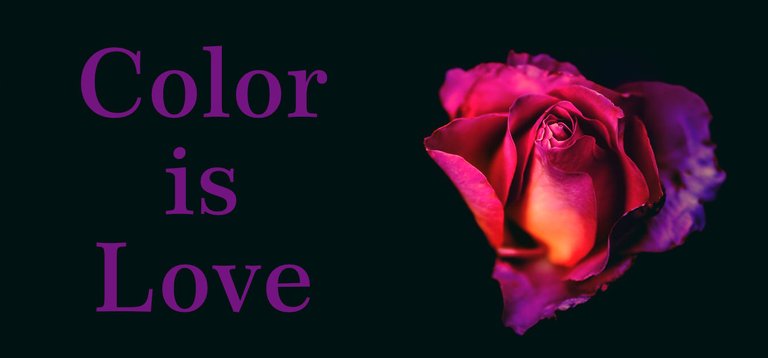
Color 2
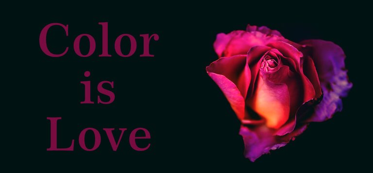
Color 3
Color 4 (Gradient)
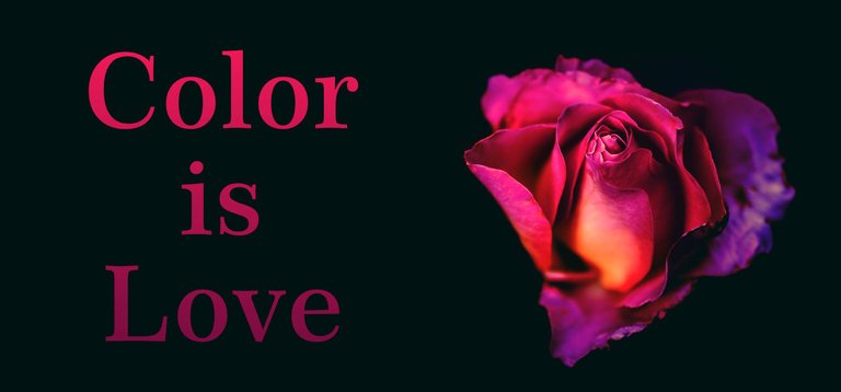
I used only the color codes provided to us in Example 03 (see above)
Observe how the choice of color changes the weight of the image. Depending on the used color, the rose has more or less presence. The last image uses a so called "Gradient" that fades one color into another color. Of course these are not finished designs. We are simply looking at how color works and how we can choose it.
If you look at color 1, the font pushes very much into the foreground and wants your attention. It's somewhat overpowering the rose. In Color 3 on the other hand, the text moves into the background. You connect more with the rose than with the text. This could be good if you want people to look at the image first, get curios and only then read the text.
The gradient of Color 4 mimics the rose in its flow of color. Here the text appears to be closely associated with the rose. It gives the impression that it is as soft and as alive as the flower.
If you want to play around with images and colors yourself, have a look at www.canva.com - it's free and allows you to upload your own images.
Create some examples and post them in the comments to get feedback from me.
Again, this is only about color - don't think too much about a final design. Just get a feeling for how color works.
Color Relations
Now that we covered picking colors from pictures, how about we take a quick look at selecting your own colors. Like with love, colors can match because of their similarities, but also because of their differences. For this we head over to https://color.adobe.com/
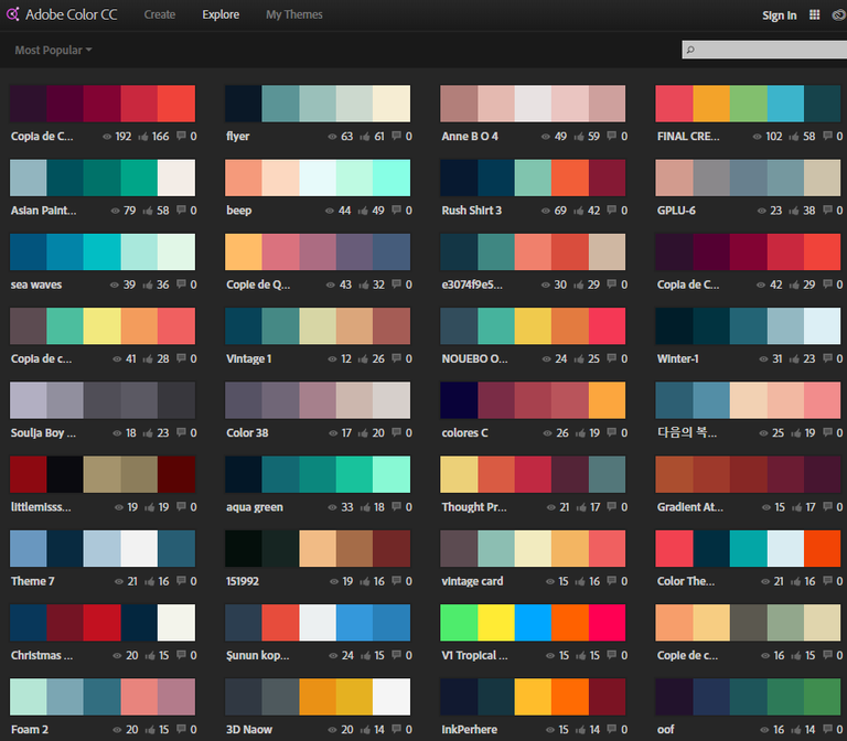
If we look at "explore" (top left) there is a wealth of color combinations others have created. We can export, change or save them (with an account). If you have Adobe Photoshop, you can automatically import your choices into your color pallet.
Under "create" we find a magical tool for playing with colors. And it provides us with some built-in expert know-how about the relations of color - these are known as color schemes: Analogous, Monochromatic, Triad, Complementary, Compound, Shades and Custom
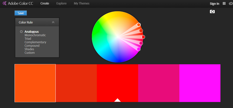
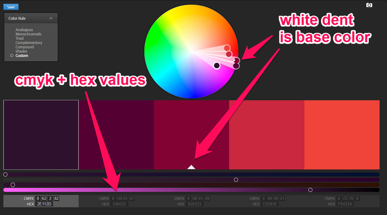
The way to use this, is to find the one circle with the little white dent. This is our base color and all other colors relate back to that one color. So if you move the color with the white dent around the color wheel, all the others follow in relation to what mode you set on the left (Color schemes). Below the colors are the CMYK and HEX values. CMYK is for print colors (C-yan, M-agenta, Y-ellow and B-lack), HEX is for web colors. Most picture editing tools will accept both. But if you do something with your Wordpress or Tumblr, you should use the HEX codes. In case you can't see them, start your color journey by clicking on explore and edit any of the color creations there.
What are these Color schemes?
They sound fancy, but it's real easy to explain them. For a longer and better explanation head over to https://en.wikipedia.org/wiki/Color_scheme
Analogous
Means that there is an analogy between the colors. On the color wheel (the colorful circle) they are distanced from each other at the same degree around the circle. Move the base color and all others follow, while keeping that angle.Monochromatic
Monochromatic colors are "mono-chrome" - simply meaning they are all of the same color or hue. On the color wheel, they are all along the same angle towards the center but in different heights.Triad
The triadic colors are evenly spread out around the color wheel. This makes a very flashy choice of colors, but also a very easy to "read" design. This is often used when designing guiding elements or the user interface of a app or website.Complementary
The complementary colors are always at the opposite side of the color wheel. Notice that it is complement with an "e", not compliment as in "your hair looks so nice".Compound
Compound colors are a split version of the complementary colors. Meaning that they are at the same angle to the colors on their side of the wheel while at the same time being on the opposite side of the other colors of our five point selection. Think about it like an X with a color at each end of the line. You can choose how tight the angle of the X-lines are and rotate that X around.Shades
Unlike Monochromatic colors, this is actually only one color, but with different values of black mixed into it, to make it lighter or darker - or in other words: the shades of one color. While strictly speaking black or grey are not colors, that is where the title "50 shades of grey" comes from.Custom
Means you can do whatever. That said, I would suggest you stick to the color schemes or picked colors, until you develop a good sense for colors and their effect.
That's it for today. It's already a lot to take in, so I will leave you to experiment with photos and colors. Next time we will look at how to combine Fonts.
Thank you for reading
Please support this project with an upvote or a resteem. Write a comment if you have any questions.
Find the next Episode "How to use Fonts" here:
Design Basics #03 - Learn how to use Fonts
Other posts by me:
Design Basics #01 - How to select a picture
BookChain Challenge
How to create a seamless audio loop - with audacity
All photos in this post are from unsplash.com
This post was ODC Nomination of the Day curated by @GMuxx

Great post ! I follow looking forward to seeing more !
thank you very much. the next post should drop tomorrow or the day after :)
It is a great article. I am someone who has zero knowledge of design and color and reading. This article gave me a good overview. Thank you !
thank you. i am happy i could help you with this. the next post of the series should drop tomorrow or the day after that
Tag me pls!
Wonderful post! Very well structured. Useful information!
Followed!
thank you very much :) - feel free to suggest topics or ask questions
Hey man, that is some quality content right here :)
I bet a post about placement and importance of space is coming in the future?
thank you! check out part one of the series, there is a bit in there. but i will also adress that in a seperate part of the series too :) https://steemit.com/tutorial/@multi4g/design-basics-01-how-to-select-a-picture
This gem of a post was discovered by the OCD Team!
Reply to this comment if you accept, and are willing to let us share your gem of a post! By accepting this, you have a chance to receive extra rewards and one of your photos in this article may be used in our compilation post!
You can follow @ocd – learn more about the project and see other Gems! We strive for transparency.
Please do. Thank you so much :)
Great job. Again. ;-)
Looking forward to the next part.
thank you so much. if you ever come to vienna, i will cook you an amazing dinner and guide you around town. you help me so much, i want to give back where i can. :)
That is great. Bookmarking to come back to it later to study it in more detail, as have to run now. Never knew this was all possible - well, I imagined it was, but not possible for me... tbc!
Thank you. Ask me if you have any questions :)
@originalworks
The @OriginalWorks bot has determined this post by @multi4g to be original material and upvoted it!
To call @OriginalWorks, simply reply to any post with @originalworks or !originalworks in your message!
Beautiful
Thank. I hope i got something in there that helps you with your work. :) Feel free to ask me anything if you have questions about this.