VELO7 is a group of bike lovers wishing to share their passion with others. Interested in offering better quality bikes to their customers, they decided to create a unique place that would reflect their shared fascination. This work has been entrusted to the fashion studio: lina ™.
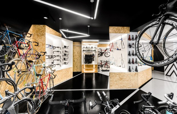
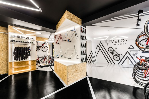
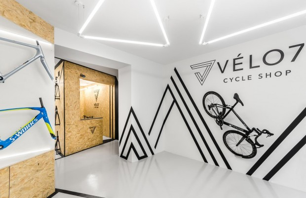
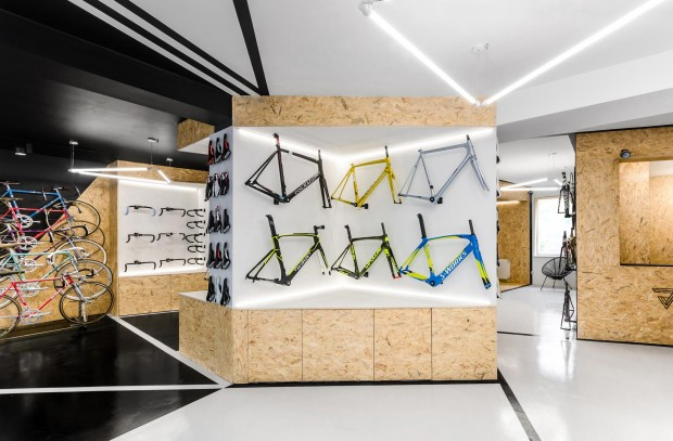
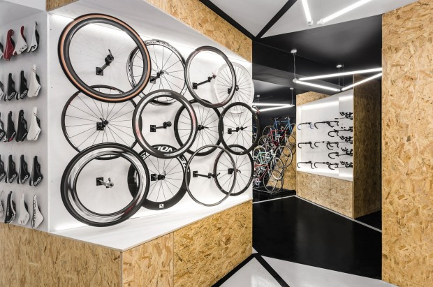
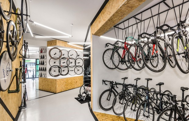
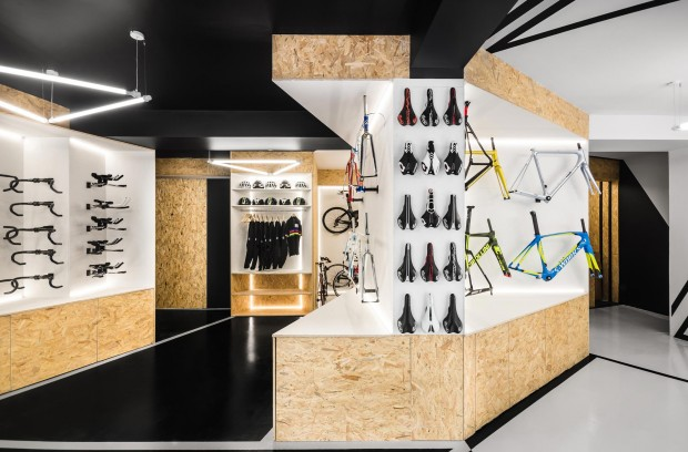
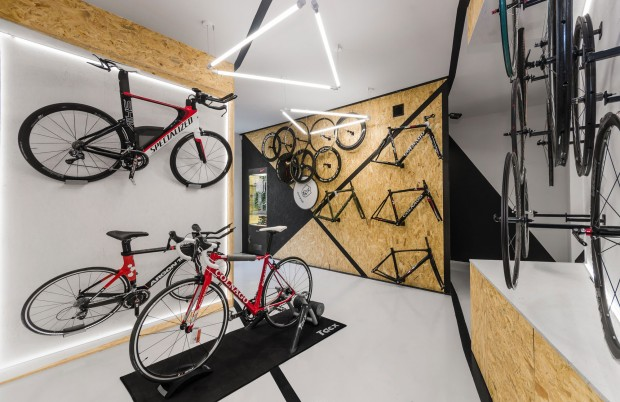
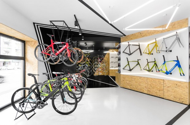
Cyclists need a multi-functional space that could easily accommodate the functions of a bike shop, repair but also a test place. Knowing that BIKE7 is about two wheels, the architects were inspired by the bike. The triangular shapes and inclined surfaces used in the interior refer to the shape of the frame of a bicycle. Its characteristic geometry has also been translated into bicycle racks specially designed for the store, which has given rise to additional spaces for the presentation of bicycles.
The studio also applied the visual identity of the brand and its logo created by Minima Advertising People. Since the brand is owned by true enthusiasts, their passion and commitment have already been reallocated to the graphic level. The black and white interior corresponds to the visual representation of BIKE7, while the dividing lines and lighting refer to its triangular logo. The basic plan of the entire store provides the ultimate, though slightly hidden, element of cycling. The respective areas are divided so as to resemble a bicycle wheel with the display area in the center and the converging lines representing the spokes.
@OriginalWorks
The @OriginalWorks bot has determined this post by @mariemm to be original material and upvoted(1.5%) it!
To call @OriginalWorks, simply reply to any post with @originalworks or !originalworks in your message!