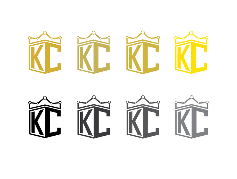
I was asked from @kingscrown to make a logo. I decided to play with the concepts of power and charts. The crown is shaped like a chart and the initials create a shield-like appearance with strong corners placed right underneath. I decided to go with quite a few variations for the gold and gray colors.

For smaller icons I believe it would be best if the initials dominate the logo. The small letters would bot be readable in small icons such as in chat rooms and steemit.




Looks awesome! Especially the one all in black with Kings Crown written across the middle
Your concept of the logo as you described "I decided to play with the concepts of power and charts. The crown is shaped like a chart and the initials create a shield-like appearance with strong corners placed right underneath." is great and all the logos are perfect as per your details. You did a great work @kyriacos
I love the designs!
That's hot! Both the logo and the concept.
I like how understated but visible the "charts" part of the "power and charts" concept is. I had scrolled down impatiently to see the whole logo first, before scrolling back up to read the posting, on my phone, and I immediately thought of a subway map when I saw the crown, but didn't know why at first.
Brilliantly done man.
:)
Outstanding design concepts. Thank you for sharing.
thank you for commenting man
You're welcome.
Very well done!
Awesome work! All the logos look professionally done.
Original clean logo!
yeap!
Nailed it. But this is crypto... Add some flash crashes into the top of the crown ;)
lol. nice one. but it might end up looking too spiky.
Thank you for sharing the logo
I can tell you put some time and thought into this. It is crisp and clear. Pleasing to the eye. Thanks for sharing and wishing you the best in your use of the logo. - Troy
thank you man
neat looking :P
thank you :)
IMO, black version without any words is the best, but letters need more phasing!
Wow man you did a great job! I also need a logo :D
I like these, especially the streamlined ones for the small icons. Among the yellow ones I think the lightest/brightest yellow one looks the best. Does the company itself already have official colors or are you charged with coming up with both a logo and color identity for them?
I am curious what they would look like with the ends of the "K" extending all the way to the outline instead of leaving white space around it.
@kyriacos
this is a definition of a job well done. the logo says it all.
nice one.
@arizonawise
Looks neat.
I've seen plenty of logos inspired by shields, but that chart-style crown is quite something! Really cool, unique concept!
(I think the third version is best btw, it has the contrast and the text instantly jumps out at you, but isn't as busy as the first)
Dude, these are badass!
would make a pretty rad t-shirt.
Will be available both version of the logo? What, if in the logo to make one part light, and the second letter in black?
@kyriacos, I rented 100 SP on month. Will wait, and see, what happens=))
How do You think it's only right I do, what participate in Contests? Or clog up my blog, and better post more serious topics? Although I love to write poetry and to write stories :=))
I just take the initiative often by myself really
Hmmmm. Understand=)
Ohh I really like the second logo with the gold crown and black lettering. I think it makes it pop. Also great idea in making the logo look 3D.
This is a great logo, love all the work you put into making it just right. Well done!
thank you
A great design. Especially the first one. Really amazing.
Well done sir! Also a designer here. Great job.
Great ! Very Imaginative and sharply Focused .........