Hey,
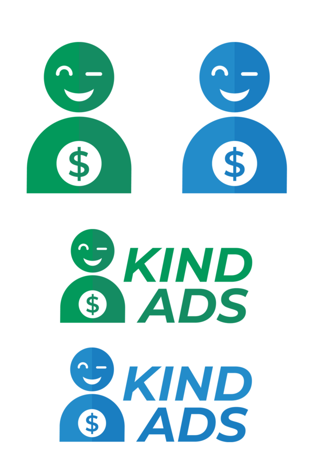
this is my entry for the @MediaWorks graphics contest. The task was creating a logo for Kind Ads.
What is Kind Ads?
Kind Ads is a decentralized ad platform. Their aim is to put the power away from the large players and back in the hands of publishers, advertisers and users. The Kind Ads platform runs on Kind Ads Tokens (KIND). These are distributed among the publishers who show ads and the users who watch ads. Furthermore, watching ads becomes optional for the users and is only a possibility to earn tokens. In return, advertisers can buy their ads with the tokens.
If you want to know more, check out the official website or read the whitepaper.
Why I chose the design
I am a big fan of flat design, so I decided to make the logo in this style. The company has the word "kind" in its name, so the first thing that popped into my head was a smiling person looking kind. It could depict a user who is happy to earn money by watching ads. Because money plays a big role in that concept, I added a dollar sign.
The logo can be used with or without text, depending on where it is applied.
I also created two different color variants. The green one highlights the positivity of the company. The blue one already fits to the color schema of the website.
Original Files (including SVG): Google Drive
The font is Montserrat Bold Italic and free to use.
kindgraphic2018


This post has been submitted for the MediaWorks Sponsored contest!
You can also follow @mediabot to be notified of future contests!