It’s February and time for another round of some the best designed websites in the cryptocurrency or blockchain space. Rather than focusing on particular ICOs, I’ve focused on design principles that have been applied to ICO websites. In this case I looked at the power of Minimalism and its impact on successful web design.
Minimalism is the art of making a website have a better impact by removing excess and unnecessary elements. Minimalism is very important for the ICO space: it makes a complex idea easy to digest and therefore it has a higher chance of turning a user into an investor or follower and this is vital to an ICOs success.
I’ve chosen to focus on three main principles that make minimalism work and how these three websites have taken advantage of them to achieve engaging and successful website design: Negative Space (aka Whitespace), Bold Colours, Typography
1. Increase negative space and clean composition
Mastering a user friendly interface relies on the effective use of space and negative space. A clean and intuitive layout allows for proper spacing between content blocks. This makes the page more inviting, allowing users to engage more and keep scrolling - decreasing the bounce rate. It also improves the user experience and concentrate the user’s attention on the important messages such as the product/service being sold.
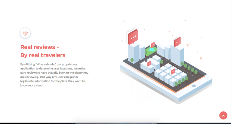
Discoveroo does a great job of implementing whitespace to highlight their benefits and unique selling points. Each component takes up as much space as possible, while leaving enough breathing room for the user without distraction.
visit: discoveroo.io
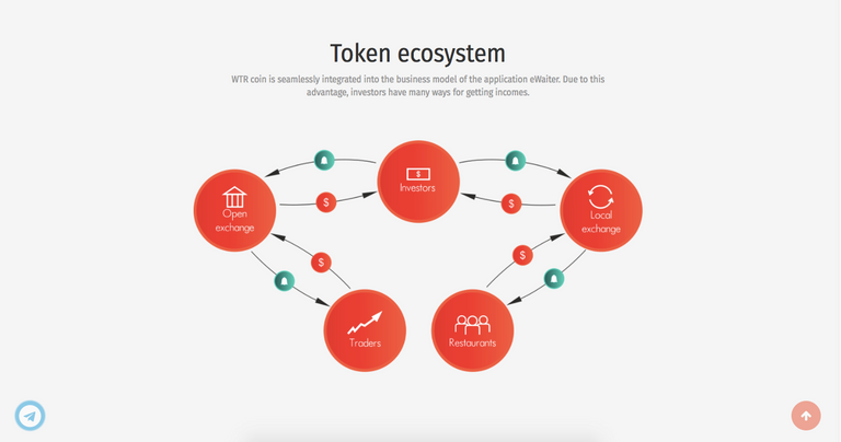
eWaiter makes a complex system less daunting through the use of less text and minimizing clutter
visit: ewaiter.io
2. Take advantage of colour and gradients
Minimalism is the art of making the greatest impact with less. The use of colour in minimalist websites can be a little tricky. Too much colour and you create distraction, not enough and you have a lifeless design. The trick to colour is choosing one and concentrating on it. Using different shades and hues to create a fuller palette without complicating the look. Using subtle hints of a complementary colour can add a little jazz. Another good way to make minimal design colourful yet not irritating is to use gradients. Gradients allow a soothing and enjoyable digestion of colour without the bombardment and are also a great way to establish flow and a natural feel. Just think about nature, looking at the sky and you’ll see a gradient spectrum with hues of blues, reds, yellows, purples etc. This is the same concept behind gradients and shadows. They help add a level of depth and reality to the design when done well.
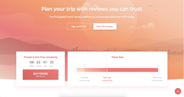
Discoveroo nails it with their peachy palette gradients that bring a bright and pleasant working in harmony with whitespace and illustrations.
visit: discoveroo.io
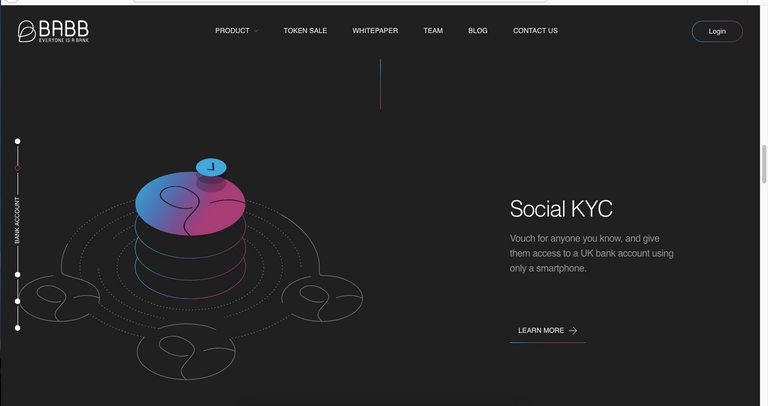
Gradients and colour don’t always need to take center stage. Barb do a great job of implementing bright gradients as a decorative accent by adding it only to break the dominance of the dark primary colour.
visit: getbarb.io
3. Organise typography
Decluttering website designs mean efficient use of typography can compensate for the sparse use of elements. Use of larger and bolder typography takes advantage of a minimalist layout and allows for more captivating headlines to keep users engaged.
Finding the right balance of font sizes creates a great hierarchy, using small fonts can be a great way of presenting information without taking up too much space and adds a touch of elegance.
By dividing text content into blocks it helps users perceive text better and add lightness to the overall design. Organizing text in blocks also fits in nicely with a well defined grid and composition adding harmony to the overall layout.
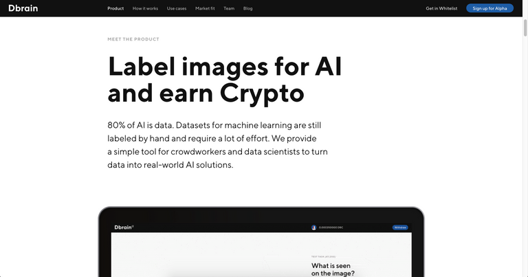
dBrain takes advantage of whitespace with large sans-serif headings
visit: dbrain.io
A lot of ICOs try to fit as much as they can on the screen, making it excruciating for user experience. Empathy is vital for convincing users to become investors which is why Minimalism is a really important style to consider.
A few other reasons minimalism works
- Minimalism makes navigation intuitive.
- Minimalist websites are easy to make responsive.
What to avoid when applying minimalism:
- Making products look unfinished because they don’t think through the design thoroughly.
- Hiding important navigation buttons in favor of minimalism, making for an uncomfortable user experience.
If you enjoyed this read please remember to upvote and please follow!
If you would like me to look at any ICO/Crypto website or if you would like some advice contact me at hello@arashrahmati.com
Until next time!
Congratulations @arirahmati! You received a personal award!
Click here to view your Board of Honor
Congratulations @arirahmati! You received a personal award!
You can view your badges on your Steem Board and compare to others on the Steem Ranking
Vote for @Steemitboard as a witness to get one more award and increased upvotes!