Good news everyone!
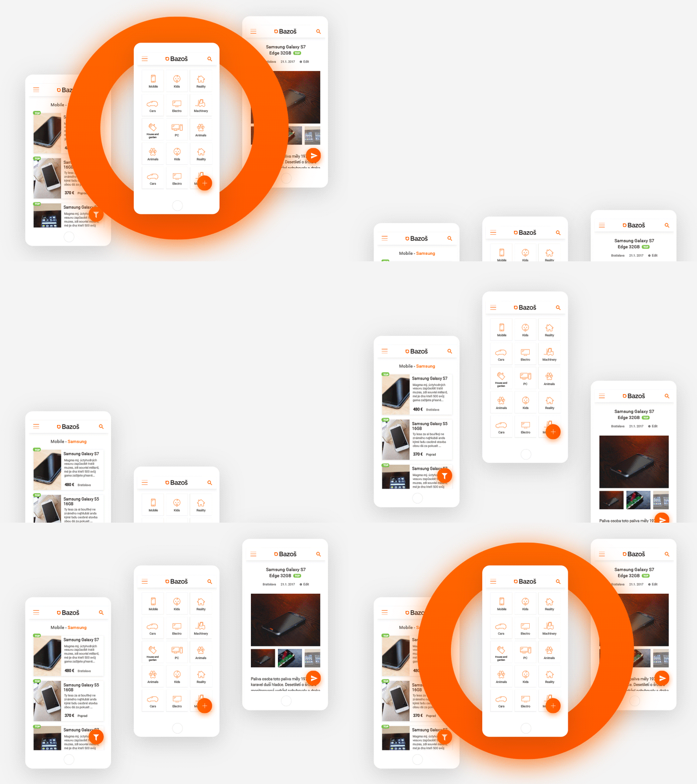
I have another great project for you. Its unofficial redesign of the biggest ad portal in Slovakia and Czechia.

Why redesign?
The portal has tens of thousands of users daily. Its really good for finding cheap....everything. From old phones to houses. The design, however....its painfully old and inadequate. I think it changed only a little since 2004.
The logo
@ symbol isn't really original and can't really function as a standalone logo. This logo clearly didn't see a designer's hand.

Current design
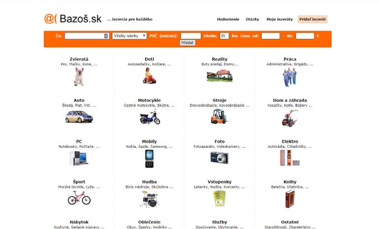
Homepage
It isn't that bad from usability standpoint, but the main filter could be better. I dont think the categories are sorted by usage.

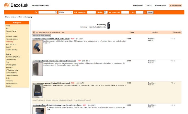
Listing page
Lack of any advanced filtering makes finding the right item really long process.

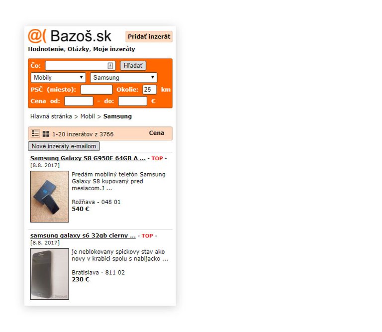
Mobile version
The website isnt responsive, you have to click the mobile version link at the bottom. 😪

Strong points:
- It's really popular
- Lots and lots of items to buy or sell
- Fast loading
- You dont have to register to use it
In the next part I will introduce my solution to make this old site better.

Andrej Cibík @andrejcibik
Web design | Web development | Logo design
@andrejcibik got you a $0.96 @minnowbooster upgoat, nice! (Image: pixabay.com)
Want a boost? Click here to read more!
You found a pretty shade of orange. Wow. Respect! :D
Wasnt hard :) Thank you.