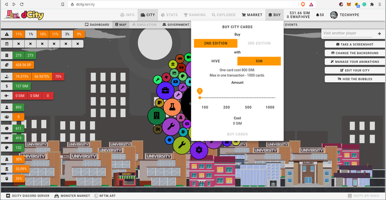
Every city now has a new interface. The city page has more info at a glance without the need for hovering your mouse over some of the stats to see them. It looks busier but it will grow on the user base. Hovering the mouse over the colored stat numbers still givers more info.

This is part of the progress being made in preparation for launching 3rd Edition cards.

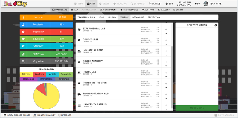
Under the combine cards tab, we see some new buildings where other cards can be thrown into to build capacity and make them productive.

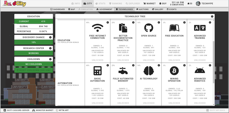
The technologies tab has also been revamped, this time they have been arranged left to right rather than top-down. One has to squint a bit to see all the data though. The previous interface highlighted the number of cards one had, making the info easier to digest.

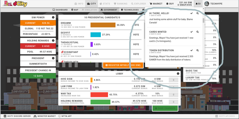
The game recognizes me as Mayor! At least I'm somebody, eh? A new notification pull-down instead of the previous log screen. In the background, we see a revamped Government interface. Nice. Maybe I should register myself and see if I can be the prez. Would you vote for me?
There are more changes I haven't explored yet. The game seems to be moving forward as we pay more taxes.
The Mayor.
Congratulations @techhype! You have completed the following achievement on the Hive blockchain and have been rewarded with new badge(s) :
Your next target is to reach 12000 upvotes.
You can view your badges on your board and compare yourself to others in the Ranking
If you no longer want to receive notifications, reply to this comment with the word
STOPCheck out the last post from @hivebuzz:
Support the HiveBuzz project. Vote for our proposal!