First of all I'd like to thank you for your big support my last post about volume. A lot of people asked me about basic issues in technical analysis. I noticed that some of you need much more information about charts. What kind of chart will be the best for you? Candle or linear? What kind of scale? Logarithmic or arithmetic? Let me answer those questions in this post. As always I will present a lot of examples.
Arithmetic or logarithmic scale?
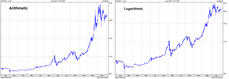
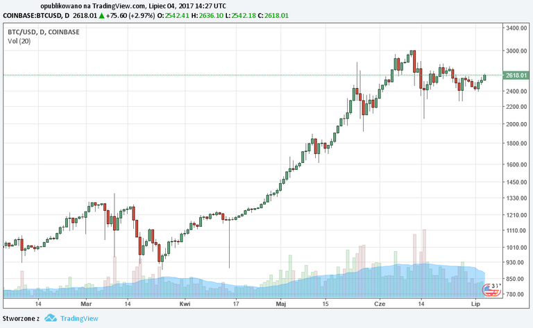
An arithmetic scale present equal distance between price unitis. For example the difference between 1000 and 2000 has the same distance as 1500 to 2500. On a logarithmic scale distance between price unitis present their percentage change. For example, the distance 1000 to 2000 is the same as 5000 to 10000. Many online analytical websites of stock markets used logarithmic scale, but future markets are dominated by arithmetic charts. Below I present a bitcoin graph on both scales.
A line chart, candles, bars or point-symbolic?
As you noticed I use candle chart for chart analysis. In my opinion candels are more clear (compared to bars), show the full range of price movement (and not only a point like a line chart). OK! What is the difference?
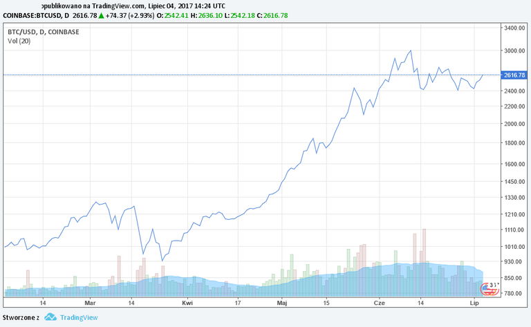
Line charts are nothing but points connected with each other. If we use points, they can present only a specific price (closing price, opening price, maximum/minimum price). In my opinion, the graph only shows a fragment of what has happened during the session/day.
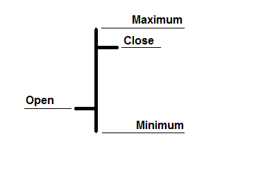
The bar chart, like the candlestick chart, shows the full range of price movement (vertical bar). Horizontal lines mark the opening price (left line) and closing price (right bar). If the right-hand bar is above the left it is the rising bar. If the right-hand bar is below the left bar, it is going down.
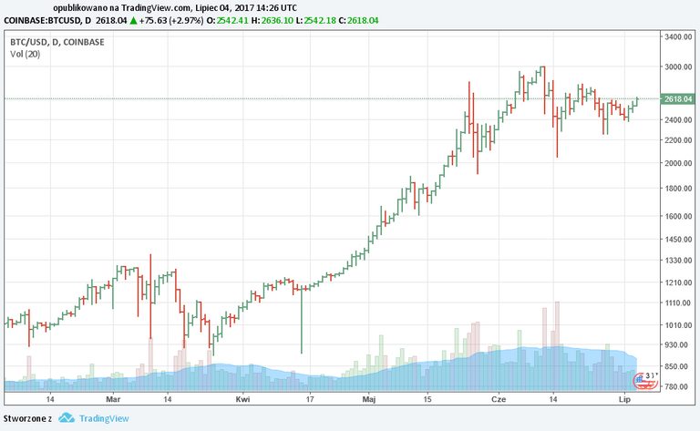
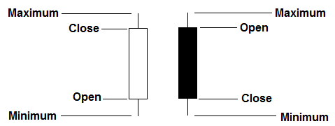
My favourite candlestick chart shows the full range of prices - they are called shadows, or thin lines. The thicker part of the graph is the corpus. White or green means a rising candle. Black or red represents a downward price. Why use it? Candles form so-called candle formations that give us signals of trend change. I consider this a big advantage. Candles formations will present in another post in the future.
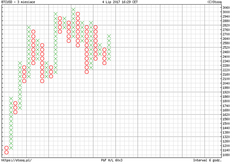
The point-symbolic graph is the most complicated for me. In this method, two letters of the alphabet are used: X and O. X represents the demand, O represents the supply. The chart is created exclusively using vertical columns X or O. If the price is rising - we draw X if the price is decreasing - we add another O sign.
Thank you @dataguy for the inspirations;) Hopefully now everything will be clear. I invite you to read the previous post in which I wrote about the volume and follow me me not to miss the new posts;)
Tag polish używamy do postów z polską treścią, jeżeli chcesz pisać w innych językach to prosimy nie wpisywanie do tego polish.
Thanks for great article. I have never seen the last type, it looks like a tic tac toe ;)
Nice intro to charting and technical analysis @ uzamkniete. Following you now. Japanese Candlestick Charting Techniques is a great read on the ancient background of candles. A great read, check it out.
Fajny artykuł, daje followa, upv i czekam na więcej ;)
Dziękuję :) Niedługo (obiecany już) post o średnich.
Fajnie, będę śledził!
Great article, very well explained! Keep up good work and please share articles more often :) Thanks!
Thanks! :)