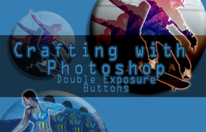
As you can see on my previous posts I have taken interest in creating Button Designs. :) These buttons can be made as badges as well, like those badges I often see here in Steemit. So today, I decided to make some "Interest" buttons, that made use of the 'Double Exposure' effect.
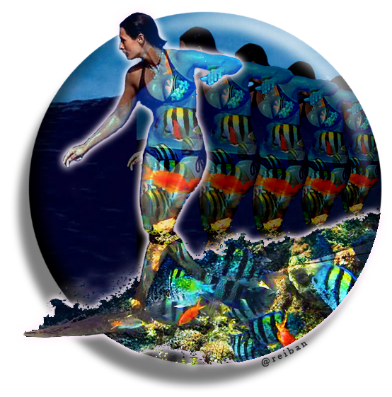
What I created here are a Skateboarding and a Surfing button (or maybe call it a badge). If you have interest in those sports you are free to use the images I made. Other than that, the main thing in this post is How I Made It, so I made a tutorial just for you!
We're going to start off with a blank & transparent canvass.
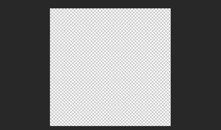
Then we draw a circle in it. You can either use the Brush Tool to draw a circle or use the Elliptical Marquee Tool to create a circle that you will fill in with a color as well. I used black for this for better visibility.
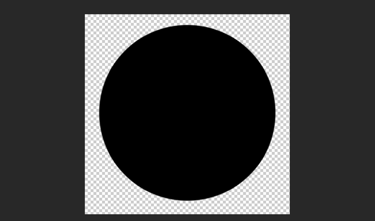
We now choose something that's going to be our subject or centerpiece for this work. For this I used an image of a Skateboarder doing trick. This is the full image and this is the source website.
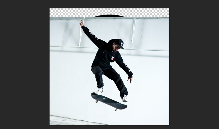
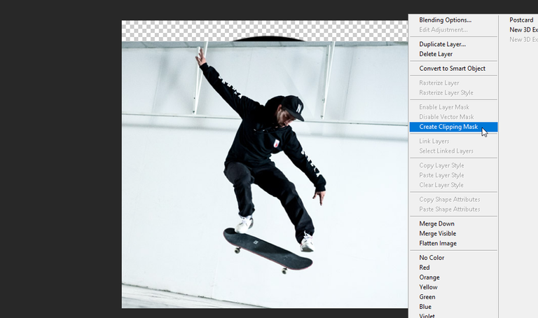
As you can see, the image exceeds the circle that we made, but don't fret, it's very easy to fix that. First, make a duplicate copy of the 'Skateboarder' using Ctrl+J or Right-click then choose Duplicate Layer. Afterwards, we will use "Create Clipping Mask" onto the first 'Skateboarder' layer to maintain the image inside our circle:
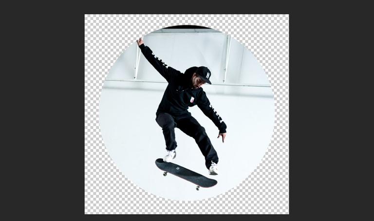
The result would look like this (by the way I've hidden the duplicate 'Skateboarder' so it wouldn't block our view):
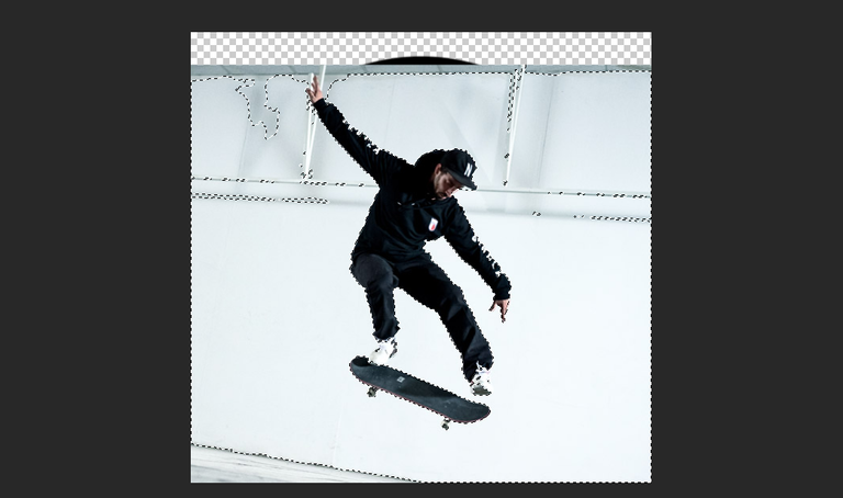
We will now remove the background from the duplicate 'Skateboarder' layer, we will use tools like the Eraser Tool and the Magic Wand Tool:
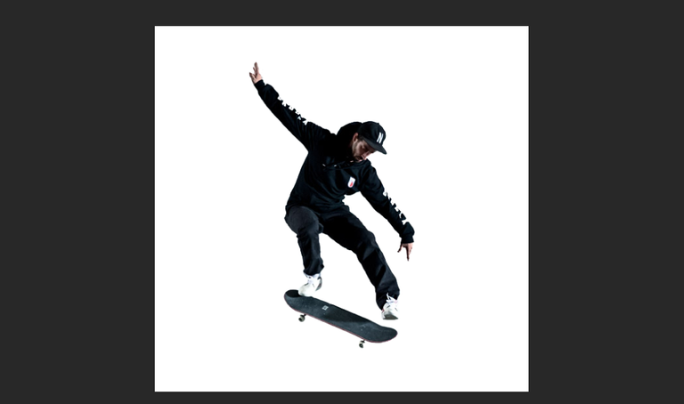
It would look like this - the idea is for this 'Skateboarder' layer to exceed the circle we made for a bit of a 3D effect:

How this layer looks in white background:
Now, we will make it bigger using the Free Transform settings, to make it stand out a bit more:
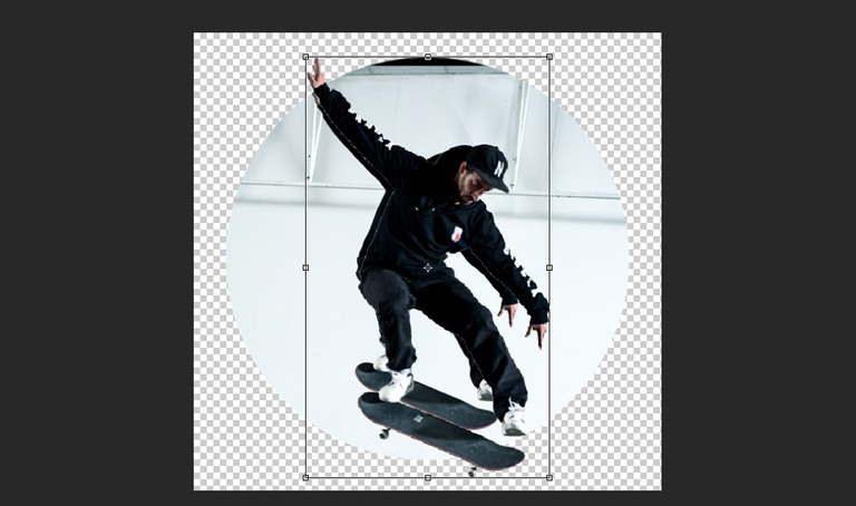
You will have to erase the original 'Skateboarder' or change the background into something else, like this:
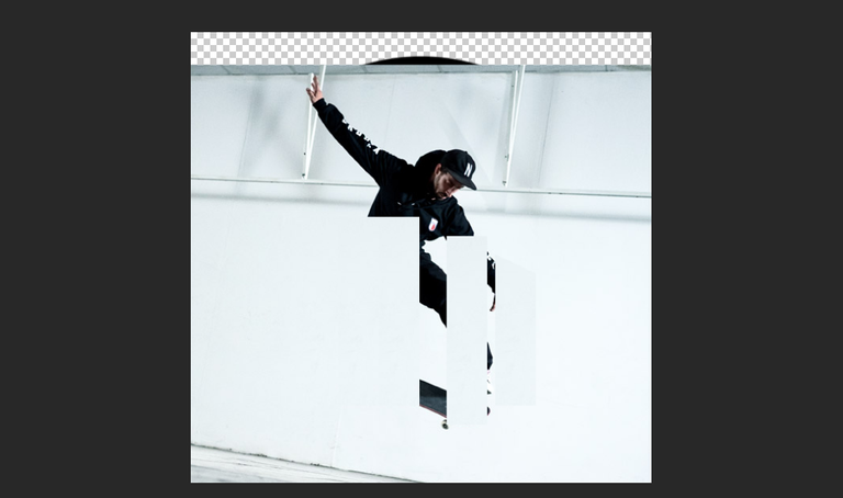
Or, like this:
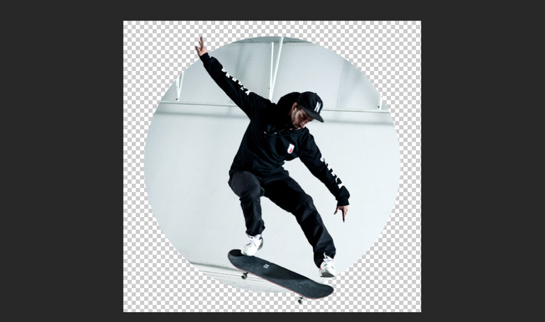
I think that image above will work great as our base. Now onto adding the Double Exposure effect. First we need to find an image to use. I used this one (image source here):
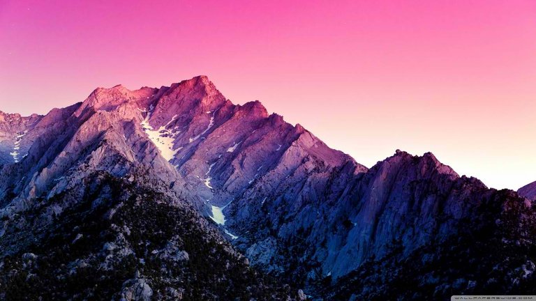
Just add the image of your choice onto your work:
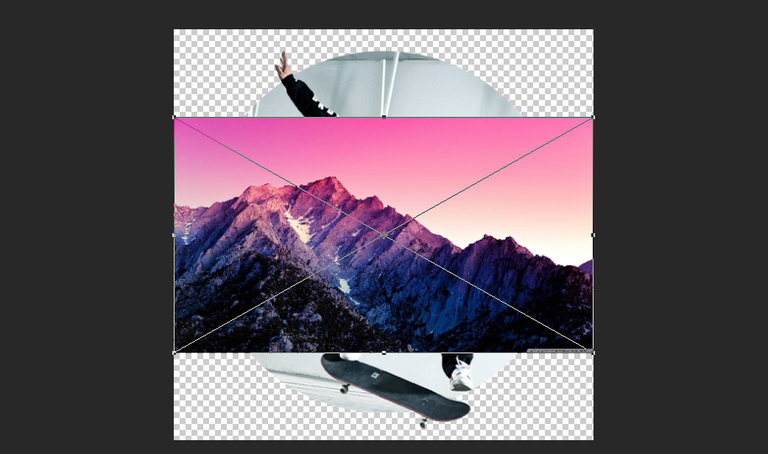
Test and experiment with its position and size until you get the suitable effects you want on your image:
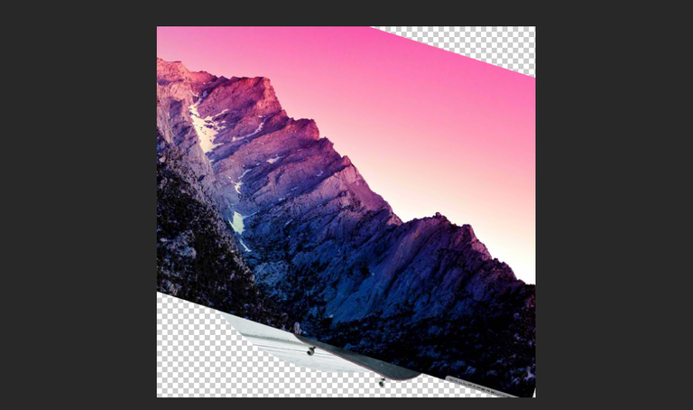
We will put it just on top of the 'Skateboarded' so we will again use the "Create Clipping Mask" tool to make that happen:
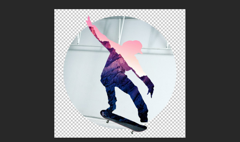
As you can see above, we're able to add it on top of our image. We just need to find the suitable layer effect on it.
Lighten - retains the foreground images but uses the highlights/whites from the background:
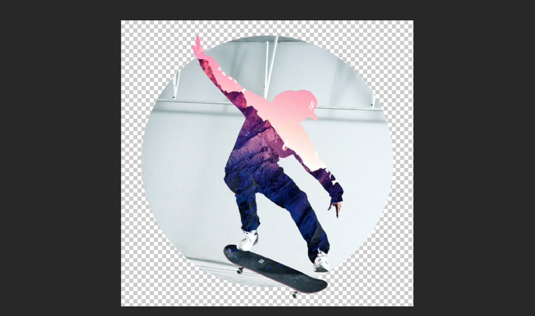
Screen - looks a bit more promising cause it includes most of the highlights and lighter midtones of the background, thus showing the face of our 'Skateboarder':

Color Dodge - doesn't look as much good but the effects are still okay. It uses the highlights on the foreground as an area to signal higher contrast on the lighter parts of the background, it pretty much retains the darker midtones and shadows of our background image:
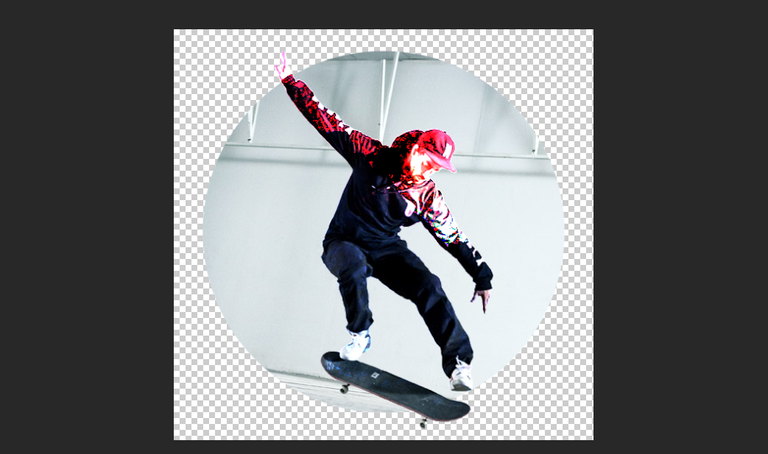
Linear Dodge - pretty much the same with Screen but makes the highlights more contrasted and lighter:
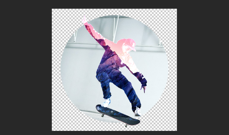
Hard Light - produces some nice effects to it, especially on the lighter colors of the background, it's okay on the darker colors:
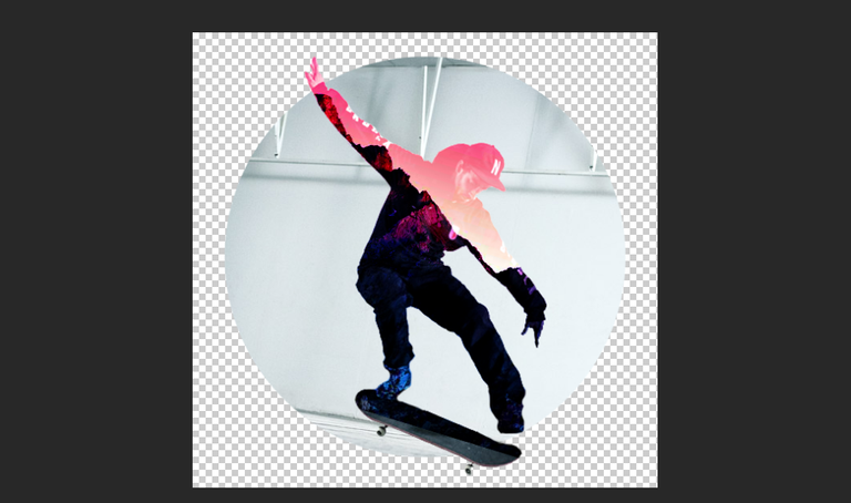
Pin Light - add more focus on the effects on the darker parts of the background:
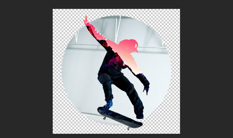
Exclusion - looks like an interesting effect, it does the usual job on the darker parts of the background but inverses the effects on the lighter parts:
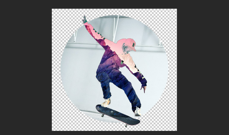
Divide - is another interesting effect, this inverts the colors of the foreground and focuses effects on the darker parts of the background:
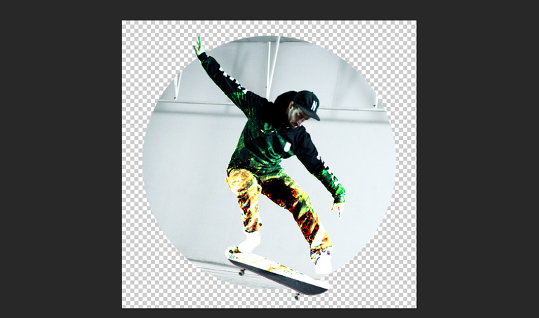
The other effects are not that usable for this so I didn't bother adding them. After studying various effects, I've decided to use Screen:

It already looks fine but I decided to add more changes to it by adding some more Saturation and Removing some brightness (Press Ctrl+U to open the Hue/Saturation settings):
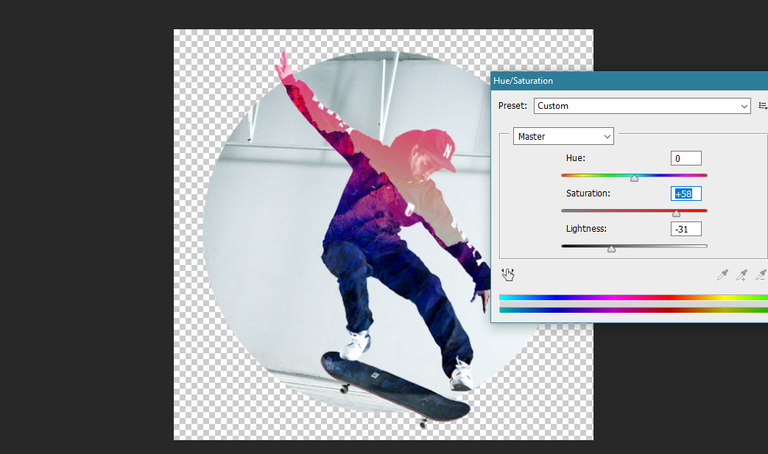
I also added a Gradient Overlay onto the background with these settings:
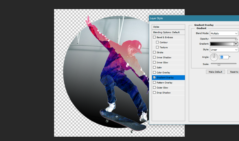
I made the background layer of the 'Skateboarder' and the foreground layer of the Mountains into 1 combined Smart Object and made 2 duplicates of it. I also moved it to the side:
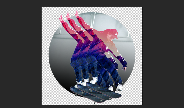
I rearranged them by making the ones at the back smaller and rotated them a bit:
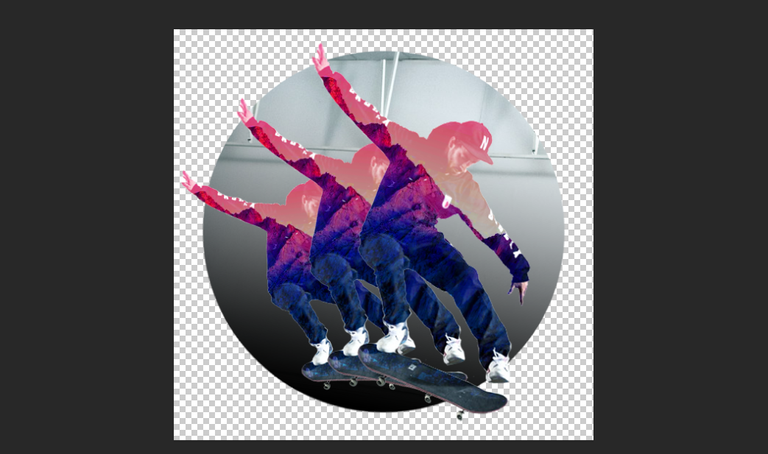
I opted to add 2 more shadow duplicates:
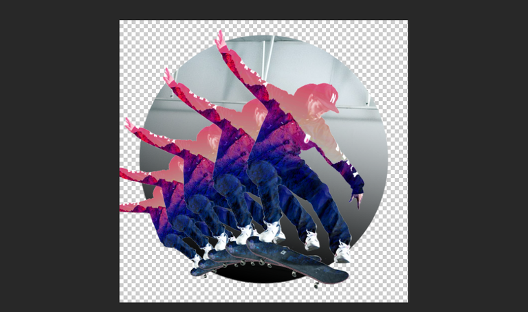
After that, I combined the 4 shadow 'Skateboarders' into 1 single Smart Object, added a "Create Clipping Mask" onto them to keep them in the circle and also added a Gradient Overlay with Colorburn effect:
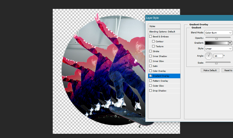
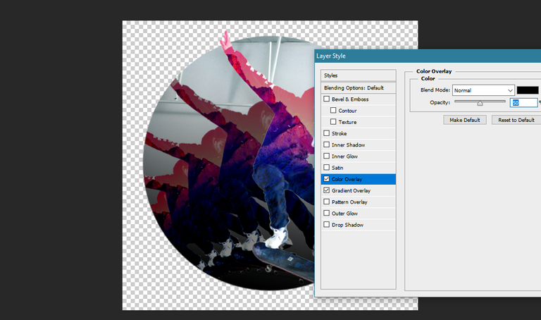
Also added a Color Overlay with Normal Effect in 50% Opacity:
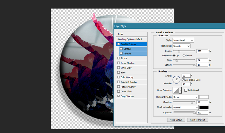
I also added some effects to the Circle Layer, Bevel & Emboss:
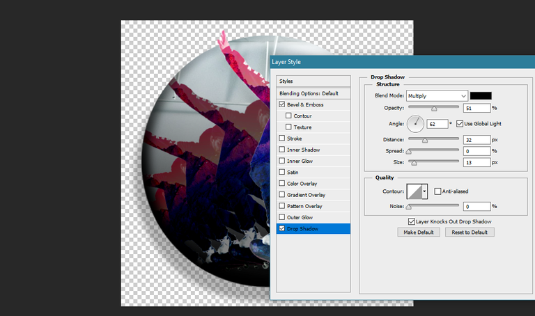
As well as Drop Shadow:
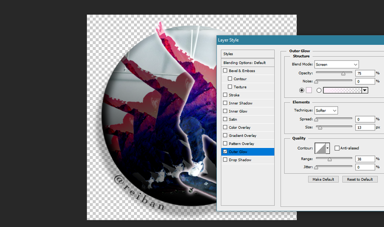
Lastly, I added an Outer Glow Effect onto the Skateboarder and my Steemit Name as a Signature:
Here is the Finished Image:
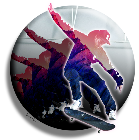
I also made another sample, this time it's a Surfer. Surfer image source here, Fishes Overlay source here.
Thanks!

Nice work!
Thank you!
great!your post is so good that I like it very much!
Thank you so much @lingfei! Glad you like it! :)