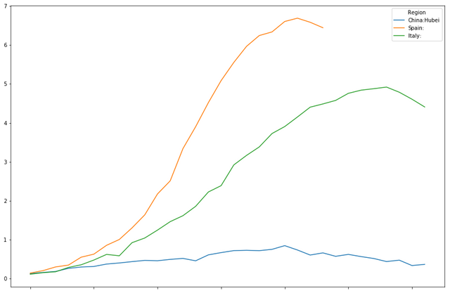
In this blog post I want to revisit Pandas and the COVID19 data. In my previous blog post, six days ago, we first looked at visualizing the COVID19 mortality data with Python, using Pandas and Numpy. There are six more days of data now that we can look at, and these six days make a bit of a difference in how we can visualize our data. But there are also things in my previous blog post that I think could have done better. I dumped a few rather big chunks of code at the reader without much explanation to those completely unfamilar with Pandas and Numpy. I also didn't get into any theory that might help to understand how to use these base data preprocessing and visualization techniques. I want this blog post to be more of a step by step tutorial, both for preprocessing data with Numpy and Pandas for visualization, for learning and understanding about the limitation of emerging data.
Before we look into the real data again, let us start of with a bit of fake data for learning purposes.
Because disease mortality for contageous disceases seems to move in waves, we start by looking at a really simple wave. A single-period of a harmonic wave. In order to create our fake wave, we first need a special number: pi or π.For this we import the math library.
#Math for pi
import math
math.pi
3.141592653589793
Next to the math library, we need to import the numpy and the matplot library. Numpy is needed for working with arrays of numeric data in a convenient way. The matplotlib library is needed for base visuialization.
Because this blog post is created with Jupyter Notebook, we use the special command %matplotlib inline to allow us to directly plot our graphs as we go along.
import numpy as np
%matplotlib inline
import matplotlib.pyplot as plt
Poissonicise
A bit of theory. Even if there are no waves of contageous disease and no seasonal fluctuations, there will always be day to day fluctuation in mortality even if the curve isn't a curve but a constant rate. Constant rate mortality follows what is called a Poisson arrival process. Numpy has several random data generators that can be used to model different mathematical properties of complex systems. One of these generators is the poisson generator.
Because later on we will be using wave shaped base functions, we create a little set of two helper functions. The first function, simple_model_val calls the poisson generator with the average per period number of deaths, more generically named lambda or λ and returns a single number. The second function is of a type you will often use when using numpy. This function is an addapter that turns our simple_model_val that works on single values, into a function that takes and returns a numpy array. Numpy provides us with a usefull function vectorize just for this purpose.
Now to understand what Poissonic noise looks like, let us start with an array with one hundred times the same value. The numpy linspace function allows us to quickly create a numpy array depicting a linearly increasing or decreasing series of values. In this case we use it to create 100 values of 100.
We then apply our simple_model to our linespace generated array to create some fake mortality data that we then plot using matplotlib.
def simple_model_val(lamb):
    return  np.random.poisson(lamb,1)[0]

def simple_model(vec):
    smv = np.vectorize(simple_model_val)
    return smv(vec)


constline = np.linspace(100,100, num=100)
fakemort = simple_model(constline)
plt.plot(constline)
plt.plot(fakemort)
plt.ylabel('mortality')
plt.xlabel('day')
plt.show()
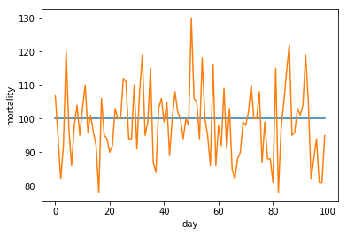
To illustrate some important properties of Poissonic noise in the light of scaling data for normalization purposes, we repeat this whole process with the scaled up results from an invocation of our simple model with a scaled down lambda.
constline2 = np.linspace(10,10, num=100)
fakemort2 = simple_model(constline2)
plt.plot(constline)
plt.plot(fakemort)
plt.plot(fakemort2*10)
plt.ylabel('mortality')
plt.xlabel('day')
plt.show()
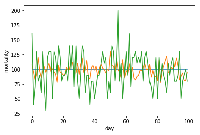
As we see, by scaling up our lambda of ten data to the same level as our lambda of one hundred data, we also scaled up our Poissonic noice. This is very important to realize once we start normalizing our data for different hugely different size countries. We will revisit this later.
A singular wave
So far for scaling, lets look at a wave shaped piece of data.
linspace, but now we create an array of increasing values ranging from zero up to two pi. We provide this array to the numpy cos function that we than scale and transpose to form a nice wave formed shape.
Finaly we feed the resulting wave form to our simple_model function to add realistic Poissonic noise.
cosline = 50-50*np.cos(np.linspace(0,math.pi*2, num=100))
fakemort = simple_model(cosline)
plt.plot(cosline)
plt.plot(fakemort)
plt.ylabel('mortality')
plt.xlabel('day')
plt.show()
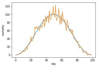
If we look at a small part of our graph, we see the start of the graph can be quite misleading.
plt.plot(cosline[:25])
plt.plot(fakemort[:25])
plt.ylabel('mortality')
plt.xlabel('day')
plt.show()
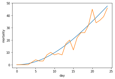
And if we scale things, even more so.
cosline2 = 5-5*np.cos(np.linspace(0,math.pi*2, num=100))
fakemort2 = simple_model(cosline2)
plt.plot(10*cosline2[:25])
plt.plot(10*fakemort2[:25])
plt.ylabel('mortality')
plt.xlabel('day')
plt.show()

A composite wave
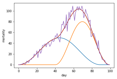
Our previous wave form was the simplest wave form we could run into. If you look at simple theoretical models where a region consiss of multiple semi-connected sub-regions, the real wave might be a composite of two or more waves. Let us look at two examples of two wave composites.
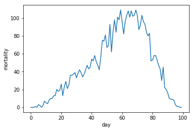
In the first composit, the second wave starts while the first wave is still in its upwards trajectory.
cosline1 = np.append(25-25*np.cos(np.linspace(0,math.pi*2, num=90)), np.linspace(0,0,10))
cosline2 = np.append(np.linspace(0,0,40),40-40*np.cos(np.linspace(0,math.pi*2, num=60)))
combined1 = cosline1+cosline2
fakemort2 = simple_model(combined1)
plt.plot(cosline1)
plt.plot(cosline2)
plt.plot(combined1)
plt.plot(combined1)
plt.plot(fakemort2)
plt.ylabel('mortality')
plt.xlabel('day')
plt.show()
plt.plot(fakemort2)
plt.ylabel('mortality')
plt.xlabel('day')
plt.show()
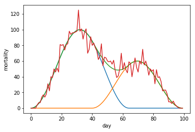
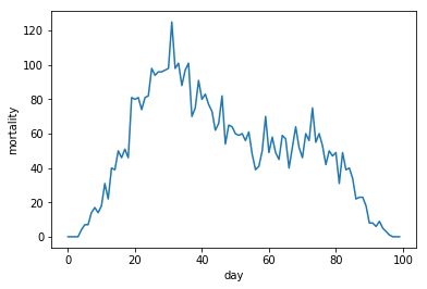
In the second type of two wave composit, the second wave starts while the first wave is already in a downward trajectory.
cosline3 = np.append(50-50*np.cos(np.linspace(0,math.pi*2, num=65)), np.linspace(0,0,35))
cosline4 = np.append(np.linspace(0,0,40),30-30*np.cos(np.linspace(0,math.pi*2, num=60)))
combined2 = cosline3+cosline4
fakemort3 = simple_model(combined2)
plt.plot(cosline3)
plt.plot(cosline4)
plt.plot(combined2)
plt.plot(fakemort3)
plt.ylabel('mortality')
plt.xlabel('day')
plt.show()
plt.plot(fakemort3)
plt.ylabel('mortality')
plt.xlabel('day')
plt.show()
Trading in days for reduced Poissonic noise
Let's look at the three resulting waves together.
plt.plot(fakemort)
plt.plot(fakemort2)
plt.plot(fakemort3)
plt.ylabel('mortality')
plt.xlabel('day')
plt.show()
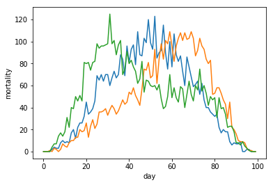
To make this very noicy data quite a bit more usable, we use an operation that doesn't come for free,
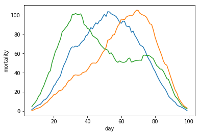
We replace our data points with the per-day seven-day-average of the data. This means we lose seven days of data in order to make our data less noisy and allow us to make our data more usefull.
To implement this, we reach out to the pandas library. We implement the seven day averaging using the cumsum method from numpy. This method transforms the input array with death-rates into an array with cummultative deaths, not unlike the raw data from the COVID19 data set.
This commultative mortality data is then transformed from a numpy array into a pandas Series for the sole purpose of being able to invoke the pandas diff method, that with an optional argument of seven, gives us exactly the result we were looking for,
We then print the resulting data and see how it has smoothened out wuite a bit.
import pandas as pd
fakemort = pd.Series(fakemort.cumsum()).diff(7).values/7
fakemort2 = pd.Series(fakemort2.cumsum()).diff(7).values/7
fakemort3 = pd.Series(fakemort3.cumsum()).diff(7).values/7
plt.plot(fakemort)
plt.plot(fakemort2)
plt.plot(fakemort3)
plt.ylabel('mortality')
plt.xlabel('day')
plt.show()
Reading the data set
Now that we've gone through some of the theory and have simulated some waves and ways to smoothen them out a bit, it is time to look at the real data.
As before, we use the COVID19 data from the Novel Corona Virus 2019 data set.
We use the Pandas function read_csv to read in the file time_series_covid_19_deaths.csv from the unzipped data set into a Pandas DataFrame object. Think of a Pandas DataFrame as an in-memory Excell sheet. We then apply the fillna method on the DataFrame to replace all non values (that occure in the Province/State column, into empty strings.
To get a bit of a feel for the data, we look at the first two rows of data for a bit.
deaths = pd.read_csv("time_series_covid_19_deaths.csv")
deaths.fillna('', inplace=True)
deaths.head(2)
| Province/State | Country/Region | Lat | Long | 1/22/20 | 1/23/20 | 1/24/20 | 1/25/20 | 1/26/20 | 1/27/20 | ... | 3/27/20 | 3/28/20 | 3/29/20 | 3/30/20 | 3/31/20 | 4/1/20 | 4/2/20 | 4/3/20 | 4/4/20 | 4/5/20 | |
|---|---|---|---|---|---|---|---|---|---|---|---|---|---|---|---|---|---|---|---|---|---|
| 0 | Afghanistan | 33.0000 | 65.0000 | 0 | 0 | 0 | 0 | 0 | 0 | ... | 4 | 4 | 4 | 4 | 4 | 4 | 6 | 6 | 7 | 7 | |
| 1 | Albania | 41.1533 | 20.1683 | 0 | 0 | 0 | 0 | 0 | 0 | ... | 8 | 10 | 10 | 11 | 15 | 15 | 16 | 17 | 20 | 20 |
2 rows × 79 columns
Adding a "World" row.
The first thing we do now is that we will extend our DataFrame with an extra row of data containing the summed up data for all the other rows. Summing up numeric columns works quite well out of the box for the most part using the DataFrame sum method. There are a few columns though that require some extra attention. Once we are happy with our new row, we use the DataFrame's append method to add the row to the bottom of the DataFrame.
worldrow = deaths.sum()
worldrow["Country/Region"] = "World"
worldrow["Province/State"] = ""
worldrow["Lat"] = 0.0
worldrow["Long"] = 0.0
deaths = deaths.append(worldrow,ignore_index=True)
deaths.tail(2)
| Province/State | Country/Region | Lat | Long | 1/22/20 | 1/23/20 | 1/24/20 | 1/25/20 | 1/26/20 | 1/27/20 | ... | 3/27/20 | 3/28/20 | 3/29/20 | 3/30/20 | 3/31/20 | 4/1/20 | 4/2/20 | 4/3/20 | 4/4/20 | 4/5/20 | |
|---|---|---|---|---|---|---|---|---|---|---|---|---|---|---|---|---|---|---|---|---|---|
| 261 | Western Sahara | 24.2155 | -12.8858 | 0 | 0 | 0 | 0 | 0 | 0 | ... | 0 | 0 | 0 | 0 | 0 | 0 | 0 | 0 | 0 | 0 | |
| 262 | World | 0.0000 | 0.0000 | 17 | 18 | 26 | 42 | 56 | 82 | ... | 27198 | 30652 | 33925 | 37582 | 42107 | 46809 | 52983 | 58787 | 64606 | 69374 |
2 rows × 79 columns
(Preparing for) Transpose
The data we have now has a two column index that is composed of the Country/Region value and the Province/State value that together are a unique index. We want to first replace this with a single unique index.
In our first step we create a new column named Region that contains a concatenation of the two columns.
The new column first ends up at the right of our DataSet. Using th set_index method of the DataFrame we then promote the new column to the row-index of the DataFrame. After this promotion, we can delete the original two columns. We also delete the Lat and the Long column as we won't be using these anymore for our visualization.
After this we end up with a clean DataFrame structure filled only with mortality data points. The row-indices being all countries and regions, and the column indices being all dates from the 2th of January up to yesterday.
deaths["Region"] = deaths["Country/Region"] + ":" + deaths["Province/State"]
deaths.set_index("Region", inplace=True)
del deaths["Country/Region"]
del deaths["Province/State"]
del deaths["Lat"]
del deaths["Long"]
deaths.head(2)
| 1/22/20 | 1/23/20 | 1/24/20 | 1/25/20 | 1/26/20 | 1/27/20 | 1/28/20 | 1/29/20 | 1/30/20 | 1/31/20 | ... | 3/27/20 | 3/28/20 | 3/29/20 | 3/30/20 | 3/31/20 | 4/1/20 | 4/2/20 | 4/3/20 | 4/4/20 | 4/5/20 | |
|---|---|---|---|---|---|---|---|---|---|---|---|---|---|---|---|---|---|---|---|---|---|
| Region | |||||||||||||||||||||
| Afghanistan: | 0 | 0 | 0 | 0 | 0 | 0 | 0 | 0 | 0 | 0 | ... | 4 | 4 | 4 | 4 | 4 | 4 | 6 | 6 | 7 | 7 |
| Albania: | 0 | 0 | 0 | 0 | 0 | 0 | 0 | 0 | 0 | 0 | ... | 8 | 10 | 10 | 11 | 15 | 15 | 16 | 17 | 20 | 20 |
2 rows × 75 columns
Now this is almost what we want, but it would be better if it was the other way arround. For this, The Pandas Datadrame provides the transpose method, Transpose basically turns columns into rows and rows into collumns. Exactly what we want here.
ctimeline = deaths.transpose()
ctimeline[["World:","China:Hubei","Italy:","Spain:"]].tail(4)
| Region | World: | China:Hubei | Italy: | Spain: |
|---|---|---|---|---|
| 4/2/20 | 52983 | 3199 | 13915 | 10348 |
| 4/3/20 | 58787 | 3203 | 14681 | 11198 |
| 4/4/20 | 64606 | 3207 | 15362 | 11947 |
| 4/5/20 | 69374 | 3210 | 15887 | 12641 |
A top level view
Now tat we have our transposed DataFrame with mortality data we can use the plot method, not of the matplotlib but of the Pandas DataFrame.
There is a lot of data in this DataFrame for a single graph, so lets select a few key columns.
ctop = ctimeline[["World:","China:Hubei","Italy:","Spain:"]]
ctop.plot()
<matplotlib.axes._subplots.AxesSubplot at 0x7fd7bbdd91d0>
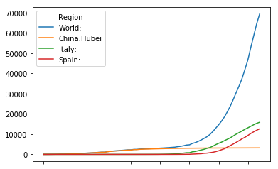
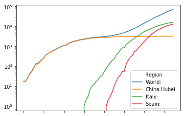
Seems this view on the data might be more usefull on a logaritmix y-axis. We add an extra attribute to plot to achieve this.
ctop.plot(logy=True)
<matplotlib.axes._subplots.AxesSubplot at 0x7fd7bbf620f0>
Mortality rate
The data, as mentioned before, is commultative mortality data. Commultative data isn't particularly intuitive to parse when we are concerned with the impact of these waves. It is absolute essential to transform the data into data that depicts the mortality rate instead. We do this with the diff method we encountered before. And as before, we use the trick of paying with seven days of data to reduce the Poissonic noice in the derivative.
timeline = ctimeline.diff(7)
top = timeline[["World:","China:Hubei","Italy:","Spain:"]]
top.plot(logy=True)
<matplotlib.axes._subplots.AxesSubplot at 0x7fd7bbc4c9e8>
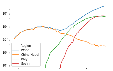
As we saw in our theoreticcal part, we see clear signs of a composite wave on a global level. We must consider composite waves on national levels as well when we look deeper.
Second and third derivatives
Mortality rate is the first derivative of the commultative data. Let's have a look at the largest wave, Spain, to see what use second and third derivative might be in the future.
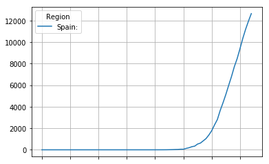
The raw data : commultative deaths
The data as is provides us with comultative deaths.
original = ctimeline[["Spain:"]]
original.plot(grid=True)
<matplotlib.axes._subplots.AxesSubplot at 0x7fd7bba97c50>
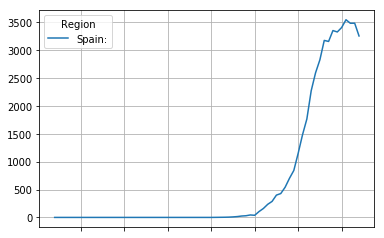
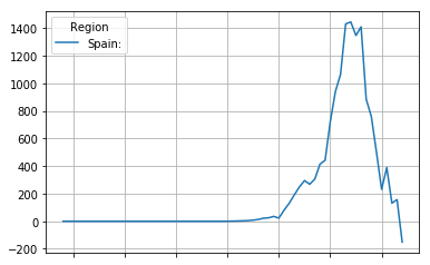
The first derivative, the mortality rate is usualy the most usefull view on the data. It depicts the rate at which people die ploted against the time.
first_derivative = original.diff(4)
first_derivative.plot(grid=True)
<matplotlib.axes._subplots.AxesSubplot at 0x7fd7bb9042b0>
The second derivative can sometimes show interesting info not directly obvious from the first derivative. It shows the acceleration (or when negative, deceleration of the mortality rate. The point where the curve crosses zero is interesting, as it is the point where growth of the mortality rate halts, and the mortality rate first starts to drop down again.
second_derivative = first_derivative.diff(4)
second_derivative.plot(grid=True)
<matplotlib.axes._subplots.AxesSubplot at 0x7fd7bb8f57b8>
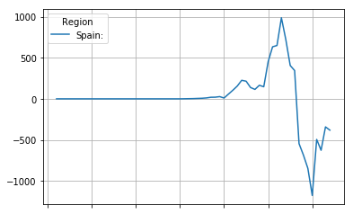
The third derivative can, if the curve data is smooth, provide us with a one usefull data point. The point where the third derivative passes from positive to negative is the point where the continuing growth of the mortality rate stops accelerating and starts decelleration.
third_derivative = second_derivative.diff(4)
third_derivative.plot(grid=True)
<matplotlib.axes._subplots.AxesSubplot at 0x7fd7bb77ee48>
Enough per-region data points ? (run one)
Not all columns will contain a usefull amount of mortality endpoints at this time. So our first step is to drop those columns from our data frames that don't contain at least two weeks worth of data where the comultative mortality is above two.
Note the line where filterlen is defined. It might be a bit hard to parse for people not already acquanted with Pandas and Numpy. The statement (ctimeline[region] > 2) returns an array of boolean values, indicating for each element of the specified column if the cell has a content greater than two. The astype(int) method incocation on this arrays converts the array of booleans into an array of integers. Finaly the sum counts the number of 1 values (originally True ) contained tin the last array. The result being that filterlen will end up containing the count of the number of column cells that indicate at least three comultative deaths.
deathset = set(ctimeline.columns)
dropcount = 0
for region in deathset:
    filterlen = (ctimeline[region] > 2).astype(int).sum()
    if filterlen < 14:
        del ctimeline[region]
        del timeline[region]
        dropcount += 1
print("Dropped", dropcount,"regions with too few data points.")
timeline.head(2)
Dropped 190 regions with too few data points.
| Region | Albania: | Algeria: | Argentina: | Australia:New South Wales | Austria: | Bangladesh: | Belgium: | Brazil: | Bulgaria: | Burkina Faso: | ... | Slovenia: | Spain: | Sweden: | Switzerland: | Tunisia: | Turkey: | Ukraine: | United Kingdom: | US: | World: |
|---|---|---|---|---|---|---|---|---|---|---|---|---|---|---|---|---|---|---|---|---|---|
| 1/22/20 | NaN | NaN | NaN | NaN | NaN | NaN | NaN | NaN | NaN | NaN | ... | NaN | NaN | NaN | NaN | NaN | NaN | NaN | NaN | NaN | NaN |
| 1/23/20 | NaN | NaN | NaN | NaN | NaN | NaN | NaN | NaN | NaN | NaN | ... | NaN | NaN | NaN | NaN | NaN | NaN | NaN | NaN | NaN | NaN |
2 rows × 73 columns
Normalizing the data
Before we can continue filtering usefull columns, we first need to normalize the data. If we want to be able to compare countries with different population sizes, the current numbers are completely and utterly useless if we don't normalize them. A hundred deaths a day, afterall is a whole other thing if these deaths are in the US, than if these deaths are in Luxembourg. We need to normalize our data using the population sizes of the countries and regions still left in our DataFrames.
We start bu using the urllib and the BeautifulSoup library to extract the needed data from a few Wikipedia pages. We'll start with country data.
# urllib for fetching web pages from wikipedia
import urllib.request as rq
# BeautifulSoup for parsing wikipedia HTML pages from wikipedia.
from bs4 import BeautifulSoup as bs
wikipedia = 'https://en.wikipedia.org/wiki/'
page1 = rq.urlopen(wikipedia + 'List_of_countries_and_dependencies_by_population')
s1 = bs(page1, 'html.parser')
t1 = s1.find_all("table", attrs={"class": "wikitable sortable"})[0]
altnames = dict()
altnames["Myanmar"] = "Burma"
altnames["Cape Verde"] = "Cabo Verde"
altnames["Ivory Coast"] = "Cote d'Ivoire"
altnames["Congo"] = "Congo (Brazzaville)"
altnames["DR Congo"] = "Congo (Kinshasa)"
altnames["Czech Republic"] = "Czechia"
altnames["United States"] = "US"
altnames["East Timor"] = "Timor-Leste"
altnames["Taiwan"] = "Taiwan*"
altnames["South Korea"] = "Korea, South"
objlist = list()
for row in t1.find_all('tr')[1:-1]:
    tds = row.find_all('td')
    links = tds[1].find_all('a')
    count = len(links)
    candidate = links[0].getText()
    if count > 1:
        alt = links[1].getText()
        if "[" not in alt:
            if not candidate:
                candidate = alt
            else:
                candidate = alt + ":" + candidate
    if candidate in altnames.keys():
        candidate = altnames[candidate]
    if ":" not in candidate:
        candidate += ":"
    obj = dict()
    obj["cy"] = candidate
    obj["population"] = int("".join(tds[2].getText().split(",")))
    if obj["cy"]:
        objlist.append(obj)
populations = pd.DataFrame(objlist)
popset = set(populations["cy"].values)
Let's look what regions are still missing.
set(timeline.columns) - popset
{'Australia:New South Wales',
 'Canada:British Columbia',
 'Canada:Ontario',
 'Canada:Quebec',
 'China:Anhui',
 'China:Beijing',
 'China:Chongqing',
 'China:Guangdong',
 'China:Hainan',
 'China:Hebei',
 'China:Heilongjiang',
 'China:Henan',
 'China:Hubei',
 'China:Hunan',
 'China:Shaanxi',
 'China:Shandong',
 'China:Shanghai',
 'China:Sichuan',
 'China:Tianjin',
 'China:Xinjiang',
 'Diamond Princess:',
 'World:'}
A lot of Chinese regions. There is a wikipedia page for those as well.
page2 = rq.urlopen(wikipedia + 'List_of_Chinese_administrative_divisions_by_population')
s2 = bs(page2, 'html.parser')
t2 = s2.find_all("table", attrs={"class": "wikitable sortable"})[1]
for row in t2.find_all('tr')[2:-1]:
    tds = row.find_all('td')
    links = tds[0].find_all('a')
    province = links[0].getText()
    if len(links) > 2:
        province = links[1].getText()
    population = int("".join(tds[1].getText().split(",")))
    obj = dict()
    obj["cy"] = "China:" + province
    obj["population"] = population
    objlist.append(obj)
populations = pd.DataFrame(objlist)
popset = set(populations["cy"].values)
Still a few missing. We add these by hand.
set(timeline.columns) - popset
{'Australia:New South Wales',
 'Canada:British Columbia',
 'Canada:Ontario',
 'Canada:Quebec',
 'Diamond Princess:',
 'World:'}
obj = dict()
obj["cy"] = "World:"
obj["population"] = 7775760000
objlist.append(obj)
obj = dict()
obj["cy"] = "Australia:New South Wales"
obj["population"] = 7544000
objlist.append(obj)
obj = dict()
obj["cy"] = "Canada:British Columbia"
obj["population"] = 5071000
objlist.append(obj)
obj = dict()
obj["cy"] = "Canada:Ontario"
obj["population"] = 14570000
objlist.append(obj)
obj = dict()
obj["cy"] = "Canada:Quebec"
obj["population"] = 8485000
objlist.append(obj)
populations = pd.DataFrame(objlist)
popset = set(populations["cy"].values)
del timeline['Diamond Princess:']
del ctimeline['Diamond Princess:']
set(timeline.columns) - popset
set()
Normalize and drop small countries
To reduce the problems with Poissonic noise amplification we discussed earlier, we drop all columns for countries with less than a million occupants. We normalize the rest. Commultative numbers are normalized to deaths per million. Mortality rates are normalized to anual deaths per thousand.
for region in timeline.columns:
    rpop = populations[populations["cy"] == region]["population"].values[0]
    if rpop < 1000000:
        print("Dropping", region, "because of small population:", rpop)
        del timeline[region]
        del ctimeline[region]
    else:
        ctimeline[region] *= 1000000/rpop
        timeline[region] *= 1000*52/rpop
Dropping Luxembourg: because of small population: 626108
Dropping San Marino: because of small population: 33574
dropping low-peek colums
All cause mortality on a world scale is about 7.7. In many countries, mortality rate wouldn't even register on a lineair scale that goes up to 7.7. For this reason we drop all columns that don't at least reach a mortality rate of 0.1.
for region in timeline.columns:
    regmax = timeline[region].max()
    if regmax < 0.1:
        print("Dropping", region, "because peek mortality too low:",regmax)
        del timeline[region]
        del ctimeline[region]
Dropping Argentina: because peek mortality too low: 0.031242550965857676
Dropping Australia:New South Wales because peek mortality too low: 0.05514316012725345
Dropping Bangladesh: because peek mortality too low: 0.0012351952936398892
Dropping Brazil: because peek mortality too low: 0.08611130411240857
Dropping Bulgaria: because peek mortality too low: 0.08914236049256297
Dropping Burkina Faso: because peek mortality too low: 0.02989929113763928
Dropping China:Anhui because peek mortality too low: 0.004988009592326139
Dropping China:Beijing because peek mortality too low: 0.009580838323353293
Dropping China:Chongqing because peek mortality too low: 0.005073170731707316
Dropping China:Guangdong because peek mortality too low: 0.00186229743038768
Dropping China:Hainan because peek mortality too low: 0.017011995637949837
Dropping China:Hebei because peek mortality too low: 0.002074468085106383
Dropping China:Heilongjiang because peek mortality too low: 0.010979150171549221
Dropping China:Henan because peek mortality too low: 0.00652787948530181
Dropping China:Hong Kong because peek mortality too low: 0.013865372565227246
Dropping China:Hunan because peek mortality too low: 0.002274052478134111
Dropping China:Shaanxi because peek mortality too low: 0.002711864406779661
Dropping China:Shandong because peek mortality too low: 0.001559064561263242
Dropping China:Shanghai because peek mortality too low: 0.004301075268817204
Dropping China:Sichuan because peek mortality too low: 0.0012527101903155866
Dropping China:Tianjin because peek mortality too low: 0.006679511881824021
Dropping China:Xinjiang because peek mortality too low: 0.004253578732106339
Dropping Colombia: because peek mortality too low: 0.027370815721974702
Dropping Egypt: because peek mortality too low: 0.01971744344745848
Dropping India: because peek mortality too low: 0.0027515289057033435
Dropping Indonesia: because peek mortality too low: 0.01928726295080886
Dropping Iraq: because peek mortality too low: 0.03322437442336542
Dropping Japan: because peek mortality too low: 0.010321556173084558
Dropping Korea, South: because peek mortality too low: 0.04719916322295276
Dropping Lebanon: because peek mortality too low: 0.07618554226964348
Dropping Malaysia: because peek mortality too low: 0.04764557555855275
Dropping Mexico: because peek mortality too low: 0.025881337968157437
Dropping Morocco: because peek mortality too low: 0.06380268462065287
Dropping Pakistan: because peek mortality too low: 0.00782873430169971
Dropping Philippines: because peek mortality too low: 0.03929806540250578
Dropping Poland: because peek mortality too low: 0.09755334948800126
Dropping Tunisia: because peek mortality too low: 0.062105241426448195
Dropping Ukraine: because peek mortality too low: 0.03352443214769547
Re-anchoring the data
In order to be able to compare curves that occure at different points in time, we need to shift the column data to a common anchor-point. We choose the 0.1 mortality rate as anchor point.
There are a few methods worth looking at in the below code. We already discussed the meaning of the (timeline[region] >= 0.1) statement above. It returns an array of booleans. The idxmax method then returns the index (a string) of the row with the first matching column entry. The get_loc method invoked on DataFrame index converts this string into a numeric index. We use the found index to shift our column data up. The shifted data gets padded with NaN values.
oldlen = len(timeline)
for region in timeline.columns:
    newidx = (timeline[region] >= 0.1).idxmax()
    numeric_index = timeline.index.get_loc(newidx)
    shifted = timeline[region][numeric_index:].values
    cshifted = ctimeline[region][numeric_index:].values
    shifted = np.pad(shifted,numeric_index,mode='constant',constant_values=(np.nan,))[numeric_index:]
    cshifted = np.pad(cshifted,numeric_index,mode='constant',constant_values=(np.nan,))[numeric_index:]
    timeline[region] = shifted
    ctimeline[region] = cshifted
Enough per-region data points ? (run two)
As we did before, we once-more need to filter out those columns that don't contain enough usefull data points. This time we want at least a week worth of remaining data points in our normalized and re-anchored data.
for region in timeline.columns:
    normalized_datalen = timeline[region].notna().astype(int).sum()
    if  normalized_datalen < 7:
        print("Dropping", region,"not enough normalized data points:", normalized_datalen)
        del timeline[region]
        del ctimeline[region]
Dropping Algeria: not enough normalized data points: 2
Dropping Canada:British Columbia not enough normalized data points: 6
Dropping Canada:Ontario not enough normalized data points: 5
Dropping Hungary: not enough normalized data points: 2
Dropping Peru: not enough normalized data points: 1
Dropping Turkey: not enough normalized data points: 6
timeline.columns
Index(['Albania:', 'Austria:', 'Belgium:', 'Canada:Quebec', 'China:Hubei',
       'Denmark:', 'Dominican Republic:', 'Ecuador:', 'France:', 'Germany:',
       'Greece:', 'Iran:', 'Ireland:', 'Italy:', 'Netherlands:', 'Norway:',
       'Panama:', 'Portugal:', 'Romania:', 'Slovenia:', 'Spain:', 'Sweden:',
       'Switzerland:', 'United Kingdom:', 'US:', 'World:'],
      dtype='object', name='Region')
Dropping rows
If we want to compare curves visually, we are not that interested in half an image dedicated to just a single curve. We drop the bottom rows that don't pertain to at least two different regions.
atleast_two = (timeline.notna().astype(int).sum(axis=1)>1).astype(int).sum()
timeline = timeline.head(atleast_two)
ctimeline = ctimeline.head(atleast_two)
All in one
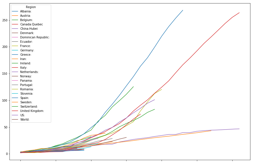
Ok, our data pre-processing is finaly done. All data is normalized and re-anchored. Lets look at the big picture.
Commultative per million deaths
ctimeline.plot(figsize=(15,10))
<matplotlib.axes._subplots.AxesSubplot at 0x7fd7c8be96a0>
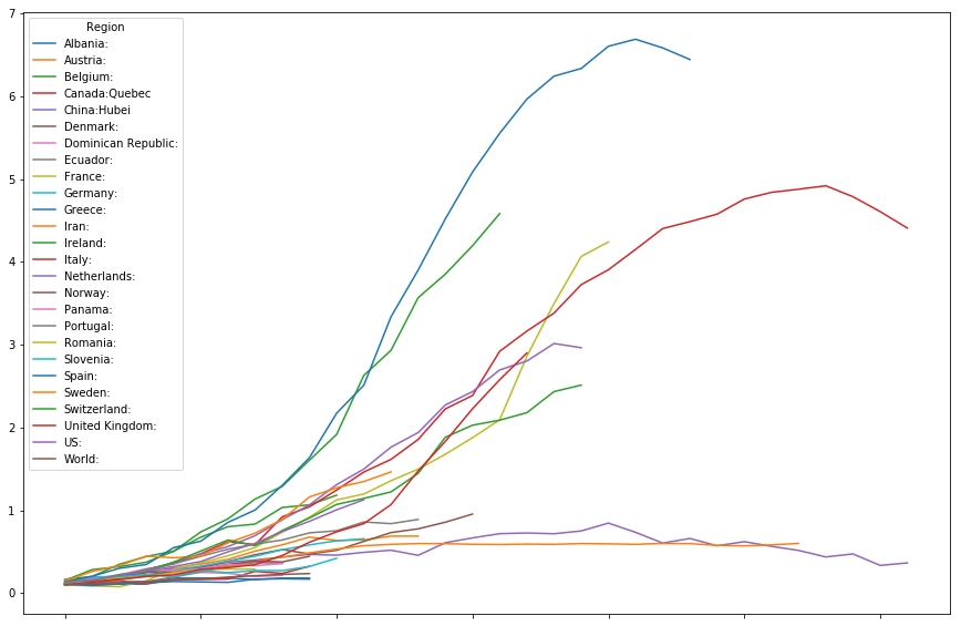
Mortality rate
timeline.plot(figsize=(15,10))
<matplotlib.axes._subplots.AxesSubplot at 0x7fd7c1bb1e10>
Selected curves
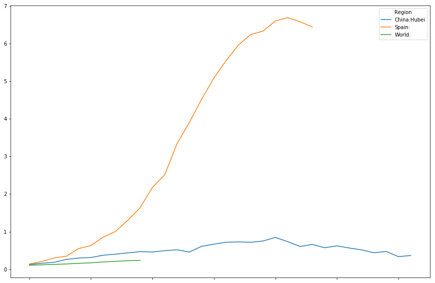
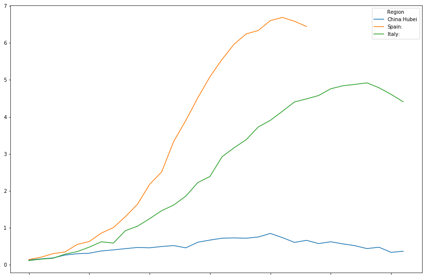
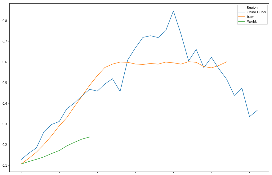
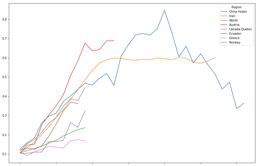
The above graph is a bit hard to read. A shortage of collors is one of the issues. Lets try to look at a few select curves at a time.
timeline[["China:Hubei","Spain:","World:"]].plot(figsize=(15,10))
<matplotlib.axes._subplots.AxesSubplot at 0x7fd7c1a29278>
timeline[["China:Hubei","Spain:","Italy:"]].plot(figsize=(15,10))
<matplotlib.axes._subplots.AxesSubplot at 0x7fd7c011d8d0>
timeline[["China:Hubei","Iran:","World:"]].plot(figsize=(15,10))
<matplotlib.axes._subplots.AxesSubplot at 0x7fd7c0098748>
timeline[["China:Hubei",
          "Iran:",
          "World:",
          "Austria:",
          "Canada:Quebec",
          "Ecuador:",
          "Greece:",
          "Norway:"
         ]].plot(figsize=(15,10))
<matplotlib.axes._subplots.AxesSubplot at 0x7fd7c0010d68>
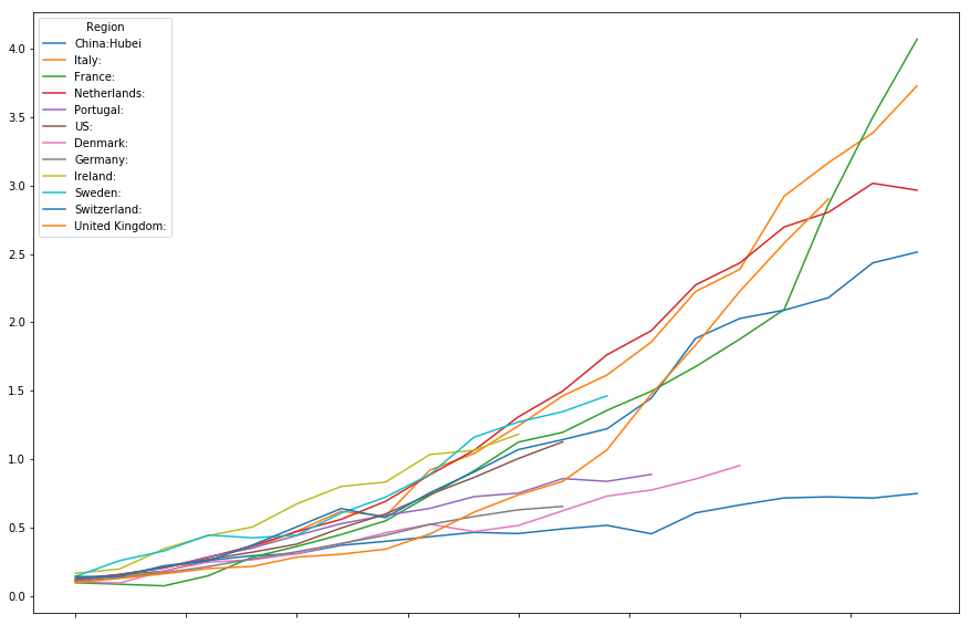
timeline[["China:Hubei",
          "Italy:",
          "France:",
          "Netherlands:",
          "Portugal:",
          "US:",
          "Denmark:",
          "Germany:",
          "Ireland:",
          "Sweden:",
          "Switzerland:",
          "United Kingdom:"
         ]].head(20).plot(figsize=(15,10))
<matplotlib.axes._subplots.AxesSubplot at 0x7fd7c0084828>
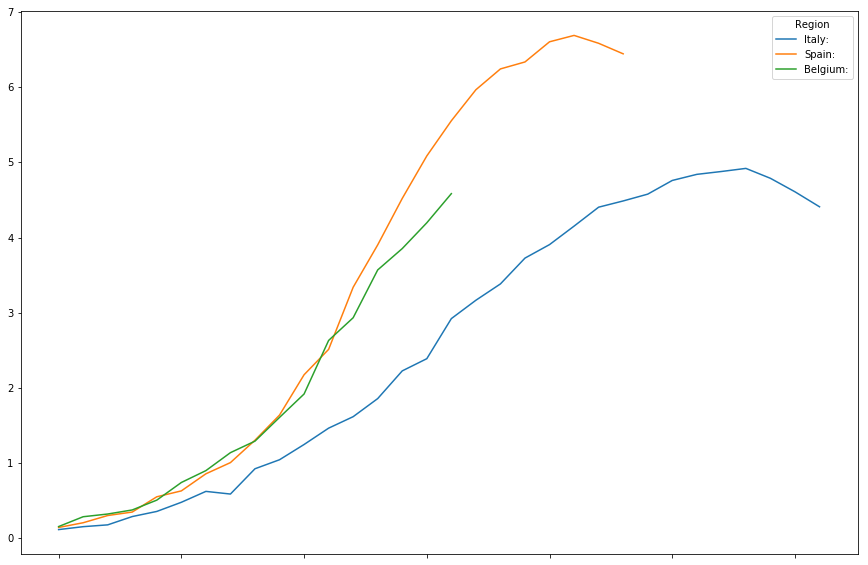
timeline[["Italy:",
          "Spain:",
          "Belgium:"
         ]].plot(figsize=(15,10))
<matplotlib.axes._subplots.AxesSubplot at 0x7fd7bbee3240>
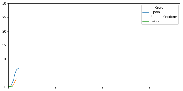
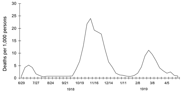
On a longer timescale
If we want to compare our curves to, say, the Spanish-Flu, putting our graph on a different, much larger time-scale can be usefull.
timeline[["Spain:",
          "United Kingdom:",
          "World:"
         ]].plot(figsize=(10,5),xlim=(0,365), ylim=(0,30))
<matplotlib.axes._subplots.AxesSubplot at 0x7fd7bbe5d0b8>
Conclusions
I hope this blog post is helpfull to you, the reader, in more than one way. I hope the blogpost, more so than the previous one, is usefull as a basic tutorial on using Pandas and Numpy for preparing data for visualizing the data. I also hope the intro on Poissonic noise in the context of normalizing mortality data was usefull in illustrating the need to filter out smaller countries. Finaly I hope this post and its visualizations show thus how huge the uncertainty is on how this pandemic will pan out in the end, and how premature many of the analyssis's out there are. Different countries follow a wide range of trajectories, and there might be many factors at play. Stay safe, stay at home, and most importantly, mask-up whenever you do need to go out. The uncertainties are just too big to risk it.
Wow,
very nice guide for data science. Thanks for sharing. Resteem!
Regards
Chapper
This is awesome!
Pandas is such a powerful library when working with data.
If you appreciate the work we are doing, then consider supporting our witness @stem.witness. Additional witness support to the curie witness would be appreciated as well.
For additional information please join us on the SteemSTEM discord and to get to know the rest of the community!
Please consider using the stem.openhive.network app and including @steemstem as a beneficiary of this post. This could yield a stronger support.
An impressive piece of the tutorial.
Thanks a lot for sharing and adding all the explanations in the post.
I am using pandas and matplotlib to extract hive price data from coingecko and showing posts every day. You can take a look at my daily posts.
Thank you for sharing
I am not sure I completely follow the part about poissonic noise. If you use least squares fit (with a smooth function) won't this just reduce the noise beyond levels where it isn't a problem anymore?