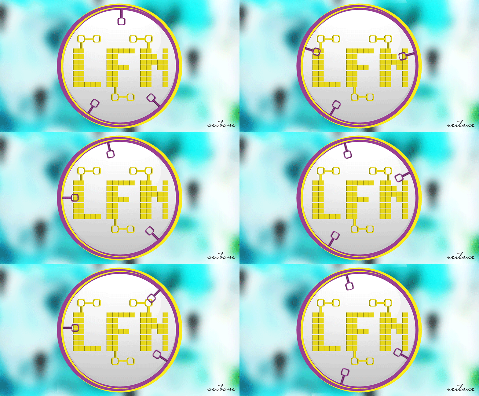
Logo placed on background,converted to gif
We are looking for a logo but usually, we don't know what exactly it s!
I have heard from clients that they have a lot of photos and I could choose one of them for the logo.
No! A logo can't be a photo! A Logo can be placed on a photo!
Why? There are so many great photos out there that explain what my company is!
The answer is simple as a logo could be! You can use photos to explain everything and you will use the logo to make your company memorable exposed and friendly to clients, in the same time you could make understand what your company is but they will still have some question about your products so they will come to check em and maybe you will have some sales!
Logos must be simple, distinct, versatile, appropriate, targeted, memorable and timeless
There are three types of logos: typographic, illustrative, and abstract graphic/graphic.
So when we know what logo is preferred from a client, the next step is to find out what colors are the best for his kind of job.
So these are the most important tips for a great logo! There are still many things to know about Graphic design and logos to learn and I'll try to write other posts about this as here we have to focus on LFN logo!
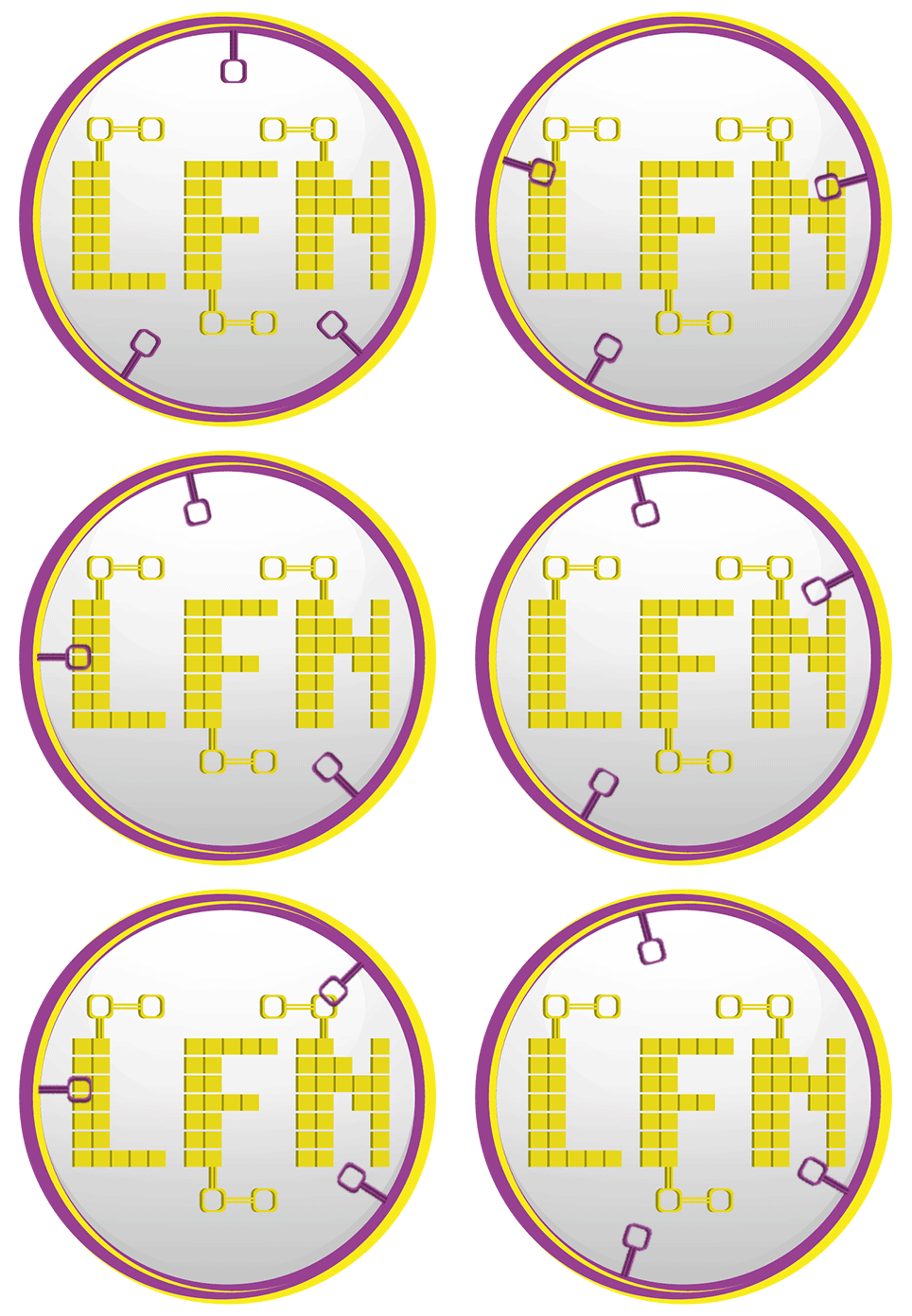
Let's go back to the main topic which is the Logo contest by @rawbinhutt For LFN (looking for niche) chanell on Discord!
The price for the winner is 2000 LFNCOIN! I am new here and I don't know exactly the value of these coins, to be honest, but it doesn't stop me to design the logo below! I love to draw, I love to design, I love to feel creative!

An white background will help us to design our ideas with a black pen! It is something like a draft, it will help to find out the best size of every object. Now we can see how simple or full of different objects is our design! The most important thing is to view the LFN first and then all the rest!

Now it is the first time when we trying to add a cool combination of colors and make our logo more attractive! Wait a second, are these colors the best for our project? What we have to mention and on wich target group we want to have interaction?

If the colors that we have choose already aren't the best for our concept it is the perfect time to rechange em so the combination of design and colors will be more representative to the client's profile! It isn't shame to ask our friends which is their opinion about our artwork before to show it to the client! Some times it is very helpfull.

This is the part of correction, maybe the most interesting and fun! The creator have to think about the project again and look at everything from scratch, It is something like retcouch on photoshop, everything must looks like profesional, no mistakes at all!

Congratulations @veibone! You have completed some achievement on Steemit and have been rewarded with new badge(s) :
Click on any badge to view your own Board of Honor on SteemitBoard.
For more information about SteemitBoard, click here
If you no longer want to receive notifications, reply to this comment with the word
STOP