This contest honestly had fairly low participation compared to my previous design contests, however we now have enough superior entries to proceed. I was happy to see some new faces, and am looking forward to handing out prizes to some different Steemian artists (entry time is now closed).
Here are the top four entries I have selected to advance, for consideration to place for a prize. I have not quite decided how many places there will be, but it will be at least two, if not more. Community, please voice your opinions in the comments as to which design you like the best and why, especially if you are a member of @EarthTribe.
@gade4rt's ET Design
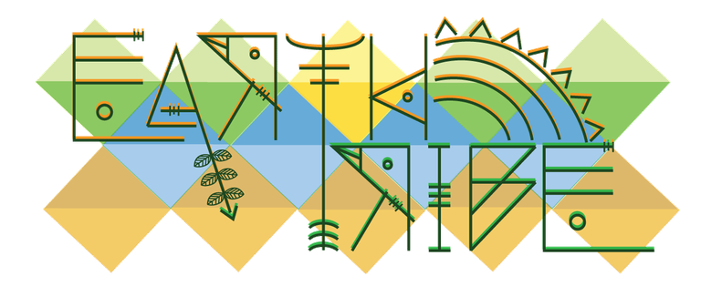

This most recent entry made the deadline just in the nick of time. @gade4rt uses petroglyphs to form the letters of Earth Tribe in the design.
"The petroglyphs are figures found in stone made during prehistory in the Neolithic period and are part of many of the natural heritages of the world, many were made with plant pigments, blood or natural paint, often considered these figures as a means of communication and art of the caverns." - @gade4rt
Basing the letters on petroglyphs is a great idea, since out tribe definitely portrays elements of ancient man in our philosophies. I am impressed with the amount of forethought put into this design, and especially with the page separator that was created. The background colors are also based on all the colors of nature.

@crittercrats' ET Design
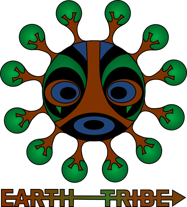

This entry is fantastic. I love the way the trees are incorporated into an esoteric mask, that has nature spirits and the tribal essence of ancient man written all over it. This is one of the most unique design submission I have seen in any of my design contests. I am also pleased with the amount of effort put into the banners and page separators in addition to the logo itself. Outstanding job @crittercrats!!

@erune's ET Design



I love the overall appeal of this logo, and also how it was originally drawn by hand, which was then morphed into a digital image. The focus of this logo seems to be making the Earth and @EarthTribe one in the same in a combined visual image. What a fantastic concept that has a brilliant and relatable appeal.

@thewalker's ET Design
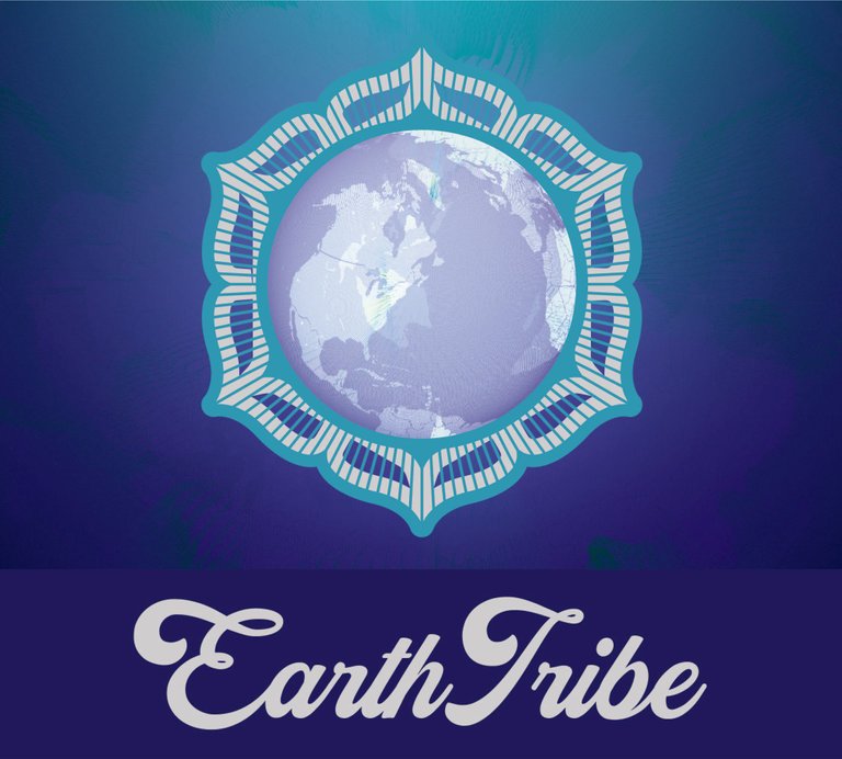


This entry depicts the Earth as a blossoming flower, which is appropriate for EarthTribe, as our tribe is a blossoming project that is becoming more beautiful by the day. This one is simple yet professional, and can most definitely be used in situations that require a more professional appeal. Thank you for a wonderful entry @thewalker, your banner and page separators are looking good as well.

@edxserverus' ET Design
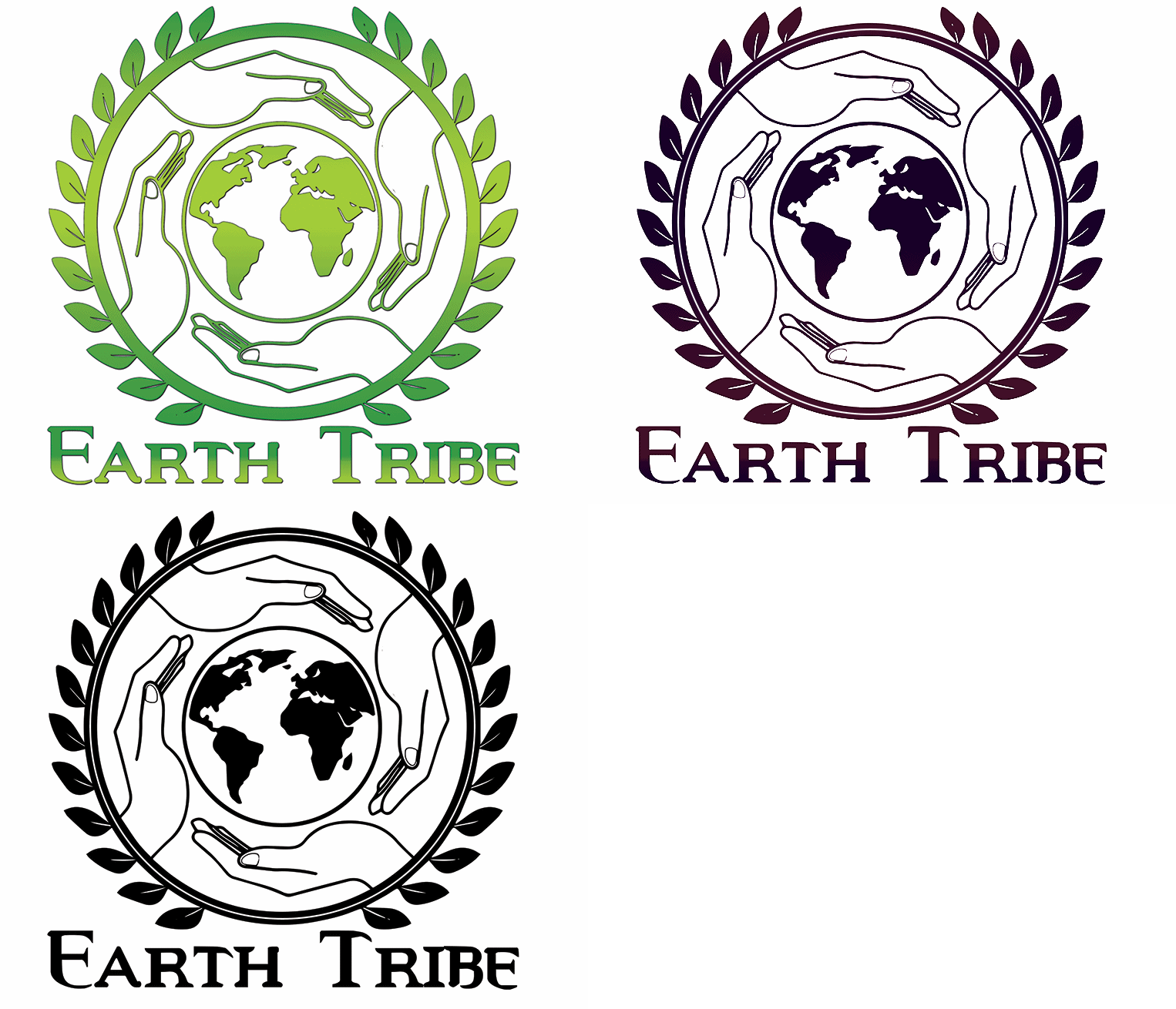
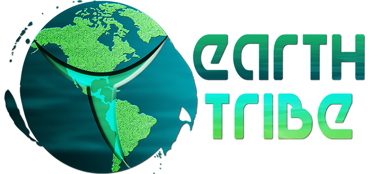
This is the final design that I would have included in, what would have ended up being a top five, however out of respect to the other contestants that posted their entries in the entry article correctly, I cannot include this as an official entry. I did however want to promote @edxserverus' design talents here however, as his impressive skills have already earned him a first place prize in my @tribesteemup design contest, and a second place prize in my #anarchapulco contest. If you ever need design assistance, he is one of the greats that I would highly recommend.

Thank you for taking the time to view these creative designs for our community. Please feel free to leave a review of what you see above, in the comments below.
@EarthTribe's Mission Statement
It is @earthtribe's mission to support those on the Steemit platform that produce quality, professional, Earth conscious, humanitarian, platform advancing content, & want to truly benefit humanity by promoting topics of liberty, resisting tyranny & oppression, understanding diversity, and healing this world and our people, moving us and the planet forward in a positive direction. I also want this tribe to become a haven for star seeds, where they can connect, share ideas and inspiration, resolve conflicts, and collaborate on projects of healing and peace.
and support content that is aiding in the healing of our planet

Do not forget that my debut conscious Hip-Hop album is completely free for download on Bandcamp and Soundcloud (click the links to go to my music on those platforms), or CLICK HERE for download instructions.







Dear Artzonian, thanks for using the #ArtzOne hashtag. Your work is valuable to the @ArtzOne community. Quote of the week: Art, freedom and creativity will change society faster than politics. -Victor Pinchuk
I like @thewalker's!
I love the logo that made @gade4rt for this excellent contest <3 As a graphic designer, I can assure that the logo perfectly transmits the elements of nature through the colors that she used, likewise, also for the use of the petroglyphs in the typography for the logo, together with the sun and the leaves that make a perfect balance in the concept of this proposal for the graphic image of @EarthTribe.
I also loved the separator that she made, leaving the logo in a single color which makes a good contrast with the geometrical figures that have the logo around them.
I hope that she is among the winners and a lot of success to all the participants ^^ Regards @elamental
@crittercrats design!!!!
All the logo proposals are very good but my favorites are the logo of @gade4rt & the logo of @crittercrats since both logo proposals are very unique. @gade4rt for using the petroglyphs with elements and colors of nature as the fundamental basis of their concept and @crittercrats for adding a mask or face to the planet earth, together with elements of nature. I hope both are among the winners.
I love the design of @erune I think it is the one that most represents the Community. A hug!
In my opinion Erune's design is the best i see. Cya around!
To be fair, all designs were awesome, but im more inclined towards @erune 's design, it's blue, but it radiates energy and joy. Good vibes!
the design of @erune it's my 1st choice, the planet earth in to a logo represent exactly the comunity name , however I can remember a little the majora mask with the design of crittercrats
I really like the one from @erune that complies with what is established, it is nice and fresh. He deserves to win for his effort. Successes!
Oooh they are GREAT. I like @erunes but the words on the banner need to change. Love the logo though. Love @ewalkers blossom mandela too. A hard choice!
Posted using Partiko Android
@gade4rt's design It is quite complete in terms of the elements that make up the concept of a "tribe", I think that with the help of the colors and background figures it looks quite tropical and it is something that pleases me!
They all look very nice but my personal favorite is @gade4rt's ET Design. It is amazing, unique, colorful and powerful. Simply gorgeous.
wow these are all really great, but my favourites are @gade4rt's, I love how the words are so connected and the symbols used and it is so earthy. I also love @crittercrats entry, so tribal and earthy and loving those trees. This is a tough one @elamental xxx
@Gade4rt's Design shows love for nature and heritage. :)
Estan geniales, pero a mi parecer el diseño de @gade4rt es el que mejor se adapta a la temática. ♥
I like @erune's ET Design
i think i go with @crittercrats design. Its full of a lot of wisdom
The design of @erune is so great, i really is the best i see.
Incredible talent so far. Really cool to see so many good entries!
I love the @gade4rt logo, we love you cute :3