We are pleased to announce the winners of the Curie Logo Design Contest
First a big thank you to everyone who entered, as well as everyone who participated by voting and commenting on the entries. There were so many entries that narrowing it down to a field of finalists was a difficult task. Community input was sought in the form of upvotes on the comment entries into the contest, and all top vote getters (by number of votes) were included in the field of finalists. In addition, Curie curators, reviewers and operators discussed internally and nominated some entries that may have come late to the contest and did not have the number of votes, but were still considered to be quality entrants.
View the finalists
Curie curators, reviewers and operators voted on the field of finalists. Voting methodology was weighted top 3 with all voters selecting top 3 entries: 1st place (3 points); 2nd place (2 points); 3rd place (1 point).
Second Runner Up: @ufxpression
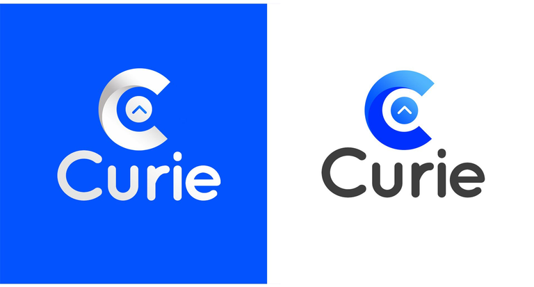
I am really excited about the opportunity Designers on this platform are given to express their artistic skill and to emanate a new Logo based on the ideology Curie as a community was formed on.
Taking a look at the community itself, which happens to be a community that rewards people for creating engaging and Original Posts I believed making emphasis on what the community does for the platform is important , so I came up with a "C" and an Upvote button"^".(source: @ufxpression's contest entry post)
First Runner Up: @skippyza
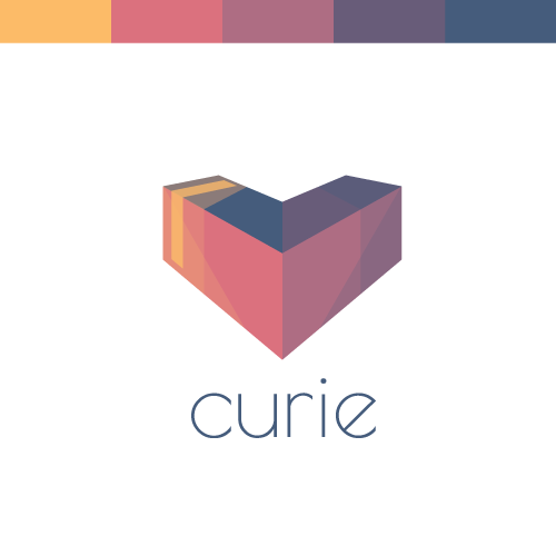
I don't know if anyone else reading this has ever been "hit" by a curie (I'm sure you have), but it must have been one of my favorite experiences on Steemit thus far. The experience of being recognized by curie is only really trumped by all the people I have met through Steemit. So thank you @curie, for making Steemit a better place!
The Shape: At first you might see a heart, or perhaps a 3D "V" shaped box. So what is it really all about? Well, imagine for a second the upvote button was a 3D object, and fell over (right on it's face), you would end up with something like this. Of course the fact that it then forms the heart shape was also intentional, and I thought sharing some love was a good way of describing @curie as a service and a community.(source: @skippyza's contest entry post
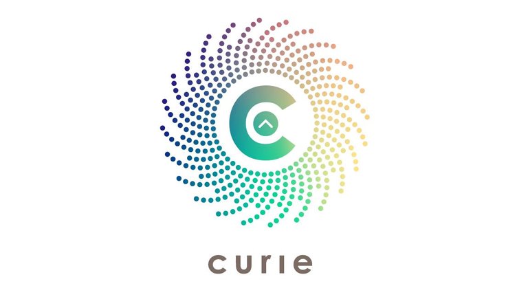
Winner: @overdye
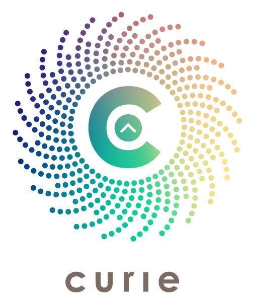
Representing concepts such "meritocracy" and "discovery" do not fall under the canons of traditional design. Not really. This is why I took the opportunity, as a unique opportunity.The canons that I imposed for this realization had to be:
- Meritocracy
- Community
- Joy
The points, in a community context, finally become people, energy, joy and life.(source: @overdye's post explaining the design process)Well yes, joy finally. The very reason to exist for any community.
Despite the "venal" meanings that I feel to attribute to steemit, I feel I have found in Curie a community in search of an authentic values. Made of good contents, of people who celebrate life and human beings every day. Is this the same sense of modern "currency" in actual and future living?
Joy?Absolutely yes.
They are.Let's make it joyful.
Another point that led me to dwell on this solution was usability. For a good brand to be effective, I make sure that this can be used in a creative and fun way without diminishing the essence, indeed, trying to understand how the essence of the logo can be enhanced and brought to new levels. This is why I created a series of ready-to-use graphic elements:
Blog Messaging

Power Signature
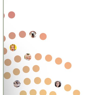

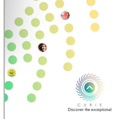
Blog Elements

For those new to Curie, please follow @curie, and join us on Discord: https://discord.gg/jQtWbfj
Follow @curie's votes to support the authors. Please consider following our trail and voting for curated authors. If you are a SteemAuto user, @curie is an available trail to follow.
Absolutely best choice! Congrats the winner!
Wow! All contestants are creative enough!
WOW AWESOME! I like curie when they picked some minnow to win the contest. Not someone who already established on this platform. 150 steem for this guy might mean a world to him! You might just save another investor! Curie is a great role model to all the whales, its their curation effort which kept me motivated too!
Hello @tngflx! So true.
150 Steem are very a lot for a newbie like me! 😊
I will try to make good use of it inside the steemit ecosystem.
Necessarly this is a nice incentive to improve interaction, and continue to make content.
Happy
Hah keep up the good work. By the way your design is really superb. You're a designer in real life?
Design is a significant part of my life. Definitely.
..If I try to get away, he calls me back with wonderful experiences like this..
😊
waaaaa congratulation for the winner,
the design is very nice. represents something that is shining and attractive
Thank You for the good words
🌞
Congratulations to the Winner of Curie Logo Design Contest
👏
Hi @myaceh, thanks!
I'm glad You like it!
🌞
So, why didn't you you change the profile picture yet?
I really believe that the second and third place were very unfair, you should not at least reward them as promised? @curie
@overdye Congrats and great job! Nice job @curie on choosing a winner too :-)
hello @insideoutlet!
Thanks! You are really ahead! 😊
Hi @curie, Please check out this outstanding poery piece:
https://steemit.com/poetry/@crosswell/empath
I think that it deserves a large upvote, so all could read it!
Hi, I noticed you are writing some great fictions, but you don't have 'introduceyourself' post, and also, you are not very active in commenting on the posts of others. Please improve on these 2 areas in order to get a curie vote.
Curie, looks in circular dots waving to get all together, in my view I feel really good logo.@indian-mom, congratulation to the winner.
I'm glad that the sense of the logo is well perceived.
Nice when this happen. Thanks! 💛
Congratulations For all ths winner
You deserved it @curie.
Those Logo are Awesome and Brilliant ide👍👍👍
WOW Looks Great! Congrats @overdye You Did A Good Job!
Thank You @kephawalks!
"WOW" is always welcome 😄
wow.. i think this logo is amazing
I actually commented on his post like 40 minutes ago and said he must be the winner, and he is!
That's awesome.
You made the right decision. Congratulations @overdye
Congratulations to the winners!!! They all look really nice and well-thought of. 👍 Kudos too to everyone who shared their ideas and creativities!
Fantastic result!
Wow I really like the new logo @curie announced this even I want to use but what can make this because it has copyright. Save to steal hopefully with this new logo can make you more successful than ever
very nice graphic design guys...
WOOOWW!! congratulations to the winners! You deserve it all!
Congratulations @ufxpression @skippyza and @overdye! Those are some cool logos you three came up with.
Also, congrats @curie on the new avy! With a new and fresh face, looks like curie's become a cutie!
Wow...nice post, thanks
success for the winner may be useful for others.
Hello @ilhamnur! Nice point, for a minnow like me.
I will put my efforts to keep my investment in steemit. Not sure "how" :-)
But for sure I'm looking forward to award good contents with part of the budget won.
Congratulations @overdye to the Winner of Curie Logo Design Contest.. best your design concept logo to @curie.. i hope @curie can to next contest again.. keep spirit steemians.
Congratulations to all the winners and it's really hard to choose one out of them bcz they all are so beautiful.
Congratulations to the winners!!!😍😍👏👏👏
Congratulation to the winners...very beautiful design! good work!
This logo design is amazing...👏👏👏👏
Two of my choice here :)
Wow! This looks great, nice work. The other finalists did a great job too. I wish I was this talented in design. If you need an awesome tagline I'd love to join that competition :-)
The winning design is excellent! It embodies the key aspirations of curie very elegantly. Congratulations to the winner!
Many Thank @scdevan, really appreciated!
🙏
Awesome logos! Congratulations! I love how you truly portray community in the different colors that look harmonious despite the differences. It does evoke a joyful feeling when I look at it. And of course, the c for curie has been a symbol of meritocracy. All captured well in this logo! <3
https://steemit.com/introduceyourself/@nawgyi/i-introduce-my-self-to-steemit-cd162d074705b
Please UPVOTE | RESTEEM | FOLLOW a friend of yours @nawgyi
Congratulations. Beautiful logo.
That first place is really from a professional design eye.
It is light, transports all the messages & it also looks like a planet illuminated from one side by the sun.
I liked the 3d logo, too - would have only preferred other colors, but the idea is also great.
Well done, designers. :)
Congrats @overdye !!! Really clean design! 150 steem is a looot! :D
😁
Really fantastic work by everyone. The winner definitely captured the essence of Curie! :)
Love it! There were so many designs, you picked a great one. Wonderful work, everyone! :)
Thank you for all the time and work invested thus far. The idea behind @curie, if I've understood it correctly, seems a very promising one.
I for one believe firmly in the future of cooperative communities. It is a basic requirement by most all mammals to receive attention(romantically dubbed affection), but the sheer magnitude of informational input into any system(hashtag or otherwise) makes it improbable for valuable content to ever see the light of attention amidst the vastness of "background noise". So once more, thank you.
Going to follow with continued interest!
🙏 1ove 💞
I missed this contest: /
I feel sorry for what I did not realize the time. maybe I'll catch you another opportunity :) meanwhile great logo. I liked it :)
See you again
Congratulations to the winner of the contest @overdye, and to the first and second runner up. Finally to all the participants in the contest. 🎻🎼🎶🍸🍸🍺🍺🍻. Thank you @curie for that wonderful opportunity given to them to show case their skills.
Alot of great content. I guess i love the one red corner logo.
It's awesome. @Skyppiza is my favorite.
a simple logo but gives the impression of elegance ... the logo maker has a brilliant idea.