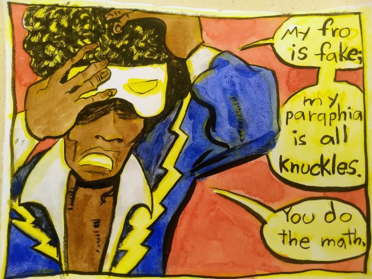
Black Lightning
A couple weeks ago I walked into the library in the hood. I checked out a bunch of comics. Among them a collection of Black Lightning. It's just called Black Lightning, not The Essential, or The Complete, or even The Collected Black Lightning, which makes it awkward to talk about, a little confusing.
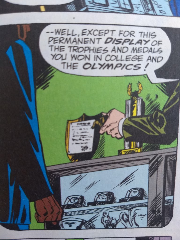
Black Lightning was D.C. Comics first black hero, according to the introduction. He's a high school teacher and former Olympic athlete who turns to a life of crime fighting vigilanteism, just like Batman and the rest. Apparently he never metaled at the big event, because his high school got to keep all his trophies.
His dad was collateral damage, shot in a street scuffle between a cop and an assassin. Here that is; dad innocently buying the farm while carrying a crate of cookies.
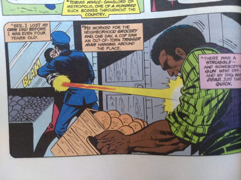
I love this simple background, and the crate in the foreground with the flat oranges that are brown. Also, there's something off about his dad's left arm, like it has no humerus.
Through a sci-fi gadget in his belt Black Lightning can erect an electrical force field and discharge electricity through conduits, like catwalk railings and other conductors. He's not that compelling. He's a little Spider-man, a little Batman, and all the squeaking cleanliness of Superman, but none of the fun of any of them. He's not a loser in life whom we root for, like Peter Parker. He's not in an imaginative world where anything can happen, like Superman. He's not a dirty-fighting ghost of the underworld embodying all of our angst , hatred, and anger at a system that breaks and oppresses us like Batman.
Written by Tony Isabella and illustrated by Trevor Von Eeden and Michael Netzer the collection Black Lighting is a lesson in what not to do, limply phoning-it-in. And yet, because of its bronze-age publication it is saved by the four-color process, and benday dots. The collection, unfortunately, digitally remasters the color, hiding the dots and adding that hated Adobe brush-tool-fade in places. But, even with that, the flatness, or Takashi Murakami's Superflat, remains. Discovering the joy of flatness is the only reason to look at Black Lightning With only one intriguing panel (see below) the narrative refuses to return your investment.
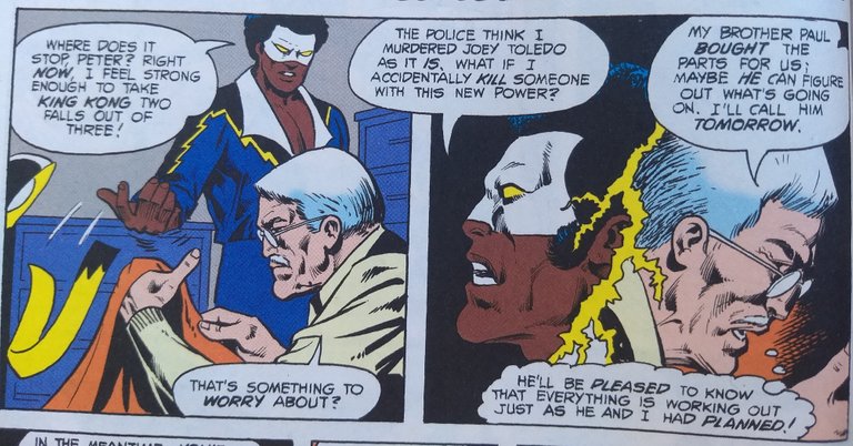
This is forgotten for the rest of the run. The old guys dies in a sacrifice play and we never hear of the brother or their plan again. Too bad. It was the only part that got my attention. Certainly the preaching didn't.
Here's the picture of him punching out a hunk of machinery.
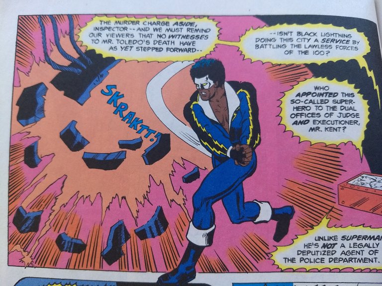
Underwhelming; even the sound effect lacks punch.
The reason that I recommend this comic in which all the word balloons should be covered in white paint and rewritten, and all the drawings are flaccid, is for the inattention generated absurdities. The flatness of line drawings in comics is one of their dynamic strengths. It highlights the flat and visually increases our imaginative processing. The contemporary use of computers in coloring obscures this, unfortunately, and when backgrounds are simplified or missing through incompetence, the comic suffers. In comics like Black Lightning, however, the simplified drawings and missing background accentuate the power of the flat and increase the magic of the absurd. Superflat.
Here's a few of my favourite panels:
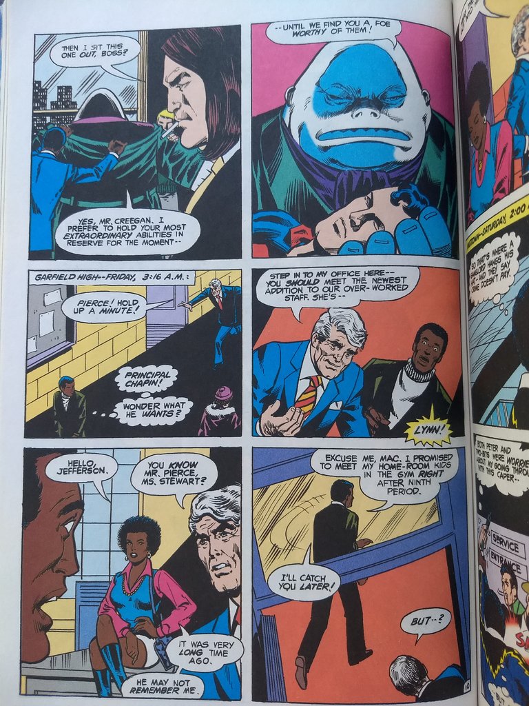
page 10 of issue 3
This page is divided symmetrically on two axes suggesting stability, structure, stasis. Yet the most boring of them, Lightning's work life are subdivided into severe angles, the final two panels actually running into each other. Follow the transom down, into the desk on the preceding panel. One end of this angle supports Lightning's chin, and the other end divides him in two, three actually; leg, leg, and torso. The transom also divides the panel into two sub-panels, one yellow the other red, further dividing Lightning from his legs. Superflat!
This is Lightning's stool pigeon in the underworld informant,two-Bits tanner.
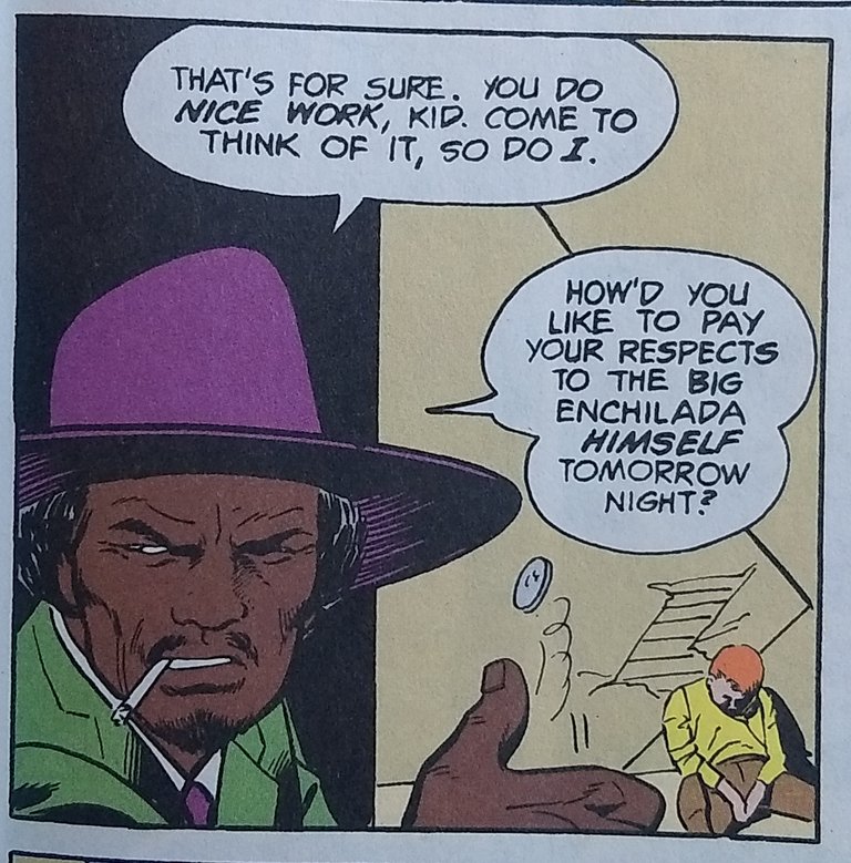
This classic blaxploitation underworld figure is grossly underused and abused (see below)
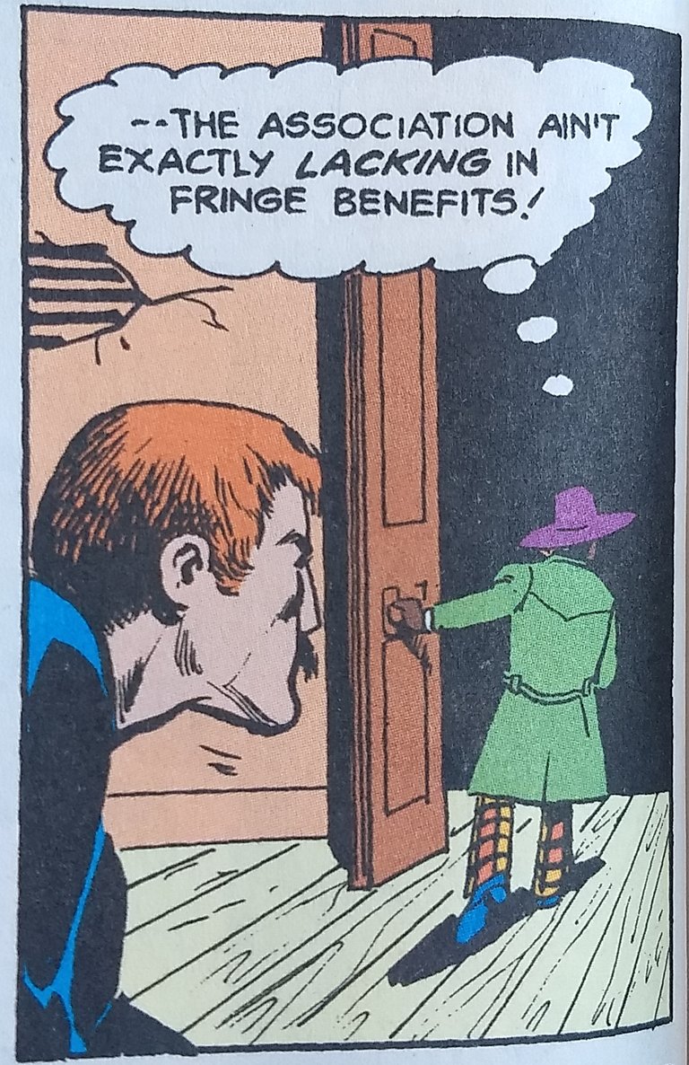
He is short, but is he really this short? Is anyone? Only in the Superflat. Below is an example of isometric perspective and the flattening process as exemplafied by Black Lightning. His rooftop sequences are the best.
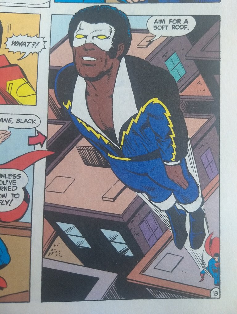
"Aim for a soft roof!" he says streakingthrough a jagged tangle of angles and squares.
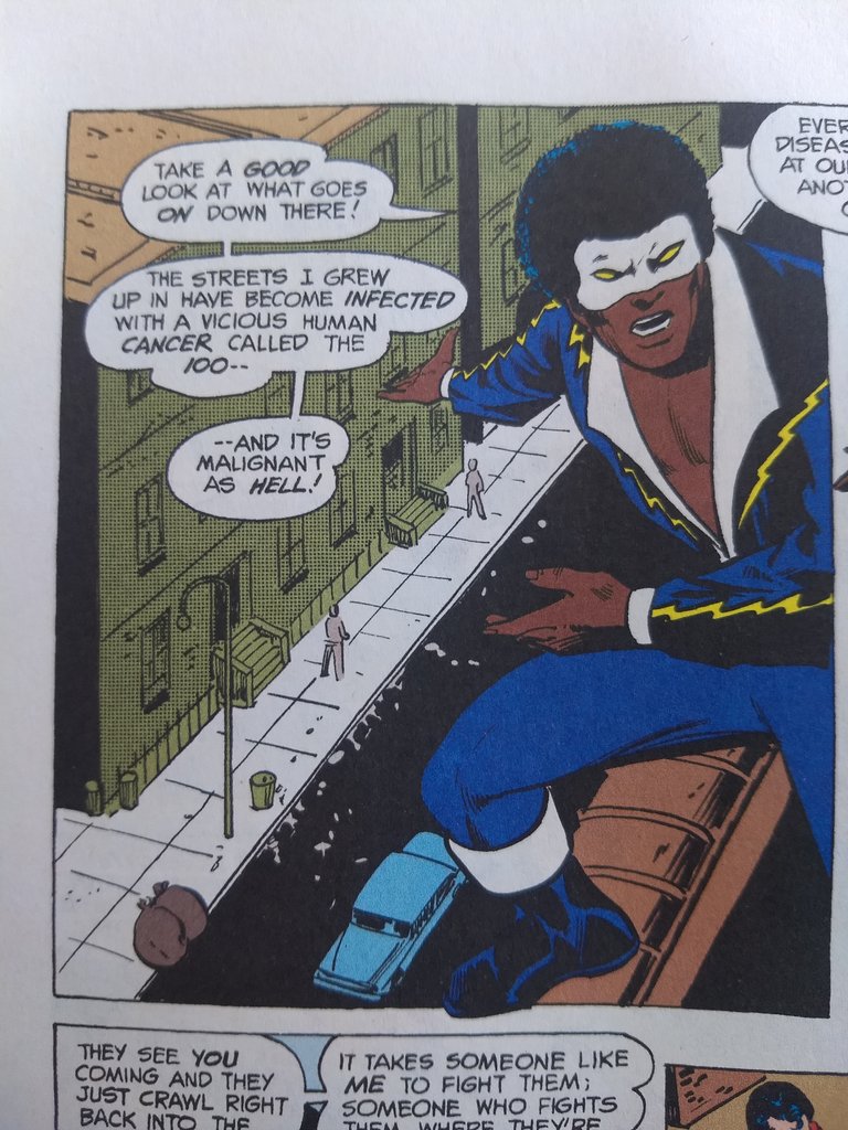
In this example it appears that he is stepping both on the rooftop and the street reducing everything in the panel to dollhouse proportions. It's also the panel where he gives his sermon on the flat. "Only I can save them, Supes, because crooks see you coming and hide, even though you have x-ray night vision and can fly through a brick wall faster than the speed of light."
The weakest part of all superhero comics are the fight sequences, for the most part. Yet, most superhero cartoonists put less effort into the mundane sequences, less realisation of the everyday, which makes the world flat and the fights even more tedious. This can be a good thing. Here's an example of a non-super powered dramatic shot that works wonderfully.
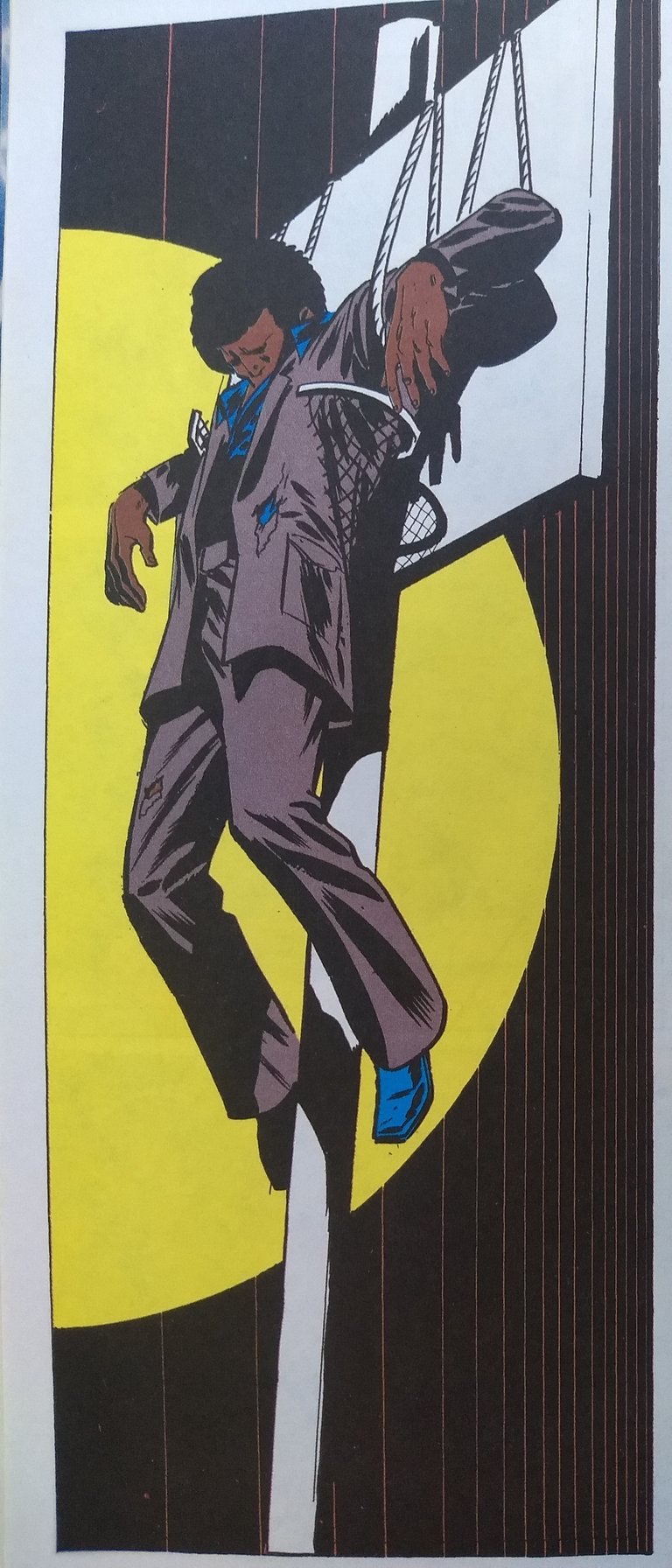
Yes, christ-figuration in a broken basketball hoop. Is there anything more hilariously half-assed? The melodrama radiates with glory. This panel triumphs over any of the following fight panels, just by graphical per alone. It gives even more rewards when you see how hard it tries to be taken seriously. Close the book. Nothing after this panel has any value.
Black Lighting not the collection.
It's full of delights if you know which delights that you're looking for. I have helped you detect some. read it yourself and when you find more, share them with me.
the tags list on Steemit is generated by code...which puts tags up there based on ONLY popularity of use. You will notice that #comics does not exist there...yet. So I ASK THAT YOU USE #comics ON EVERY COMMENT YOU LEAVE ON MY BLOGS
Sup Dork! Enjoy the upvote!!!
This post was shared in the Curation Collective Discord community for curators, and upvoted and resteemed by the @c-squared community account after manual review.
@c-squared runs a community witness. Please consider using one of your witness votes on us here
Thank you very much. I appreciate the support.