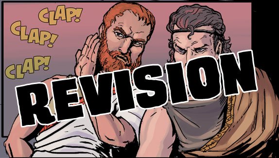
My last post here asked about a font change I was thinking about. I didn't get a very large response, but I decided to make that change, and otherwise improve some of the lettering.
Take a look at the comparison:
Original
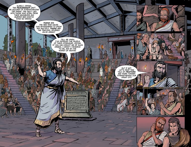
Revised
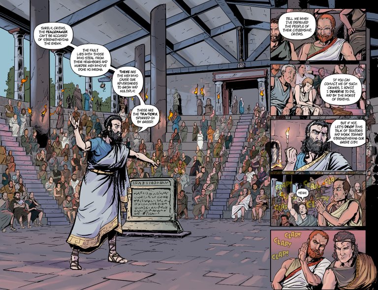
Original
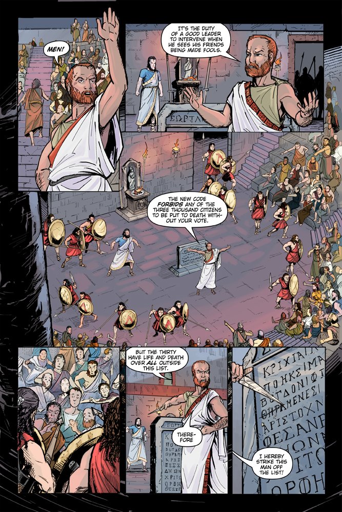
Revised
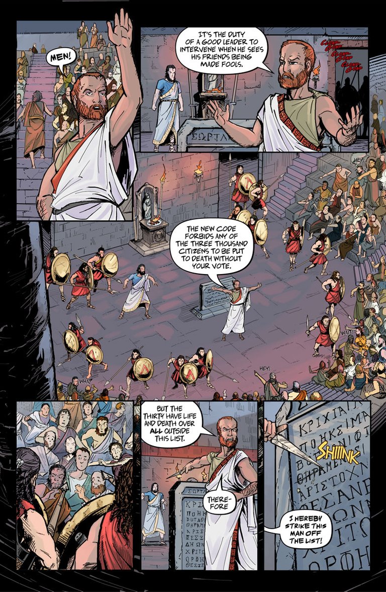
I added some SFX, changed the font, massaged the bubbles, and slightly thickened up the panel borders.
What do you think? Improved, or am I spinning my wheels?
Art by Daniel Becker.
Previous colored pages: Page 14-15 | Page 16 | Page 17 | Page 18 | Page 19
Thanks for your support and any feedback! Your upvote is definitely appreciated. I hope you'll stick around and watch it all come together.

I like the revised one better, has a Greek-er feel to it, in my opinion.
Also come back to steem! Been missing you man! Fundition is dropping some big votes, you gotta get in on that!
Miss your posts man!
Hope you are doing well 😃
Also prefer the revised one, is more spaced and easier to read 👍👍
Congratulations @jpgaltmiller! You received a personal award!
Click here to view your Board
Congratulations @jpgaltmiller! You received a personal award!
You can view your badges on your Steem Board and compare to others on the Steem Ranking
Vote for @Steemitboard as a witness to get one more award and increased upvotes!