Hello my dear hivians!
How are you feeling tonight? Hoping from the bottom of my heart your answer to that question is "more than alright!"
I'm going to show you guys this time a project I finished a couple of weeks ago. I was sort of "hired" as a freelance illustrator to make a character design for a marketing agency.
The task was simple, they gave me four previously written descriptions of four different people, all of them with distinct characteristics including age, jobs, personality, and digital marketing level of skill.
Also, I was limited to use only 3 colors. Dark blue, turquoise and white: the colors of the brand.
This was the final design for each of them.
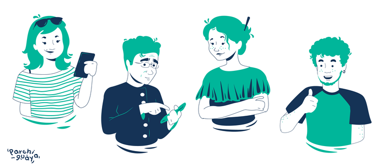
Each of these characters was made up as a publicity strategy from my employers. The main idea was to imagine very specific scenarios where people would need the assistant of this marketing agency to make their businesses grow.
First, we have Manu, described as a 26-year-old girl that has a brilliant idea for a start-up business but she doesn't know how to start to make it come true.

She is supposed to be very skilled when it comes to social media, so I drew her using her phone.
I made the first handover, and they asked me to change her clothes, to be more youthful.
This was the final result.

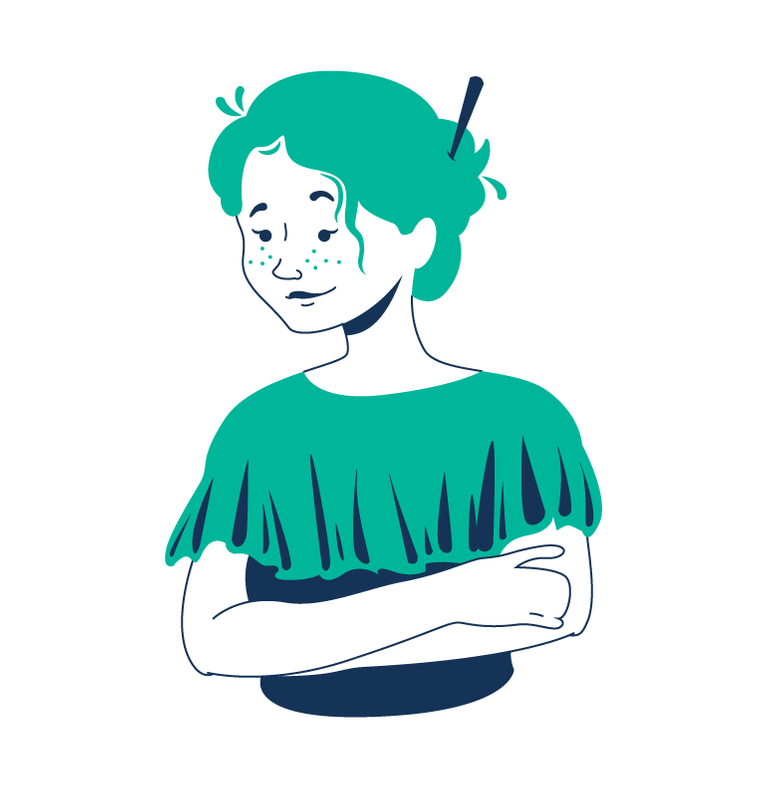
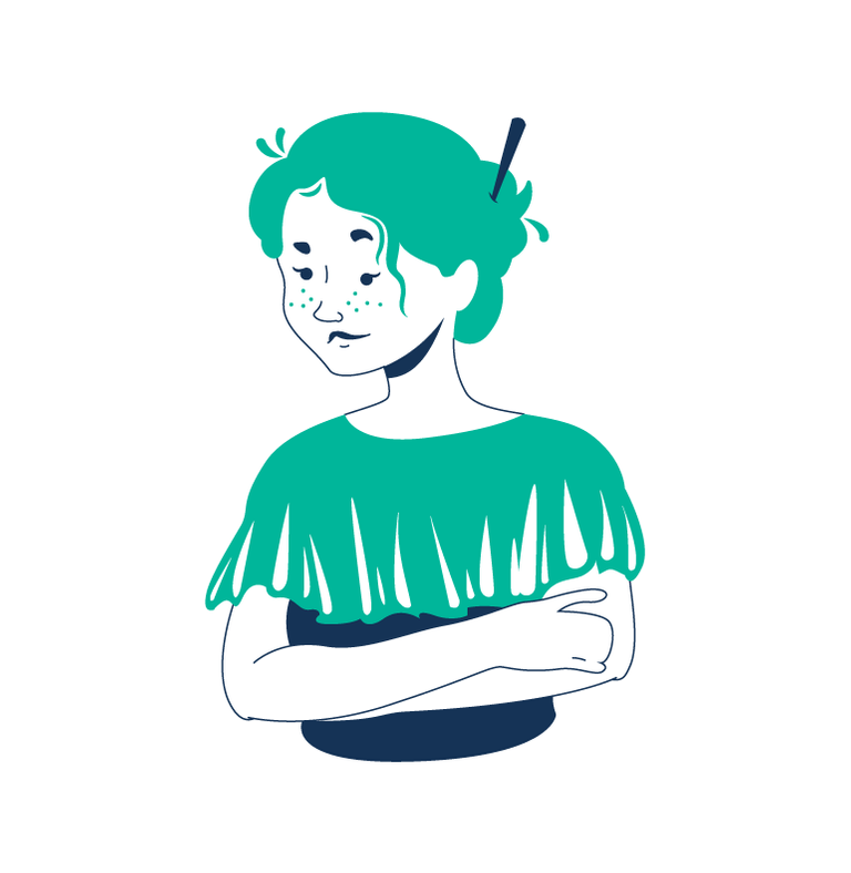
Next, we have Aurora, a 35-year-old woman that owns a textile factory. She already had all the tools necessary to make her business good. However, the results are not like she expected them to be.

After the first revision, they told me she looked kind of angry.
So I corrected her eyebrows and mouth to achieve a happier look.
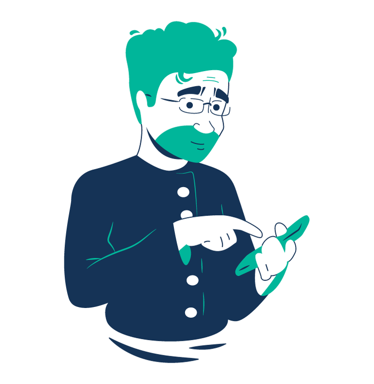
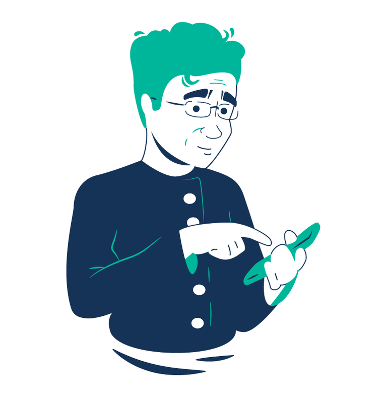
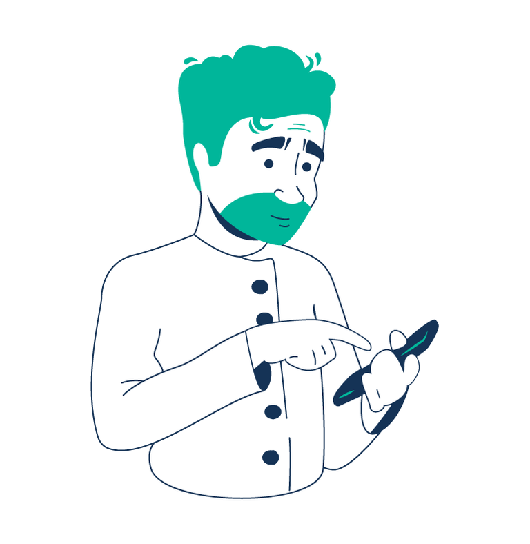
Next up, it's Moisés. A 43-year-old cook. He's a great chef but very unskilled about social media topics.
First revision.
They asked me to remove the beard.
And finally here's Camilo, a 23 y/o young man that handles his uncle's business social media profiles.
I imagined him very funny and charismatic because of his age, so THUMBS UP! 👍 👍 👍 👍 👍

I made a few alternate versions, just in case my employers liked it better that way.
Aurora's:
Making the wrinkles in her blouse white.
Moisés' :
With no glasses and a white chef suit.
Camilo's:
With no beard.

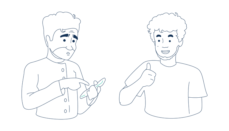
Some of the lineworks before applying the colors :)

Thank you for reading!

All content is my own unless otherwise stated.
You work as a freelance illustrator? That is so cool. I love your character designs especially the choice colours. They are exquisite! Keep it up. Hugs
I think it's great, you have a lot of skill to develop this kind of work using only 3 colors.
Regards
Hahaha... I would have been surprised to see your color combination but l'm happy that you gave us the reason for that.
You were still creative enough to do it nicely despite the constraint you have by your employer. Freelancing is really a cool thing and you are doing it nicely.
Well Done Dear
I love that you demonstrated your images and then also showed the results of your revisions. Awesome.