Only two weeks left before our Public Beta release!
The Busy Team wish you a happy new year!
Since our previous December news, the Alpha has been through numerous updates and the last two weeks before the Beta will mostly be dedicated to polish/finish current features before our next milestone which includes:
- New features
- Post-Beta graphic redesign
- User interface and experience redesign/rework
- Global experience and navigation improvements
- Sign-up, with New playful Onboarding process
- Bootstrap the first steps of our marketing strategy to popularize Steem via Busy.org and reach mainstream adoption
To appeal to an early adopter audience, a platform needs to differentiate itself from every other failed "competitor." Steem (and Steemit) is the only blockchain based social media/network bootstrapping a cryptocurrency that has successfully launched a working product with proof-of-concept and growing community. Subsequently, as more early adopters join, the activity increases and a positive feedback effect is built.
Despite their >4M$ fundraising, Synereo is sinking with a broken team, a completely nonexistent product and their CEO/CTO fights, Decent and Yours showing nothing serious for more than a year. Even Lisk with more than 6M$ funds couldn't have a popular/working decentralized app running on their chain in 2016. Steem is starting 2017 with 6 month Beta, some important hard forks to improve our Blockchain and more than 100.000 accounts created. Steem and Steemit did a tremendous job getting a working product and early adopters to signup.
2017 is the Steem Year!
Appealing to an early adopter crowd is different from appealing to a mainstream audience. The early adopters tend to be more comfortable embracing risk while the mainstream audience tends to be more pragmatic. To reach a mainstream population, a platform needs to achieve both efficiency and effectiveness.
While early adopters may enjoy tinkering with a new technology, a mainstream audience needs a reliable mechanism for consuming interesting content. Imagine YouTube with a poor search algorithm or without a voting mechanism to separate the good from the bad, or a poor user interface/experience and low overall design experience. Well, the Steem team is working every day with the community to improve the existing model on the blockchain side, but Steemit.com and Busy.org goals are now more focus on User interface and experience and helping to make it more attractive for a mainstream audience as the blockchain grows.
After the Beta release, with all basics features working without issue, with Busy.org we will mainly focus on having the most attractive and friendly platform by drawing conclusions from the last 6 month of Steemit.com Beta and our 2 month Alpha. We are hiring very talented and creative minds to work on UI/UX and marketing strategy, reaching and on-boarding new users. After that, our important milestone is the Marketplace for goods and services.
Alpha Release updates
Monday 5th December we started our closed Alpha version (invitation-only).
150 steemians were invited to test our under-construction platform. We’re getting a lot of valuable feedbacks and many words of encouragement and support. Thank you so much! It gives the Busy team force and motivation to achieve our goals.
We are adding new users on a weekly basis. If you want to join the Alpha and the Beta test release, please register with your email on https://busy.org, join #busy on steemit.chat and PM @ekitcho. The platform will open for everyone to test from 1st February 2017. Tomorrow, 150 other steemians from the list will be invited to the last 2 weeks of the private Alpha.
We decided to deploy several fixes and new features directly on the Alpha so selected testers could directly try these enhancements.
https://github.com/adcpm/busy/commits/master
Recent updates
New Layout (List)
Adding different layout to display the content is definitely important. It gives the users the ability to choose among Feed (Facebook Style), List (More like Reddit/Steemit style), Grid (Pinterest style). We are also discussing for re-creating a specific and custom Busy layout.
The Card view (Feed) allow better navigation in filtered content with good embed (featured image/content) like Photography, Videos, etc. But it requires more scrolling to browse the content.
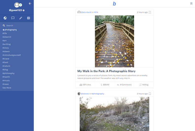
We implemented the List view which is more convenient to rapidly browse the content. This is a first test and highly abbreviated version. It will be improved after the Beta and our UI/UX redesign.
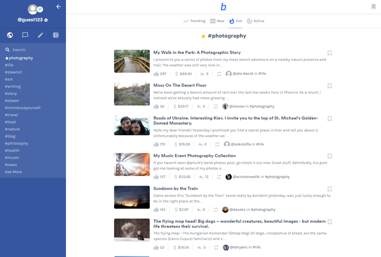
New improved Editor
The New editor is available to test in our Alpha.
- Menu/Editor on text selection (Bold/Italic/H1/H2/Quote/Code)
- Keyboard Shortcut (CTRL+b / CTRL+i)

- Instant markdown conversion (v1)
- In-post Direct image upload
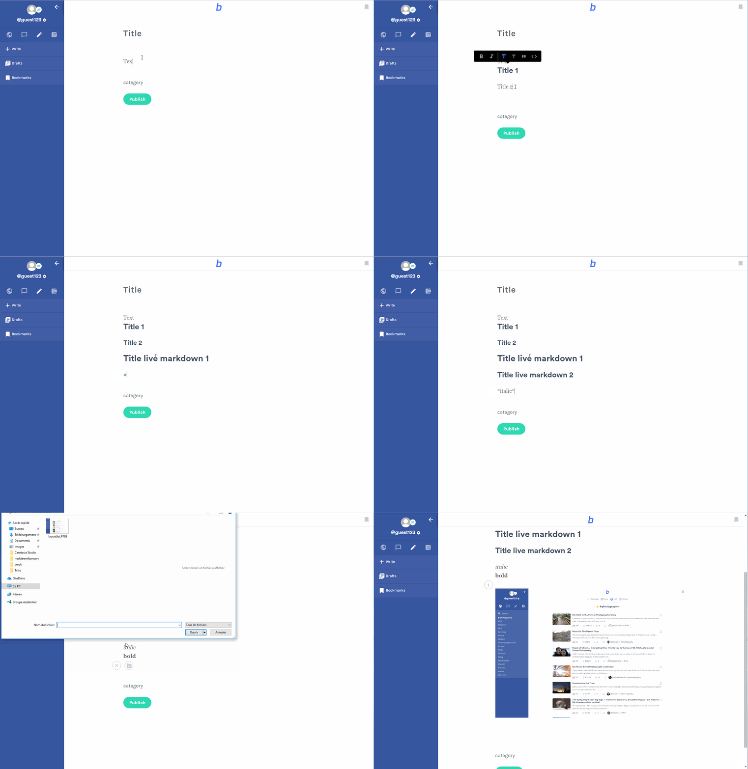
Draft Manager
The New editor is available to test in our Alpha.
- Auto-save of any started post in the Draft Manager
- Quick access/edit/delete to your saved Draft
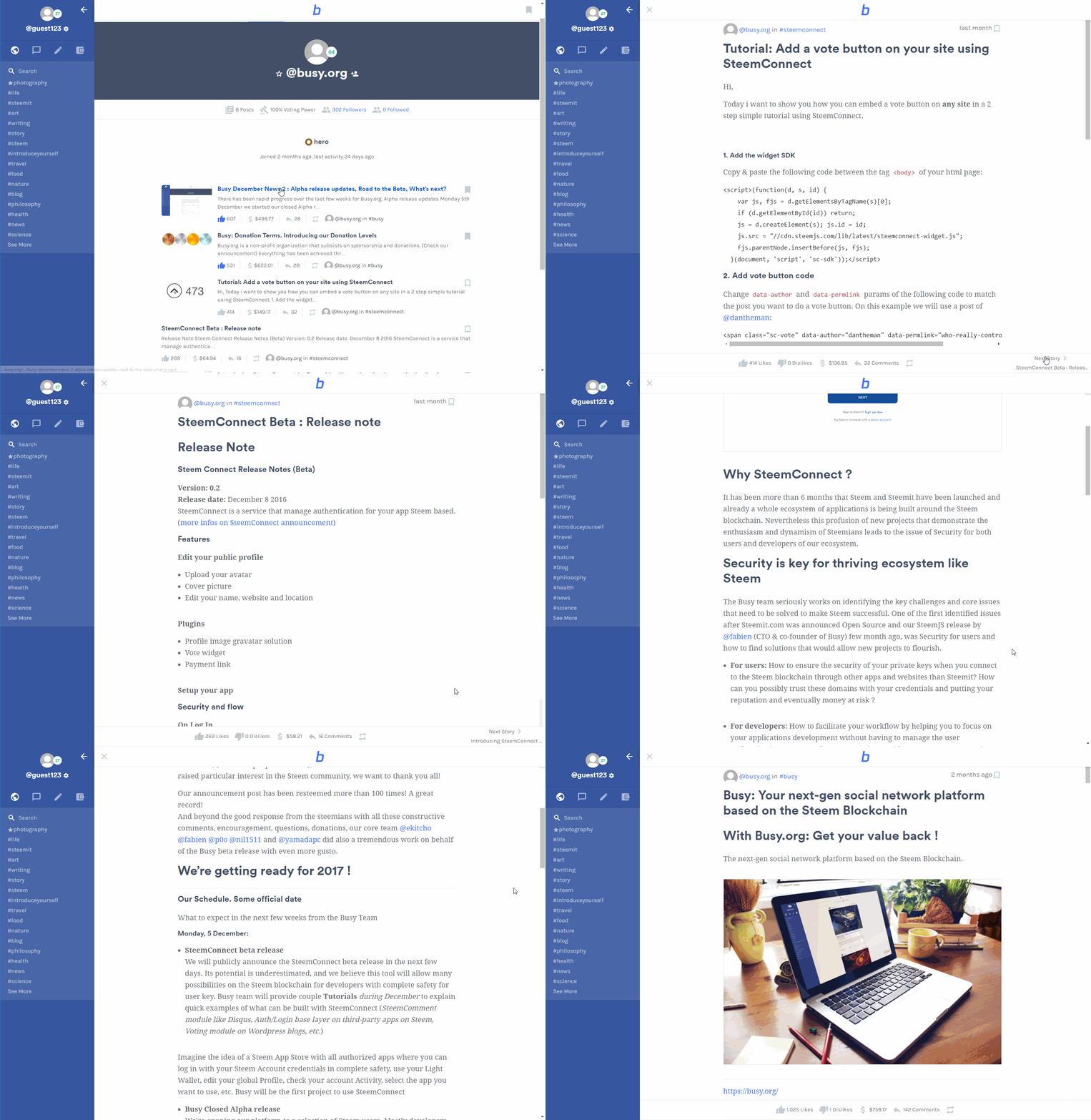
Improved Navigation (Next Story)
For a better user experience we added a Next Story button.
In a specific post you can directly access to the next post with this quick-access button. For example if you are on trending/photography and open the first post, you'll be able to browse all post from this category directly from the first one. Same for user Profile/ Blog page: in this demo, we're navigating though @busy.org blog posts by clicking the Next Story button.
Transfer (via SteemJs)
We are testing a new Transfer feature implemented on Busy with SteemJs.
Public Beta Release
Wednesday, February 1 we will publish the official Public Beta release URL on @busy.org.
Everyone will have access to our Beta to test the platform.
You are free to post any feedback by using the #busy tag. Most consistent and complete feedbacks will be rewarded by Busy.
Donation updates
On December 2016 we announced an introduction to our Donation Terms and had a nice response from the community. We decided to implement the Busy Donor badge on Profile, and Busy Donor list.
The team is still deeply discussing the idea of having greater benefits for our Donors and is working towards this end. As we mostly rely on Donations, for now, it's important for Busy to find the best way to incentivize it.
Donation to Busy Development from September to today January 16
| Level | Donation Range | Donor(s) (SBD) |
|---|---|---|
| Bronze | 20-500 SBD | @liondani (258), @delegate.lafona (200), @donkeypong (124), @furion (85), @theprophet0 (80), @steemship (85), @pfunk (30), @twinner (30), @deanliu (25), @craig-grant (20), @teamsteem, @fulltimegeek, @shortcut, @hql2016, @hanshotfirst, @exyle, @sweetsssj, @bears |
| Silver | 500-5K SBD | @cass (1.5K), @bhuz (800) |
| Gold | 5K-25K SBD | @smooth (17K), @jamesc (15K) |
| Platinum | 25K-50K SBD | @steemit (25K) |
| Diamond | >50K SBD | / |
Busy support the "Multiple Arbitrary Beneficiaries to Reward Payouts" of Steem 0.17 change proposal introduction
https://steemit.com/steem/@steemitblog/steem-0-17-change-proposal-introduction
For any given post there can be a half-dozen different people who have a financial interest in the reward. The include: voters, author, referrers, hosting providers, blogs that embedded blockchain comments, and tool developers. Whatever website or tool that is used to construct a post or comment will have the power to set how rewards from that comment are divided among various parties.
This means that if you post via Busy.org that your post will share some of its rewards with Busy. If you post through the various phone and/or desktop apps then the app developer will be able to claim some of the rewards.
@steemitblog
The funds received from this blockchain enhancement will be redirected into a our development fund that can help bootstrap new features and services and cover Busy expenses and development. It will allow Busy to reduce our reliance on Donations, and become viable and autonomous.
We are looking forward to implementing it, but our top priority is to build a good platform that can appeal to a mainstream audience.
What’s next?
The Beta release is only the first step of the Busy project.
Our goal is to prove that we have the appropriate, qualified resources and vision to bring new value-adding, with the strength and responsiveness that our ecosystem needs to succeed.
Busy is still discussing different possibilities to get the required funding. It will allow us to work on our 2017 Roadmap and complete platform. (need at least 200K SBD)
Steemit Inc decides to support us a few more month with some Donations until we can define our viable model. Thanks to @ned & @dantheman, we are very grateful for this support.
After the Beta release (assuming that adequate funding will be available at next stage), our plan is to work on
- Busy Marketplace for product and services as a platform
- Design enhancements UI/UX rework-redesign
- Playful Onboarding process of new users / Improved Sign up
- Busy marketing strategy to bring new users on the Steem blockchain (make Steem more user-friendly, easy to understand and adopt via Busy, aim mainstream adoption, friend invitation, work on user retention, etc.)
- Make SteemJS and SteemConnect official with the help of the community and Steemit inc, Steem core team
All rewards from the @busy.org account and donations will be used to fund our projects
Links
- Transfer test with SteemJS (Busy Donation)
- ITW of @ekitcho, CEO of Busy.org by @infovore and SteemMag
- Busy Github
Thanks to : Geoffrey Moore, James Calfee, smooth, Ned, Dan, liondani, lafona, snowflake, teamsteem, krnel, and all people who are helping us everyday with good advice, support or donation. We love you.
Looking good. How will downvotes/"flags" be handled (displayed, explained, etc) on the platform?
for now we plan to try a Like/Dislike model (@fabien idea, you're free to PM him to discuss about it ;))
Just a thought, but I don't know about this one, because "Dislike" doesn't always equate to what some consider "Flag" worthy, and it was always something that bugged me with facebook until at least they more recently added a few more possible actions (ie. angry, sad, wow, haha, love). I'd like to see a headshake in there too.
But, for an example:
"50 dead in forest fire" ... Do you really want to "Like" this?
27 Likes - 599 Dislikes - 0 flags
Good point alex. Changing it to "upvote/downvote" shouldn't be that big of a deal if necessary I guess. Edit: Now included in the first comment.
I'm very positive to such a model. Good to hear!
Edit: See below possible issues with "liking" content.
We probably will show both downvote and flag with a different weight, see discussion here: https://steemit.com/flagging/@timcliff/flagging#@jamesc/re-timcliff-flagging-20170117t143039503z
Awesome to hear!
The issue with "flags" right now is that they are considered offensive and at the same time even Dan want's to use them to subjectively disagree with and lower rewards. To me and users I've talked to that's problematic for onboarding and clearity in general, because users from other platforms already use "real" flags in a whole other way.
That's why I'm positive to the recent changes of guidelines for "flagging" here on Steemit, but would also want to see the flag icon be replaced by a downvote button and weigthing changed as soon as possible.
(I commented on the post you linked as well, but should it be of interest, you can find my better comments on the issue under the other 3 latest resteemed posts in my blog as well)
/Thomas
I am quite excited to take it for a test drive!
I really look forward to the official release. Thank you for the updates. I'm glad to see everything going well on the development side.
Thank you very much for the mention! I really appreciate it.
Keep up the good work guys!
I have one problem with these announcements: they get me so excited I can hardly concentrate on my work :-)
Seriously guys, this might be really huge...
Wow, these news are sending electricity up my spine and tingles fire up my brain!!! This is so awesome, thanks for sharing these updates with us. What an amazing amount of great work the team as put in the last few months! All for one and one for all!!! Namaste :)
Waiting for my Steem to convert into SBD, will be donating after. I need one of those donating badges :) you are doing great work guys! Just cant wait to start using Busy.org
Good to see over $1000 payout again!
:D
Happy New Year to @busy.org team, thank you for the update, being able to switch between feed, list or grid is a great feature !...just one question, i would like to make a donation but doesn't have enough Steem or SBD , is there another way ?
depending on the amount you can contact me at christopher@busy.org or on steemit.chat @ekitcho
Thanks for your support
I have not seen a $1000+ payout in far too long, and judging from the pennies I have been receiving from my posts, I was starting to doubt there was even that much in the daily payout-pot.
It's wonderful to see the payouts picking up again, and in this case, being allocated towards a terrific cause that I suspect will help Steemit exponentially.
Awesome work. You guys are doing great. We're all looking forward to Busy!
This is great! Looking forward to the launch. :)
Excited about this one guys, busy.org is bringing in more support for fork changes and some nice improvements. Everything that attracts more users to steemit is a huge benefit to us all. Keep it up!
Great work. Resteemed :-)
Excellent news!
Thank you for working so hard on this! I think this will mean awesome things for the community!
Hi @busy.org, I just stopped back to let you know your post was one of my favourite reads today/yesterday and I included it in my Steemit Ramble. You can read what I wrote about your post here.
Will there be a release tomorrow?
Yes!
Your thoughts on akasha?
Guys do you ever sleep? Fantastic work !
Very cool! :-) I am a returning steemit user. Looking forward to busy's release :-)
This looks excellent. I am looking forward to see it public :)
Will features from busy migrate to Steemit?
Is busy on the steemit blockchain?
Will busy users be rewarded in steem?
I am trying to catch up, but those are my initial questions.
Short answers:
I'm not a developer, but I hope so.
Neither Busy nor Steemit are themselves on the blockchain, but are simply tools used to access the Steem blockchain.
Given the above, Yes.
A just so slightly more technical answer what Busy/Steemit is in relation the blockchain:
I would say that for example steemit.com is to be considered a form of "open contract", that relates to a resource (The Steem blockchain).
You as a user can choose to use (sign) this open contract/steemit.com in order to access the Steem blockchain. If you want to and support it's maintance and developement.
By using steemit.com you accept the rules regarding passwords that most likely were displayed to you when you signed up ("The first rule of Steemit is: Do not lose your password") and up until recently there was also an info box for downvotes ("flags") on this user interface/contract, that informed you about what the "flag" ought to be used for.
... Now Busy, is another contract, where certain features such as flags/downvotes/smileys/goofey effects may have been removed/added to make things better for you as the person "signing the contract" each day by using the platform to access the blockchain. When using Busy, you don't need to consider any rules/guidelines given by Steemit.
Ultimately, it's up to you what platform you want to you use - or open contract you want to sign, so to speak.
Great answer. Thank you.
You're welcome.
Great work. Busy will be yet another foundation stone in the steem economy. Can't wait to see it launch!
Make friends steemit friends who are in aceh follow @ herman2141. And in the vote yes friends
What's the benefit in going to Busy.org as opposed to using Steemit.com? If Busy and Steemit is one of the same except for the user interface and the look, why go to Busy at all? What purpose does it serve?
I think i answered to your question already 21 days ago on another post (from you..) :)
you answered also yourself in the question by saying "except user interface and the look", yes, but it's mostly the reason for which you can buy different phone on android for example. Some may prefer Samsung design than Huawei, other just prefer iOS and Apple. After all it's the same use : phone calls, sms, internet, apps. So what's the benefit ? Offer different choices for different people/vision. And yes, the user interface/experience and the look does count ;)
Thanks again, guys! This completely answered my repetitive question =D
I would say that for example steemit.com is to be considered a form of "open contract", that relates to a resource (The Steem blockchain).
You as a user can choose to use (sign) this open contract/steemit.com in order to access the Steem blockchain. If you want to and support it's maintance and developement.
By using steemit.com you accept the rules regarding passwords that most likely were displayed to you when you signed up ("The first rule of Steemit is: Do not lose your password") and up until recently there was also an info box for downvotes ("flags") on this user interface/contract, that informed you about what the "flag" ought to be used for.
... Now Busy, is another contract, where certain features such as flags/downvotes/smileys/goofey effects may have been removed/added to make things better for you as the person "signing the contract" each day by using the platform to access the blockchain. When using Busy, you don't need to consider any rules/guidelines given by Steemit.
Ultimately, it's up to you what platform you want to you use - or open contract you want to sign, so to speak.
Don't get me wrong, I have huge respect for all Steem developers. But even Busy UI seems late 90's or early 2000's.(Steemit is early-middle 90's) Compare to beauty of Akasha, Busy is not beautiful enough to give good impression to users, consequently not attractive to ordinary users. Akasha has Bogdan, who is very impressive digital artist. I really think Steem should hire digital artist ASAP. It's matter of die or live.
What you see there is 20% if the Busy design potential. We are far from having our final design product. This is an Alpha version in which we focused on main features like posting, voting, and not the design/interface or real user experience.
90/2000 i'm not sure if you know what you're talking about. Unless Facebook, Slack, Rocketchat, are from 90's, dont get me wrong, this is the design trends 2010-2015, not 90-2000 even if i could agree on the fix sidebar/iframe early 90 style. But we could discuss this for hours. I've seen Akasha and it does not surprise me at all, wait & see Busy in few month after our redesign...
you'll be surprised ;)
Also i'd like to add that ordinary users dont necessarily like futuristic designs.. they mostly like to use what they're familiar with.
I'm not sure what you are talking about, busy's design is modern, clean and simple. Tool bar on the side is excellent to avoid overloading interface and you can even hide it completely which is great . Akasha UI looks like this I'm curious why do you think Akasha's interface is beautiful while busy's is not ?
I must say I consider the Akasha sidebar to look more "uplifting" somehow, which probably has to do with the colors used. Whereas the Busy sidebar looks good, it is a bit darker in color and the text doesn't stand out as clearly.
Excellent news! I really like the way this project is unfolding. Keep up the good work!
It's looking great. Looking forward to what's coming.
Very exciting year ahead and I will be watching closely. The more teh community invests in each other and Steem Power, the stronger this will get. Time will tell.
Looks great!
I've registered from the start, but never had any notification to my e-mail.
Should I PM @ekitcho?
send me a PM on the chat with your email, i'll invite you in the next wave
Hi! Sent you DM, thanks!
Thank you for your great work, the gif's look already very promising. I can't wait for the launch.
Awesome work guys!
Awesome work! Look forward to checking this out soon.
Great work. Thank you!
Well done. By the way, not @bears donated 20 SBD, it was @beers :-)
will be corrected
thanks for your support ;)
gee is very nice and very brilliant your posts.
Nice work! Keep up the good work. Very excited about this platform.
F***K FACEBOOK!
Great job guys and thks for the updates. You are taking Steem in another level and that's what the community need. You can count on me.
great work !
I am so excited to try Busy out!!! It looks beautiful! Also, I am wondering if it's going to have a similar functionality to OpenBazaar...Like will we be able to create a storefront at some point on Busy?
This is really great. You guys are ahead of the race. Awesome!
Thanks to all of Busy's supporters * bow *
I'm looking forward to the beta release.
I am really looking forward to the beta release!
This is awesome, very excited for this!
Excelente trabajo, estoy ansioso de probarlo!
What's the difference with Steemit?
This looks amazing! Damn...
stupid fucking shill account