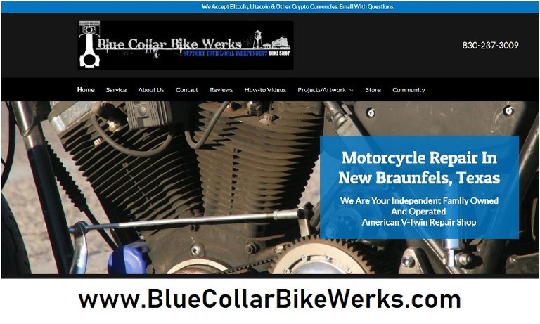
After a little more than a year of being down my business web page is back up and running.
I have been burned by website developers 3 times now in 8 years. Finally just did it all on my own. (Can't get locked out that way.)
Go Daddy has really upped their game in the last few years. We're a far cry from "Website Tonight"
https://bluecollarbikewerks.com/
Take a look if you don't mind. Give me some feedback. What you like. What you hate. What looks dumb. What needs more content.
The "store" is being built on square as I already have an account with them and its free and I don't have to add any merchant services.
The "community" tab will have some cool stuff in it including a customer upload section that will tie into social media.
Thanks for reading my blog.
Carry On, HM

Hey buddy just took a quick gander, I'll come back and look in more detail but just heading out for a run. My one comment right off the bat is slow loading time, could be hosting or could be the website builder. One thing I found is using lower quality images speeds up load times. I'll take another peek when I get back
Hmmm thats good to know. Most of the pics are pulled from social media so its very possible they are low quality. I have a laundry list of photos I need to take that is growing by the day.
Thanks for the feedback.
Some comments. The first photo is of a rusty cilinder. Ideally you would see here what your shop offers at first glance. So before and after or something more shiny? Adress phone and opening hrs I would make more prominent. Rest looks fine to me. Good tags is important to be found but I do not know hoe that works. Community advertising and mouth to mouth is as important . Plus fat upvote given!
Thank you some much for honest feedback. The cover pic is of my bike. All of my bikes are rusty. But that is a good idea. Need something shinier or more attractive. Because its not what I like its what the customer wants to see. Thats a valuable insight.
I agree I want the address and phone number to be more prominent. Unfortunately I am constrained by how Go Daddys template is set up. Thats the trade off for building software so easy a mechanic can do it. But I will research it and see if I can make those changes.
Thanks for the upvote man! Much appreciated. Got you a follow back and upvote as well #steemsilvergold is the BEST!
It looks pretty good and you have done well.
I used to own a bicycle shop in the 90's, and did a website for it in 98. We have a totally different business online now - http://www.naturefoods.co.nz
Ok now i'll start making suggestions. From the top down.
1- Ditch the crypto header - I know they are big on Steemit but in the real world very few people use them yet and that reminds people they will have to pay. Just put that in the about section.
2 - Make the Blue Collar logo bigger.
3 - take the blue box off the photo - It could replace the crypto header
4 - use a photo with a clean shiny engine
5 - make the photo gallery static so we can choose how long to look at each photo
Thanks for the valuable insights.
You are the first person to comment on the crypto header. I think most people miss it.
The blue background and the size of the logo are coded into the template I'm using. Trying to figure out a work around. That blue bugged me too.
I have a list of pics to take for the site and a shiny motor is at the top for the header picture.
That is a sick shovel cafe racer. We don't see those here much. Lots of FL shovels around.
I took a look at your health food page. Very organized and to the point. As an American I associate New Zealand as this unspoiled bastion of natural vigor. (Thank the Lord Of The Rings Trilogy for that) This definitely adds credibility to your health food rep. Promote that imagery and ideal as much as possible.
Hahahahahahah I forgot about that!
lol ;-)
Simple and to the point. I like it. Sometimes I hit a web site that's so damn confusing that it takes a bit to navigate it. Yours ain't like that so it's allgood with me. Reading through the comments I noticed the mention of your "rusty" bike front and center. I don't have any issues with it and I get it but most want to see shiny and pristine. Besides they don't know it's yours? Anyway it a small thing. The site works and so do the photos. Kudos brother!
Thanks man. I have a whole list of photos I need to reshoot and add. Most of whats on there was pulled from social media. It works for now but I want to make it better.
Now I have the POWER!
I like it!
Thanks homie.
@harleymechanix, I'm web developer by profession. I've checked website and it looks very simple. You can improve design by choosing great free templates and make necessary changes. All the best!
Yes it is simple. But its a work in progress. I don't know coding I'm a mechanic! Thanks for the input.
Thank you for your continued support of SteemSilverGold