Despite the departure of the children, it was unthinkable for this couple to leave the family home he had occupied for 25 years. Located in an upscale neighborhood, the vast house has been the scene of several great family events, parties and memorable celebrations.
The owners, on the eve of becoming grandparents, instead bet on the renovation of several rooms in the house. The idea is to modernize the kitchen, the office, the master bedroom and its private part, while respecting the classic architectural style prevailing elsewhere in the house.
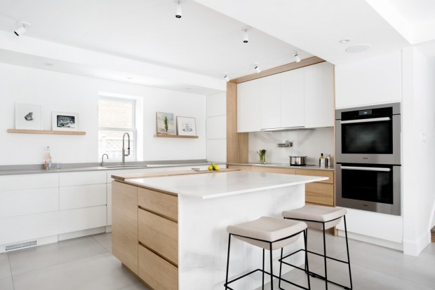
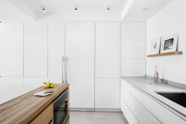
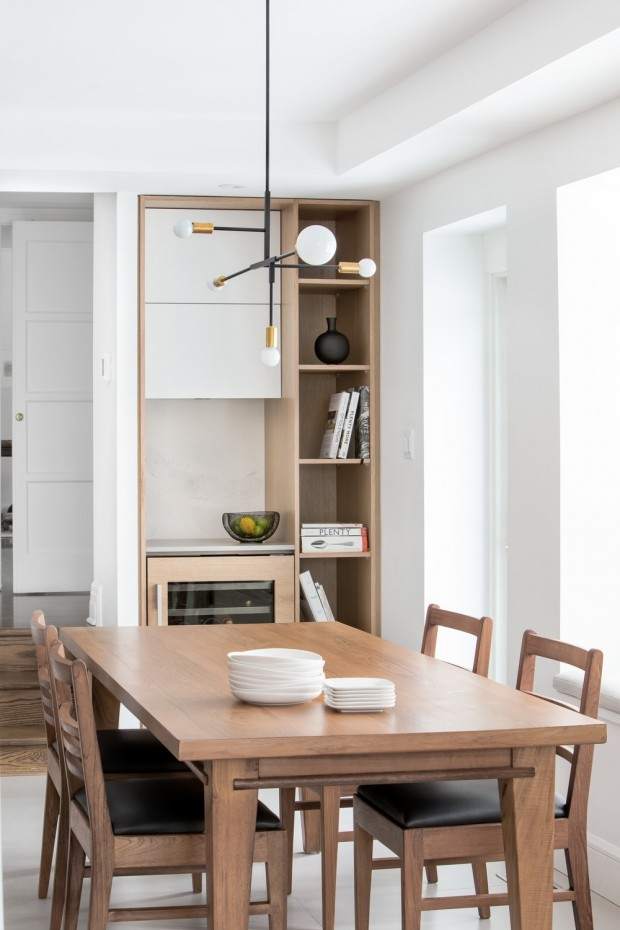
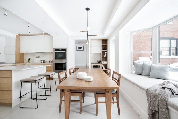
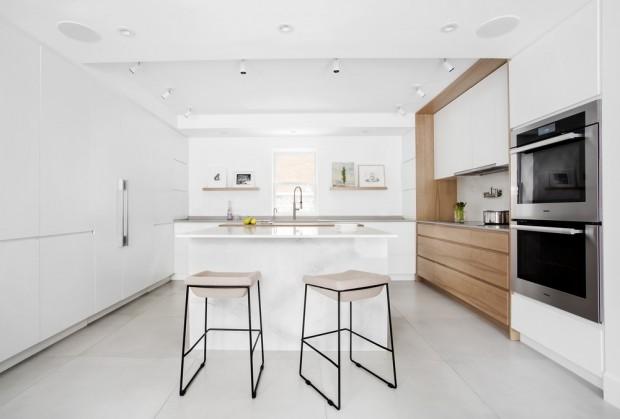
Since the kitchen had been set up in the garage during a previous renovation, the challenge was even greater. It had to start all over again to give the illusion of light and height and say goodbye to the low concrete ceiling, the ventilation ducts and the concrete walls. Today, white cabinets, arranged in whitewashed walnut, have replaced the old dark cabinets. The whiteness of counters and workspaces adds a new architectural dimension. The luminaire, installed above the large table, brings an industrial touch while the long strips of recessed LED lights compose an elegant ambient lighting.
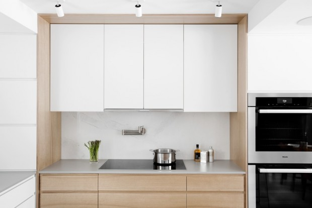
For cooking, two basic criteria had to be met: to design a space for ultra-efficient cooking and to accommodate small groups of guests or larger gatherings. Designers have opted for large cabinets in a matt white, to hide the appliances, offer plenty of storage space, and to contrast with the warm shades of blond wood. The smooth, handle-free cabinetry is a minimalist bias, while an ash block, integrated into the island, allows two people at the same time to prepare meals.
On the walls, wooden rails act as a mini-gallery allowing owners, art lovers, to modify at will the arrangement of objects or to replace them.
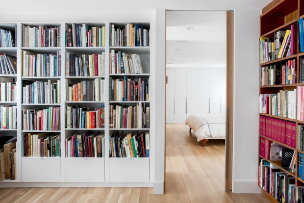
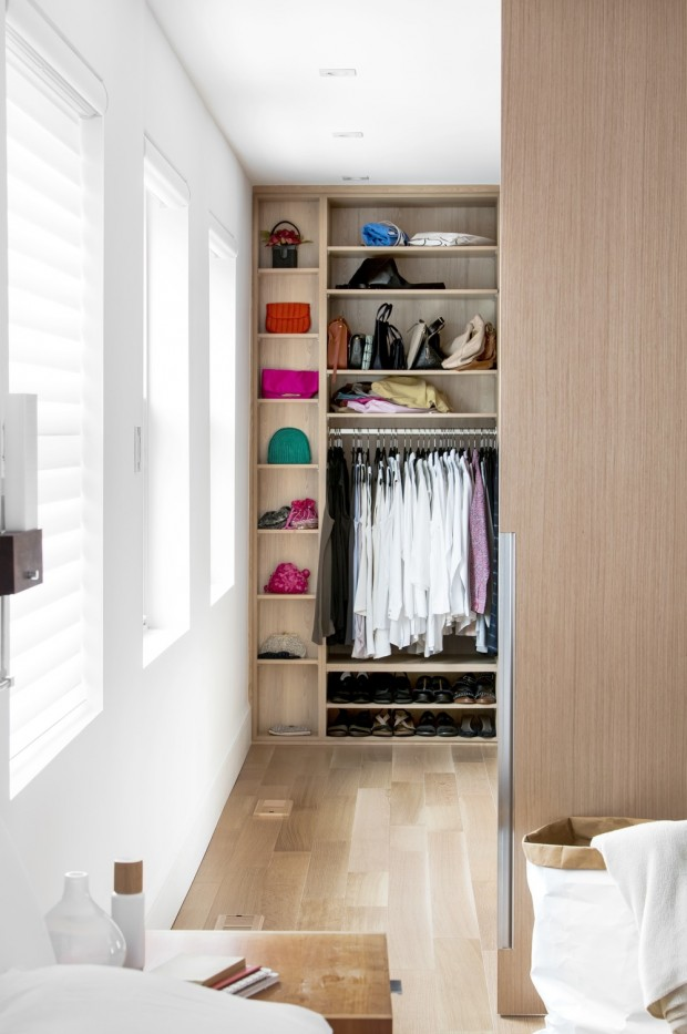
On the second floor, the walls have been moved and re-configured to provide a library, ample closets and a luxurious en-suite bedroom and walk-in closet. The bespoke teak bookcase, which overlooks the room, contains an impressive collection of drawings and art books. To eliminate the feeling of cut between parts, all openings have been increased to the maximum height and width.
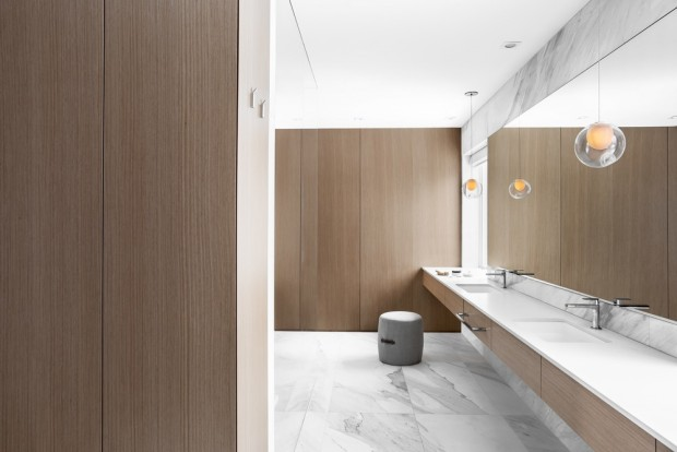
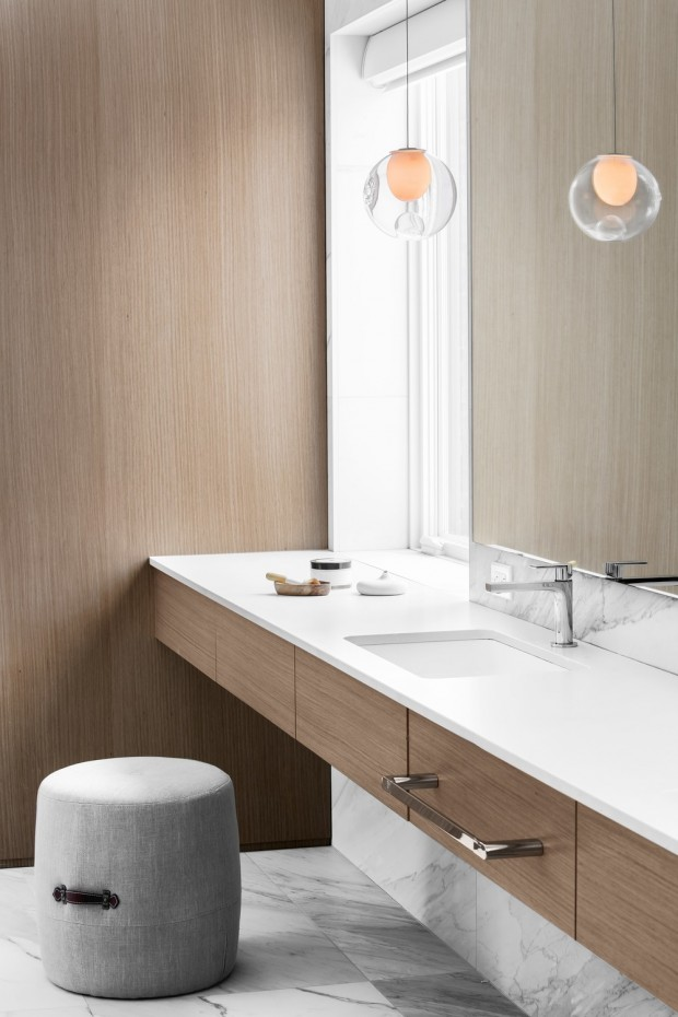
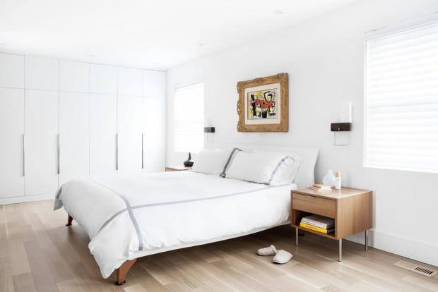
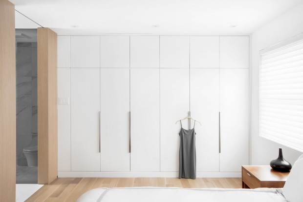
The master bedroom, with a minimalist design, combines classic and modern, unfolds on a white oak floor. Large white oak panels line the room and adorn the wall of the adjoining bathroom to form an almost invisible transition. The use of the same material offers a visual continuity and allows the unification of the two parts in one large volume. Access to the bathroom and dressing room through two entrances with sliding doors full height for more privacy.
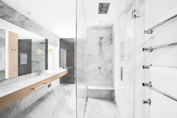
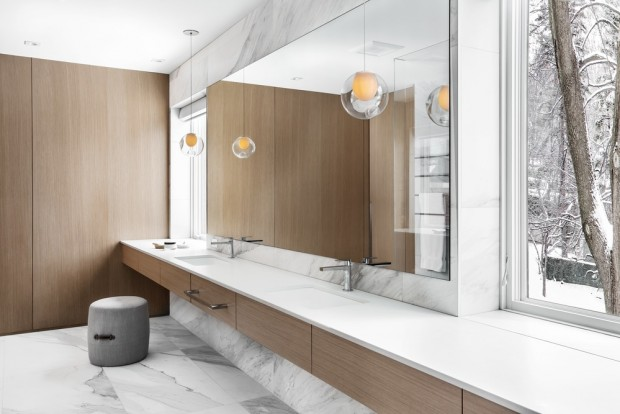
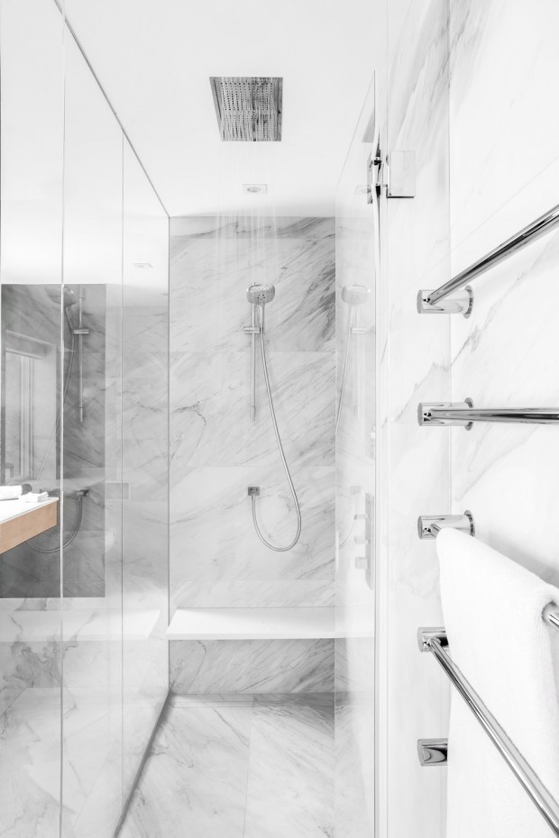
Large but warm, the bathroom is designed with materials with organic forms. Large-format porcelain tiles meet the classic features of the home by adding a modern touch. Each tile was laid according to its veins, so as to ensure a fluidity in the movement and a continuity between the walls and the walls.
floors. Responding to the wishes of the owners, the designers have designed an elongated counter 4.5 m long to accommodate the two sinks separated by a clear central space. Smoked gray glazed partitions recall the charcoal-colored veining of the tiles while contrasting with the wood finishes.

@OriginalWorks
The @OriginalWorks bot has determined this post by @lili123 to be original material and upvoted(1.5%) it!
To call @OriginalWorks, simply reply to any post with @originalworks or !originalworks in your message!