Summary
In 171101 we present a completely re-imagined voting area and made over 30 improvements including a few minor bug fixes. We still have some known issues with latency reporting on node selection that we will continue to pursue in future releases.
New and Improved
We've completely rewritten the voting area to adopt the same UI as the Dashboard. We also addressed some shortcomings of the previous UI
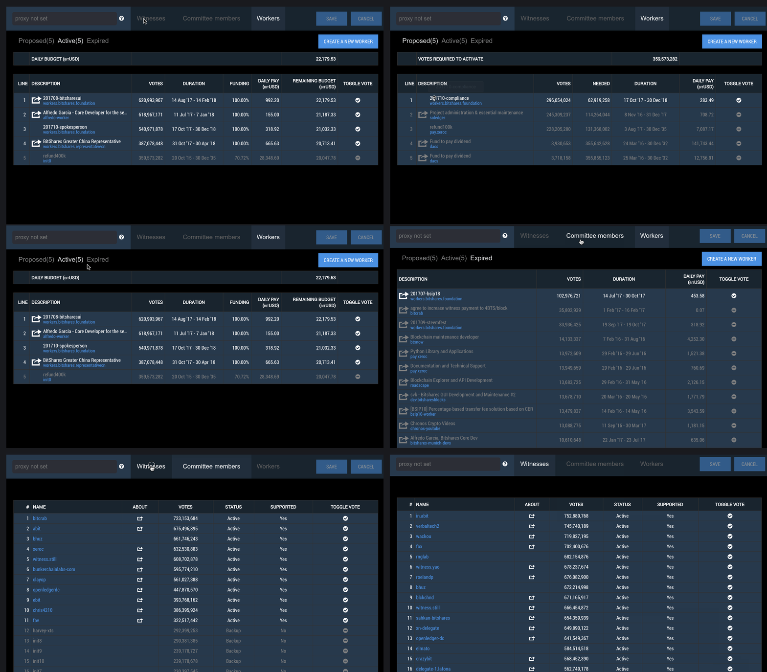
- Notification for Saving your vote is more prominent
- We removed a lot of the instructions but linked to updated help documentation
- Included line numbers for witnesses, committees and workers
- Separated workers into Proposed / Active / Expired
- Display votes required to activate
- Display total and remaining budget on active worker page
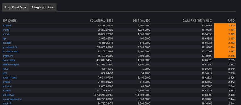
The asset explorer now shows Margin Positions with ratios. This means that cryptofresh is no longer the only source for viewing.
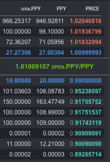
Your orders are now displayed in bold in the exchange order book
Connection Status has been added to the exchange area and clicking on it takes the user to the Settings screen.

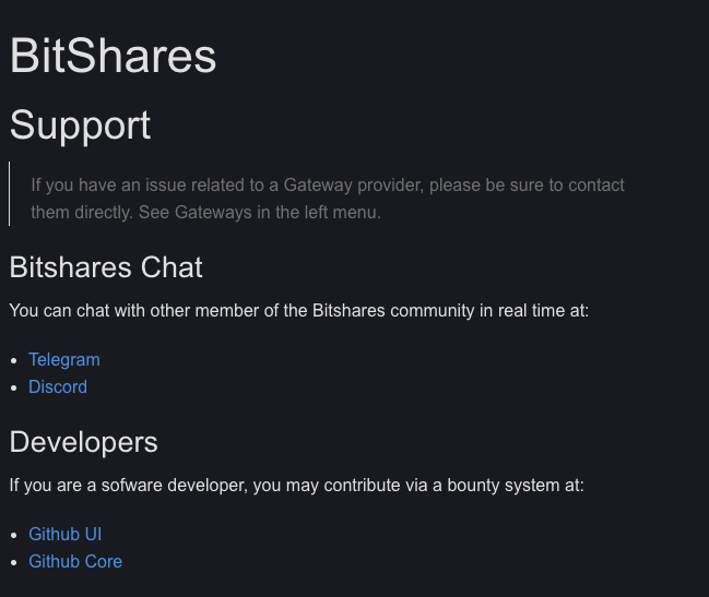
Trollbox has been completely removed and the help menu takes the user to help pages which contains links to Discord, Telegram and of course in-wallet help.
In cases where users switched from one trading pair to another on the exchange, order input fields would remain populated. Fields are now cleared appropriately.
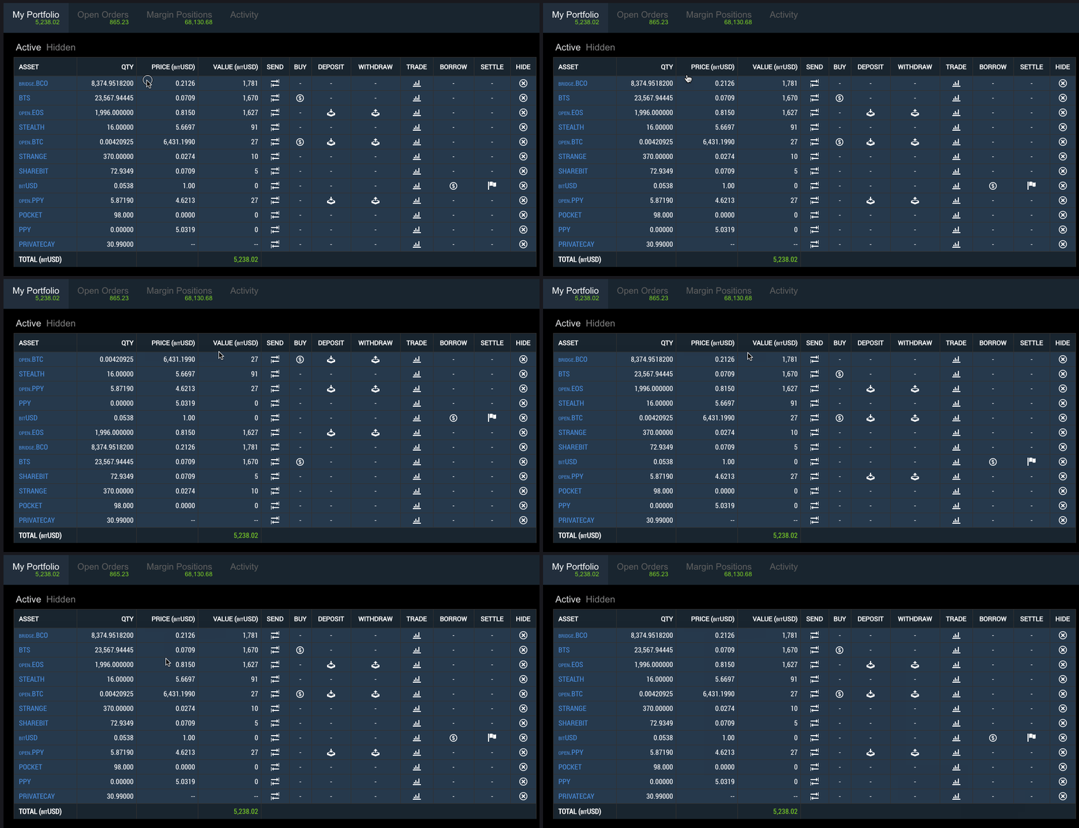
The Portfolio tab on the user dashboard is now sortable.
Announcement
In an effort to address a security concern, we are planning to migrate web users to https://wallet.bitshares.org from https://bitshares.org/wallet. This will happen at the next Sprint 171115. We plan to make it as easy as possible. No need to worry about this until that time.
Bitshares Light Client (Downloaded Client)
This won't affect you. Just download the newest version as usual
Cloud Wallet Users
All you need to do is change your bookmark to https://wallet.bitshares.org. You will need to reset all your preferred markets and for that we are sorry for the inconveience.
Local Wallet Users
If access a local wallet from https://bitshares.org/wallet, you will need to take a backup of your .bin file then import it into http://wallet.bitshares.org.
Future plans include:
- A new header menu
- Redesigned Deposit / Withdrawal / Send / Buy screens
- Tradingview integration
For a summary of bugs and features, check out the Release Page.
For a detailed view of all closed issues in the Sprint, check out the closed Milestone.
Downloads
Binary downloads for Linux, Windows and OS X are all located on this page in addition to the standard Bitshares Downloads location.
Web
- https://bitshares.org/wallet (deprecated)
- https://wallet.bitshares.org
Proceeds from this post will be divided among @svk and me.
Based on a few bug reports, we are releasing a hotfix today: https://github.com/bitshares/bitshares-ui/milestone/14
I have updated to the latest light client version but I can't find this "future" !
Asset Explorer
-->USDLook how I see your answer! Must be a bug! I can see it only right for 1 second after I refresh the page! (mozilla firefox on linux mint)
PM Could be a combination with the "night mode" I have chosen...
More than likely it's the
-->value since that can be used as an html comment.Do you still have the problem ? I have no problem with Chromium on Night Mode or not. You should update your Firefox browser to latest version.
And maybe the comments are not well escaped yet on Night Mode (since it is new).
Thanks for the update. I hope this fixes those orders that are being cancelled every time I book an order.
If you can reproduce the problem, take a licecap of it and post an issue.
Thanks for the reply @billbutler, I'll post it if it happens again. Right now I'm hodling all my $bts.
https://steemit.com/bitshares/@docmastery/bitshares-updated-its-giu-wallet-v2-0-171101-fixed-order-book-getting-canceled made a post and it's working great now thanks for the great update!
I'm a bittrex user, but if I can getr reliable service from bitshares and low commissions and transfer fees, I'll be glad to make the switch. I just hope the platform is equipped for larger volumes and is user friendly
It is equipped for large volume. We just need more traders like you to bring liquidity.
L I Q U I D I T Y !!!!
NEED MOAR !!!
Just make a good look for the UI and it will bring the traders!
@billbutler - why are some of the "Active Workers" greyed out while others are in a darker/bolder font? It's definitely not obvious what's causing the differentiation, as it doesn't appear to be based on what's been fully funded or not, nor what's active in terms of the duration / funding period.
If a line item has a checkmark by it and is in a lighter color, it means you or your proxy has voted for that entity. If it's gray and doesn't display a checkmark, it means you haven't voted fo them. Sorry it's not intuitive to you.
...but overall, very glad to see continued progress!! Very glad to see the order input fields change with the trading pairs.
Looking good Bill :)
I'm having issues cancelling orders using this build on Debian (Gnome Desktop). After confirming the order cancel it times-out, tried several times and the issue occurred every time. I've restarted the client several times. Going to revert back to the previous version for now but wanted to give you the report. All of the work done looks great and the UI has become more and more stable! I appreciate you guys! My only gripe (not nearly as important) is it would be nice if there was a minimum volume required to register movement on the candlestick chart. This would solve the problem of the faulty dust transactions (settlements) triggering huge candlesticks and appeared movement that never happened.
Actually I'm sorry guys it was the node I'm connected to! (for the cancel order issue) I feel like a big dumb dumb now haha.. Keep up the great work :)
Looks smooth as silk!
Excellent, this is massively valuable information!
Awesome feature developed by @sc-steemit
Keep up the excellent work guys, the UI is coming along nicely & the future looks bright :D
Thanks for the update, appreciated.
I look forward to trying it out and seeing the improvements first hand.
Bitshare is a very good service.This service is very useful for people of many countries.i hope it will fix other problems as well.I recommend this service to all people.
Esto lo espero con ancias: Integración de Tradingview
This looks really amazing! awesome work guys!!
Nice post
I am glad to see this update,... @steempower actually led me here by providing me a link.. you talk future plan in changing, renovating and adding new designs. Please do include me as one of the testers if you are looking for one.
now following.
Test away!
someone can explain me in a nutshell what is this about
https://bitshares.org
I'll check it thanks for the reply
Thanks to post
Wow! I like BitShares more every day. Good work, keep it up.
Sorry if I missed something obvious, but having a wallet at https://bitshares.openledger.info what if anything do I have to do to update?
The address your referring to is just the same program, but maintained updated by the openledger crew. They also use the BitShares UI front end. To be up to date, you can use the BitShares own front end hosted at https://wallet.bitshares.org or you can download it directly to your PC.
They are bit using the same logins and keys, so you can use whatever frontend you wish.
https://wallet.bitshares.org is also referred to as the reference wallet. It's essentially intended to be used as a template for any exchanges wishing to build on top of the bitshares DEX. In general, by using the reference wallet you should have the most up to User Interface.
This is amazing keep it up
https://steemit.com/abstract/@atsham/work-of-art-the-abstarct
Check it
Just take a look at Waves UI
Great !
I like bitshares, DEX is obviously the future of exchanges.
Not enough liquidity for the moment but TradingView integration is a great Idea !
How long for this feature ?
December
Congratulations, your post received one of the top 10 most powerful upvotes in the last 12 hours. You received an upvote from @thejohalfiles valued at 63.11 SBD, based on the pending payout at the time the data was extracted.
If you do not wish to receive these messages in future, reply with the word "stop".
Congratulations @billbutler, this post is the second most rewarded post (based on pending payouts) in the last 12 hours written by a Hero account holder (accounts that hold between 10 and 100 Mega Vests). The total number of posts by Hero account holders during this period was 252 and the total pending payments to posts in this category was $3283.68. To see the full list of highest paid posts across all accounts categories, click here.
If you do not wish to receive these messages in future, please reply stop to this comment.
Wowww
Amazing, love it. Thank you!
Sadly this is still confused and rough UI -- nothing has changed since 2015. I can told you that even the previous version was a little bit more aesthetic. It cannot be accepted for this great service and system. We are still waiting for more porfessional design to the exchange.
It's called progress. If you think it's the same as 2005, then you haven't bothered to look at it or see that we've closed out over 60 bugs and improved some broad UI elements. It's easy to tear down. If you aren't part of the solution, you are part of the problem.
great post I like this...really nice & mind touch blog😍😍
I simply love your articles, what great content and quality of posting you offer the community here on Steemit and abroad.
Thanks a lot :)
Good post, thank you..upvote
Good