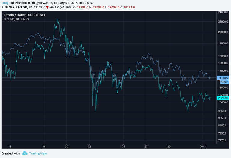
This is an example I made with BTC and LTC: they move in phase in the short time scale, but differ in the long term. In other words, their high frequency phases coincide, but the low frequencies don't.
You are viewing a single comment's thread from:

Actually there is very little correlation at the begining of the chart!
How did you manage to overlay those two charts? Ty in advance.
I use www.tradingview.com
When you are viewing an "interactive chart" you get a "weight scale" icon on the top bar, which is used for comparisons. Use that to add other coins to the chart. I used the line chart to make it more visible. Using handlebars results in a really difficult to read chart.
Ty mate