Bitcoin Lifetime Price Chart
The author is the source of this image
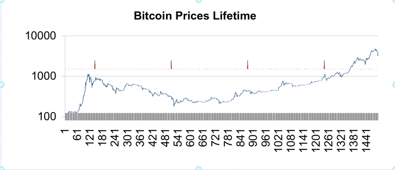
Ok, the prices began in April 2013. The red spikes on the chart mark January 1st of 2014 - 2017. The price scale on the left is logrithmic to aid in comparing price moves. The current correction could be just about over or at worst, like in 2014, could last for months.
Please vote and follow @toadslinger