I believe its about to bullish, but I am not sure which is why I am asking you @haejin's community for insight. If you scroll up in the comments, I posted an updated graph (Black background) in which I drew the slopes much better so that I can mimic the the triangle shown on @haejin's second tutorial. Looking forward to hearing a feedback! : )
I did this, but I am not sure which graph out of the list in your tutorial 2 explains this graph. Thank you @Haejin
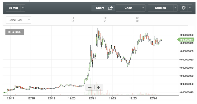
well to me this simply looks like a bullish triangle pattern which is about to take off, no?
I believe its about to bullish, but I am not sure which is why I am asking you @haejin's community for insight. If you scroll up in the comments, I posted an updated graph (Black background) in which I drew the slopes much better so that I can mimic the the triangle shown on @haejin's second tutorial. Looking forward to hearing a feedback! : )
Lol, it just went from 9,5 cent to 20.
I'm not experienced trader but I'll try to answer : Look like correction of big w1 is done, and that w1 of big w3 is correcting. Very bullish I think.