Disclaimer: I am not a financial advisor, this is not professional advice, only my opinion based on my own research. I am sharing for educational purposes only...invest, liquidate, HODL and/or SODL at your own risk...

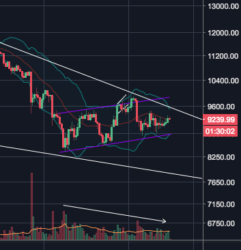
Above is a 2-hour chart showing Bitcoin's price action since 3/8/18, since the beginning of BTC's latest rally. Despite the moderate overall gains since the 8th, I do not think Bitcoin has finished correcting. Volume should be increasing with price action, this is a fundamental principle in Technical Analysis. As can be seen at the bottom of the picture, volume has been going down despite very dramatic bursts in both directions and overall upward movement.

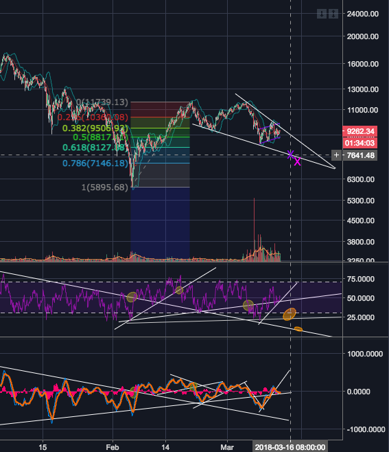
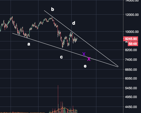
Above is a picture of displaying my first price prediction for the next lowest low, the purple X at approximately $7640. This is based on the belief that we are currently witnessing a falling wedge. This is outlined in white in the top chart. Falling wedges are a bullish indicator, but that is only upon completion of the pattern. This pattern has 5 turning points (abcde below), I observe that we have completed the first four. The decrease in volume as the wedge matures also confirms this pattern.

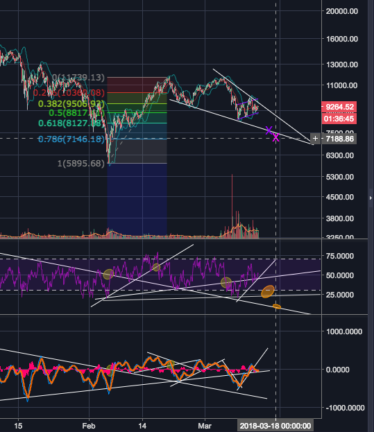
Below I show my second price prediction for the next lowest low, the pink X at approximately $7190. What the difference between my two predictions you ask? From a to b (on the above chart) took 7 days, from b to c took about 4 days, same for c to d. The purple X represents the intersection of the lower trend line of the falling wedge, half way between the .618 and .786 Fibonacci retracement levels, and the (conservative) speculation that from d to e will take 4 days. The pink X represents the intersection of the lower trendline, the .786 Fibonacci level, and the (potentially more realistic) speculation that from d to e will take 6 days.
The purple indicator underneath the main chart is RSI. The orange ovals show my predictions with regard to momentum that correspond with my price predictions. Trend lines work in similar ways on momentum indicators as they do on price charts.

Thank you