Bitcoin Price Analysis: Re-Test Before Move Up?

Foreword
This is an update on the price of Bitcoin. It seemed like this one was needed after the brief intermission between the last price update and this one.
In this piece, we’ll be discussing the potential rise of Bitcoin, its potential cap, as well as the alternative scenarios that may take place in the price action.
As always, understand that the information contained in here is strictly theory-based, and the curator of this piece does not advocate for any decisions to be made one way or another. The purpose of this piece is merely to inform you of the possible scenarios that can play out on Bitcoin in order to help stimulate your own, independent ideas.
Resistance and Support Points
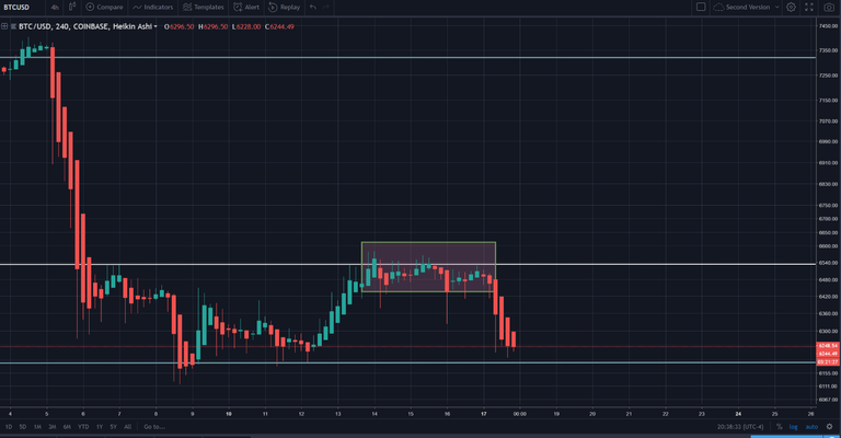
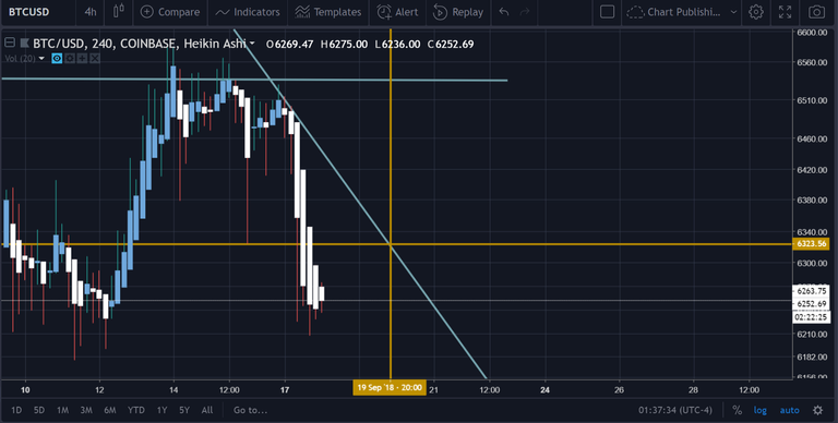
https://www.tradingview.com/x/YyUuDXjC/
In the above picture, the above line going through the transparent box shows how the price was trending against the $6.5k mark for some time.
As predicted through the Telegram, the price did eventually decline down to $6.2k (that lower support point).
Just for reference, none of the lines that you see in the above picture were drawn after the fact. These lines were drawn on the chart quite some time ago. So, this yields credence to the theory that support and resistance points are pretty reliable indicators of where the price will end up moving to next.
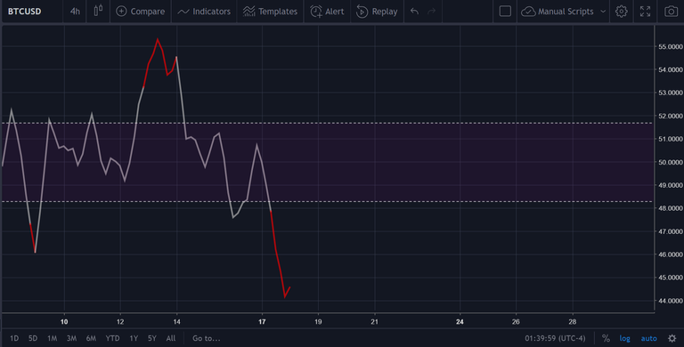
Another Reason for the $6.2k Drop-Off Point
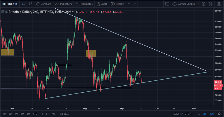
https://www.tradingview.com/x/6RoS1GxA/
The chart above is a bit less pretty than the last one that we posted of the H4, but this is effective to show some of the other resistance/support points on the chart.
What we want to draw the readers’ attention to, however, is the diagonal trendline that the price has been testing numerous times over the past few weeks.
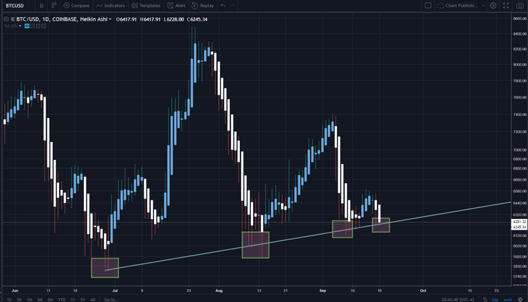
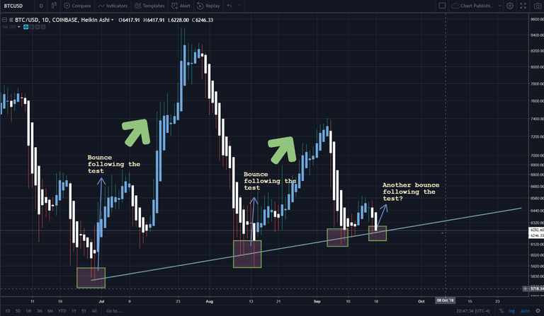
https://www.tradingview.com/x/nanwhr5z/
The picture above should give readers a better idea of the diagonal support that we are referring to.
This line dates back to June 28th (approximately), and the price has just recently re-tested this support point.
As one can observe in the picture above, each re-test of this line has come been associated with a subsequent ‘bounce’ in the price.
https://www.tradingview.com/x/kDLpAOgd/
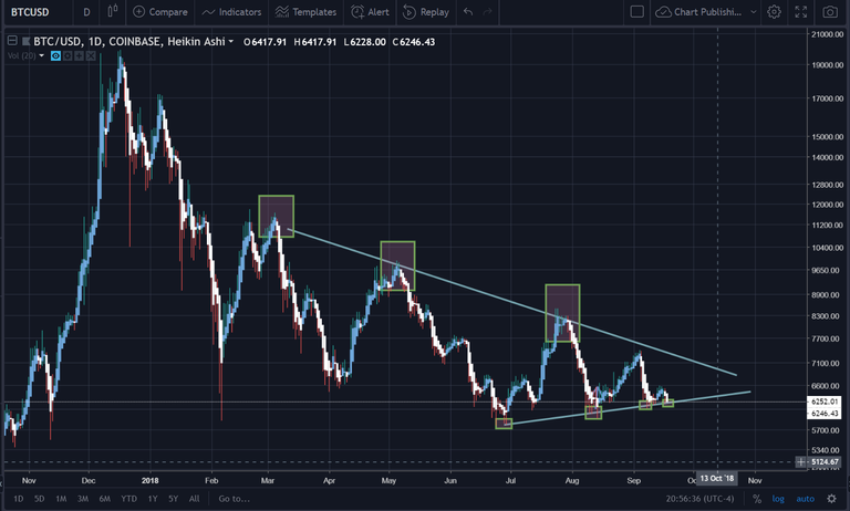
We Cannot Ignore the Lower Highs Occurring Simultaneously As Well
While there has been a steady, ascending support line for the price of Bitcoin, there has also bee a steady, descending resistance line for the price as well.
https://www.tradingview.com/x/y4aQtEYH/
As you can see in the picture above, there has been a substantive pattern of lower highs.
The two lines that you see above converge to form what is known as an asymmetrical triangle.
What is an Symmetrical Triangle?
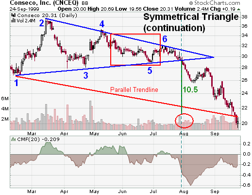
The two pictures above (which are already cited) are symmetrical triangle formations that depict two different potential outcomes.
These represent the only two possible outcomes because of the nature of the pattern.
As you can see in the above graphs that we populated in this article, the pattern of higher lows and lower highs cannot continue forever. At some point there must be a higher high or a lower low. This is simple mathematics based on the shape of triangles in general (more akin to an equilateral).
Also, a higher high or a lower low would effectively represent a break in the trendlines; both of which are very well-tested at this point in time.
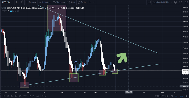
Shorter-Term Look
https://www.tradingview.com/x/mU6i3jHC/
Common sense and logic + the symmetrical triangle pattern dictates that the price would bounce toward the upper regions if it fails to break below the trend line created by the higher lows.
This may be corroborated by the reverse bump and run that appears to be developing on the protocol currently.
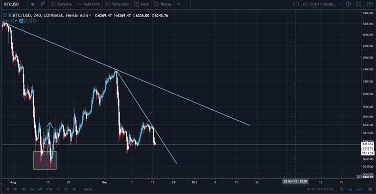
https://www.tradingview.com/x/6OuUrEYt/
The above chart is on the H4. The formation of an even steeper angle of a downward trend that is below the main downtrend (the larger line), is akin to that of a bump and run.
Except, in this case, that would precipitate a fairly massive gain, rather than a massive decrease.
Below is a picture of the conventional bump and run pattern:
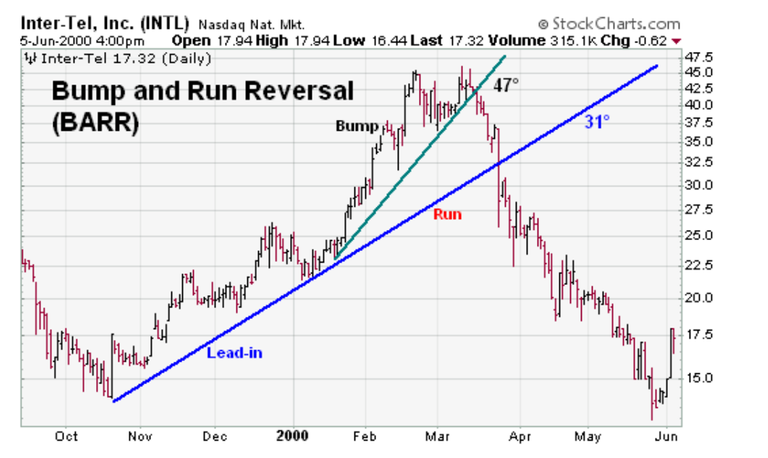
What is seen above is a conventional bump and run pattern that is followed with a steep drop.
However, this can also occur in reverse as well.
This is sometimes also known as the inverted BARR.
Below are some common examples of this chart pattern coming to fruition.
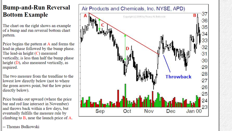
Source: http://thepatternsite.com/barrb.html
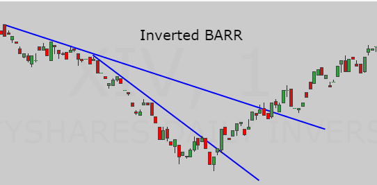
Thus, there is a latent possibility that this occurs with the price action in its current iteration.
Let’s take a look at where the optimal point to place a long position would be.
https://www.tradingview.com/x/c0fIrSjW/
The crosshair-like illustration on the chart above marks a point where a ‘long’ position on Bitcoin would probably be a bit ‘safer’ in comparison to placing one now.
The price of the yellow crosshair mark on the chart is $6.32k (approximately).
A break above this point would send the price at least toward the $6.5k resistance once again.
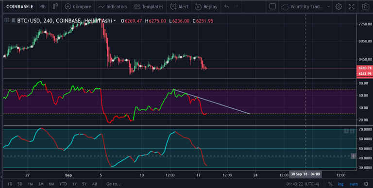
Looking at the Indicators For Potential Reversals (H4)
To be clear, the H4 is showing a downtrend. Thus, when we discuss ‘reversals’, we are talking about the chances that the price will subsequently reverse course and begin moving upward.
ZeroNoncense Balance of Power RSI
https://www.tradingview.com/x/8yH6EwqU/
The above picture shows a custom indicator that we built. This indicator, in the simplest terms, takes the Balance of Power and tracks its RSI (momentum.
When the line turns red, that means that the price has reached an ‘extreme’ in sentiment.
If the line is in the ‘overbought’ area when the red line appears, that means that there is a ‘dangerous’ amount of buy sentiment and that an impending reversal could be in the works.
When the line is in the ‘oversold’ area when it begins turning red, that means that the sell volume is higher than originally anticipated as well.
Thus, this indicator bears good news for those that are Bitcoin bulls.
Relative Strength Index (14) [H4]
https://www.tradingview.com/x/8rYZpDEQ/
In the picture above, the second panel displays a custom indicator built by Zero_n0ncense.
The indicator reflects the same reading as the regular RSI(14). However, the only major difference is that the colors represent ‘buy’ and ‘sell’ signals.
Green = Buy Signal
Red = Sell Signal
Getting back to the RSI, we can see that it is currently in the oversold portion for the H4. There was also a line drawn across the top of a portion of the RSI to show that, at one point in time (during the consolidation), there was a significant amount of negative divergence that would’ve tipped investors to the fact that they needed to get out or short (at least in the short-term).
However, the RSI is now in the oversold range. But that does not mean that the downtrend that was established by the previous RSI woes cannot come to effect now. This will not be prohibitive in the price’s attempt to climb back up in value.
Conclusion
In the author’s opinion, placing a bet on a long position at this point wouldn’t be the worst move in the world.
Please note, this isn’t financial advice.
The reasons for saying this point looks like a nice long position are:
- It appears that the price has finally hit a ‘bottom’ of some sort. This was also a bottom that was anticipated.
- The ‘cool down’ period for the RSI looks lik eit has or will subside at some point.
- The pattern that Bitcoin is in mandates that the price continue upward from where it is as well.
Ultimately, there is no guarantee that the theory presented in this article plays out — but only time will tell.
@proofofresearch