I recently learned about logarithmic price scales. The neat thing about log chart scales is percentage differences have the same vertical distance on the scale. The best way to explain is with an example.
If price moves from $10 to $20, that's a 100% increase in price. If price moves from $1000 to $2000 that's also a 100% increase in price.
On a linear scale, the difference between $10 to $20 is tiny...
$10 |-| $20 -> $10
...while the difference between $100 to $200 is much bigger by comparison.
$100 |----------| $200 -> $100
On a log scale, the vertical difference between those price moves is represented by the same percentage.
$10 |-| $20 -> %100
$100 |-| $200 -> %100
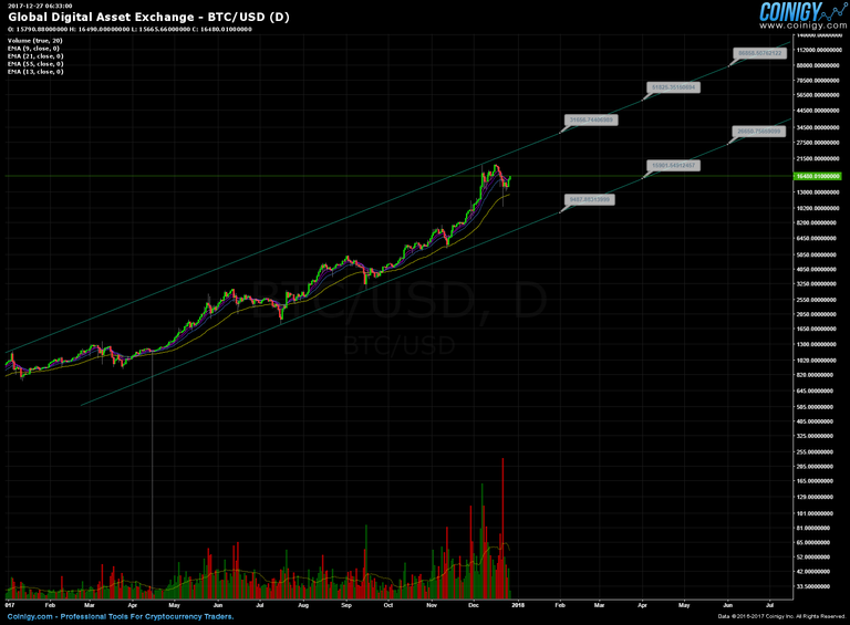
Check out the following daily Bitcoin chart on a log scale:

I'm just showing 2017 and the first half of 2018 on the chart, but if you go back in time, Bitcoin stays within those trends lines most of the time.
We can use this to map out possible price ranges for the foreseeable future assuming the trend holds.
For example in February, the price could be as low as approximately $9500 or as high as $32,000. In June, the price could be as low as $27,000 or as high as $87,000!
The likelihood is the price will be somewhere in between those extremes. While it's certainly a very wide range, we can use the extremes as a guide for spotting shorter trends.
Look at the most recent highs for Bitcoin. It's very close to touching the top trend line. We can reasonably assume the price will have to come down quite a bit from there since that trend line acts as resistance.
While this chart is interesting it's certainly not authoritative in any way. This is just another tool we can use to see the bigger picture. Trends will eventually be broken.
Congratulations @johni1028! You received a personal award!
Click here to view your Board of Honor
Congratulations @johni1028! You received a personal award!
You can view your badges on your Steem Board and compare to others on the Steem Ranking
Vote for @Steemitboard as a witness to get one more award and increased upvotes!