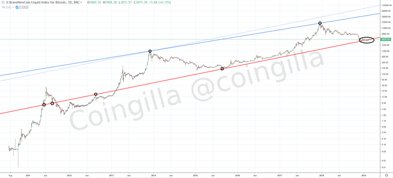
When the price never drops below last dip and it always bounces back above last high, it means that we are dealing with a bullish trend. But you will not find it on the Pic.3 as it is a linear representation of the price. To find a long term trend you have to switch to logarithmic scale. When you do so, a much better view will appear (Pic.4).

Pic.4 Bitcoin main trend lines
Now, 2 main trend lines are clearly visible. The lower one (solid red) is a support line and is so long that it looks like it comes from hell itself. It reaches “Dark Age” when Bitcoin was born and when was just finding its way (and as we know from Dow's Theory, the older the trend the greater its importance). For couples of years the price line never crossed significantly this “Hell Line” (actually it did a bit on December 2019 and from that day is crawling slightly sometimes above and sometimes below the line trying to climb along this slope up in the area marked with a black ellipse on the picture above). This trend line was attacked by the price few times in the past (from the top and from the bottom as well in the points marked with black circles at Pic.4) , which makes it even harder to cross tellingly downwards, now. First time the line was broke down on 10th of May 2011 and then the price retraced below that level to stay there until 09th of February 2013 when finally broke it remarkably out for good. This 21-month period was like a stabilization time (let's consequently call it a “Stabilization Age”) before entering the highway to the Moon on 09th of February 2013, which initiated the beginning of the “Moon Age” we are still in until today.
The second line (solid blue) is a resistance for the price when it's flying in Heaven during the last phase of the bull runs. This “Heaven Line” (let's be consequent in naming things) touches the price line only in 2 points (black circles area) but it's enough to create a long-term “Moon Channel” combined with the lower line.
You can also find more support and resistance lines there but those 2 seems to be the major ones. Why are they so important? Because they can help you position yourself according to the trend. If the price is close to the Hell Line (Death Line, Ground Line... - name it as you wish, it doesn't matter) and you buy, then even if the market goes down a bit more you probably won't lose. If you wait some time, there is a big chance the movement will change its direction upwards soon (at least in theory). The same situation is when you sell close to the Heaven Line (Life Line, Sky Line… - just name it). When some trend line develops over the years and eventually the price line breaks it through, it means the trend may change. So what may happen when we cross this red line downwards? You are right, Bitcoin would be in trouble and it may fall straight to hell. Or more probable, it will just start another trend. And what may happen when we cross the Heaven Line upwards? I will let your imagination solve this complicated problem.
One thing which bothers me is that solid blue line is not parallel to the red one. That's why I placed another blue dotted line parallel to the Hell Line and with only one point of contact (for now). Thanks to this we received a perfect channel. Will the price touch this line during next ATH (All Time High) to complete the channel? Time will show. If we look at the peak in April 2013 when the price didn't go straight to Heaven area but just made a retracement and then went back up to form a new high in November 2013, then there is a small chance that something similar may happen again. Why not, this is crypto!
Next chapter:
<< Bitcoin cycles
| Home |
Bitcoin turning points >>
Everything is beautiful