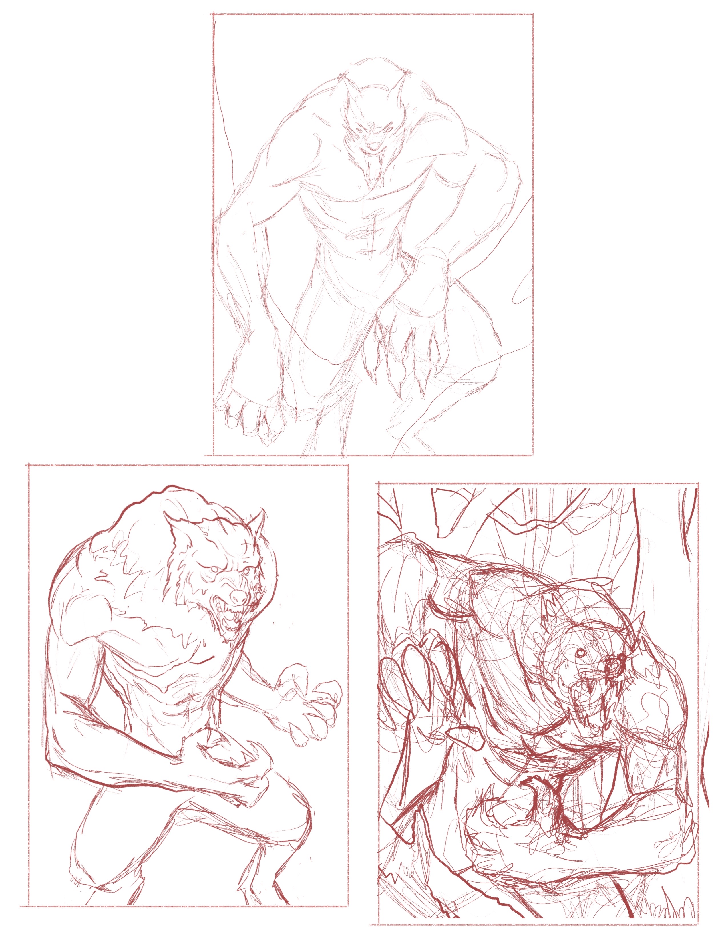
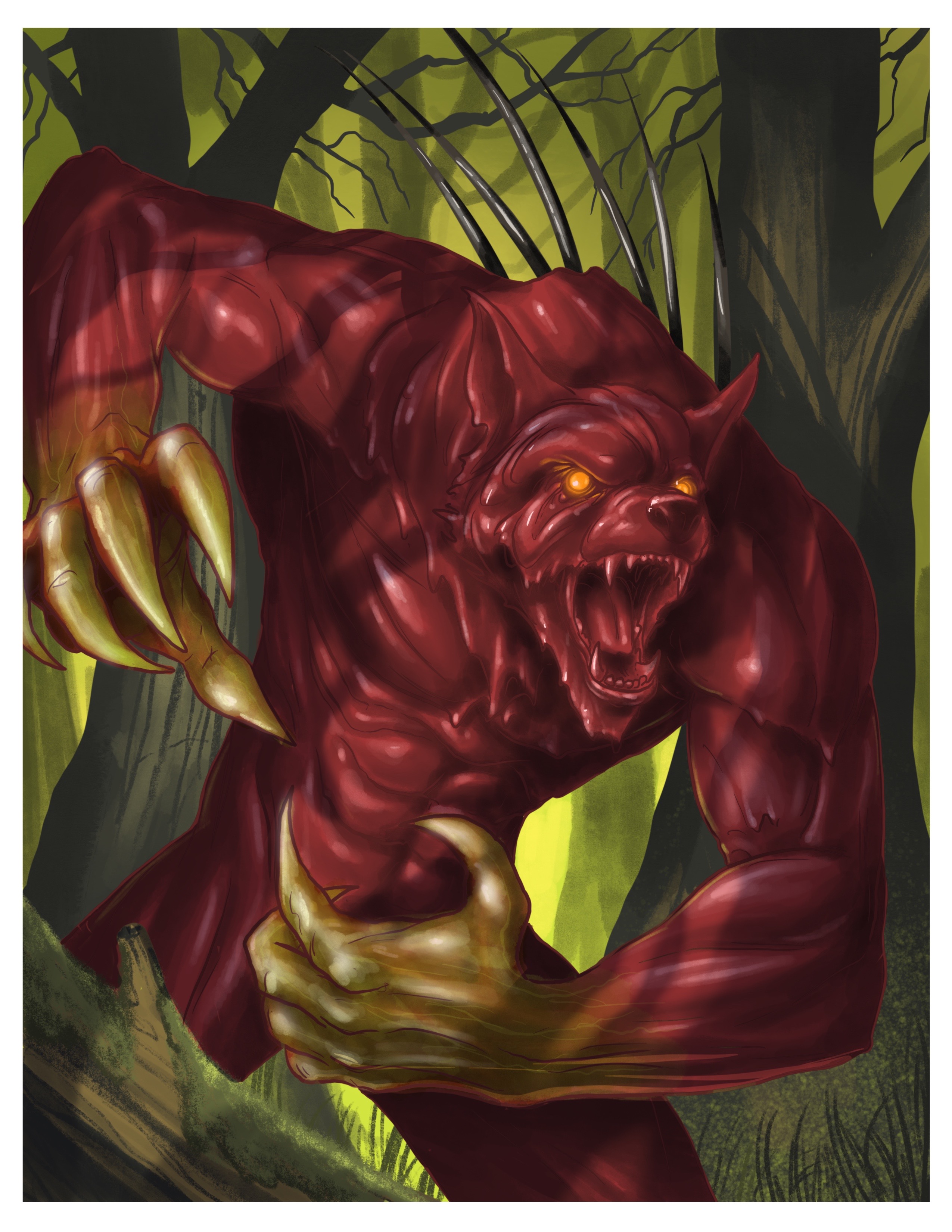
A client that found me through the art I've done for The Dresden Files fandom over the last few years contacted me recently about commissioning an illustration of his son's D&D character. Described to me as a "werewolf made of blood, with glowing orange eyes and a sort of venomous green running from his claws up to his forearms." Outside of that, and a few reference photos showcases the desired viscosity, I got to tackle it any way I wanted to. Firstly, I had to come up with the composition, which was harder than expected. I actually wound up doing about five or six roughs before I though about how this process might make a good post, so unfortunately those weren't saved before I started over. Below are the last three I did before settling on the final.
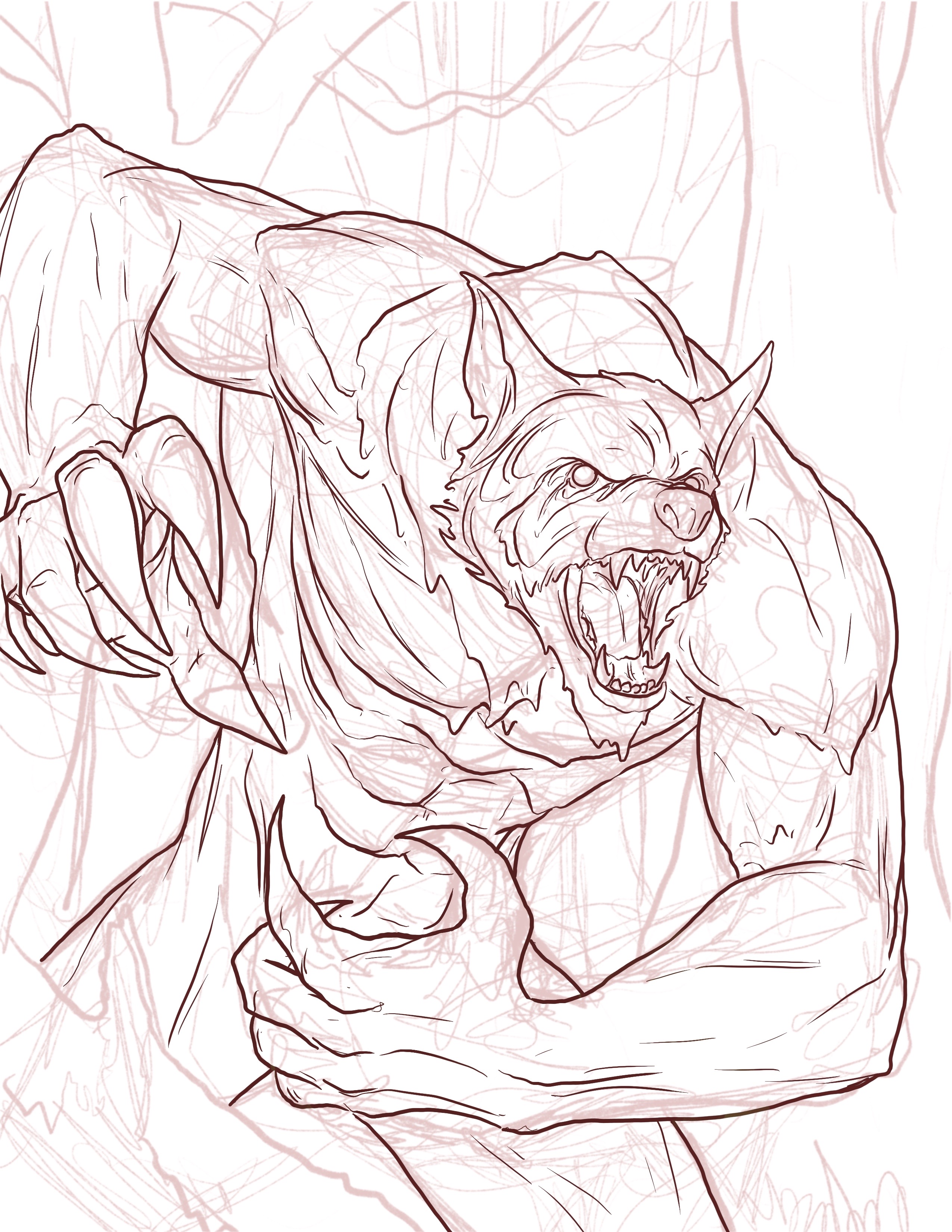
Once I landed on the final, I went through and inked just the werewolf itself. I kept the linework really minimal, as I figured too much linework would obscure the idea that it was made out of blood. I used dark red for the linework for the same reason.
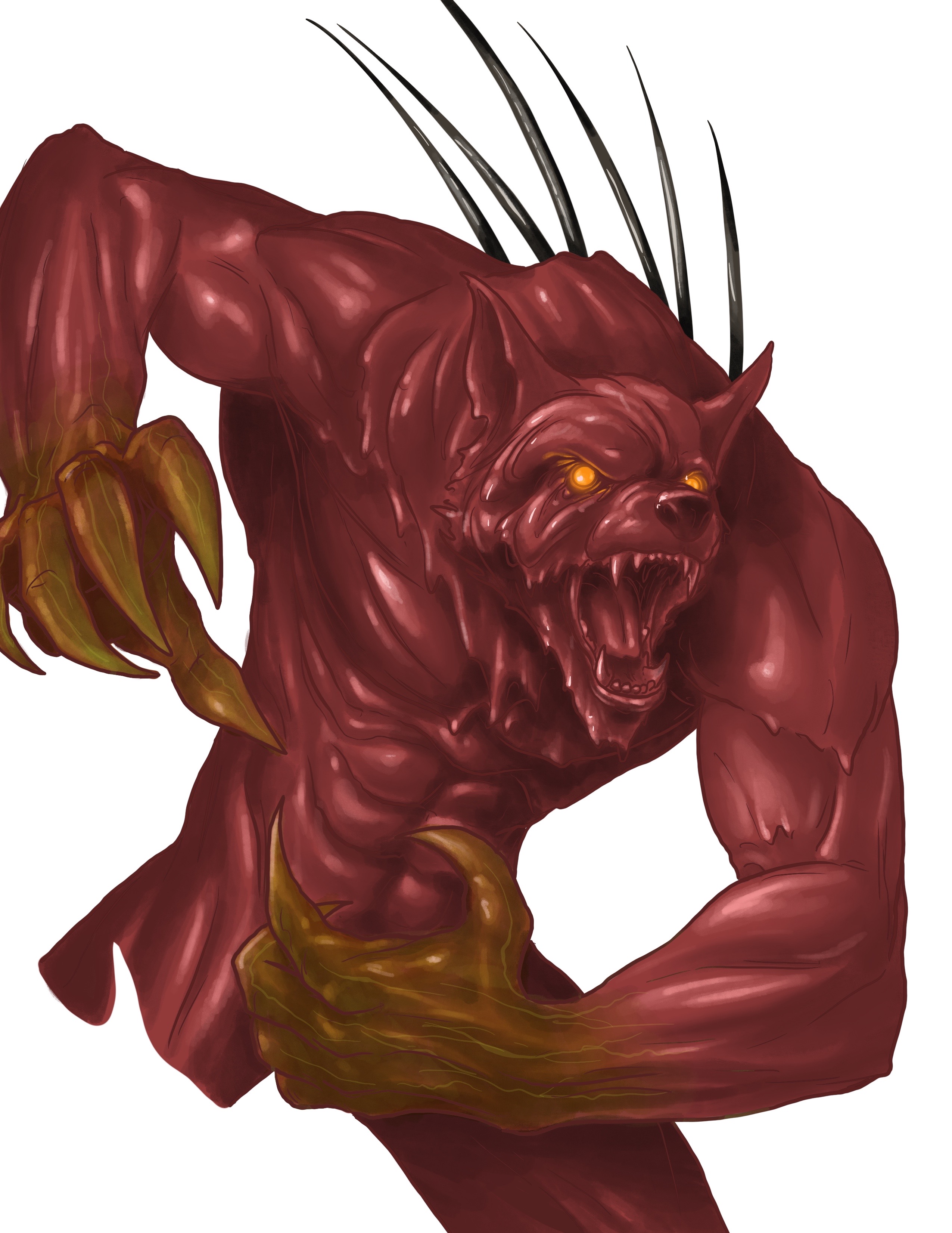
Once that was sorted, I dropped out the sketch layer. Using the gouache brush in Procreate I rendered the wolf using two shades of red, and then an almost white highlight. I had also forgotten that the blood wolf was supposed to have six large black quills coming out of its back. I also laid down a green overlay layer on the hands.
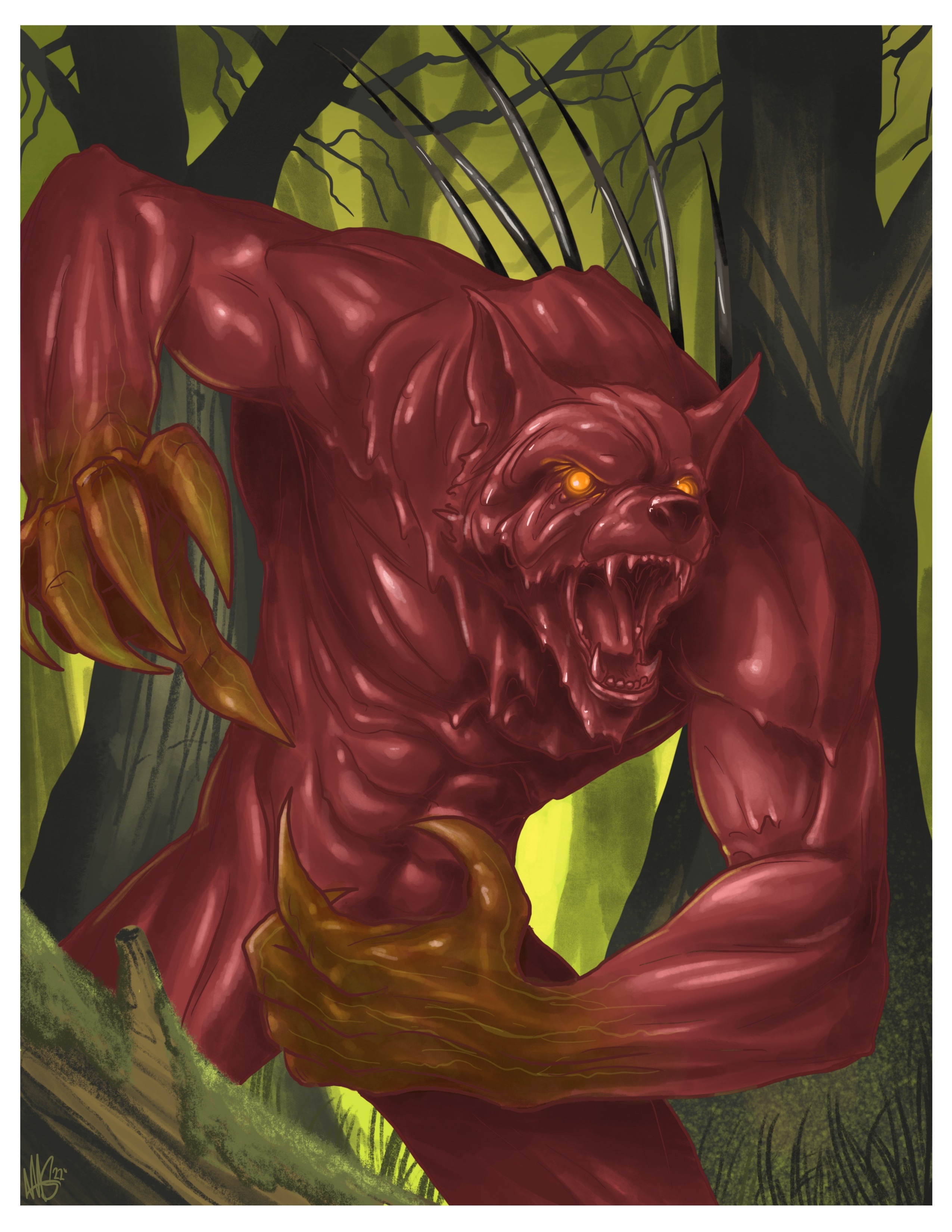
Once I was reasonably happy with how the blood wolf was looking, I dropped in the background. This started with just filling a layer behind the blood wolf with green, and blending in some bright green and yellow. Dropping the background trees was basically accomplished using a slightly darker green than the background. The trees directly behind the blood wolf were done in a dark brown instead of a black, because I didn't want them to draw attention from the wolf. I still treated them as silhouettes, adding highlights where it was helpful.
Now that the background was in, it was time to do a final pass on the rendering of the wolf. Darkened up the contrast a bit, added a cast shadow to imply trees in front of the blood wolf as well. I also expanded and finished up the green on the claws.
And that's the final. The end result kind of reminds me of a Goosebumps cover, which I'm not at all upset about.
That is pretty awesome. What are all the random lines in like the third or fourth image though? Are those just to show depth or contour or something?
Your content has been voted as a part of Encouragement program. Keep up the good work!
Use Ecency daily to boost your growth on platform!
Support Ecency
Vote for new Proposal
Delegate HP and earn more
This is really cool @swarddraws the colour is amazing.
Congratulations @swarddraws! You have completed the following achievement on the Hive blockchain and have been rewarded with new badge(s):
Your next target is to reach 4000 upvotes.
You can view your badges on your board and compare yourself to others in the Ranking
If you no longer want to receive notifications, reply to this comment with the word
STOPCheck out the last post from @hivebuzz:
Support the HiveBuzz project. Vote for our proposal!