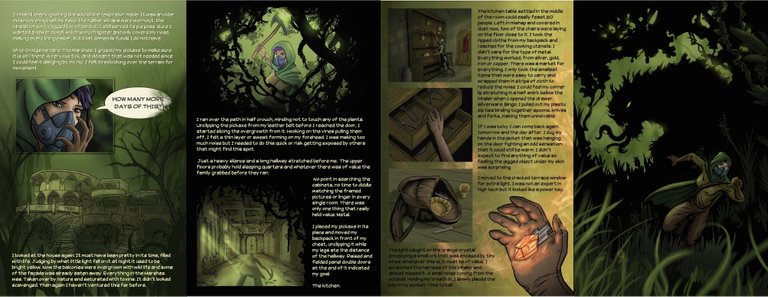
I was working on the 5 and 6th page (its double page splash) and I put all the images together in a row so far to see if they were looking cohesive and to make sure the next pages matched the feel and I was pleasantly surprised at how they looked.
Been busy doing some work stuff and some steem stuff and trying to get another website set up ughh, I hate website type stuff just not familiar with it enough.
Also have to get everything in order to post my digital collectible artwork, hopefully this week.

They look pretty good! Cohesion achieved at least on a colour and image flow level as I can't read anything XD
The comic looks great at the moment, I keep dying to read it full, I'm glad to see that you progress with that :)
Appreciate that!
Very nice bro
I sense a kick ass comic on the way
Hey SA. You are super talented and have been waiting for it to come together. You have been busy on this one for some time and look forward to seeing it completed.
You got a 32.11% upvote from @ocdb courtesy of @steemitadventure!
I love the writing! (someone who actually writes!)
Keep up the great work! Looking forward to more!
Cheers!
Oh wow, these look so awesome together. It's amazing how the pages can change when you put them next to another. Great work!!
They are looking great man! I have seen them all individually and even one after another in your post but never quite like this. Put together in a horizontal series............. viewing the image full screen makes the impact clearer.
BTW, you haven't published the the fifth and sixth page till now right? Did I miss something?