Or at least my process.
I drew ten characters from a podcast I listened to last month. It's called Wolf 359 and I highly recomemend you give it a listen if you like Sci-Fi, Comedy and good plots. Now on to the art.
SKETCHES
I love designing characters. I'm pretty sure I don't know most of the tricks of the trade, but that's what practice is for. Sketching the simplest and most generic versions of your characters is usually the first step. In animation and comics, designing characters based on the shapes they are made up of is a well used practice.
The main reasoning behind this is so that when the characters are simplified (i.e. in aniamtion and comics) the creators want the viewers to be able to recognize characters quickly. There's a lot of good logic in that.

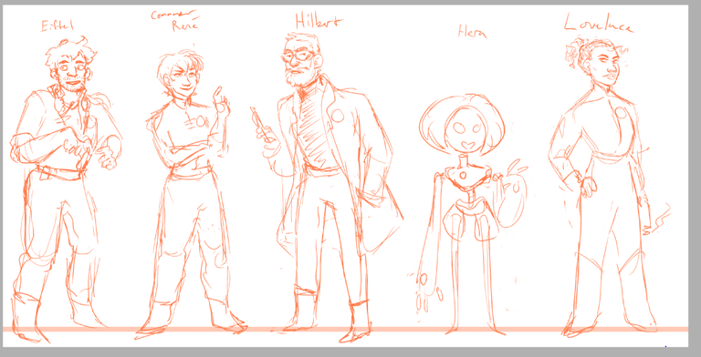
My first sketches were a strange mix of semi realistic faces and very cartoony bodies. In all honestly I just didn't want to draw anatomy, but I realized that I could go to the extreme with this and just give them rounder and simplified features.

These sketches aren't that drastically different. But the faces and the bodies have better synergy. Speaking of synergy, these characters are a crew on a spacestation, and while you don't have to design them, it's likely they all have some variant of a uniform. Making it so that the characters outfits don't seem too different from each other, and yet also unique is an obnoxious balancing act.
But that's the thing about designing the visuals of a character when you aren't the creator. I like to work within the bounds of what a character would look like, based off of what they complain about or what they value. Do they exercise? Do they like pop-culture? Do they respect authority? Do they shower?
If you are thinking about these things while you are designing, you characters should always look like you answered at least a few questions about them.

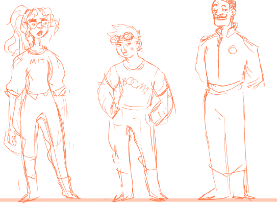
These next 5 characters, while part of the podcast, don't start in the same place as the other ones. So I felt it was ok to design them out of uniform. I also did not want to get bored by drawing the same awful jumpsuit. As long as I answer some questions about them in their design, I don't feel the need to push myself too hard.


Also note, simple changes of poses and size of body parts can make drastic improvements on designs.
LINEART
Now for some people, Lineart is tedious and not worth your time. They are correct. But here I am, still doing it. This is a part of my process where I add all the details. This includes a lot of the texture found on clothes and hair of my characters. I like to have contrast in the lineart and make sure it is good enough on it's own before I start the colors. If I can post the lineart by itself, then I know I wont be using color to hide other problems in the design, be it anatomy or shoddy shoe designs. *cough*


There's less designing in the lineart stage, but still the little details you include are what helps sell a character. Props for characters to hold, or graphics on their clothing helps suggest things about them without the a visual medium having to explicitly state it.
COLOR
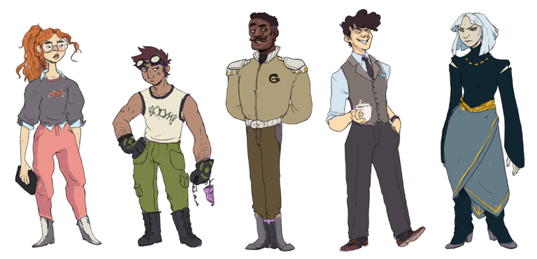
Color can be tricky. If you are designing a character by themselves, you have fewer constraints. But if you are designing a group, you have that annoying synergy problem.
You don't want the characters to be too different, or it wont feel like they are supposed to be in even the same universe.


Individually, these characters look pretty good. But looking at them doesn't suggest that they even know each other. That's ok for some of these characters, but not all of them. The robot-like character in the top image was the solution. She's an AI that runs the spacestation that Wolf 359 takes place on. I made her orange for no reason other than it wasn't on any of the other characters. I found that I was able to take that orange, and put it into all the other designs.
And it worked out pretty great!


Thanks for reading!
You can also find me elsewhere online!
Tumblr| Instagram | Twitter | ArtStation | RedBubble
Really very informative lessons. I am also learning these things to make my digital paintng good and realistic.
Thanks! Sometimes you have to be your own teacher!! so good luck!!
This is the best comment. I really love it.
I love the variety of the desing of the characters, how everybody looks diferent and so real, one of my mistakes is that my characters there doesn't have that variety is always the same noses and i dont like it but still happen and I try to chance them with some practique but is always the same :c btw : Now you have a new follower here also on Instagram, keep drawing <3
oh wow thank you! and as for the noses, it was a very intentional decision. I frequently will forget to draw differences there as well, so you aren't alone. :D ima follow u back, cuz u look like your gonna bring a lot of fun to this site!!
Amazing illustration very impressed UpVoted
thank you! much appreciated!
Good sharing! Love your style. 👍
Thanks!
Awesome art work.. looking forward to new and amazing arts from you on steemit
Dante is here, No Fearthanks! i'll be trying to post more, we'll see how that goes!
You have been scouted by @promo-mentors. We are a community of new and veteran Steemians and we are always on the look out for promising authors.
I would like to invite you to our discord group https://discord.gg/vDPAFqb.
When you are there send me a message if you get lost! (My Discord name is the same as here on Steemit)
This is great!! I love how you can see your personality shine through your work, your characters have a lot of life & originality to them.
Cant wait to see you grow ! :)
nice design sheagar!!..love it!!
I can totally see this as a comic. Great that they all have their personalities and traits. Nice one @sheagar!
thank you! i'm tempted to make a short comic with them or an animatic, but i've some other projects in mind for the moment. perhaps in the future!