
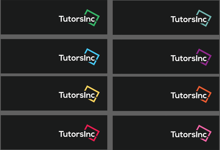
Its for a website that will make education/classroom digitised. The green box with the dot represents tab (pad to be precise).
What do you think? How is it? Any room for improvement?
Also its for students so it will be very colourful indeed.
Here's a sample:
 !
!
I dont like that dot inside the line. This deatail wont be possible in very small size. Its hard to see and it looks like separated line.
Otherwise its very cool. Have an upvote :)
I had the exact same thought but tbe company is registered with the dot in the name, so i have to use it. They don't even wanna maker the dot smaller as they want the dot of the same size as the font!
I'm pretty helpless there, but planing to use a different font that not as thick as this one.
Thanks for the feedback @andrejcibik :D
clients are like that sometimes :D Ego over brain.
Hhahahahahaha
I would consider making the dot white and splitting the green line to make room for the dot.
Nice One. I like it. The logo and the name.
It is legible.
It is simple yet pretty.
It's pretty timeless.
The only thing I might suggest is to reduce leading for the T and see how that goes. I feel like it's too much compared to the rest.
Also, if you want to make it more in a box, try to put the Inc down and play with that configuration. Cause right now this is a great logo for a Header, etc. though it's probably not that great for an Icon, web thumbnail, etc. (it's hard to put it in a box).
Though depending on the usage it might be a minor issue.
Also, why so many colours? Why would students need so many colours?
Great job, man :).
After seeing your post i realised that T actually seems far away!
And i made one with 2 separate line for Tutors and Inc, but they said it's a one single word, and want it that way! :(
Thanks a lot @designthinking for the feedback! :D
Awesome. I'm glad I could help :).