Even though it's my job title, I've never felt comfortable calling myself a graphic designer. I dunno what it is. Maybe it's because I never went to school and got proper training. Maybe it's the countless intimidating rules of design that should be adhered to that freak me out. Or maybe it's because when I hear the word "designer", I tend to think of a worldly, slightly snooty person with eagle-eyed vision for pointing out flaws in a page layout.
If you can't tell from reading that last sentence, it all just boils down to my personal insecurity. There! I've said it. I'm an insecure designer! (Whew. That wasn't so hard.)
It's true, though. When I think about it, a lot of my insecurities stem from a lack of knowledge and practice. Since graphic design is quite a bit more technical than the comic illustration I'm used to, I second guess myself a lot. However, I've found some simple ways to improve my confidence when it comes to design that you might find helpful as well.
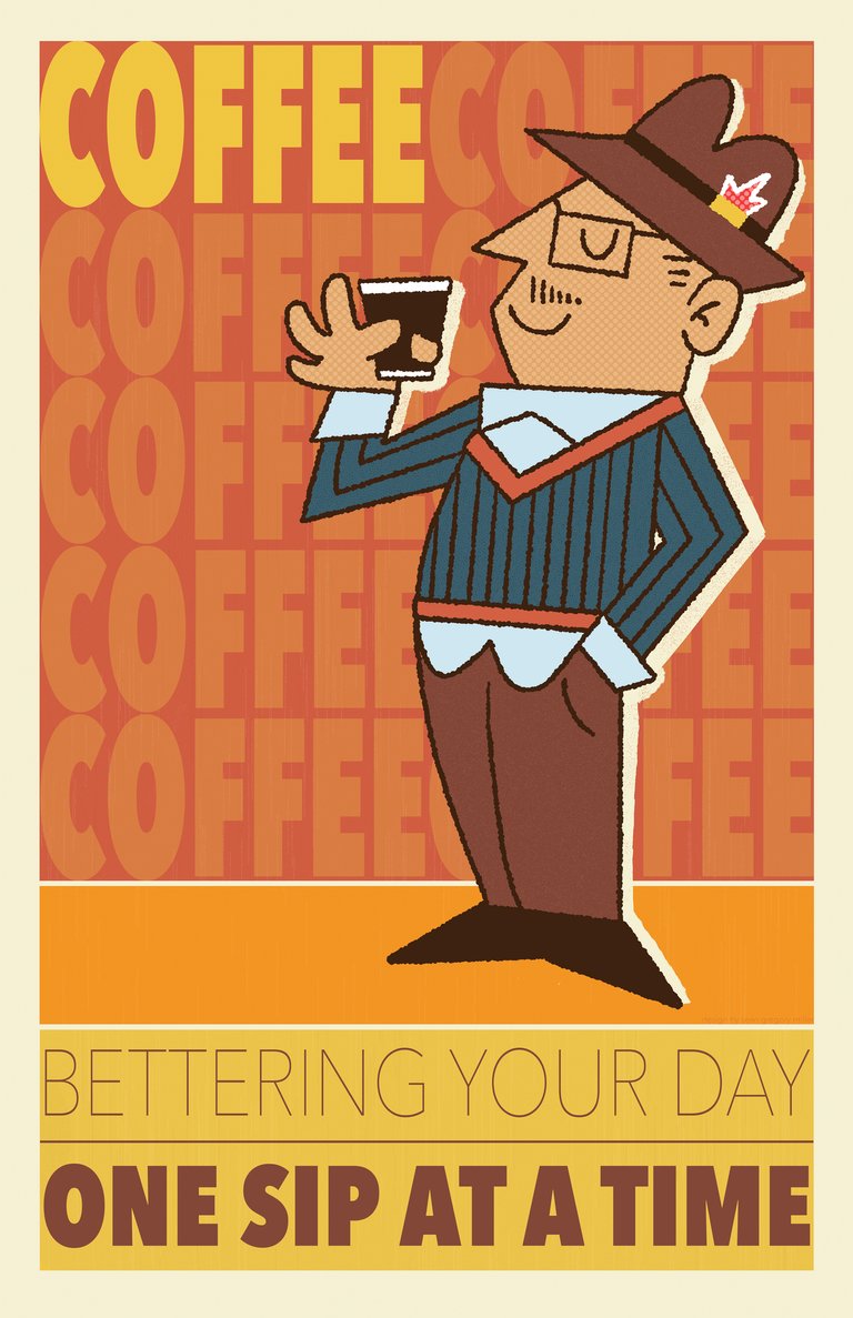
The first is imitation. Everyone has a personal taste or style they are drawn to and for me, I really like the illustration and design of the early 50s-70s. I've found that simply imitating that style of design has taught me so much about line weight, layout, color choice, typography and character placement. When you try your best to imitate or copy a piece of design that you like, it really brings your deficiencies as a designer to the forefront. Rather than letting this crush you, try to use it as a way of learning what you're good at FIRST, and then focus on what you need to work on. In a way, the source material you are imitating is acting as your private tutor and giving you a gentle, but honest critique.
The picture shown above was one of my first ventures into graphic design by combining what little knowledge I had with my love of retro illustration and coffee. There's room for improvement, for sure, but overall I still dig this one!
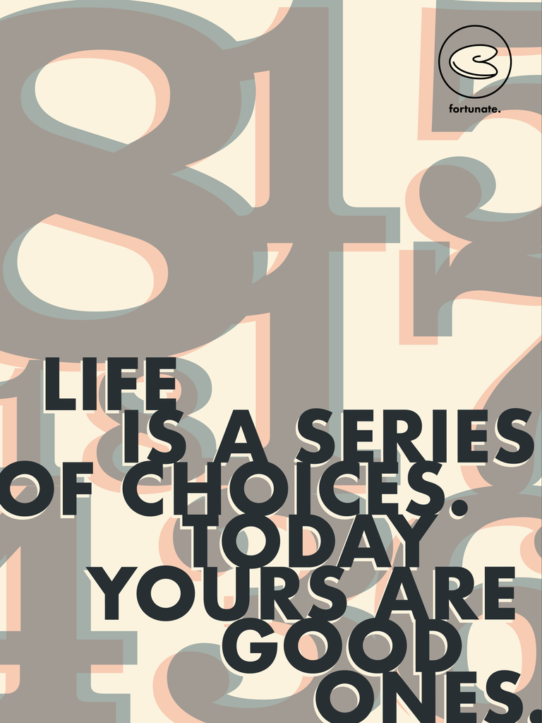
Second, try taking something like a catchphrase or a quote and turning it into a piece of design. For example...

To improve my understanding of grids and typography, I did a exercise where I used the fortune and the lucky numbers on the slip of paper from a fortune cookie and turned it into a poster design. Typography is particularly challenging for me so doing this exercise was a great way to see what a already knew and what I needed to improve on. The end result turned out cool enough and I learned a lot in the process!
Both exercises are just challenging enough to make you feel like you really gave your creative muscles a solid workout. Plus, the more you do them, the more improvement you'll see, thus building that creative confidence you'll need for your next big project!
Congratulations @seanbiance! You have completed the following achievement on Steemit and have been rewarded with new badge(s) :
Click on the badge to view your Board of Honor.
If you no longer want to receive notifications, reply to this comment with the word
STOP