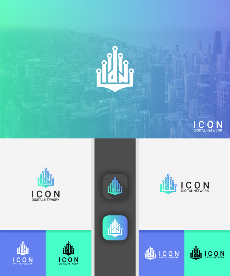
wordmark (monogram), logomark and also can be a combination mark logo.Hey, @truthproductions. Here is the first idea can be
They have been created with minimal designs based on gridline for constructions logo. Here is also I put the trends to logo designs based on Pushing metaphors to the extreme with a custom letter IDN with network visual, also there is an Experimental technique in typography IDN, a logo can use only the monogram without the full text ICON DIGITAL NETWORK
And the logo is on Primary, Secondary and Icon logo. This is useful for being able to adjust the logo to a different place. For example, on the web using the primary, and in other places using secondary. and on the profile using the icon version.
Let me know what do you think. Regard. WKWK MAN.

Great! Bright colors, and love the IDN subtly worked into the design. Unique entry as no one else has though to do that yet. Also great to see so many mock ups of it!! Thank you for your entry!!
If you make a whole post about it, we will resteem your entry :)
Check out the post. The logo have been reconstructions :)
https://steemit.com/logo/@podanrj/my-logo-design-is-an-effort-to-participate-in-the-logo-design-contest-for-icon-digital-network