# 2 Drawing process - illustration and work layers

in #art6 years ago


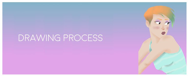
Hello friends, in this post I will publish another design of mine, the elaboration process, this design in its style is different from the previous one post, this is an illustration with more vivid colors and pastels.

1. Original drawing


As usual in my drawing processes always start with a sketch or a drawing by hand, for me it is essential to scratch a sheet first and then pass it to the computer.

https://ipfs.busy.org/ipfs/QmYHWEf66dDmCFRdFFYTsG21Dbr9tWhjaiSoh8CtYCeddX

2. Base colors


After having the photo of the drawing in Photoshop I begin to fill them with base colors, like the skin, the shirt, and the hair, eyes, etc.

https://ipfs.busy.org/ipfs/QmQTLorh75MG7B4Hb1sgH1ZGYP4K2cjYSmh2z5t312DKJ5

3. Details


Once the basic image has been deactivated, I begin to give minimal details such as some textures, or the depth of the eyes, and a gradient of the hair, to give it shape.

https://ipfs.busy.org/ipfs/QmXgcXpXVgA8gZ7bpn8Y8vew6nYLtcw9N71VGLbw5ENg3p

4. Adding more details


As you can see in the image I dedicate myself to give you more details, such as the outline of the eyes, the nose, so that the drawing and the character begin to take the shape I want without filling it with so many details, I like to be minimalist in these details , for me the less clean and pure the drawing, but obviously there has to be a balance, neither much nor less.

https://ipfs.busy.org/ipfs/QmcEEUWWDY2SHJPEJFvEZFMZNfW5Q2jQkhDTEpsTSmfo1J

5. Background (sky)


In the choice of heaven I wanted to choose a base of bright colors, saturating a little the colors and give a tone of magic, as a style more stories for children.

https://ipfs.busy.org/ipfs/QmPVHnhkB1wAzV8qXgoH8NRCPB8MyGhryS8fKvHg1873UG

6. Shadows


In this step I start to give depth to the character, with soft leftovers so as not to hit the bottom, but with this intensity I like it because the design I still have balance in terms of the color palette.

https://ipfs.busy.org/ipfs/QmTK2X55nkAotkjmXc2QU32qB4487v4ptSrXRQ5vntYkxS

7. Detailing the sky


Here I start to focus more on the sky, I add some clouds that give a touch of epicity, as I said before a magic tone, that's why the clouds leave them with that tonality, I think I like it.

https://ipfs.busy.org/ipfs/QmfPCFddCJDx9r8YPrHR4SG6kpEixLQdB2Cxp9tJiLu1Uy

8. The moon


Here I simply add the moon with some textures in the sky to complement the sky.

https://ipfs.busy.org/ipfs/QmQi8xqY2LRv1coqNQAfyv9cvgNBXimEkuXarod25YpVUV

9. Final Drawing


In the last part, what I did was to finish the sky adding more details like stars, or the moon's flash. And with this the design is ready.

https://ipfs.busy.org/ipfs/QmQrE6RjtBUsrojjrgUwawf6D9wdoL3JS42ktPdBaG75Nm (https://www.behance.net/gallery/60145443/Bad-girl)

Click on the link to see the original drawing.


Thanks for watching this post, I hope you liked it as much as I did. :D
Sort:  

Congratulations @pipearq95! You have completed the following achievement on the Steem blockchain and have been rewarded with new badge(s) :

You received more than 100 upvotes. Your next target is to reach 250 upvotes.

Click here to view your Board
If you no longer want to receive notifications, reply to this comment with the word STOP

Support SteemitBoard's project! Vote for its witness and get one more award!

✅ Enjoy the vote! For more amazing content, please follow @themadcurator!