Hi Steemit friends!
(ര̀ᴗര́)و ̑̑
I chose the glasses emoji today because I am currently wearing my
♡glasses♡
They're not square frames though.
I made a previous post about my inking Link, and I didn't think I would go any further with drawing Link, but as I was looking at him, he was looking pretty plain. I know many people draw anime and that's great and all, but I feel that if I am drawing anime, I should use it to work on improving some aspect of my drawing, or put my own spin on it.
I did both this time; I wanted to learn how to make hair more realistic, despite it being anime, and I thought it would be more interesting if I drew my own variation of Majora's Mask imposed over Link's face. I recently inked Todoroki from My Hero Academia too, and now that I'm looking at it, I want to change him up also! I'm not sure that I will though since I was given an image to draw. I'm not sure how much wiggle room I have for creativity there. Todoroki will probably stay the same. I haven't decided if I'm going to color Link or not, I would still have to figure out a color scheme for him.
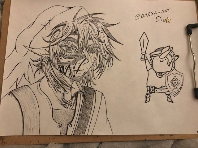
That little Link is still looking spunky. It's kind of funny seeing both Links in the same picture.
Here is the drawing process:
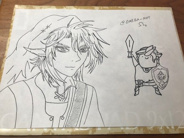
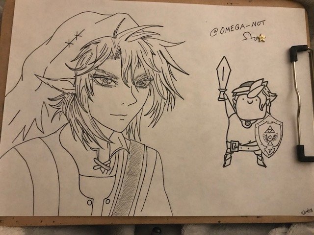
Here, I bolded the lines underneath each chunk of hair to add some depth to the picture. I also added more flowing lines.
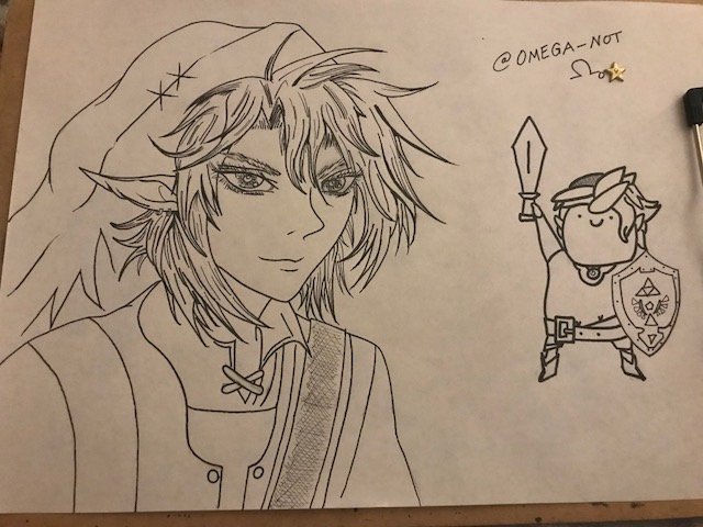
I added even more thin lines in the hair, but I also used a fine point Copic liner to thin out the ends of the hair. I think this part added the most realism to the picture, which makes sense because hair doesn't clump at the end, it ends with fine wisps of hair.
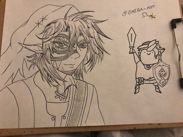
Goodbye pretty face!
(๑•̀ㅂ•́)و✧
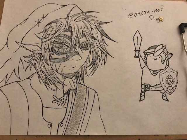
It doesn't look like much changed in this picture, but here is where I worked on Link's hat a little more by adding some shading. I also added some shading under his neck, collar, and on his clothes.
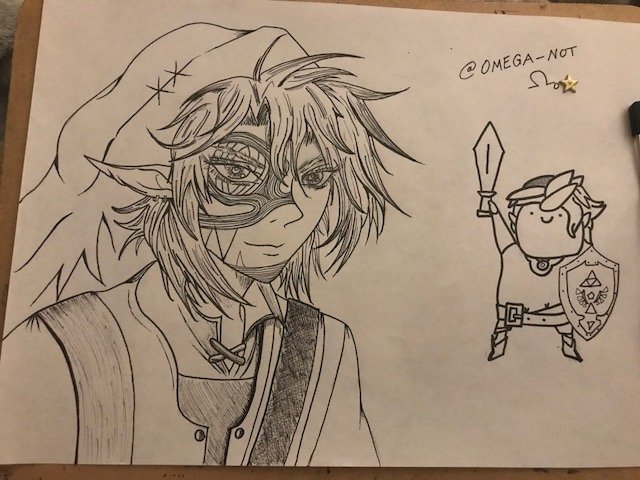
Here it is more evident that I focused on shading the clothes. Though, honestly, I have no idea how to shade clothing. That's probably one of the future projects I will work on. I just made some guesses as to how it might look with shading. It was too strange for me to look at a detailed head and hat with 2-D clothing.

Again, I did add more to the hair here, but the focus was more on his face. I added a little more detail to the mask with the teeth on his face and added some other details on his face.
Before and After


Digression: Downtown Sculpture
Since today's post was kind of long, today we will look at this sculpture I found whilst walking around downtown and ponder it's meaning.
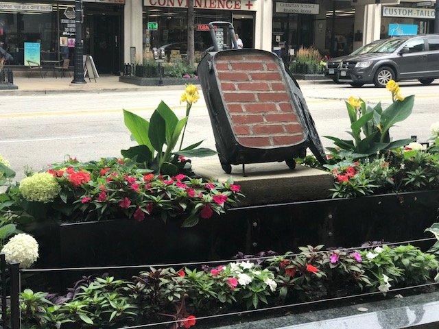
Thanks for pondering with me!
@omega-not
Woah, the extra facial detail sure adds a whole new and exciting dimension to this fine drawing.
Well done drawing! That sculpture has me stumped 😉
;) There was actually a tour going on, so I snapped a quick picture as everyone gathered around it. I should've joined the tour and to learn a little more about Wisconsin.
oh link is progressing well ! very good detailing on the mask :D
Thanks Redips :))
Still love the two different style Links on the page, the contrast is hilarious XD Don't know why, just is XP The addition of the mask makes it look a bit more fun with all the swirly patterns. At this stage think it will look good with or without colour :)
Thanks Vomnom! I'm thinking about drawing some more anime first and then later maybe coming back to practice coloring. :D
Thats a glass emoji? That sure doesnt look like one to me o.o
Anyways,, aaa that link looks very nice, much more better than link with nothing on his face, lets just say he painted himself like that 😂
You know what's funny is, on my laptop it looks like it has square eyes with nothing in the middle, but on my phone it looks like circle eyes. Lol, who knows what kind of emoji it is.
Thanks! I definitely like the new Link better :)